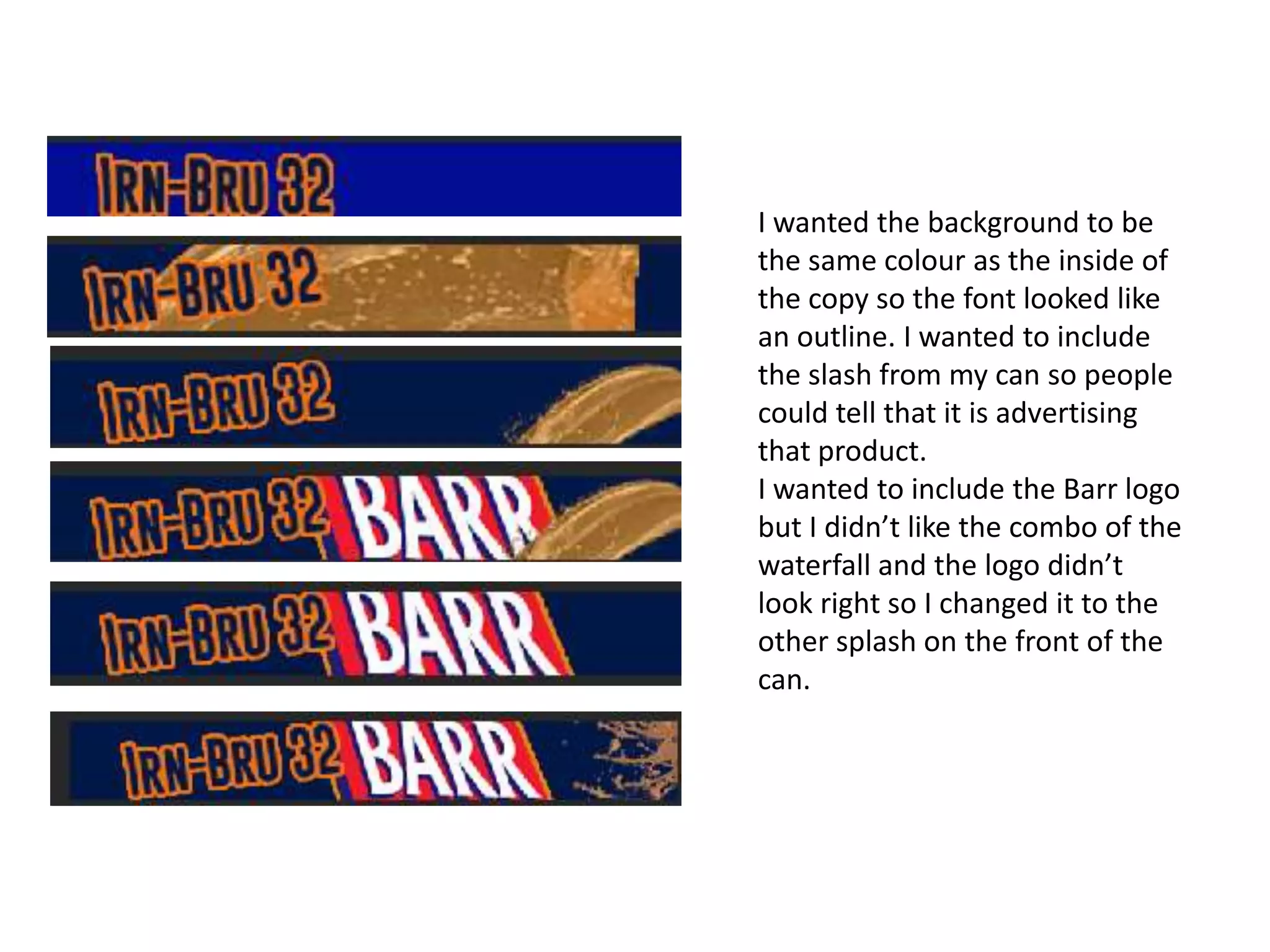
#StandardsGoals for 2024: What’s new for BISAC - Tech Forum 2024
Banner development
1. I wanted the background to be
the same colour as the inside of
the copy so the font looked like
an outline. I wanted to include
the slash from my can so people
could tell that it is advertising
that product.
I wanted to include the Barr logo
but I didn’t like the combo of the
waterfall and the logo didn’t
look right so I changed it to the
other splash on the front of the
can.
2.
3. This banner started off as a still one. But once I added the flash marks around the
‘new’ I wanted them to flash on and off. To do this was simple, make a gif out of it. But
since it was my making a gif moving the can back and forth made for difficult work. I
quickly figured out what to do and the gif was born.
The background of the banner is still undecided. I don’t know whether to have a
background or just have a border so it looks separate but not too separate.
The font looks nice on some of the words but on others it has left too many lines
undefined. On some of the words I had to re-add the lines back into the font which
made the quality of the banner go down.
However, the can is meant to be the focus of the banner and I think it is. It will draw
away from the low quality font. Especially since it moves it will be the thing people will
look at the most.
4. The first draft of the
moving wave is the
picture closest, I thought I
could move the wave
myself and create the
wave. But when it got
time for the wave to fall
and crash against itself,
this proven very difficult
and time consuming.
I knew most gifs were made when people opened videos
up in Photoshop so I found a wave that fit the bill of
want I wanted and opened it up in Photoshop. This is the
four images on the left, it shows the movement of the
gif. When the water drains away ‘Irn-Bru 32’ is revealed,
making the public know the advert is for that specific
drink.
I decided to go for a wave to fit in with the splash and
water theme I have carried throughout my designs. It
helps to say the drink is refreshing and a big wave like
this must take some energy to produce.
5. This banner is supposed to
look similar to the can. The
effect is meant to look like
the can is rolling, so the
splash that was on the can
is revealed and the copy at
the bottom of the can is
revealed, ‘Refreshing
Energy’.
This text that flashed
because of the white
stroke I put around it.
I would of preferred it if
the whole can was showing
and you could see the can
physically roll but this
proved too difficult in the
time we had left.
6. The last banner I made includes the
product. Since Irn-Bru has a hyphen I
thought that the can would fit inside
it nicely. The can then disappears and
the writing starts to shrink until you
can see it all, and read it clearly.
The can then pops up again at the
side of the banner.
I tried to keep the hyphen in the same
place so it looked like the text was
really shrinking but after a while it has
hard to do because the copy is
uneven. There is more on the right
side of the hyphen than on the left
and I had to move to text over a little
to fit it all on.