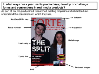
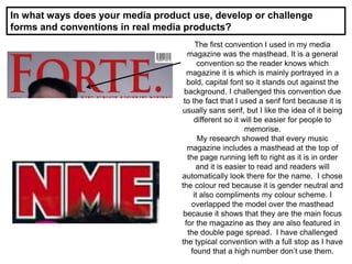
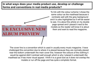
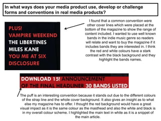
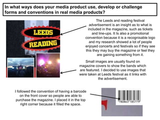
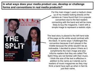
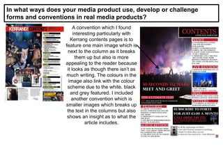
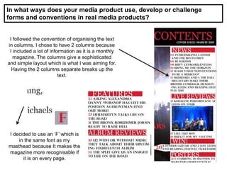
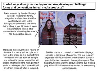
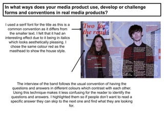
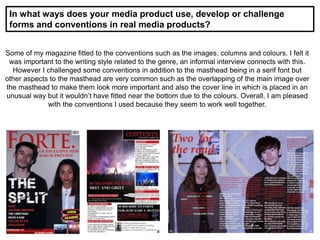
The document discusses the conventions used in real media products and how the student's media magazine both follows and challenges some of these conventions. Some conventions that were followed include using a masthead, cover lines, images, columns for text layout, and different colors to identify questions and answers in an interview. Some conventions that were challenged include using a serif font for the masthead, placing a cover line above the masthead, and positioning the lead story to the left of the main image rather than in the center. Overall, the document evaluates how the student aimed to balance following industry standards with also making some unconventional design choices.