Organic Name Reactions for the students and aspirants of Chemistry12th.pptx
Task 6
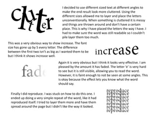
1. I decided to use different sized text at different angles to
make the end result look more cluttered. Using the
different sizes allowed me to layer and place the letters
unconventionally. When something is cluttered it is messy
and things are thrown around and don’t have a certain
place. This is why I have placed the letters the way I have. I
had to make sure the word was still readable so I couldn’t
pile layer them too much.
This was a very obvious way to show increase. The font
size has gone up by 5 every letter. The difference
between the first two isn’t as big as I wanted them to be
but I think it shows increase well.
Again it is very obvious but I think it looks very effective. I am
pleased by the amount it has faded. The letter ‘e’ is very hard
to see but it is still visible, allowing you to read the word.
However, it is faint enough to not be seen at some angles. This
is okay because the effect lets you know what the word
should say.
Finally I did reproduce. I was stuck on how to do this one. I
ended up doing a very simple repeat of the word, like it had
reproduced itself. I tried to layer them more and have them
spread around the page but I didn’t like the way it looked.