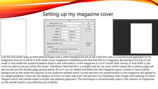
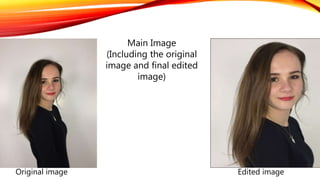
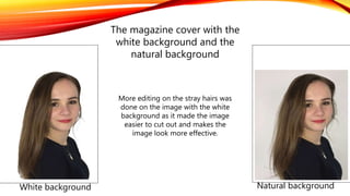
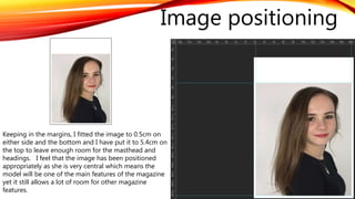
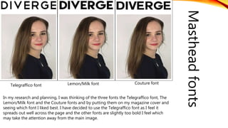
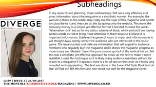
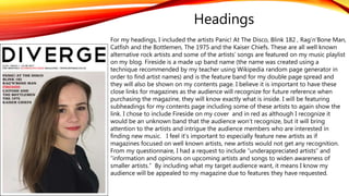
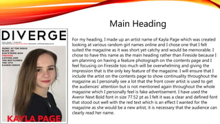
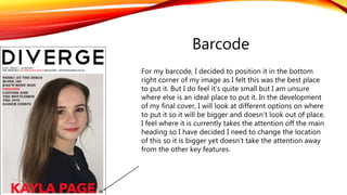
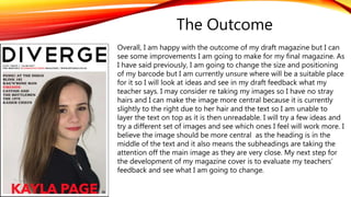
The document summarizes the creative process behind developing a draft magazine cover. Key decisions included choosing an A4 size with white background to appeal to the target audience. The main image was cropped and edited to draw attention, and positioned within the margins with space left for the masthead and headings. Various fonts and styles were tested for the masthead, subheadings, and artist headings before final selections. Overall the creator was happy with the draft but identified areas for improvement, such as repositioning the barcode and recentering the main image, based on feedback.