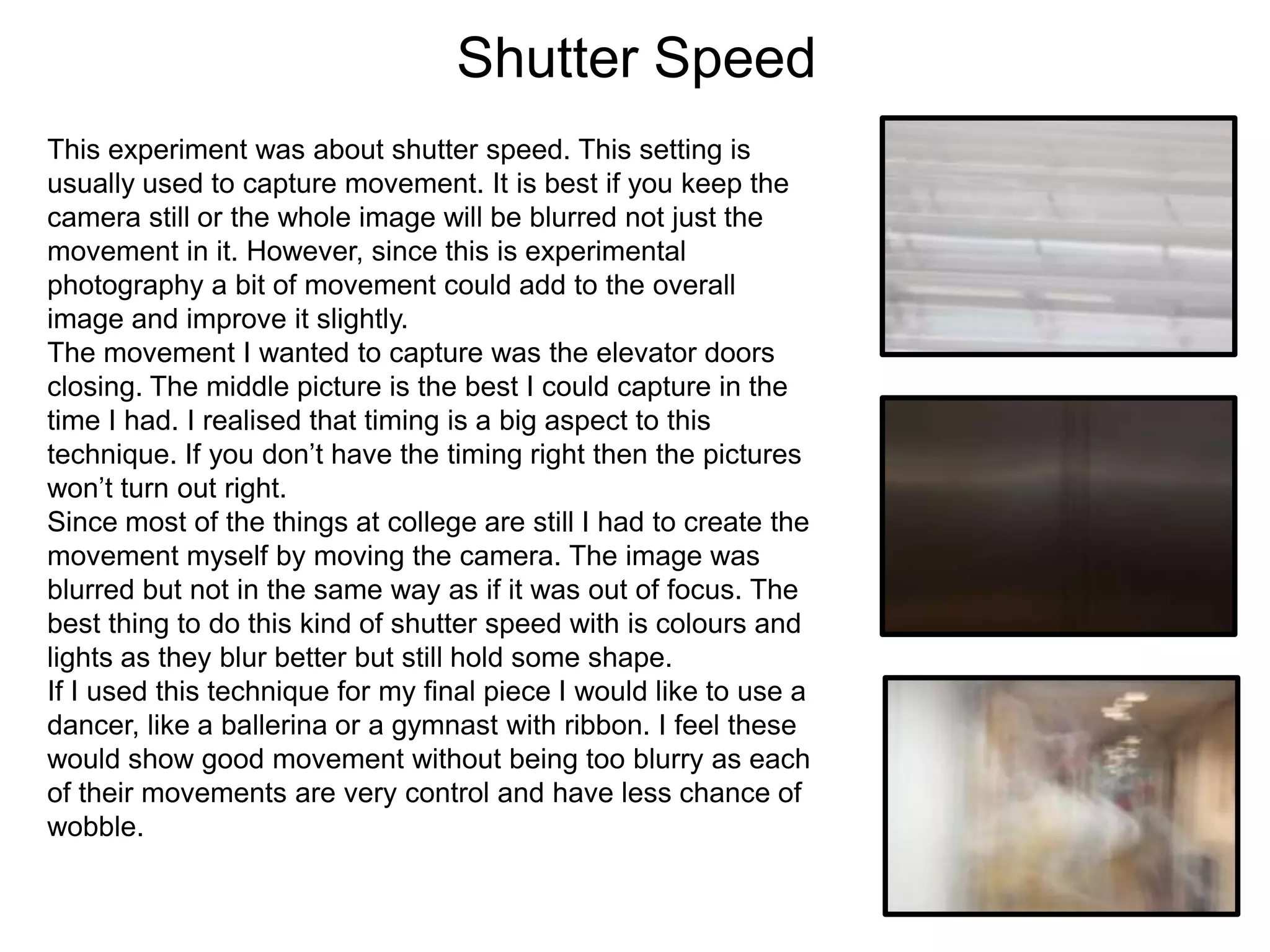
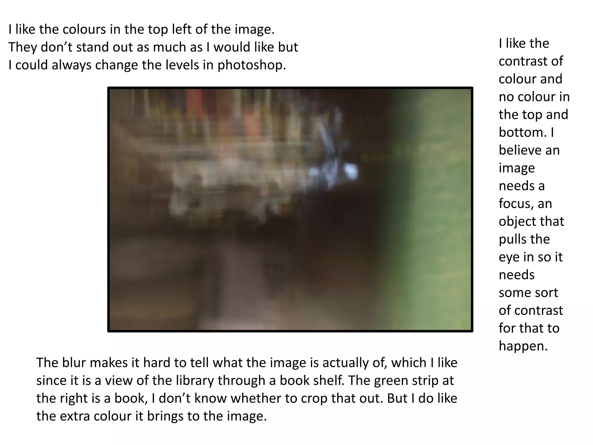
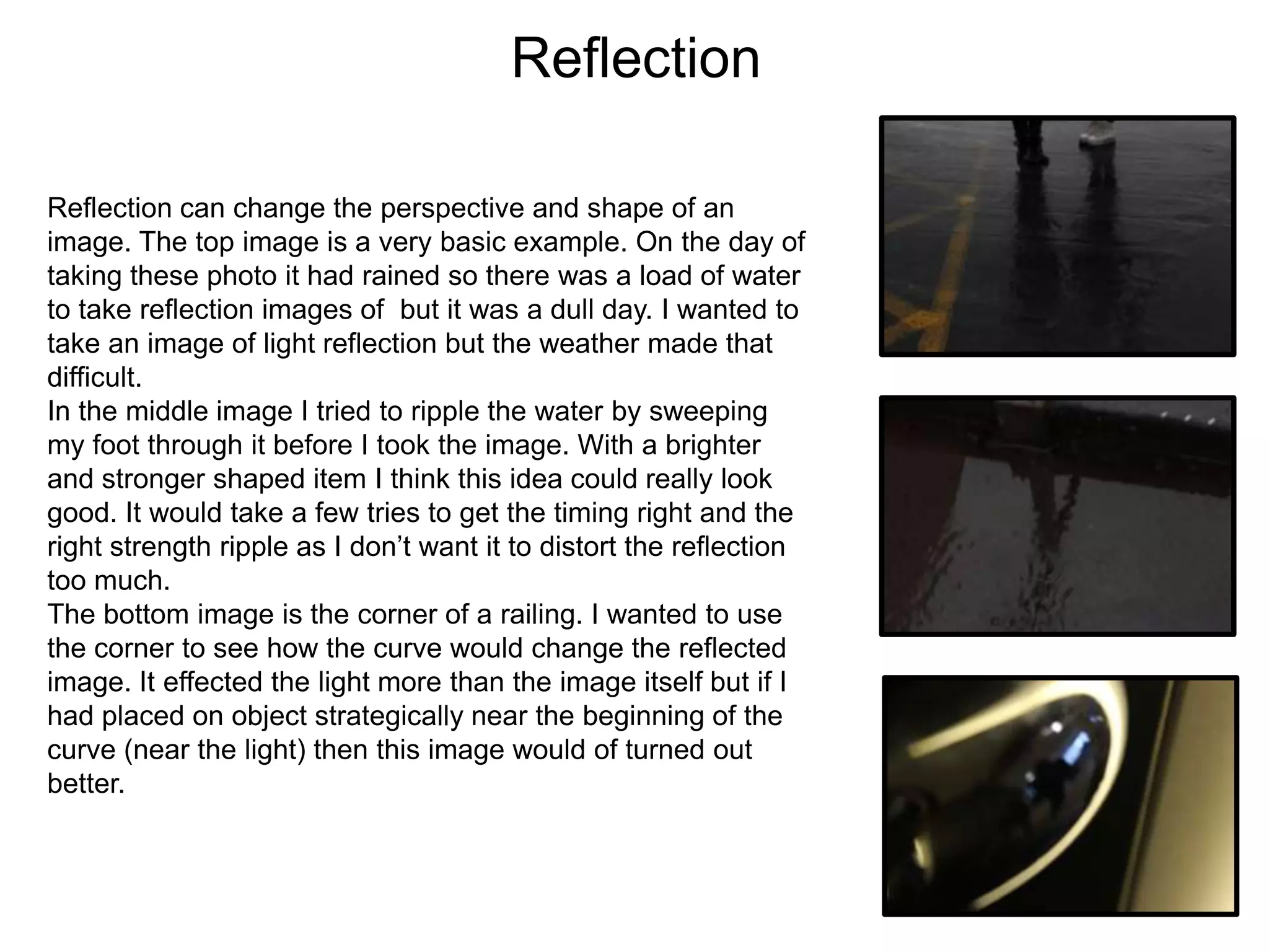
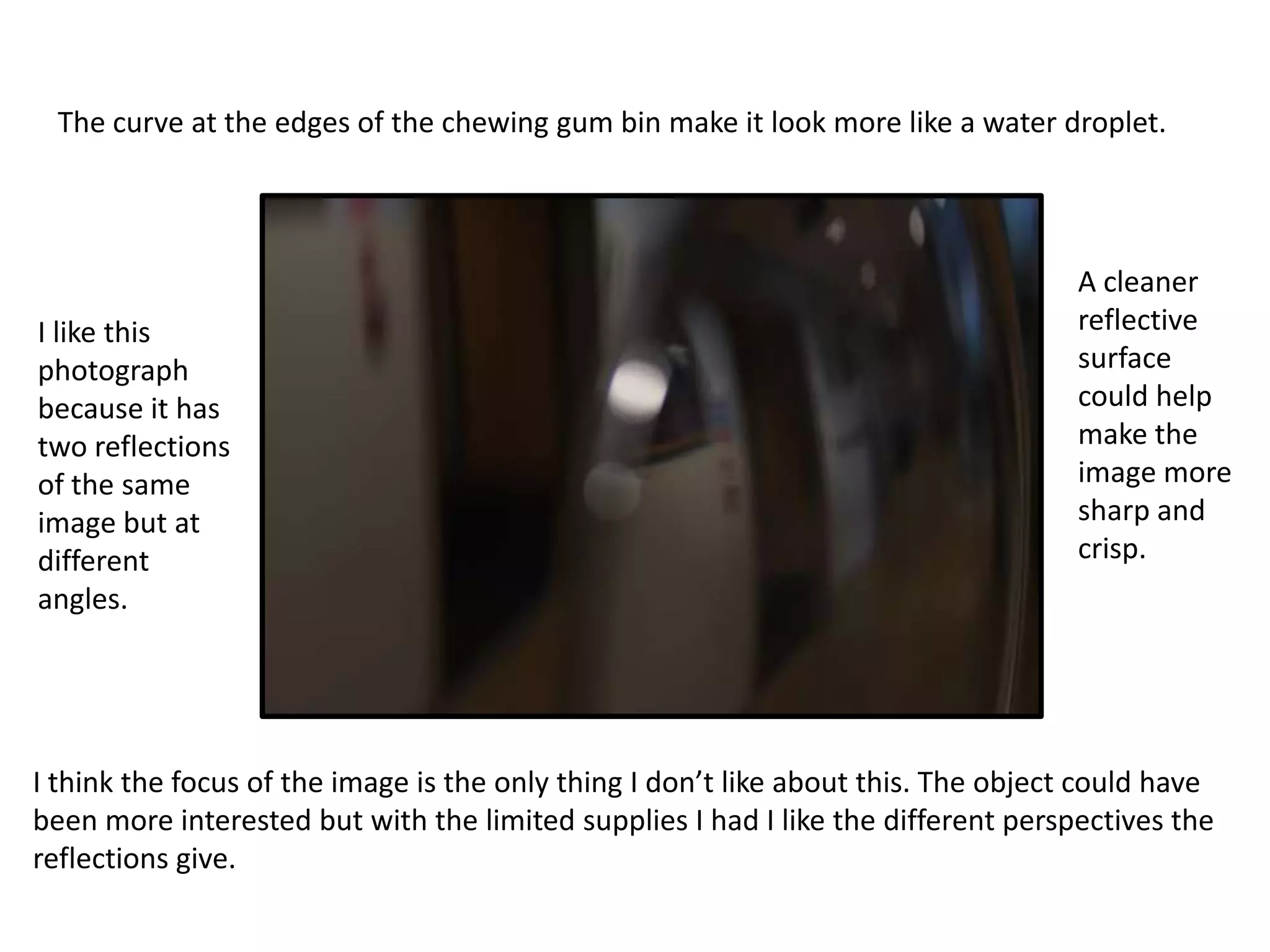
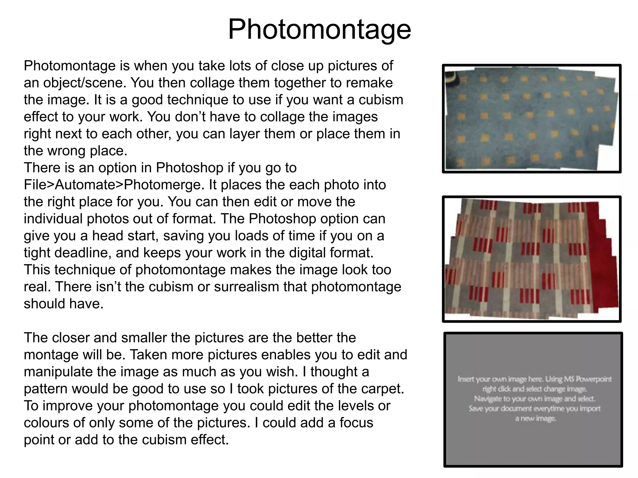
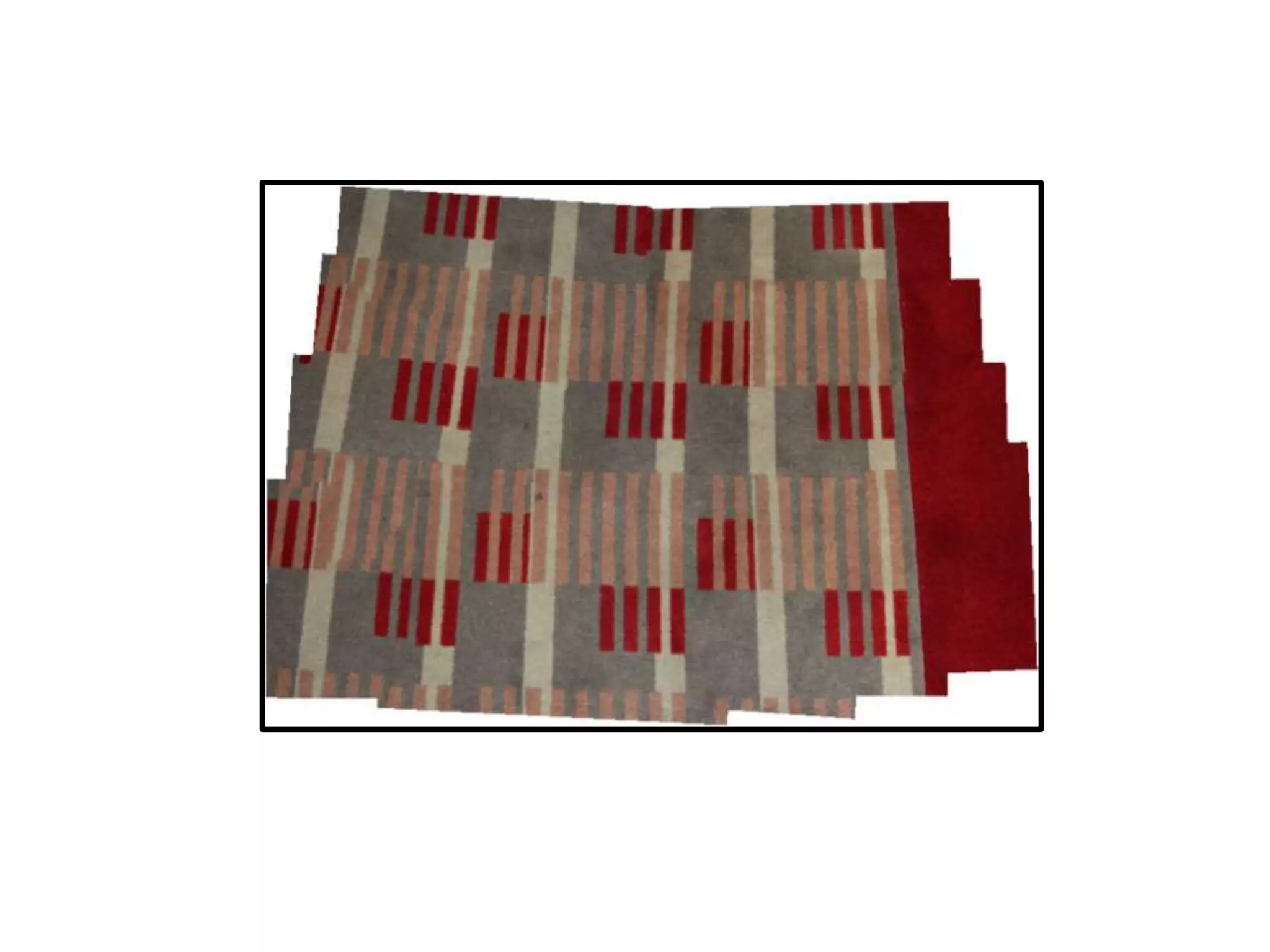
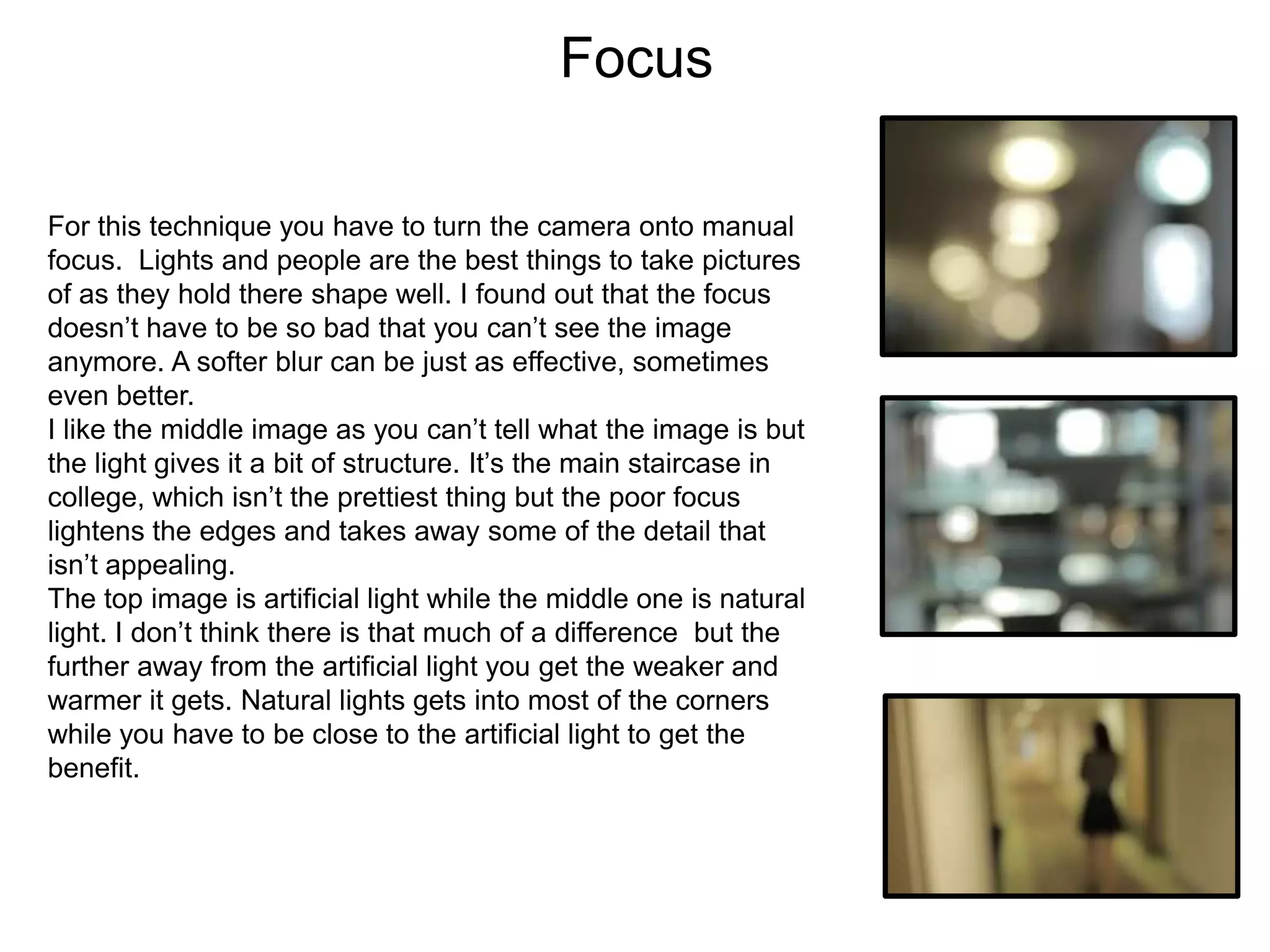
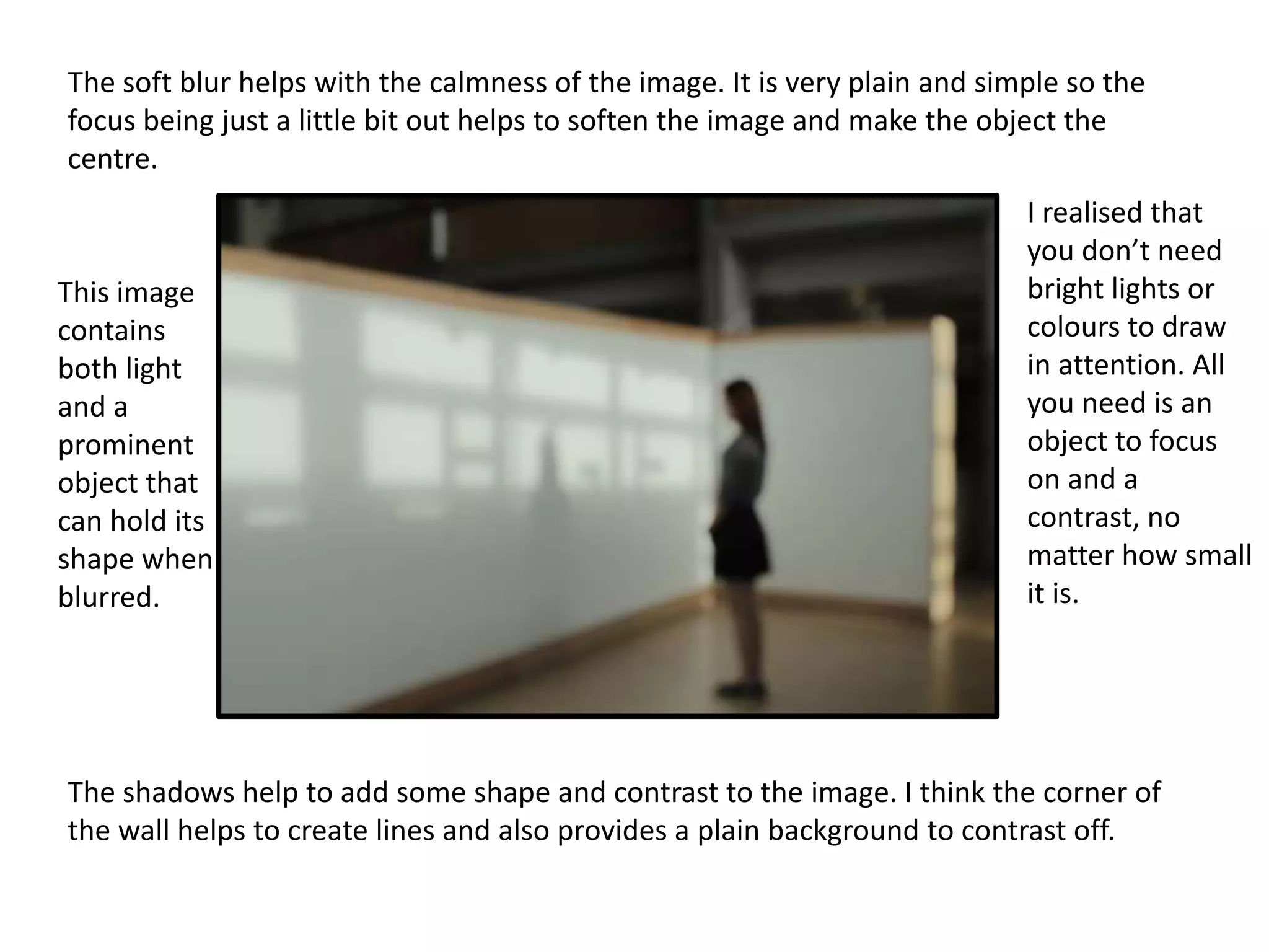
Experimental Photography
Marie

1
Shutter Speed
This experiment was about shutter speed. This setting is
usually used to capture movement. It is best if you keep the
camera still or the whole image will be blurred not just the
movement in it. However, since this is experimental
photography a bit of movement could add to the overall
image and improve it slightly.
The movement I wanted to capture was the elevator doors
closing. The middle picture is the best I could capture in the
time I had. I realised that timing is a big aspect to this
technique. If you don’t have the timing right then the pictures
won’t turn out right.
Since most of the things at college are still I had to create the
movement myself by moving the camera. The image was
blurred but not in the same way as if it was out of focus. The
best thing to do this kind of shutter speed with is colours and
lights as they blur better but still hold some shape.
If I used this technique for my final piece I would like to use a
dancer, like a ballerina or a gymnast with ribbon. I feel these
would show good movement without being too blurry as each
of their movements are very control and have less chance of
wobble.
I like the colours in the top left of the image.
They don’t stand out as much as I would like but
I could always change the levels in photoshop.

The blur makes it hard to tell what the image is actually of, which I like
since it is a view of the library through a book shelf. The green strip at
the right is a book, I don’t know whether to crop that out. But I do like
the extra colour it brings to the image.

I like the
contrast of
colour and
no colour in
the top and
bottom. I
believe an
image
needs a
focus, an
object that
pulls the
eye in so it
needs
some sort
of contrast
for that to
happen.
Reflection
Reflection can change the perspective and shape of an
image. The top image is a very basic example. On the day of
taking these photo it had rained so there was a load of water
to take reflection images of but it was a dull day. I wanted to
take an image of light reflection but the weather made that
difficult.
In the middle image I tried to ripple the water by sweeping
my foot through it before I took the image. With a brighter
and stronger shaped item I think this idea could really look
good. It would take a few tries to get the timing right and the
right strength ripple as I don’t want it to distort the reflection
too much.
The bottom image is the corner of a railing. I wanted to use
the corner to see how the curve would change the reflected
image. It effected the light more than the image itself but if I
had placed on object strategically near the beginning of the
curve (near the light) then this image would of turned out
better.
The curve at the edges of the chewing gum bin make it look more like a water droplet.

I like this
photograph
because it has
two reflections
of the same
image but at
different
angles.

A cleaner
reflective
surface
could help
make the
image more
sharp and
crisp.

I think the focus of the image is the only thing I don’t like about this. The object could have
been more interested but with the limited supplies I had I like the different perspectives the
reflections give.
Photomontage
Photomontage is when you take lots of close up pictures of
an object/scene. You then collage them together to remake
the image. It is a good technique to use if you want a cubism
effect to your work. You don’t have to collage the images
right next to each other, you can layer them or place them in
the wrong place.
There is an option in Photoshop if you go to
File>Automate>Photomerge. It places the each photo into
the right place for you. You can then edit or move the
individual photos out of format. The Photoshop option can
give you a head start, saving you loads of time if you on a
tight deadline, and keeps your work in the digital format.
This technique of photomontage makes the image look too
real. There isn’t the cubism or surrealism that photomontage
should have.
The closer and smaller the pictures are the better the
montage will be. Taken more pictures enables you to edit and
manipulate the image as much as you wish. I thought a
pattern would be good to use so I took pictures of the carpet.
To improve your photomontage you could edit the levels or
colours of only some of the pictures. I could add a focus
point or add to the cubism effect.
Focus
For this technique you have to turn the camera onto manual
focus. Lights and people are the best things to take pictures
of as they hold there shape well. I found out that the focus
doesn’t have to be so bad that you can’t see the image
anymore. A softer blur can be just as effective, sometimes
even better.
I like the middle image as you can’t tell what the image is but
the light gives it a bit of structure. It’s the main staircase in
college, which isn’t the prettiest thing but the poor focus
lightens the edges and takes away some of the detail that
isn’t appealing.
The top image is artificial light while the middle one is natural
light. I don’t think there is that much of a difference but the
further away from the artificial light you get the weaker and
warmer it gets. Natural lights gets into most of the corners
while you have to be close to the artificial light to get the
benefit.
The soft blur helps with the calmness of the image. It is very plain and simple so the
focus being just a little bit out helps to soften the image and make the object the
centre.

This image
contains
both light
and a
prominent
object that
can hold its
shape when
blurred.

I realised that
you don’t need
bright lights or
colours to draw
in attention. All
you need is an
object to focus
on and a
contrast, no
matter how small
it is.

The shadows help to add some shape and contrast to the image. I think the corner of
the wall helps to create lines and also provides a plain background to contrast off.

Experiments evidence template

  • 1.
  • 2.
    Shutter Speed This experimentwas about shutter speed. This setting is usually used to capture movement. It is best if you keep the camera still or the whole image will be blurred not just the movement in it. However, since this is experimental photography a bit of movement could add to the overall image and improve it slightly. The movement I wanted to capture was the elevator doors closing. The middle picture is the best I could capture in the time I had. I realised that timing is a big aspect to this technique. If you don’t have the timing right then the pictures won’t turn out right. Since most of the things at college are still I had to create the movement myself by moving the camera. The image was blurred but not in the same way as if it was out of focus. The best thing to do this kind of shutter speed with is colours and lights as they blur better but still hold some shape. If I used this technique for my final piece I would like to use a dancer, like a ballerina or a gymnast with ribbon. I feel these would show good movement without being too blurry as each of their movements are very control and have less chance of wobble.
  • 3.
    I like thecolours in the top left of the image. They don’t stand out as much as I would like but I could always change the levels in photoshop. The blur makes it hard to tell what the image is actually of, which I like since it is a view of the library through a book shelf. The green strip at the right is a book, I don’t know whether to crop that out. But I do like the extra colour it brings to the image. I like the contrast of colour and no colour in the top and bottom. I believe an image needs a focus, an object that pulls the eye in so it needs some sort of contrast for that to happen.
  • 4.
    Reflection Reflection can changethe perspective and shape of an image. The top image is a very basic example. On the day of taking these photo it had rained so there was a load of water to take reflection images of but it was a dull day. I wanted to take an image of light reflection but the weather made that difficult. In the middle image I tried to ripple the water by sweeping my foot through it before I took the image. With a brighter and stronger shaped item I think this idea could really look good. It would take a few tries to get the timing right and the right strength ripple as I don’t want it to distort the reflection too much. The bottom image is the corner of a railing. I wanted to use the corner to see how the curve would change the reflected image. It effected the light more than the image itself but if I had placed on object strategically near the beginning of the curve (near the light) then this image would of turned out better.
  • 5.
    The curve atthe edges of the chewing gum bin make it look more like a water droplet. I like this photograph because it has two reflections of the same image but at different angles. A cleaner reflective surface could help make the image more sharp and crisp. I think the focus of the image is the only thing I don’t like about this. The object could have been more interested but with the limited supplies I had I like the different perspectives the reflections give.
  • 6.
    Photomontage Photomontage is whenyou take lots of close up pictures of an object/scene. You then collage them together to remake the image. It is a good technique to use if you want a cubism effect to your work. You don’t have to collage the images right next to each other, you can layer them or place them in the wrong place. There is an option in Photoshop if you go to File>Automate>Photomerge. It places the each photo into the right place for you. You can then edit or move the individual photos out of format. The Photoshop option can give you a head start, saving you loads of time if you on a tight deadline, and keeps your work in the digital format. This technique of photomontage makes the image look too real. There isn’t the cubism or surrealism that photomontage should have. The closer and smaller the pictures are the better the montage will be. Taken more pictures enables you to edit and manipulate the image as much as you wish. I thought a pattern would be good to use so I took pictures of the carpet. To improve your photomontage you could edit the levels or colours of only some of the pictures. I could add a focus point or add to the cubism effect.
  • 8.
    Focus For this techniqueyou have to turn the camera onto manual focus. Lights and people are the best things to take pictures of as they hold there shape well. I found out that the focus doesn’t have to be so bad that you can’t see the image anymore. A softer blur can be just as effective, sometimes even better. I like the middle image as you can’t tell what the image is but the light gives it a bit of structure. It’s the main staircase in college, which isn’t the prettiest thing but the poor focus lightens the edges and takes away some of the detail that isn’t appealing. The top image is artificial light while the middle one is natural light. I don’t think there is that much of a difference but the further away from the artificial light you get the weaker and warmer it gets. Natural lights gets into most of the corners while you have to be close to the artificial light to get the benefit.
  • 9.
    The soft blurhelps with the calmness of the image. It is very plain and simple so the focus being just a little bit out helps to soften the image and make the object the centre. This image contains both light and a prominent object that can hold its shape when blurred. I realised that you don’t need bright lights or colours to draw in attention. All you need is an object to focus on and a contrast, no matter how small it is. The shadows help to add some shape and contrast to the image. I think the corner of the wall helps to create lines and also provides a plain background to contrast off.