This document summarizes the steps taken to design a double-page magazine spread. The designer placed background images of a band, added text boxes for articles, and included page numbers, logos, headlines, and images. The designer adjusted layout elements and text boxes to optimize the design and flow of content across the two pages. Additional elements like a drop quote were included to entice readers into the full articles.
How to Create Map Views in the Odoo 17 ERPCeline George
The map views are useful for providing a geographical representation of data. They allow users to visualize and analyze the data in a more intuitive manner.
Model Attribute Check Company Auto PropertyCeline George
In Odoo, the multi-company feature allows you to manage multiple companies within a single Odoo database instance. Each company can have its own configurations while still sharing common resources such as products, customers, and suppliers.
How to Make a Field invisible in Odoo 17Celine George
It is possible to hide or invisible some fields in odoo. Commonly using “invisible” attribute in the field definition to invisible the fields. This slide will show how to make a field invisible in odoo 17.
2024.06.01 Introducing a competency framework for languag learning materials ...Sandy Millin
http://sandymillin.wordpress.com/iateflwebinar2024
Published classroom materials form the basis of syllabuses, drive teacher professional development, and have a potentially huge influence on learners, teachers and education systems. All teachers also create their own materials, whether a few sentences on a blackboard, a highly-structured fully-realised online course, or anything in between. Despite this, the knowledge and skills needed to create effective language learning materials are rarely part of teacher training, and are mostly learnt by trial and error.
Knowledge and skills frameworks, generally called competency frameworks, for ELT teachers, trainers and managers have existed for a few years now. However, until I created one for my MA dissertation, there wasn’t one drawing together what we need to know and do to be able to effectively produce language learning materials.
This webinar will introduce you to my framework, highlighting the key competencies I identified from my research. It will also show how anybody involved in language teaching (any language, not just English!), teacher training, managing schools or developing language learning materials can benefit from using the framework.
Welcome to TechSoup New Member Orientation and Q&A (May 2024).pdfTechSoup
In this webinar you will learn how your organization can access TechSoup's wide variety of product discount and donation programs. From hardware to software, we'll give you a tour of the tools available to help your nonprofit with productivity, collaboration, financial management, donor tracking, security, and more.
Palestine last event orientationfvgnh .pptxRaedMohamed3
An EFL lesson about the current events in Palestine. It is intended to be for intermediate students who wish to increase their listening skills through a short lesson in power point.
The Art Pastor's Guide to Sabbath | Steve ThomasonSteve Thomason
What is the purpose of the Sabbath Law in the Torah. It is interesting to compare how the context of the law shifts from Exodus to Deuteronomy. Who gets to rest, and why?
Unit 8 - Information and Communication Technology (Paper I).pdfThiyagu K
This slides describes the basic concepts of ICT, basics of Email, Emerging Technology and Digital Initiatives in Education. This presentations aligns with the UGC Paper I syllabus.
Unit 8 - Information and Communication Technology (Paper I).pdf
Double page spread development diary
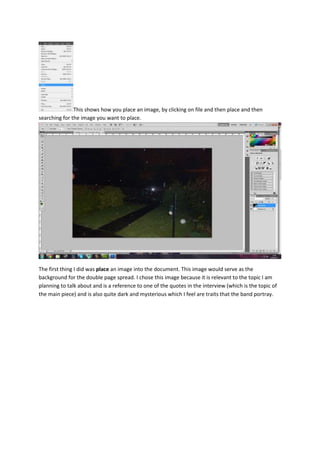
1. This shows how you place an image, by clicking on file and then place and then
searching for the image you want to place.
The first thing I did was place an image into the document. This image would serve as the
background for the double page spread. I chose this image because it is relevant to the topic I am
planning to talk about and is a reference to one of the quotes in the interview (which is the topic of
the main piece) and is also quite dark and mysterious which I feel are traits that the band portray.
2. In this print screen I inserted some images into the double page spread. I tried to place them so it
would look like they are actually playing in the garden and I therefore had to take their posture and
poses into account when taking the shots.
I used the same effects that I usually do with these images, putting a drop shadow on the image to
give it some depth and realism and placing a slight colour overlay over the image as a reference to
the band name “Origin of Sin”.
In this print screen you can see I used the rectangle tool and placed two rectangles, this is where I
plan for all of the text to go on the double page spread. I edited the opacity of the boxes so you can
see some of the background as well. This helps make the page more aesthetically pleasing.
3. In this print screen I have placed the page numbers, issue date and magazine logo in the bottom left
and right. I tried to find a colour that matched with the rest of the theme of this page but the page
number on the bottom right gets slightly lost unless you look up close. Having page numbers,
company logos etc. on the pages were a convention I found and wanted to follow.
Next I inserted the headline. I created this headline using the same logo generator as “BAM!”. I
chose colours that would continue the theme of the greens, browns and blacks and wanted a font
that was quite edgy and representative of the bands image. Therefore I felt this font was
appropriate. I also decided to make some words bigger than others just to emphasise that edgy feel.
4. I placed it in the top left so it would have enough space to become prominent without taking away
the importance of the body text.
This print screen shows that I have added a substantial amount of text to the document, although I
don’t feel like I have given myself enough space. I will place another text box into the document so I
can extend me interview (located on the left side of the double page spread). On the right side of the
double page spread is an album review. The two pieces go hand-in-hand as in the interview the band
talks about their new album.
5. This print screen shows that I have added more text in as well as another text box. I tried to place
the text box so it would still be on the same page but not obstructing any of the musicians. I also
selected white font because it contrasts nicely with the green and is easy to read.
This print screen shows I have given the album review section a heading so that people know what it
is, along with the band’s name, the name of the album and an image of the album. I used the text
tool and the rectangle tool as well as the place tool to produce all of these things.
6. This shows my double page spread with the lead singer in the image, along with an end blob that is
the B from BAM! (my magazine title).
This is the same magazine with a drop quote. The quote helps to lure people in as if they are
interested in the quote they will read the full article. Due to this I was careful with what I pulled out
from the text.