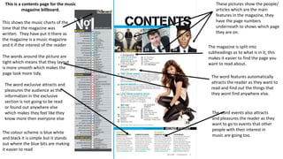
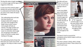
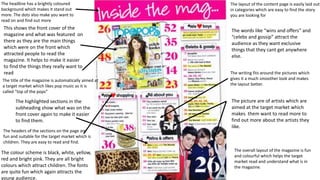
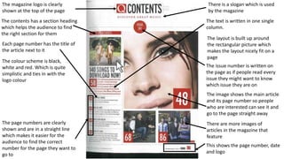
Contents page research
This is a contents page for the music
magazine billboard.
This shows the music charts of the
time that the magazine was
written. They have put it there as
the magazine is a music magazine
and it if the interest of the reader
These pictures show the people/
articles which are the main
features in the magazine, they
have the page numbers
underneath to shows which page
they are on.
The magazine is split into
subheadings as to what is in it, this
makes it easier to find the page you
want to read about.
The word features automatically
attracts the reader as they want to
read and find out the things that
they wont find anywhere else.
The colour scheme is blue white
and black it is simple but it stands
out where the blue bits are making
it easier to read
The words around the picture are
tight which means that they layout
is more smooth which makes the
page look more tidy.
The word exclusive attracts and
pleasures the audience as the
information in the exclusive
section is not going to be read
or found out anywhere else
which makes they feel like they
know more then everyone else
The word events also attracts
and pleasures the reader as they
want to go to events that other
people with their interest in
music are going too.
Here is another issue
of “Q” magazines
contents page. It is in
the same layout which
shows that they use
the same layout
throughout their
magazines.
This subheading clearly shows that
these bits are in each issue of the
magazine, this helps to make it easier
to find
The big title states straight away that it
is a contents page and the logo of the
magazine is there too.
In each issue the contents page is
divided into sections which are easy
to understand and find the things
you want it also makes the layout
look better.
The colour scheme is black, white, orange
and a grey kind of colour. These colours are
used in each issue.
The layout is built up around the
rectangular picture which makes it all fit on
the page nicely.
The date and issue
number is in the top
corner of each issue
making it easy to
find.
In this issue Adele
was a main feature
which meant that
putting her on the
contents page and
writing the page
number she was on
was easier for
people who were
interested to find
the page/ pages
about her. This idea
runs throughout the
issues.
The subheading which will take
the most interest are
backgrounded with orange as
your eyes look straight at the
bright colours which means
more people will take an
interest, The page numbers are
also in orange which makes it
easier to remember which page
you are going to and makes it
easier to find the number when
looking on the page.
The headline has a brightly coloured
background which makes it stand out
more. The dots also make you want to
read on and find out more
This shows the front cover of the
magazine and what was featured on
there as they are the main things
which were on the front which
attracted people to read the
magazine. It helps to make it easier
to find the things they really want to
read
The headers of the sections on the page are
fun and suitable for the target market which is
children. They are easy to read and find.
The colour scheme is black, white, yellow,
red and bright pink. They are all bright
colours which attract children. The fonts
are quite fun which again attracts the
young audience.
The picture are of artists which are
aimed at the target market which
makes them want to read more to
find out more about the artists they
like.
The layout of the content page is easily laid out
in categories which are easy to find the story
you are looking for
The words like “wins and offers” and
“celebs and gossip” attract the
audience as they want exclusive
things that they cant get anywhere
else.
The writing fits around the pictures which
gives it a much smoother look and makes
the layout better.
The title of the magazine is automatically aimed at
a target market which likes pop music as it is
called “top of the pops”
The highlighted sections in the
subheading show what was on the
front cover again to make it easier
to find them.
The overall layout of the magazine is fun
and colourful which helps the target
market read and understand what is in
the magazine.
The image shows the main article
and its page number so people
who are interested can see it and
go to the page straight away
The page numbers are clearly
shown and are in a straight line
which makes it easier for the
audience to find the correct
number for the page they want to
go to
The magazine logo is clearly
shown at the top of the page
The contents has a section heading
which helps the audience to find
the right section for them
Each page number has the title of
the article next to it
This shows the page number, date
and logo
There is a slogan which is used
by the magazine
The colour scheme is black,
white and red. Which is quite
simplistic and ties in with the
logo colour
The text is written in one single
column.
The layout is built up around
the rectangular picture which
makes the layout nicely fit on a
page
The issue number is written on
the page as if people read every
issue they might want to know
which issue they are on
There are more images of
articles in the magazine that
feature

Contents page research

  • 1.
  • 2.
    This is acontents page for the music magazine billboard. This shows the music charts of the time that the magazine was written. They have put it there as the magazine is a music magazine and it if the interest of the reader These pictures show the people/ articles which are the main features in the magazine, they have the page numbers underneath to shows which page they are on. The magazine is split into subheadings as to what is in it, this makes it easier to find the page you want to read about. The word features automatically attracts the reader as they want to read and find out the things that they wont find anywhere else. The colour scheme is blue white and black it is simple but it stands out where the blue bits are making it easier to read The words around the picture are tight which means that they layout is more smooth which makes the page look more tidy. The word exclusive attracts and pleasures the audience as the information in the exclusive section is not going to be read or found out anywhere else which makes they feel like they know more then everyone else The word events also attracts and pleasures the reader as they want to go to events that other people with their interest in music are going too.
  • 3.
    Here is anotherissue of “Q” magazines contents page. It is in the same layout which shows that they use the same layout throughout their magazines. This subheading clearly shows that these bits are in each issue of the magazine, this helps to make it easier to find The big title states straight away that it is a contents page and the logo of the magazine is there too. In each issue the contents page is divided into sections which are easy to understand and find the things you want it also makes the layout look better. The colour scheme is black, white, orange and a grey kind of colour. These colours are used in each issue. The layout is built up around the rectangular picture which makes it all fit on the page nicely. The date and issue number is in the top corner of each issue making it easy to find. In this issue Adele was a main feature which meant that putting her on the contents page and writing the page number she was on was easier for people who were interested to find the page/ pages about her. This idea runs throughout the issues. The subheading which will take the most interest are backgrounded with orange as your eyes look straight at the bright colours which means more people will take an interest, The page numbers are also in orange which makes it easier to remember which page you are going to and makes it easier to find the number when looking on the page.
  • 4.
    The headline hasa brightly coloured background which makes it stand out more. The dots also make you want to read on and find out more This shows the front cover of the magazine and what was featured on there as they are the main things which were on the front which attracted people to read the magazine. It helps to make it easier to find the things they really want to read The headers of the sections on the page are fun and suitable for the target market which is children. They are easy to read and find. The colour scheme is black, white, yellow, red and bright pink. They are all bright colours which attract children. The fonts are quite fun which again attracts the young audience. The picture are of artists which are aimed at the target market which makes them want to read more to find out more about the artists they like. The layout of the content page is easily laid out in categories which are easy to find the story you are looking for The words like “wins and offers” and “celebs and gossip” attract the audience as they want exclusive things that they cant get anywhere else. The writing fits around the pictures which gives it a much smoother look and makes the layout better. The title of the magazine is automatically aimed at a target market which likes pop music as it is called “top of the pops” The highlighted sections in the subheading show what was on the front cover again to make it easier to find them. The overall layout of the magazine is fun and colourful which helps the target market read and understand what is in the magazine.
  • 5.
    The image showsthe main article and its page number so people who are interested can see it and go to the page straight away The page numbers are clearly shown and are in a straight line which makes it easier for the audience to find the correct number for the page they want to go to The magazine logo is clearly shown at the top of the page The contents has a section heading which helps the audience to find the right section for them Each page number has the title of the article next to it This shows the page number, date and logo There is a slogan which is used by the magazine The colour scheme is black, white and red. Which is quite simplistic and ties in with the logo colour The text is written in one single column. The layout is built up around the rectangular picture which makes the layout nicely fit on a page The issue number is written on the page as if people read every issue they might want to know which issue they are on There are more images of articles in the magazine that feature