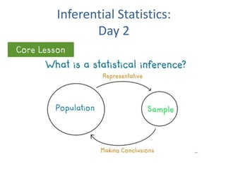
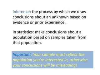
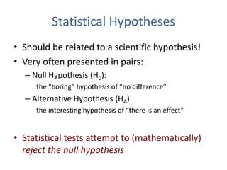
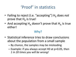
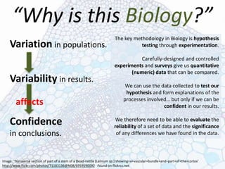
The document discusses objectives and concepts related to statistical analysis in biology, including:
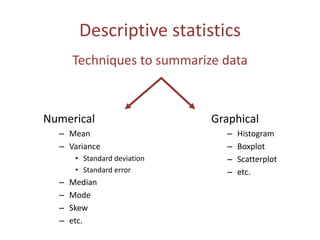
- Types of data, graphs, and statistical analyses such as mean, standard deviation, and chi square analysis.
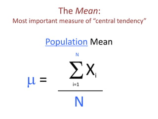
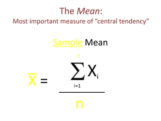
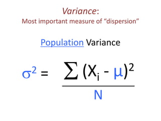
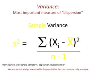
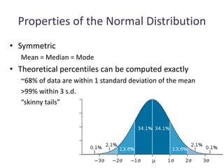
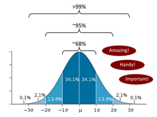
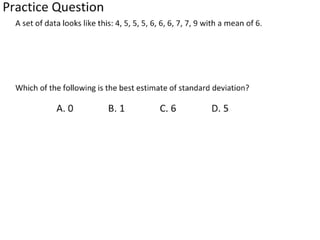
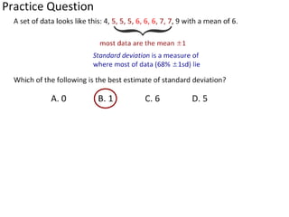
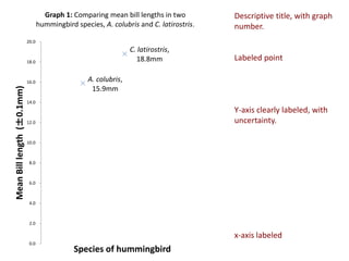
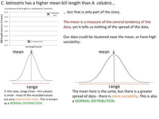
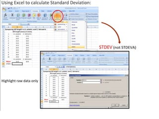
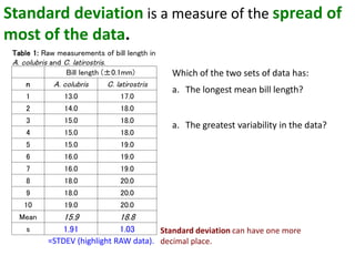
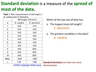
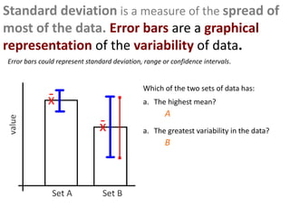
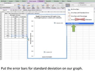
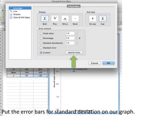
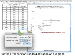
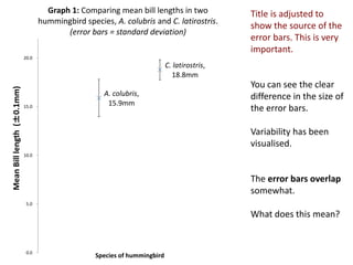
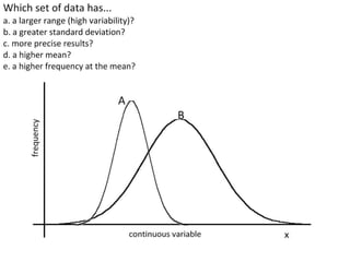
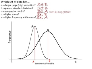
- Calculating and interpreting the mean and standard deviation of a data set to describe variability.
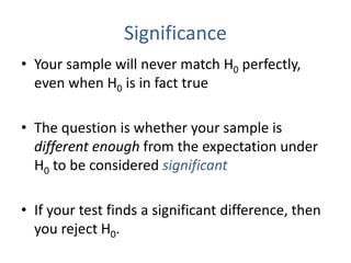
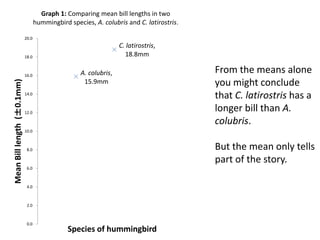
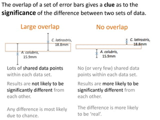
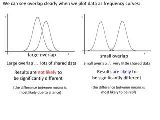
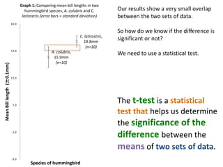
- Using standard deviation to compare the spread of data between samples and determine significance.
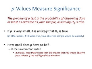
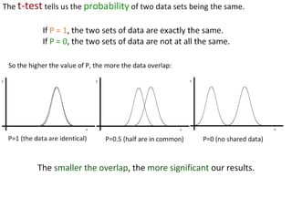
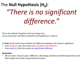
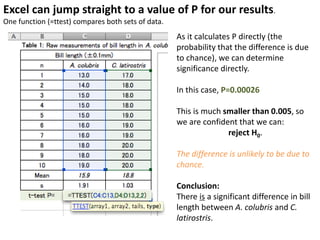
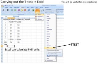
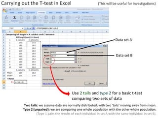
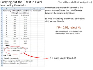
- Performing hypothesis testing using calculated t values, t tables, and p values to determine if differences between data sets are statistically significant.