This document discusses font formats and typography. It defines key typographic concepts like typeface, font, bitmap fonts, TrueType fonts, and font formats. It explains the differences between a typeface and font. Bitmap fonts are described as consisting of screen and printer fonts, while TrueType fonts have a single file. The document also covers serif, sans-serif, and decorative fonts as well as guidelines for choosing fonts and using typographic emphasis through size, weight, alignment, leading and other techniques.


![The Difference between a Type and Font
To begin with, it’s important to understand the difference
between a typeface and a font. As mentioned in the
previous chapter, a typeface is the term for the design
of a set of characters. Typefaces can come in a number
of typestyles, such as bold, narrow or light. Font refers to
the character set in its physical form – metal type or
digital type files, for example. On your computer, a font
consists of a set of typeface in a particular typestyle
stored in a file.
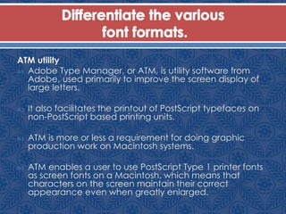
Font Types
There are several font types: TrueType, Bitmap [PostScript
Type 1], Multiple Master and Open Type are a few
examples. For now, you just need to concentrate on the
TrueType and Bitmap fonts. The most widely used and
the safest for rasterizing is Bitmap font [Postscript Type 1].](https://image.slidesharecdn.com/chap7-140502015945-phpapp01/85/Chap7-5-320.jpg)
![Bitmap Fonts [Postscript Type 1]
Bitmap font is also known as the PostScript Type 1.
PostScript Type 1 font for Macintosh actually consists
of two fonts: a screen font and a printer font. The
screen font is used when the typeface is displayed
on the screen and the printer font when the
typeface is printed.
Screen fonts are not necessary when working in
Windows because the printer font is used for both
screen and printing.](https://image.slidesharecdn.com/chap7-140502015945-phpapp01/85/Chap7-6-320.jpg)


![Bezier Curves
All characters in printer fonts are created using bezier
curves. As a result, printer fonts are not dependent upon
the resolution of the printer and can be enlarged without
taking on a jagged appearance. Printer fonts are not
stored in any fixed size (10 point, 12 point, etc.) and can
be scaled up or down as necessary [See Figure 2].
The Decorative, Serif, Sans-Serif Fonts, its commonly used
Typefaces and its uses and characteristics
Bezier Curves
This is how a Bezier curve is created. A
number of anchor points determine the shape
of the curve. Object graphics are mainly based
on bezier curves.](https://image.slidesharecdn.com/chap7-140502015945-phpapp01/85/Chap7-12-320.jpg)