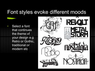
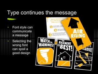
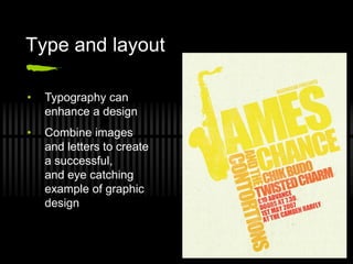
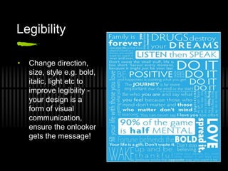
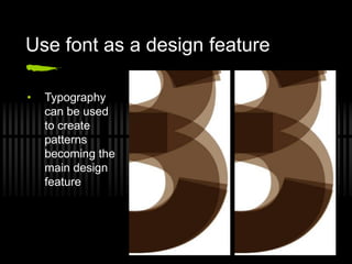
Typography
Font styles evoke different moods

•   Select a font
    that continues
    the theme of
    your design e.g
    Retro or Gothic,
    traditional or
    modern etc
Type continues the message

•   Font style can
    communicate
    a message
•   Selecting the
    wrong font
    can spoil a
    good design
Type and layout

•   Typography can
    enhance a design
•   Combine images
    and letters to create
    a successful,
    and eye catching
    example of graphic
    design
Legibility

•   Change direction,
    size, style e.g. bold,
    italic, light etc to
    improve legibility -
    your design is a
    form of visual
    communication,
    ensure the onlooker
    gets the message!
Use font as a design feature

•   Typography
    can be used
    to create
    patterns
    becoming the
    main design
    feature
Picture font

               •   Create an image
                   with words and
                   letters of varying
                   sizes
Exercise
  Write your first name in a typeface aimed at the
  following age groups:

 17-25 years
 4-7 years
 50-70 years

Use only black and white (no colour)
Consider the layout / composition of your typeface
Exercise
 Work in pairs
 Write your partner’s name using a typeface that you
  feel best represents their character
 Use only text (no images)
 Add colour if you think it helps communicate the
  message
 Consider composition I.e. where the name is placed
  within the space of an A4 page
Typeface
 Serif and Sans Serif
Typeface

 A typeface may be named after its original designer:
  Baskerville, Bodoni, Garamond, Goudy
 For its use:
  Times roman was designed for the London Times
  Avant Garde was designed for magazines
 For its characteristics:
  Excelsior, Paragon were designed for high legibility
 Or for its designer’s fancy:
  Perpetua, Centaur
 Typeface are also given brand names:
  Geneva, English
Parts of the letter: Type Anatomy

•      Bowl: main curved part
•      Counter: enclosed
       circular section
•      Ligature: where two or
       more letters are joined
•     Stem: main vertical
      stroke
     Spine: The main left to right curving stroke
     Serif: The thin projection at the end of main strokes
     Descender: The part of the lowercase letter below the baseline
     Ascender: The part of the lowercase letter above the mean line
How to recognize typefaces

                                                 1
                                                                         5
                                                                   4
                                                                         3
                                           2

1.   The point of letter strokes rising above the lowercase characters
2.   The point of letter strokes descending below the characters
3.   The point on which all characters and symbols rest
4.   The point that determines the height of lower case characters
5.   The point that determines the height of capital letters
Family
 A typeface can have a number of variants within the family:

Bold, Italic, Roman, Normal
   The popular type Helvetica
   has a family of over 50 variants
   whereas other more decorative fonts
   may have only one variant
   e.g. Algerian
Exercise
 Split into groups of 4
 Research two sans serif and two serif fonts (What did
  you use in the earlier exercises?)
 Compare their anatomy (see handout)
 Give an example of where the font may be used e.g.
  newspaper, children’s book, poster, magazine - find
  examples of these categories and look at the font
  used for headlines, titles etc
 Consider target audience
 Present your findings in a Power point
Exercise

Select a suitable typeface for the following words:

           Crazy                    Shade

          Space                    Summer

            Boy                     Winter

            Girl                    Smoke

Typography, A Presentation

  • 1.
  • 2.
    Font styles evokedifferent moods • Select a font that continues the theme of your design e.g Retro or Gothic, traditional or modern etc
  • 3.
    Type continues themessage • Font style can communicate a message • Selecting the wrong font can spoil a good design
  • 4.
    Type and layout • Typography can enhance a design • Combine images and letters to create a successful, and eye catching example of graphic design
  • 5.
    Legibility • Change direction, size, style e.g. bold, italic, light etc to improve legibility - your design is a form of visual communication, ensure the onlooker gets the message!
  • 6.
    Use font asa design feature • Typography can be used to create patterns becoming the main design feature
  • 7.
    Picture font • Create an image with words and letters of varying sizes
  • 8.
    Exercise Writeyour first name in a typeface aimed at the following age groups:  17-25 years  4-7 years  50-70 years Use only black and white (no colour) Consider the layout / composition of your typeface
  • 9.
    Exercise  Work inpairs  Write your partner’s name using a typeface that you feel best represents their character  Use only text (no images)  Add colour if you think it helps communicate the message  Consider composition I.e. where the name is placed within the space of an A4 page
  • 10.
  • 11.
    Typeface  A typefacemay be named after its original designer: Baskerville, Bodoni, Garamond, Goudy  For its use: Times roman was designed for the London Times Avant Garde was designed for magazines  For its characteristics: Excelsior, Paragon were designed for high legibility  Or for its designer’s fancy: Perpetua, Centaur  Typeface are also given brand names: Geneva, English
  • 12.
    Parts of theletter: Type Anatomy • Bowl: main curved part • Counter: enclosed circular section • Ligature: where two or more letters are joined • Stem: main vertical stroke  Spine: The main left to right curving stroke  Serif: The thin projection at the end of main strokes  Descender: The part of the lowercase letter below the baseline  Ascender: The part of the lowercase letter above the mean line
  • 13.
    How to recognizetypefaces 1 5 4 3 2 1. The point of letter strokes rising above the lowercase characters 2. The point of letter strokes descending below the characters 3. The point on which all characters and symbols rest 4. The point that determines the height of lower case characters 5. The point that determines the height of capital letters
  • 14.
    Family  A typefacecan have a number of variants within the family: Bold, Italic, Roman, Normal The popular type Helvetica has a family of over 50 variants whereas other more decorative fonts may have only one variant e.g. Algerian
  • 15.
    Exercise  Split intogroups of 4  Research two sans serif and two serif fonts (What did you use in the earlier exercises?)  Compare their anatomy (see handout)  Give an example of where the font may be used e.g. newspaper, children’s book, poster, magazine - find examples of these categories and look at the font used for headlines, titles etc  Consider target audience  Present your findings in a Power point
  • 16.
    Exercise Select a suitabletypeface for the following words: Crazy Shade Space Summer Boy Winter Girl Smoke