Type Anatomy
The main instruction about type anatomy is found in the readings for today.
Here’s a recap slide of the parts of anatomy that are the basics for our purposes.
anatomy of type
the blue dotted circles indicate the terms we’ll emphasize over others
stress (the tilt
of the blue
line)
also check out: the typography.pdf excerpt and http://thinkingwithtype.com/letter/#anatomy
what’s the first step for
identifying a font
category?
The most basic anatomy
required to know:
the SERIF.
SERIF SANS SERIF
SERIF SANS SERIF
Type Categories
image: drawers of an old printing press shop; each drawer represent a particular FONT style
OLDSTYLE +
TRANSITIONAL
MODERN
SLAB SERIF
SANS SERIF
SCRIPT
DECORATIVE
NOTE: the following slides are Dr.B’s summary of the
textbook and typography.pdf
I highly recommend that you also review this website:
http://thinkingwithtype.com/letter/#type-classification
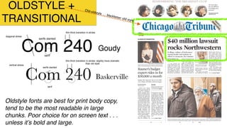
OLDSTYLE +
TRANSITIONAL
Com 240
diagonal stress
Goudy
serifs slanted
thin-thick transition in stroke
serif
Com 240
vertical stress
Baskerville
serifs slanted
thin-thick transition in stroke; slightly more dramatic
than old style
serif
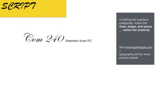
to distinguish typeface
categories, notice the
lines, shape, and space
… notice the anatomy.
See thinkingwithtype.com
+
typography.pdf for more
precise details
OLDSTYLE +
TRANSITIONAL
Com 240
diagonal stress
Goudy
serifs slanted
thin-thick transition in stroke
serif
Com 240
vertical stress
Baskerville
serifs slanted
thin-thick transition in stroke; slightly more dramatic
than old style
serif
Oldstyle fonts are best for print body copy,
tend to be the most readable in large
chunks. Poor choice for on screen text . . .
unless it’s bold and large.
Old-oldstyle … blackletter old style
MODERN
Categories of Type
  Modern
Vertical stress
Radical thick-thin
transition in stroke
Serifs horizontal
and thin
Moderns work best when they are set very large.
They are not a good choice for body copy. They
have a cold & elegant feel.
to distinguish typeface
categories, notice the
lines, shape, and space
… notice the anatomy.
See thinkingwithtype.com
+
typography.pdf for more
precise details
MODERN
Categories of Type
  Modern
Vertical stress
Radical thick-thin
transition in stroke
Serifs horizontal
and thin
Moderns work best when they are set very large.
They are not a good choice for body copy. They
have a cold & elegant feel.
Moderns work best when they are set very large (e.g.
headlines). They are not a good choice for body copy.
They have a cold & elegant feel.
SLAB SERIF
Categories of Type
  Slab Serif
Very slight transition in stroke
Vertical stress
Serifs horizontal
and thick
Slab serifs can be used for body copy but they will
appear heavier and darker than Oldstyle. Often used
in children’s books.
to distinguish typeface
categories, notice the
lines, shape, and space
… notice the anatomy.
See thinkingwithtype.com
+
typography.pdf for more
precise details
SLAB SERIF
Slab serifs can be used for body copy but they
will appear heavier and darker than Oldstyle.
Look for the uniformity of thick lines and serifs
Also referred to as Egyptian Serif
Categories of Type
  Slab Serif
Very slight transition in stroke
Vertical stress
Serifs horizontal
and thick
Slab serifs can be used for body copy but they will
appear heavier and darker than Oldstyle. Often used
in children’s books.
SANS SERIF
Categories of Type
  Sans Serif
No transition in stroke
No stress
No Serifs.
Notta.
Television graphics use sans serifs almost exclusively
because they reproduce well on the screen. In print
they are often used in Headlines. They have an
informal feel.
to distinguish typeface
categories, notice the
lines, shape, and space
… notice the anatomy.
See thinkingwithtype.com
+
typography.pdf for more
precise details
SANS SERIF
Television graphics use sans serifs
almost exclusively because they
reproduce well on the screen. In print
they are often used in headlines,
captions, and pull quotes / sidebars
SHORT BURSTS OF TEXT =
LEGIBILITY
Categories of Type
  Sans Serif
No transition in stroke
No stress
No Serifs.
Notta.
Television graphics use sans serifs almost exclusively
because they reproduce well on the screen. In print
they are often used in Headlines. They have an
informal feel.
SCRIPT
Categories of Type
  Script
Scripts look like handwriting. Use sparingly. Never
ALL CAPS! See what I mean? Can be quite
stunning especially if set very large.
to distinguish typeface
categories, notice the
lines, shape, and space
… notice the anatomy.
See thinkingwithtype.com
+
typography.pdf for more
precise details
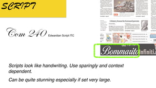
SCRIPT
Scripts look like handwriting. Use sparingly and context
dependent.
Can be quite stunning especially if set very large.
Categories of Type
  Script
Scripts look like handwriting. Use sparingly. Never
ALL CAPS! See what I mean? Can be quite
stunning especially if set very large.
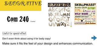
DECORATIVE
Categories of Type
  Decorative
Useful for special effect. Don’t even think
about using it for body copy! Make sure it fits
the feel of your design and enhances
communication.
to distinguish typeface
categories, notice the
lines, shape, and space
… notice the anatomy.
See thinkingwithtype.com
+
typography.pdf for more
precise details
DECORATIVE
Categories of Type
  Decorative
Useful for special effect. Don’t even think
about using it for body copy! Make sure it fits
the feel of your design and enhances
communication.
Useful for special effect.
Don’t even think about using it for body copy!
Make sure it fits the feel of your design and enhances communication.
sometimes the designer
wants to communicate by
using a typeface that
purposely impedes the
ability to read …. like this:
https://nvtodorova.wordpress.com/2013/10/16/david-carson-the-father-of-grunge/
which brings us to:
legibility and readability
reading text and typography
What do these have in
common?
What do these all have
in common?
Spacing
between 2
letters
Legibility: ability to easily
distinguish each letter.
Goal is to quickly perceive the
message with short bursts of text
that are communicated quickly.
Readability refers to the overall
ease of reading, especially related
to extended amount of text.
also explained in: WSINYE , thinkingwithtype.com , typography.pdf. See for more precise details
Legibility and Readability: Defined
Classic example: highway signs Classic example: newspaper type, book pages
https://creativepro.com/legibility-and-readability-whats-the-difference/
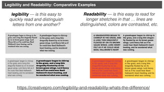
legibility — is this easy to
quickly read and distinguish
letters from one another?
Readability — is this easy to read for
longer stretches in that … lines are
distinguished, colors are contrasted, etc.
Legibility and Readability: Comparative Examples
how we can control for legibility
and readability, beyond selecting
the appropriate typeface:
Leading/Line Spacing
Kerning
Tracking
Legibility and Readability: 3 Essential Typographic Terms
Leading/Line Spacing
http://www.thinkingwithtype.com/contents/text/#Line_Spacing
Kerning
http://www.thinkingwithtype.com/contents/text/#Kerning
space between 2 letters
Needs kerning - too much
space
Why bothersome? Because
it’s:
1) not balanced (equal
amounts of spacing
between all letters)
2) hinders smooth, quick
reading (legibility)
Tracking
http://www.thinkingwithtype.com/contents/text/#Tracking
overall spacing for any words highlighted
Need more resources for learning about typography?
 
Play these game 
Shot the Serif - practice identifying serifs: https://www.tothepoint.co.uk/us/fun/i-shot-the-serif/  
Play this game about letter shapes: https://shape.method.ac/
Play this game about kerning: https://type.method.ac/
 
Check out these articles and videos
Beginning Graphic Design - Typography -  https://edu.gcfglobal.org/en/beginning-graphic-design/
typography/1/
20 typography mistakes every beginner makes – And how you can avoid them - https://learn.canva.com/
learn/typography-mistakes/
The History of Typography - Animated Short https://www.youtube.com/watch?v=wOgIkxAfJsk
intro to typography terms: https://www.youtube.com/watch?v=tWFWJGA7qrc
Ryan Gosling on SNL as the creator of the Papyrus font: https://www.youtube.com/watch?v=jVhlJNJopOQ  
and a response from the real creator: https://techcrunch.com/2017/10/03/papyrus-creator-speaks-out-
after-ryan-gosling-roasts-the-font-on-snl/

Unit2 type anatomy_categories_spacing

  • 1.
    Type Anatomy The maininstruction about type anatomy is found in the readings for today. Here’s a recap slide of the parts of anatomy that are the basics for our purposes.
  • 2.
    anatomy of type theblue dotted circles indicate the terms we’ll emphasize over others stress (the tilt of the blue line) also check out: the typography.pdf excerpt and http://thinkingwithtype.com/letter/#anatomy
  • 3.
    what’s the firststep for identifying a font category?
  • 4.
    The most basicanatomy required to know: the SERIF. SERIF SANS SERIF SERIF SANS SERIF
  • 5.
    Type Categories image: drawersof an old printing press shop; each drawer represent a particular FONT style
  • 6.
  • 7.
    NOTE: the followingslides are Dr.B’s summary of the textbook and typography.pdf I highly recommend that you also review this website: http://thinkingwithtype.com/letter/#type-classification
  • 8.
    OLDSTYLE + TRANSITIONAL Com 240 diagonalstress Goudy serifs slanted thin-thick transition in stroke serif Com 240 vertical stress Baskerville serifs slanted thin-thick transition in stroke; slightly more dramatic than old style serif to distinguish typeface categories, notice the lines, shape, and space … notice the anatomy. See thinkingwithtype.com + typography.pdf for more precise details
  • 9.
    OLDSTYLE + TRANSITIONAL Com 240 diagonalstress Goudy serifs slanted thin-thick transition in stroke serif Com 240 vertical stress Baskerville serifs slanted thin-thick transition in stroke; slightly more dramatic than old style serif Oldstyle fonts are best for print body copy, tend to be the most readable in large chunks. Poor choice for on screen text . . . unless it’s bold and large. Old-oldstyle … blackletter old style
  • 10.
    MODERN Categories of Type  Modern Vertical stress Radical thick-thin transition in stroke Serifs horizontal and thin Moderns work best when they are set very large. They are not a good choice for body copy. They have a cold & elegant feel. to distinguish typeface categories, notice the lines, shape, and space … notice the anatomy. See thinkingwithtype.com + typography.pdf for more precise details
  • 11.
    MODERN Categories of Type  Modern Vertical stress Radical thick-thin transition in stroke Serifs horizontal and thin Moderns work best when they are set very large. They are not a good choice for body copy. They have a cold & elegant feel. Moderns work best when they are set very large (e.g. headlines). They are not a good choice for body copy. They have a cold & elegant feel.
  • 12.
    SLAB SERIF Categories ofType   Slab Serif Very slight transition in stroke Vertical stress Serifs horizontal and thick Slab serifs can be used for body copy but they will appear heavier and darker than Oldstyle. Often used in children’s books. to distinguish typeface categories, notice the lines, shape, and space … notice the anatomy. See thinkingwithtype.com + typography.pdf for more precise details
  • 13.
    SLAB SERIF Slab serifscan be used for body copy but they will appear heavier and darker than Oldstyle. Look for the uniformity of thick lines and serifs Also referred to as Egyptian Serif Categories of Type   Slab Serif Very slight transition in stroke Vertical stress Serifs horizontal and thick Slab serifs can be used for body copy but they will appear heavier and darker than Oldstyle. Often used in children’s books.
  • 14.
    SANS SERIF Categories ofType   Sans Serif No transition in stroke No stress No Serifs. Notta. Television graphics use sans serifs almost exclusively because they reproduce well on the screen. In print they are often used in Headlines. They have an informal feel. to distinguish typeface categories, notice the lines, shape, and space … notice the anatomy. See thinkingwithtype.com + typography.pdf for more precise details
  • 15.
    SANS SERIF Television graphicsuse sans serifs almost exclusively because they reproduce well on the screen. In print they are often used in headlines, captions, and pull quotes / sidebars SHORT BURSTS OF TEXT = LEGIBILITY Categories of Type   Sans Serif No transition in stroke No stress No Serifs. Notta. Television graphics use sans serifs almost exclusively because they reproduce well on the screen. In print they are often used in Headlines. They have an informal feel.
  • 16.
    SCRIPT Categories of Type  Script Scripts look like handwriting. Use sparingly. Never ALL CAPS! See what I mean? Can be quite stunning especially if set very large. to distinguish typeface categories, notice the lines, shape, and space … notice the anatomy. See thinkingwithtype.com + typography.pdf for more precise details
  • 17.
    SCRIPT Scripts look likehandwriting. Use sparingly and context dependent. Can be quite stunning especially if set very large. Categories of Type   Script Scripts look like handwriting. Use sparingly. Never ALL CAPS! See what I mean? Can be quite stunning especially if set very large.
  • 18.
    DECORATIVE Categories of Type  Decorative Useful for special effect. Don’t even think about using it for body copy! Make sure it fits the feel of your design and enhances communication. to distinguish typeface categories, notice the lines, shape, and space … notice the anatomy. See thinkingwithtype.com + typography.pdf for more precise details
  • 19.
    DECORATIVE Categories of Type  Decorative Useful for special effect. Don’t even think about using it for body copy! Make sure it fits the feel of your design and enhances communication. Useful for special effect. Don’t even think about using it for body copy! Make sure it fits the feel of your design and enhances communication.
  • 20.
    sometimes the designer wantsto communicate by using a typeface that purposely impedes the ability to read …. like this: https://nvtodorova.wordpress.com/2013/10/16/david-carson-the-father-of-grunge/
  • 21.
    which brings usto: legibility and readability reading text and typography
  • 22.
    What do thesehave in common?
  • 23.
    What do theseall have in common? Spacing between 2 letters
  • 24.
    Legibility: ability toeasily distinguish each letter. Goal is to quickly perceive the message with short bursts of text that are communicated quickly. Readability refers to the overall ease of reading, especially related to extended amount of text. also explained in: WSINYE , thinkingwithtype.com , typography.pdf. See for more precise details Legibility and Readability: Defined Classic example: highway signs Classic example: newspaper type, book pages
  • 25.
    https://creativepro.com/legibility-and-readability-whats-the-difference/ legibility — isthis easy to quickly read and distinguish letters from one another? Readability — is this easy to read for longer stretches in that … lines are distinguished, colors are contrasted, etc. Legibility and Readability: Comparative Examples
  • 26.
    how we cancontrol for legibility and readability, beyond selecting the appropriate typeface: Leading/Line Spacing Kerning Tracking Legibility and Readability: 3 Essential Typographic Terms
  • 27.
  • 28.
    Kerning http://www.thinkingwithtype.com/contents/text/#Kerning space between 2letters Needs kerning - too much space Why bothersome? Because it’s: 1) not balanced (equal amounts of spacing between all letters) 2) hinders smooth, quick reading (legibility)
  • 29.
  • 30.
    Need more resourcesfor learning about typography?   Play these game  Shot the Serif - practice identifying serifs: https://www.tothepoint.co.uk/us/fun/i-shot-the-serif/   Play this game about letter shapes: https://shape.method.ac/ Play this game about kerning: https://type.method.ac/   Check out these articles and videos Beginning Graphic Design - Typography -  https://edu.gcfglobal.org/en/beginning-graphic-design/ typography/1/ 20 typography mistakes every beginner makes – And how you can avoid them - https://learn.canva.com/ learn/typography-mistakes/ The History of Typography - Animated Short https://www.youtube.com/watch?v=wOgIkxAfJsk intro to typography terms: https://www.youtube.com/watch?v=tWFWJGA7qrc Ryan Gosling on SNL as the creator of the Papyrus font: https://www.youtube.com/watch?v=jVhlJNJopOQ   and a response from the real creator: https://techcrunch.com/2017/10/03/papyrus-creator-speaks-out- after-ryan-gosling-roasts-the-font-on-snl/