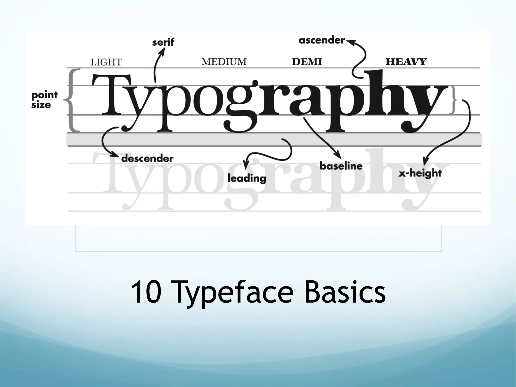
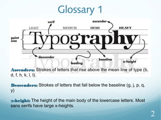
This document provides an overview of typeface basics and tips for using type effectively. It defines typeface terminology like ascenders, descenders, and x-height. It also describes the main classifications of type families like serif, sans serif, script, display, monospace, and dingbat fonts. The document provides examples of common fonts for each classification and tips for pairing personality with purpose, limiting the number of type families used, avoiding all capitals, paying attention to relationships between combined types, and learning from design experts.
Typography is an imperative, yet sometimes overlooked aspect of the design process. Educating yourself on the basics of type with the help of this SlideShare will give you some insight into the intricate world of typography, and give you some actionable tips on how to make your business stand out from the competition.
Yesterday the 11th of June 2015, the User Experience department took us down the exciting path of fonts and typography.
Facilitated by Crystal Chijindu, we came to realize the importance of Typography as an intricate element of design and idea development.
Have a good read and don't forget to share.
The typography by Fady El-Masry
Typography (from the Greek words τύπος (typos) = form and γραφή
(graphe) = writing) is the art and technique of arranging type in order to make
language visible. The arrangement of type involves the selection of typefaces,
point size, line length, leading (line spacing), adjusting the spaces between
groups of letters (tracking) and adjusting the space between pairs of letters
(kerning). Type design is a closely related craft, which some consider distinct
and others a part of typography; most typographers do not design typefaces,
and some type designers do not consider themselves typographers. In modern
times, typography has been put into motion — in film, television and online
broadcasts — to add emotion to mass communication.
Typography is performed by typesetters, compositors, typographers, graphic
designers, art directors, comic book artists, graffiti artists, clerical workers,
and anyone else who arranges type for a product. Until the Digital Age,
typography was a specialized occupation. Digitization opened up typography
to new generations of visual designers and lay users, and it has been said that
“typography is now something everybody does.
Good practises in graphic design, typography and editing: “Clear Layout. Basi...Tomasz Charnas
Graduates’ visual works and fragments of presentation about content design at Tischner European University by Tomasz Charnas, an editor, publisher, communication scientist and specialist in language and literature. Visual materials have been taken from original LinkedIn user guide prepared by the students' group.
Anatomy of letterforms
Evolution of letterforms & type classifications
Type terminology typefaces, type styles & type families
Measurements of type
Line spacing
Letter spacing and word spacing
Working with large bodies of type
Alignment for large bodies of type
Choosing and using a typeface
Graphic Design Elements and Principles - Tips and inspirationShahria Hossain
Graphic Design Elements and Principles - Tips and inspiration.In this Slide i tried to share some tips and inspiraion and some major discuss about Graphic Design principles and elements.I hope you enjoy it all.
Do you want to learn about typography art technique? Then come to Graphic Designing Institute in Delhi which allows you to write content in various ways.
Directions to "An Illustrated DNA Tale" a comical guide to protein synthesis. Students design a comic strip using non-science terms to depict a "tale" paralleling protein synthesis.
➢ Words and symbols in any form, spoken or written, are the most common means of communication.
➢ Texts in the form of words, sentences, and paragraphs are used to
communicate thoughts, ideas, and facts in nearly every aspect of our lives.
➢ Text is a vital element of multimedia menus, navigation systems, and content.
➢ Multimedia developers must use words carefully and accurately.
Embracing GenAI - A Strategic ImperativePeter Windle
Artificial Intelligence (AI) technologies such as Generative AI, Image Generators and Large Language Models have had a dramatic impact on teaching, learning and assessment over the past 18 months. The most immediate threat AI posed was to Academic Integrity with Higher Education Institutes (HEIs) focusing their efforts on combating the use of GenAI in assessment. Guidelines were developed for staff and students, policies put in place too. Innovative educators have forged paths in the use of Generative AI for teaching, learning and assessments leading to pockets of transformation springing up across HEIs, often with little or no top-down guidance, support or direction.
This Gasta posits a strategic approach to integrating AI into HEIs to prepare staff, students and the curriculum for an evolving world and workplace. We will highlight the advantages of working with these technologies beyond the realm of teaching, learning and assessment by considering prompt engineering skills, industry impact, curriculum changes, and the need for staff upskilling. In contrast, not engaging strategically with Generative AI poses risks, including falling behind peers, missed opportunities and failing to ensure our graduates remain employable. The rapid evolution of AI technologies necessitates a proactive and strategic approach if we are to remain relevant.
Unit 8 - Information and Communication Technology (Paper I).pdfThiyagu K
This slides describes the basic concepts of ICT, basics of Email, Emerging Technology and Digital Initiatives in Education. This presentations aligns with the UGC Paper I syllabus.
Palestine last event orientationfvgnh .pptxRaedMohamed3
An EFL lesson about the current events in Palestine. It is intended to be for intermediate students who wish to increase their listening skills through a short lesson in power point.
2024.06.01 Introducing a competency framework for languag learning materials ...Sandy Millin
http://sandymillin.wordpress.com/iateflwebinar2024
Published classroom materials form the basis of syllabuses, drive teacher professional development, and have a potentially huge influence on learners, teachers and education systems. All teachers also create their own materials, whether a few sentences on a blackboard, a highly-structured fully-realised online course, or anything in between. Despite this, the knowledge and skills needed to create effective language learning materials are rarely part of teacher training, and are mostly learnt by trial and error.
Knowledge and skills frameworks, generally called competency frameworks, for ELT teachers, trainers and managers have existed for a few years now. However, until I created one for my MA dissertation, there wasn’t one drawing together what we need to know and do to be able to effectively produce language learning materials.
This webinar will introduce you to my framework, highlighting the key competencies I identified from my research. It will also show how anybody involved in language teaching (any language, not just English!), teacher training, managing schools or developing language learning materials can benefit from using the framework.
Introduction to AI for Nonprofits with Tapp NetworkTechSoup
Dive into the world of AI! Experts Jon Hill and Tareq Monaur will guide you through AI's role in enhancing nonprofit websites and basic marketing strategies, making it easy to understand and apply.
How to Make a Field invisible in Odoo 17Celine George
It is possible to hide or invisible some fields in odoo. Commonly using “invisible” attribute in the field definition to invisible the fields. This slide will show how to make a field invisible in odoo 17.
Instructions for Submissions thorugh G- Classroom.pptxJheel Barad
This presentation provides a briefing on how to upload submissions and documents in Google Classroom. It was prepared as part of an orientation for new Sainik School in-service teacher trainees. As a training officer, my goal is to ensure that you are comfortable and proficient with this essential tool for managing assignments and fostering student engagement.
Macroeconomics- Movie Location
This will be used as part of your Personal Professional Portfolio once graded.
Objective:
Prepare a presentation or a paper using research, basic comparative analysis, data organization and application of economic information. You will make an informed assessment of an economic climate outside of the United States to accomplish an entertainment industry objective.
The French Revolution, which began in 1789, was a period of radical social and political upheaval in France. It marked the decline of absolute monarchies, the rise of secular and democratic republics, and the eventual rise of Napoleon Bonaparte. This revolutionary period is crucial in understanding the transition from feudalism to modernity in Europe.
For more information, visit-www.vavaclasses.com
The Roman Empire A Historical Colossus.pdfkaushalkr1407
The Roman Empire, a vast and enduring power, stands as one of history's most remarkable civilizations, leaving an indelible imprint on the world. It emerged from the Roman Republic, transitioning into an imperial powerhouse under the leadership of Augustus Caesar in 27 BCE. This transformation marked the beginning of an era defined by unprecedented territorial expansion, architectural marvels, and profound cultural influence.
The empire's roots lie in the city of Rome, founded, according to legend, by Romulus in 753 BCE. Over centuries, Rome evolved from a small settlement to a formidable republic, characterized by a complex political system with elected officials and checks on power. However, internal strife, class conflicts, and military ambitions paved the way for the end of the Republic. Julius Caesar’s dictatorship and subsequent assassination in 44 BCE created a power vacuum, leading to a civil war. Octavian, later Augustus, emerged victorious, heralding the Roman Empire’s birth.
Under Augustus, the empire experienced the Pax Romana, a 200-year period of relative peace and stability. Augustus reformed the military, established efficient administrative systems, and initiated grand construction projects. The empire's borders expanded, encompassing territories from Britain to Egypt and from Spain to the Euphrates. Roman legions, renowned for their discipline and engineering prowess, secured and maintained these vast territories, building roads, fortifications, and cities that facilitated control and integration.
The Roman Empire’s society was hierarchical, with a rigid class system. At the top were the patricians, wealthy elites who held significant political power. Below them were the plebeians, free citizens with limited political influence, and the vast numbers of slaves who formed the backbone of the economy. The family unit was central, governed by the paterfamilias, the male head who held absolute authority.
Culturally, the Romans were eclectic, absorbing and adapting elements from the civilizations they encountered, particularly the Greeks. Roman art, literature, and philosophy reflected this synthesis, creating a rich cultural tapestry. Latin, the Roman language, became the lingua franca of the Western world, influencing numerous modern languages.
Roman architecture and engineering achievements were monumental. They perfected the arch, vault, and dome, constructing enduring structures like the Colosseum, Pantheon, and aqueducts. These engineering marvels not only showcased Roman ingenuity but also served practical purposes, from public entertainment to water supply.
Read| The latest issue of The Challenger is here! We are thrilled to announce that our school paper has qualified for the NATIONAL SCHOOLS PRESS CONFERENCE (NSPC) 2024. Thank you for your unwavering support and trust. Dive into the stories that made us stand out!
2. Glossary 1
Ascenders:Ascenders: Strokes of letters that rise above the mean line of type (b,
d, f, h, k, l, t).
Descenders:Descenders: Strokes of letters that fall below the baseline (g, j, p, q,
y)
x-height:x-height: The height of the main body of the lowercase letters. Most
sans serifs have large x-heights.
2
3. Glossary 2
Type families (sometimes referred to as font):Type families (sometimes referred to as font): Versatile faces such as
Garamond, Franklin Gothic, Futura, etc. offer several variations of weight
and posture in the same typeface.
Display type:Display type: Point sizes 14 point and above.
Width rule:Width rule: When copy gets too wide, readability drops off. The rule is
that copy should be no wider than an alphabet and a half or 39 characters.
3
4. Measuring Type
1. Type is measured in points.
2. 72 points = 1 inch,
3. 72-pt. type is 1 inch tall,
measured from the top of the
ascenderascender to the bottom of the
descenderdescender.
4. ½-inch = 36-pt.
5. ¼-inch = 18-pt.
6. No letter has both an ascender
and a descender; however in
any given typeface and size, the
length of the ascender and
descender are the same.
4
6. Tip #
1. Pair personality to purpose.
• Keep in mind the message you are trying to
communicate with your type.
• Sports, even women's sports, do not lend
themselves to feminine script, for example.
Getting down, dirty girls rugby gaining popularity
Or
Getting down, dirty girls rugby gaining popularity
7. Tip #
2. When working with type, more
type families are not better.
• Limiting type to no
more than three font
family for the entire
book is a growing trend.
• When combining type
for headlines, remember
two’s company, three’s a
crowd.
• Limit spread designs to
one distinct type
supported by something
simple.
A family of fonts is
composted of different
stylesstyles.
8. Font #
1: Reading pull-down information
Format of font
1. TrueType
2. Postscript
3. Open Type (best)
Format of font
1. TrueType
2. Postscript
3. Open Type (best)
Styles of font
in family
1. Light
2.
Condensed
Styles of font
in family
1. Light
2.
Condensed
Font Family
Myriad Pro
Font Family
Myriad Pro
9. Font #
2: Classifications of font families
6 basic font
classes
1.1. SerifSerif
A. Old Style
B. Transitional
C. Modern
D. Slab Serif
2.2. Sans SerifSans Serif
(sans = without)
3. Script
A. Blackletter
3. Display
4. Monospaced
5. Dingbat
10. Font #
3: SerifsSerifs
• SerifsSerifs are easier toeasier to
readread than sans
serifs.
• Use a serif fontserif font for
body copybody copy (text), as
a general rule.
SerifsSerifs are in red
Baskerville
Bernhard Modern
Courier Standard
Garamond
Georgia
Minion Pro
Palatino
Times New Roman
Examples Of Serif Fonts:Examples Of Serif Fonts:
11. Font #
4: Sans serifsSans serifs
These are lessThese are less
legible thanlegible than
serifs.serifs.
UseUse sans serifsans serif
fonts forfonts for
primaryprimary
headlines orheadlines or
captions as acaptions as a
general rule.general rule.
Examples of
Sans Serif Font Families
Arial
Arial Rounded MT
Comic Sans MS
Futura
Helvetica
Letter Gothic Std
Lucia San
Myriad Pro
News Gothic MT
Stone Sans ITC TT
Verdana
12. Font #
5: ScriptScript
ScriptScript fonts are
• harderharder to read.
• used as largelarge text
only.
• for special casesspecial cases
only.
Bickham Script Pro
Brush Script Std.
Caflisch Script Pro
Dickens Script SSK
Edwardian Script ITC
Handwriting — Dakota
Lucida Blackletter
Lucida Handwriting
Medici Script
Old English Text
School House Cursive
Snell Roundhand
Examples Of Script Font Families:Examples Of Script Font Families:
13. • harderharder to read
• used as largelarge text only
• for special casesspecial cases only
Examples Of Display Families:Examples Of Display Families:
DisplayDisplay fonts are:
14. Font #
6: Display FontsDisplay Fonts
• harderharder to read
• used as largelarge text only
• for special casesspecial cases only
Abite
Air Conditioner
Bionic Comic Bold
BowlORama
Big Apple
Doris Day
Lucifer’s Pension
Jellyka Castle’s Queen
JI Toy Train
Raconteur NF
Sand
15. Font #
7: Monospace FontsMonospace Fonts
MonospaceMonospace
fonts
Are also called
"fixed pitch" fonts
Have characters that
all have the same
character width
Originally were
designed for
typewriters
Used with computer
source code
Andale Mono
Courier New
Letter Gothic Std
Lucinda Console
Lucinda Sans Typewriter
Monaco
ORC A
Prestige Elite Std
Examples Of Monospace Families:Examples Of Monospace Families:
16. Font #
8: Dingbat FontsDingbat Fonts
DingbatDingbat
fonts are:
Also known as a "printer's
ornament" or "printer's
character.”
Describe fonts with symbols
and shapes in the positions
designated for alphabetical or
numeric characters.
17. Font #
9: Dingbat FontsDingbat Fonts
GlyphsGlyphs are:
An ornament, a character or spacer used
in typesetting.
18. Font #
10: Dingbat FontsDingbat Fonts
MT Extra abc fde g
MS Reference Specialty ABCDE
Symbol αβχδεφγ
Type Embellishments One LET abcdefg
Webdings
Wingdings
Wingdings3
Zapf Dingbats
Typical Examples Of Display Families:Typical Examples Of Display Families:
19. Font #
11: Dingbat FontsDingbat Fonts
AbecedarianZoo abcdefg
AmphibiPrint abcdefg
Carta abcdefg
Face it! Abcdefg
Face Off!Abcdefg
RoadSign abcdefg
RoadWarningSign abcdefg
Fun Examples Of Display Families:Fun Examples Of Display Families:
21. Tip #
3. Avoid using all capitals.
• That doesn’t mean you can never use all caps.
• Just realize all capital letters reduces
readability.
• Use all caps only when you have a specific design
purpose in mind.
• Especially avoid using all capitals in a script face.
• Your readability drops to about zero.
22. Tip #
4. Pay attention to relationships
when combining type.
• If elements are not the
same, they should be very
different.
• Remember, like the perfect
marriage, types need to
either be very similar or
fairly opposite.
• Contrast type in size,
weight, form and structure.
• The combinations you form
should communicate, not
confuse the reader.
Examples:
Verdana bold for heads
Georgia for text
= good contrast
Verdana bold for heads
Trebuchet for text
= not enough contrast
23. Tip #
5. Some types just don’t mix.
• Don't use two scripts or a script and an italic
together.
• They usually have the same form and so theythey
conflictconflict with each other rather than contrast.
• Never use two types from the same category (for
example: Script, Decorative) together.
Don'tDo
Don'tDo
24. Tip #
6. Don’t abuse type through manipulation
• Purpose is to communicate type helps do that.
• Don’t manipulate type to fit your design by adjusting
leading and width.
• Instead, edit the copy or find a word that fits the
headline space.
• Once established within a section, type size, leading
and width should remain consistent.
25. Tip #
7. Complement your knowledge of
fonts with your knowledge of
design.
• Use of effectively planned white
space and color can enhance your
use of type.
• Place type on the page to create
entry points for your reader.
26. Tip #
8. Learn more from the experts.
• Magazines like Before & After and
Dynamic Graphics have
information and advice.
• Check out books like The Non-
Designers Design Book by design
experts like Robin Williams.
• Many of these tips come from her.
• For more technical information,
check out her Non-Designers Type
Book.
• Browse the bookstores and stock up
on magazines that use type
effectively so you can build a library
of ideas.