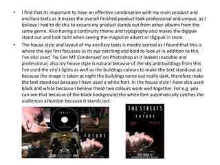
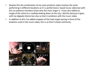
The document discusses the effectiveness of combining a main product with ancillary texts. It notes that using consistent themes, typography, and images creates a professional and unique finished product that stands out. Specifically, central layouts catch the eye, and a nighttime cityscape image with white text makes the type stand out against the dark background. Both the magazine ad and digipak use the same background image to provide insight into the artist's album and create a visual connection. Consistent fonts, sizes, and placement are used to look professional while drawing attention to important details. Overall, matching elements across video, digipak, and ancillary texts enhances the artist's brand through continuity.