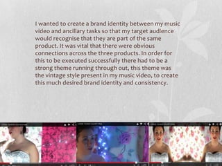
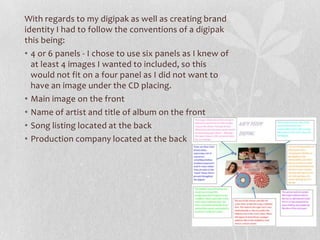
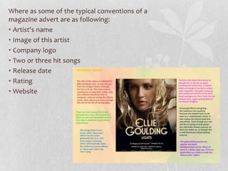
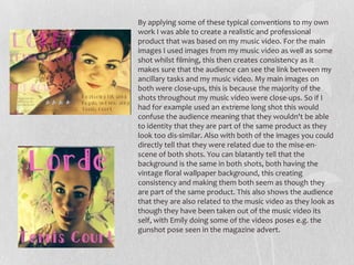
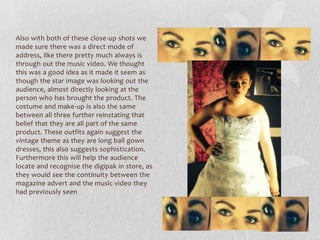
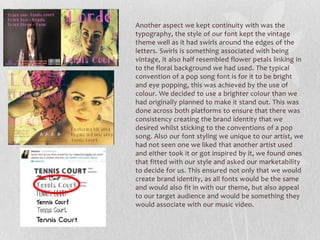
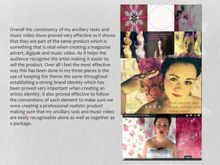
1. By Jessica Ramplin
HOW EFFECTIVE IS THE
COMBINATION OF YOUR
MAIN PRODUCT AND
ANCILLARY TEXTS?
2. I wanted to create a brand identity between my music
video and ancillary tasks so that my target audience
would recognise that they are part of the same
product. It was vital that there were obvious
connections across the three products. In order for
this to be executed successfully there had to be a
strong theme running through out, this theme was
the vintage style present in my music video, to create
this much desired brand identity and consistency.
3. With regards to my digipak as well as creating brand
identity I had to follow the conventions of a digipak
this being:
• 4 or 6 panels - I chose to use six panels as I knew of
at least 4 images I wanted to included, so this
would not fit on a four panel as I did not want to
have an image under the CD placing.
• Main image on the front
• Name of artist and title of album on the front
• Song listing located at the back
• Production company located at the back
4. Where as some of the typical conventions of a
magazine advert are as following:
• Artist's name
• Image of this artist
• Company logo
• Two or three hit songs
• Release date
• Rating
• Website
5. By applying some of these typical conventions to my own
work I was able to create a realistic and professional
product that was based on my music video. For the main
images I used images from my music video as well as some
shot whilst filming, this then creates consistency as it
makes sure that the audience can see the link between my
ancillary tasks and my music video. My main images on
both were close-ups, this is because the majority of the
shots throughout my music video were close-ups. So if I
had for example used an extreme long shot this would
confuse the audience meaning that they wouldn't be able
to identity that they are part of the same product as they
look too dis-similar. Also with both of the images you could
directly tell that they were related due to the mise-en-
scene of both shots. You can blatantly tell that the
background is the same in both shots, both having the
vintage floral wallpaper background, this creating
consistency and making them both seem as though they
are part of the same product. This also shows the audience
that they are also related to the music video as they look as
though they have been taken out of the music video its
self, with Emily doing some of the videos poses e.g. the
gunshot pose seen in the magazine advert.
6. Also with both of these close-up shots we
made sure there was a direct mode of
address, like there pretty much always is
through out the music video. We thought
this was a good idea as it made it seem as
though the star image was looking out the
audience, almost directly looking at the
person who has brought the product. The
costume and make-up is also the same
between all three further reinstating that
belief that they are all part of the same
product. These outfits again suggest the
vintage theme as they are long ball gown
dresses, this also suggests sophistication.
Furthermore this will help the audience
locate and recognise the digipak in store, as
they would see the continuity between the
magazine advert and the music video they
had previously seen
7. Another aspect we kept continuity with was the
typography, the style of our font kept the vintage
theme well as it had swirls around the edges of the
letters. Swirls is something associated with being
vintage, it also half resembled flower petals linking in
to the floral background we had used. The typical
convention of a pop song font is for it to be bright
and eye popping, this was achieved by the use of
colour. We decided to use a brighter colour than we
had originally planned to make it stand out. This was
done across both platforms to ensure that there was
consistency creating the brand identity that we
desired whilst sticking to the conventions of a pop
song. Also our font styling we unique to our artist, we
had not seen one we liked that another artist used
and either took it or got inspired by it, we found ones
that fitted with our style and asked our marketability
to decide for us. This ensured not only that we would
create brand identity, as all fonts would be the same
and would also fit in with our theme, but also appeal
to our target audience and would be something they
would associate with our music video.
8. As mentioned above a magazine adverts
typical conventions are to have a rating
and a website this will help create a
brand identity because it targets a
specific type of audience. This audience
being the same that I have targeted in
my music video therefore showing
consistency with targeting my
marketability. The target audience was
suggested through out the music video
by the genre of the song, this being pop,
and the audience of this being
teenagers/young adults. This was also
shown in our music video by the ball
gown dress something a lot of teenage
girls want either for the perfect prom or
wedding further showing the
teenage/young adult audience we have
targeted for our music video. The use of
a web address on my magazine advert
then shows that the magazine is also
targeted at people of the same age of
my music video as teenagers and young
adults regularly use the internet,
especially more often than someone of
an older age.
48% of 18-34 year olds check
Facebook when they wake
up, with 28% doing so before
even getting out of bed
9. Furthermore the use of a rating from
Seventeen Magazine and Bliss Magazine
show the target audience. Seventeen
Magazine is clearly aimed at teenagers with
its quirky colours, stars used and the
information on offer for the reader. Bliss
Magazine is targeted at a slightly older
audience, this is shown by the cover stars
being slightly older than the ones of Seven
Magazine, with their music targeting young
adults rather than teenagers. This then
meaning the ratings also reflect the audience
of my music video.
10. Overall the consistency of my ancillary tasks and
music video show proved very effective as it shows
that they are part of the same product which is
something that is vital when creating a magazine
advert, digipak and music video. As it helps the
audience recognise the artist making it easier to
sell the product. Over all I feel the most effective
way this has been done in my three pieces is the
use of keeping the theme the same throughout
establishing a strong brand identity which has
been proved very important when creating an
artists identity. It also proved effective to follow
the conventions of each element to make sure we
were creating a professional realistic product
making sure that my ancillary task and music video
are easily recognisable alone as well as together as
a package.