The student created a music video, digipak, and website for their band. To ensure continuity across products:
1) The music video incorporated the "X" logo from the other works for a few seconds at the beginning.
2) Photos from the music video were used in the digipak. Locations matched between the video and photos.
3) A consistent color scheme of pink, black, white, and grey was used throughout all products.
4) The background design of a faded gray cross and spots was replicated across the website and digipak.
2137ad Merindol Colony Interiors where refugee try to build a seemengly norm...luforfor
This are the interiors of the Merindol Colony in 2137ad after the Climate Change Collapse and the Apocalipse Wars. Merindol is a small Colony in the Italian Alps where there are around 4000 humans. The Colony values mainly around meritocracy and selection by effort.
Hadj Ounis's most notable work is his sculpture titled "Metamorphosis." This piece showcases Ounis's mastery of form and texture, as he seamlessly combines metal and wood to create a dynamic and visually striking composition. The juxtaposition of the two materials creates a sense of tension and harmony, inviting viewers to contemplate the relationship between nature and industry.
2137ad - Characters that live in Merindol and are at the center of main storiesluforfor
Kurgan is a russian expatriate that is secretly in love with Sonia Contado. Henry is a british soldier that took refuge in Merindol Colony in 2137ad. He is the lover of Sonia Contado.
Explore the multifaceted world of Muntadher Saleh, an Iraqi polymath renowned for his expertise in visual art, writing, design, and pharmacy. This SlideShare delves into his innovative contributions across various disciplines, showcasing his unique ability to blend traditional themes with modern aesthetics. Learn about his impactful artworks, thought-provoking literary pieces, and his vision as a Neo-Pop artist dedicated to raising awareness about Iraq's cultural heritage. Discover why Muntadher Saleh is celebrated as "The Last Polymath" and how his multidisciplinary talents continue to inspire and influence.
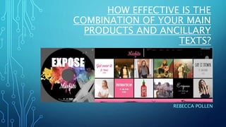
1. HOW EFFECTIVE IS THE
COMBINATION OF YOUR MAIN
PRODUCTS AND ANCILLARY
TEXTS?
REBECCA POLLEN
2. MY MUSIC VIDEO
The song I decided to use for my music video was 'Instruction' which was
released in 2017 by Jax Jones, Demi Lovato and Steflon Don. I decided not to
use a narrative within my music video as the song was very modern and the
connotations could have been taken in may different ways. Instead I decided
to create a girl band and use dancing in order to fill the whole song; I wanted
to make sure that the video wasn't very samey, so used different filming as
well as editing techniques in order to make it un-predictable and enjoyable.
When listening to the song I didn't think I needed to have the band singing
along to the entire song, so decided to vary the sections to parts where mainly
dancing took place, and then other parts involving more subtle and simplistic
moves whilst the band leader mouths the lyrics. I thought that this would
capture the theme and characteristics of my band perfectly
3. MUSIC VIDEO
Within my music video it was
extremely hard to incorporate
similar features from the digipak
and website as these aren’t still
moving images they are videos.
Throughout editing I pondered
upon ideas where I could
incorporate the ‘X’ in the
background.
I then discovered that the ‘X’
could be found in the relation
with the title of my album. I then
figured that I could use this ‘X’ to
replace the normal ‘X’ of Expose.
This is then how the relation
could be made between the three
media products.
Although it only appears for a couple of seconds at
the beginning it still makes the relation to the rest of
my media products.
4. DIGIPAK ANCILLARY
My digipak and website were my
chosen ancillary tasks and I made
sure that there was a clear link
between the three separate media
products. I decided to use a shot
from the video within my digipak, the
one of the inside featured image,
where a couple of pictures of the girl
were featured. I decided to keep my
colour scheme within all three
product the same. So throughout
production I used the colours pink,
black, white and grey; I made sure
that this was carried throughout my
website and ran through my video
within my costume and shoe choice.
I edited the photos on Photoshop
making certain aspects of the
photo stand out like the face and
costumes of the band in
comparison to some of the bold
colours in the background which I
made blurred.
5. THE LINK BETWEEN MY BACKGROUNDS
Within the designs for my website and my digipak I decided to have a constant theme
linking them in together by using the same design of background. The black
background with a faded grey cross, and multiple grey spots throughout is featured in
both the background of all my hyperlinked website pages, and also the blurb, CD
design, and front cover of my digipak. This applied continuity within my designs.
6. THE LINK BETWEEN THE DIGIPAK AND
MUSIC VIDEO
There is a clear link between the music video I have produced and the digipak.
The inside feature images are taken in the same location as my music video is
filmed. The use of graffiti in the background doesn’t just blend in but stands
out due to the bright colours that it is composed of. This is where the
connection can be made between the location of the music video and the
location of the pictures from the digipak. This helped to keep continuity as
well as create and continue the ‘brand’ of Misfits.
7. WEBSITE ANCILLARY
For the website I researched a
few known fan pages already
and based on the information
I found, I made a template for
the website that I could use as
a template for my final
website production.
On the website there is a clear
link between it and the
digipak. Firstly the use of the
same colours and fonts for
the name of my band which
had been carried across
throughout and even featured
in the first section of
the music video.
The colours were bold, similar
to the digipak and stood out
from the background visually
representing my genre of R&B
and pop. Another quality that
I carried throughout my
ancillary production is the
colour of the background; it is
black with grey spots and a 'X'
in the bottom right hand
corner. Not only is this
featured on the background
of my website but it also
features on the blurb, front
cover, and CD design of the
digipak.
8. FONTS
The fonts that I was going to use throughout my tasks had to be
eye catching especially to my target audience. I spent whole
lessons going through font types from Microsoft, Photoshop and
WIX trying to find the perfect one for my bands name. I thought
that the colour was also important for the text of my bands name. I
wanted to be stereotypical yet counter-typical in the way in which I
did this.
In the end I liked the look of this particular font as it seemed to
flow nicely and match the characteristics of my band as well as
approve to my target audience. It gave off feminine vibes as well as
elegance.
The type of font which I used also suited my website design and
slotted in perfectly.
9. LOGO
When trying to come up with a logo for my
band there were four options which I
produced varying in style as well as colour. I
used my media focus group in order to
gauge which one was most suited to my
band. In response from my target audience
they decided that a combination of two of
the designs would have been appropriate
and more suited.
Out of the four designs to the right number
1 was chosen as the primary outline of the
design however my focus group thought of
changing the colour to the shade used in
design number 3, creating a combination of
my original designs.
10. OVERALL
I think because of the continuous link within all my products, that the designs have all
worked very well together. However when talking about the music video I would have
maybe looked into making the overall continuous pattern within there ever more.
Nevertheless the pictures featured on the inside of my digipak fit in, in relation to the
setting of the video as they were captured in the same location. The use of a constant
colour and house theme also ensured continuity, the colours of pink, white, grey and
black were used throughout mise-en-scene in costuming, make-up as well as colour
themes and backgrounds on my website, in my digipak and within my final music
video production.