The document describes the process of editing photos, creating magazine elements like the cover, masthead, headlines, and double page spread. Key steps included:
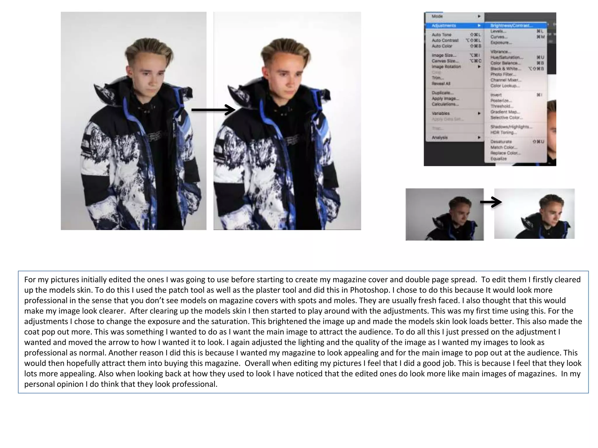
- Editing model photos in Photoshop by clearing skin and adjusting exposure and saturation.
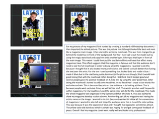
- Creating a magazine cover in Photoshop with the main edited photo, cutting out the model and placing behind text for the masthead and headlines.
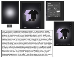
- Designing merchandise like t-shirts with logos and experimenting with colors and layouts.
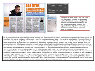
- Building a double page spread in InDesign with columns, imported article, main photo, and additional elements like headlines and reviews.