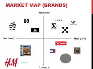
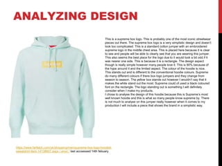
RESEARCH
PRINT ADVERTS
https://www.complex.com/styl
e/2015/05/vintage-ads-from-
supreme 1944 in Thrasher/8th
feb
https://www.complex.com/style/
2015/05/vintage-ads-from-
supreme 1995 https:// 8 th feb
Supreme turned to Studio
191 for this 2003 print.
https://www.complex.com/style/
2015/05/vintage-ads-from-
supreme / 8th feb
Print adverts are quite rare for supreme however they did use them in the early days when they was just starting up. Supreme does not
normally use them now however. This is because supreme is a clothing brand and print adverts are not very common, unless they are
online. The internet was not a massive thing in 1994 which was when supreme was founded compered to what it is today as there are over
15 billion people on the internet in 2020. These print adverts would have been placed on shop windows, lamp posts, boards and
magazines. Supreme doesn't’t really need to advertise there brand anymore. This is because of there popularity and there following. This is
shown as they have 13.7 million followers on instagram and most of their products usually sell out. These print adverts all look very different
from each other but all look quite old. These shows how here styles changed from 1994- 2004, in this 9 year gap you can see the
difference. This is shown by the colors and also the branding. The 2003 one is defiantly more subtle than the 1994 one. I will look at these
in more detail. These print adverts would have been targeted at the skateboarding demographic and community. This is because supreme
is a skateboarding brand. This is also a street wear brand. To advertise these print adverts they would feature them in skateboarding
magazines. One and the main one being thrasher. This is a big brand now who also sell street wear. This magazine is really big with in this
community.
PRINT ADVERT (1)
This was supreme first ever print advert and was featured inside the
skateboarding magazine thrasher. This is because supreme was founded
as a skateboarding magazine. On this print advert you can see that it is very
brand heavy. By this I mean that there is not much going on apart from the
large brand logo. This brand logo is very noticeable to the audience. The
colors of this are bright red and white. The whit in my opinion stands out
very clear on the red background. The font also is very clear and is spaced
out in a way so that this is very easy to read. This could have been a
strategy used by supreme however they may also just of used this font
because it looked good and stood out. The logo is all in lower case. This is
similar to adidas however the majority of brand logos include capital letters
throughout. This is in my opinion because they are bolder and stand out
more however I couldn't personally imagine supreme in capital letters. This
may have a deeper meaning. One could be that this is an informal skate
brand and capital letters are formal. Another could be that this brand is
different to others hence the logo. There is not much going on apart form
this like I said apart from a main image. This I assume is new york. I am
guessing this due to the brand being founded in 1994 which is when this
was and also being founded in new york. This is noticeable but subtly due to
the taxi which is a famous new york taxi. The majority of the audience
should know this especially because the majority of the audience then was
in America. The colors of this image is red, this looks like a filter as the
image does not look un edited. For this they have probably changed the
saturation. This links to color scheme and makes a monochromatic
background. The bottom of the advert for me Is not really readable however
it has there address of the shop and also the phone number. Today you
would just Google them things however in them days you couldn't’t. this lets
the audience know where this is and how to get there really.
PRINT ADVERT (2)
This print advert is a lot different to the other one and was made 9 years
later. This advert is a lot more subtle than the previous one I looked at.
This because the brand logo is not as noticeable as the other. On this
print advert you can see that it is a race track which is by the sea. This
looks like a very luxurious location. This could be indicating that supreme
will have a luxury feel to them however still remain a street wear brand.
The brand name is shown in the water on this specific advert. This is
shown in a lighter blue color. This compared to the other name is less
readable due to the spacing and the font used. This is also a lot less
recognizable because its not on a darker or bright background. This
however does look cool and will appeal to the audience. This is because
they are a younger audience and this does look aesthetically pleasing. As
an 18 year old male I can say that this does look good and would attract
people like me. The brand is also shown on the racing car. This is a
subtle way and is only noticeable if you look closely into the image. The
colors of the image are very nice and do resent a nice summer day. This
makes the advert stand out because its brought. The background also
makes the audience feel like this brand is associated with warm weather.
the background in my opinion does not have many conventions if any
that links to the brand and the demographic. They have simply chosen
this because of the looks.
HOW HAVE THESE
HELPED?
One way that these print advertisements have helped me is that I can see what they have done in order to target there audience and also what
they have done to advertise their brand. One way is by using the brand logo and making it large so that the audience can see. This will most
likely be used in my production however I will not do a print advert as such I will do digital advert. This is because print adverts for a clothing
company are very niche. Another way these have helped because I have been able to look at what things have changed in print adverts. By this
I mean you can clearly see what's changed between the 1994 advertisement and the 2003 one. This shows me other ways I could possibly
advertise my product and how to advertise it. I have looked at the designs used and they have used subtle hints in both adverts. In the first one
they used the yellow taxi to link the background to the brand and in the other they used a red supreme racing car. This interests me and makes
me want to include something subtle like this in my product. This is because I personally think it looks good and also can make your audience
more interested in your product. As shown in this one the race car has caught my attention, this is because I now wonder if there is a supreme
race car or not. This gets the audience questioning about your brand.
STUDIO 191
https://studio191ny.com
Studio 919 is a creative and graphic design company. They have worked with many brands some being supreme, Nike, marc Jacobs, Calvin
Klien and many more. Studio 191 specializes in graphic design. They have made covers for a magazine for huge fashion brand Givenchy
however this brand is a lot different to mine as they specialize in high price high quality products. They also did an advert for this brand. This
showcased there fall winter collection and showed 3 outfits on 3 models. This is a good way to show your products as obviously people want to
see what the clothes look like on people. This is because they might look different to how they fit and also the color might not look as good on
as it does off. I like the way they have advertised this though because it does show a bit of there collection as well as the brand so that the
audience know who this is. The brand which I am aspiring to and which mine is supreme. Studio 1919 worked with the most popular street wear
brand and made the designs for some very iconic pieces. One being the supreme and Louis Vuitton collaboration back in 2017. this
collaboration is defiantly one of the most iconic supreme pieces out there. Studio 191 worked and created the stylish print of which is seen on
so many pieces and of which resell for over triple there retail value. This design looks good and features the logo of supreme and also the
patterned Louis Vuitton print on a red background. This is on a red background due to red being the color of supreme.
This company is a very big influence for me and I would like to do what they are doing within my products. I want to design the prints and then
import them on items of clothing just like supreme did to the Louis Vuitton print that studio 191 made. I also want to make a look book. Stuidio
191 made the look book for the fall winter 2012 season. They showcased this in a way that looks professional and also looks stylish. They show
all the products clearly which are going to be releasing and also have it all organized, for example all the jackets are together then t-shirts,
trousers, accessories, jumpers and hats. I want to include a look book similar to this for my products however I will not do as many as that
would take months to design by myself. The look book is done as a magazine and you can see that each page is done very similar to the next. I
am going to analyze a look book and maybe some from other brands later in my research.
The adverts of which they have done for supreme look quite simplistic however effective. This was a print advert of which supreme does not do
anymore often or neither does any clothing business especially. This is because more people are online now and people don’t need to spend
money on advertising via leaflets and posters however they use to instead you can use online to advertise your products and is more cost
effective and you can target more people. You do however see billboard adverts but they are mainly of the logo. The posters they have done for
supreme are not to advertise the product however these are to sell and also to put on t-shirts. These are called photo t-shirts and are very
hyped up by the supreme community. They did the mike Tyson photo, Kermit the frog and Kate moss. I am going to look at these more on the
next slide.
Overall I am going to look at sutio 191 whilst doing my work as they have loads of work of which is going to be very similar to mine. This will
help me with my work as I am aspiring to there work. This will give me ideas and already ahs given me loads of ideas of what to include when it
comes to production.
PHOTO T-
SHIRTS
https://studio191ny.com/work/supre
me/poster/#4 / Alasdair McLellan /
2012 / last accesessed 13th febuary
/
https://studio191ny.com/
work/supreme/poster/#1
Terry Richardson 2016 /
13th febuary
https://studio191ny.com/work/sup
reme/poster/#1 Terry Richardson
2009 / 13th febuary
https://studio191ny.com/work/s
upreme/poster/#1 Terry
Richardson 2008 / 13th febuary
The photo t-shirts are a very iconic piece of Supremes street wear. These are the most iconic ones of
which studio 191 has designed and photographed. The photography on all the photos ranges from a
close up to a medium shot. This shows the audience the full picture and they can see the branding
clearly on the iconic supreme box logo. You can also see that on all the photos the models have there
arms and posture clear of the logo. This is so that the audience can clearly see the supreme box logo.
This advertises the product. This boosts the hype as well. This is because some of these faces are well
known such as Kate Moss and Kermit the frog and they are wearing a box logo. This increases the
hype around the brand because obviously they are wearing a piece which is very limited and hard to
get. All these photos have been taken on the same backdrop. This is because it makes the model
stand out and also then these photos can be easily transferred onto a wide range of coloured t-shirts.
The tshirts are what people want. This is because of there low retail which is around $40. they also
want these because it clearly shows that they are the brand supreme.
For my production I hope to create a photo t-shirt. This will be done by myself using the studio to take
pictures of a model and then can transfer it onto clothing items. I will also incorporate my own designs
on the model.
LOOK BOOKS
many fashion brands design these digital magazine type booklets which include the products of which they are dropping during that current
season or year. This is laid out page by page just like a magazine. This is as shown below. These are called look books however some brands
which are higher quality and higher priced fashion brands call it collections. Brands like palace and supreme as well as other street wear brands
include look books to showcase there collection every season. This is because it is a good way to show all there products before they come out.
The look book normally goes on many other websites, social media and of course the main website. On the supreme look book they showcase
there products all on the same background. This is because then it looks organized and also looks tidy. The description under the products makes
the look book look more professional and also gives the demographic a short description and gives them an idea of what this is if they did not know
or was not sure.
For my production I plan to showcase my fashion brand via a look book and show it all in a tidy manor. For mine I will do a similar design to this
one and will implement one color for the background throughout. This color scheme does look really good however is very simplistic but this does
not need to be complex. i also plan on making around about 2 ages for my look book, this will entail around 10 products maybe more.
As seen on here you can see that some products are larger than
others. This could be because of multiple reasons. One being
because these items are what supreme think are going to be more
hyped. Another could be that these are items that supreme want to
push to the audience. The final reason cold be just that this is the
order they are suppose to be in.
Overall I feel that a look book is a necessity for a street wear brand.
This is because every street wear brand includes one. I will defiantly
include one for my main products.
SUPREME
Supreme is a skateboarding and one of the most popular streetwear brands out there. This brand which was foundered in 1994 has
rose significantly over the years in popularity. The brand which conveys to skateboarding and hip hop cultures is often seen around.
The first store which was in new york in 1994 did so well that supreme now has 11 stores worldwide. Although supreme could include
more shops for example around the UK and in America it wouldn't be necessary a good thing because the whole idea behind this
brand is the accessibility and the limited clothing and accessories.
Supreme is so popular due to the high demand of their products. This is not necessary because of there unique and aesthetic
designs however this is because of the stock count for these products and the fact there is only so many worldwide and they will only
be dropped once. The drop date for supreme is 11am on a Thursday in the UK. These drops last from February time to august, this is
because of the summer season so this drop includes summer garments such as shorts and t-shirts. They then do a winter drop, this
lasts from October to roughly January. The fact that supreme is only seasonal boosts the demand for this. This is because people
obviously will have to wait for the new stuff. Something else that boosts popularity is that supreme release a look book before each
season. This is a teaser for the drop and gives you a look at some of the products that are dropping within that season. These boosts
the popularity and makes people want the reason to come quicker so that they can buy these products. This is so different to any
other clothing brand as you don’t see any other brands that do look books and specific drops such as the street wear brands. The
hip-hop endorsement around supreme is massive. Rappers such as Travis Scott and Kanye west. Loads of other rappers wear
these. If you think about it these rappers have millions of followers and a huge fan base behind them and obviously some of there
audience will want to look like them. Other celebrities and sports stars often wear the brand which makes it so much more popular as
they are often broadcasted on TV or social media. Many influencers also showcase the brand on YouTube and instagram. The
experience you also get when you buy is unique. This is because you receive a iconic supreme supreme plastic bag and a iconic red
box logo sticker. This however is a simple thing but is effective as people even resell the stickers there items come with.
Supreme has 2 different audiences one of which are the people who buy the products to keep and others want to profit off the
products by selling them. Some of the items of which are extremely hyped and one thing imp particular which is the most hyped item
is the supreme box logo, this has such a high demand it that it resells for over £500 and retails for 160. some people get annoyed at
resellers due to them getting the products they want and them having to pay triple the price for it. The demand for this is high
because of the stock numbers and because it is a very brand heavy product and people recognize it everywhere.
Supreme targets there clothes at there demographic, this is 16-35 year old males. There youngest fans are normally the most
committed. These are those getting up and going to supreme every Thursday for the new drops. This is not surprising when looking
at the supreme clothes as the designs are clearly aimed at this audience. This is because they are baggy and they look young. By
them looking young I mean that you wouldn't associate an old person with these clothes. This is because they are informal, unique
designs and also they are shown by models who are around this age.
https://issuu.com/mollywinter/docs/supreme_c1a9a0e5e86512
JAMES JEBBIA
James Jebbia is the founder and designer of supreme. James Jebbia who is from the UK started supreme in 1994. in the year 2000
supreme took the well known Louis Vuitton monogram and used it for a collection which featured skate decks, t-shirts and beanies.
Although supreme was not a big deal at this point the brand Louis Vuitton pulled there collection and took legal action. This is as as
shown here. The design which was very popular at this time obviously would of helped the brand however this wasn't fully legal. The
t-shirt now sells for around £3000 which is an insane price for a t-shirt. Although I personal like the design of the supreme box logo I
do think that this is a very simple design and that it doesn't take that much effort. This is just the logo on a t-shirt and in my opinion it
doesn't reflect the price point. In 2007 there was the first north face supreme collaboration . This is a collaboration that we have seen
every year since. This is because it was so successful then. This is something Supremes audiences and specifically resellers look
forward to. This is because these clothes often resell for a lot of money and are brand heavy of both brands. By this I mean that they
show supreme and the north face clearly on the items. For this collaborations they did jackets. These jackets again resell for a lot of
money now. This is because of the rareness and the vintage factor of them. The design aspect of these is a different to normal
clothing brands. Normally clothing brands are those you would see on most people in my opinion these are vans, levis, adidas, nike,
hollister, superdry and many more. Supreme is different as they have try to revamp the hip hop culture from the 2000s, they have
also tried to use desgins that you would see on skaters and hip hop icons. This is where his ideas came from and is shown by
looking at rappers such as snoop dog, wu-tang clan and jay z.
https://www.pinterest.com/pi
n/689261917943068919/ 8th
febuary/anon
https://hypebeast.com/2
007/2/the-north-face-x-
supreme/ 8th febuary/
anon
PALACE
Palace the brand is very similar to supreme. Palace is a streetwear brand and is an originally a skate brand. This is similar to supreme. Palace
is a London based skate shop and started off by focusing on the pop culture from 1990. Palace sell all types of products and are very similar to
rival brand. They sell tops, t-shirts, bottoms, accessories. Everything really. Palace is a popular brand and is often seen around however it is
not as popular as supreme. Palace of which has 1.6 million followers is a massive brand. Palace is so popular as it has uses the same
techniques as supreme. This is as they release all there items in limited to quantities, convey to similar styles, include a seasonal look book and
also have many celebrities and and rappers who wear their clothes. Palace although its big it isn't as big as supreme as I've said. I this case
this means that the clothes don’t resell for as much as supreme. This brand although the majority of there items sell out only some of the items
resell for a big margin. The designs of the clothes are similar to supreme however I will look more into this in the next side. Palace has quite a
lot of hype around it and celebrities such as Jonah hill and also asap rocky. Having celebrities which have a large following wear your brand
instantly boosts the profile of the brand. His is because people want to dress like there favorite people. The brand has also collaboration with
many big brands and an often collaboration seems to be with Adidas however I will talk more into this in the next slide.
The palace audience is the same as supreme and both of these brands only sell male clothes. There designs are unisex I would say and would
say that they suit both male and female. The age range again is 16-35 year olds. Mine will most likely be very similar however may not go up all
the way to 35. I think that there will not be many over 30s wearing supreme however there may be a few due to this being similar to the 90s
culture.
https://studio191ny.com/work/supreme/lookbooks/#2
LEV TANJU
Lev tanju is the founder of large London street wear company palace. Palace is a skate brand which is based in the English city of London. Palace is a
brand which is very popular within the streetwear culture. Tanju designs many clothes which are similar to the 1990s skate culture. This means that a
lot of the clothes have the baggy fit to them and some look more vintage. They have aimed at this as this is every popular in the hip hop scene and
many rappers where this brand and also celebrities. They wear this because of the designs and also because of the hype and exclusivity of the brand.
This is done by there being the same system of supreme. This brand some would prefer than supreme, this is because this brand is not as popular so
not as many people have there stuff or wear it. I think that the designs of which Tanju designs and also the collaborations look good and do appeal to
the audience however they don’t all do. One collaboration which is very popular with palace is with the very popular sports brand Adidas. This is
different to supreme because they have only had collaborations with Adidas rivals Nike. The Adidas collaboration usually is golf, football or just normal
clothing. These collaborations have a lot of hype around them, this again is because of the exclusivity of the clothing. An item of which they released
was a juventus football kit. This was a collaboration with Adidas as well as Juventus the football team. This just shows how big the brand is as this is
one of the biggest teams in the world. The design was just the usually football shirt however it featured green on the logo, sponsor and also the brand.
The name palace was also featured on the kit under the Adidas logo. This would of caused a lot of promotion for the brand. This is because millions of
people want football and also millions of people have social media. This kit was all over social media and also was worn by footballs arguably best
player Ronaldo.
One of the designs which is featured a lot with palace is the tri-ferg logo. This is the well known triangle logo. These pieces which future this logo
usually resell for around double there value which is a fair bit. This means they would resell for around £100. this is palaces staple piece and most
hyped piece. They have since done different variations of this designs for example in different colors and did the tri-ferg logo as an apple logo. This
was very hyped as this was reticent of the brand apple. This design is the equivalent of Supremes box logo however does not have as much hype
around it due to the fan base.
https://sobump.com/
products/h7bny95F
XA-Palace-
Jobsworth-Tee--
Apple-
https://versus.uk.com/2
019/10/juventus-finally-
debuted-game-
changing-collaboration-
palace-adidas-last-
night/
OFF WHITE
Off white was founded in 2013 and released his first collection in 2014 titled youth will always win, this shows that this brand was aiming
themselves at teenagers and young adults. Off white is a high end streetwear brand and is a bit different to the brands I have looked at today. Off
white is different to them brands because of many reasons. One being the price point . The price point for off white is significantly more than the
price point for supreme and also palace. This is because a standard off white hoodie is around £400 brand new however a supreme one is around
£160. off white is also widely accessible and only the collaborations really sell out. This is probably because of the price point. This does add a
element of exclusivity due to the price point and not everyone can obviously afford this. Off white design element is also a lot different to supreme
and palace. I will look at this in more detail on my next slide. Off white includes a collection for the fall winter and for the spring and summer. This
seems to be a common thing that brands include. Off white definitely seem to go for a high quality and high price gap. This could be because they
saw that this was a gap in the market. Off white however has done collaborations with brands like Nike, converse and Ikea. They have done many
more however the Nike collaboration seems to be the most popular. This collaboration is frequent and often however not to often so that the
audience can get these always. These collaborations are also very limited and hard to get. Off white is mainly known for its designs and also its
speech marks around its font. This has become a symbol of the brand.
The audience of which off white is trying to appeal o is similar to supreme and palace. I would say that looking further into it the off white audience
is for high class people. This is similar to supreme and palace however they have a varied audience. This is because supreme and palace have a
large audience who are resellers. This is because they are not high class. Supreme however does have a selection of high class people however I
would say it is mainly middle. Off white is defiantly high though due to the price point. This is double the amount for a jumper of supreme or palace.
I would say that off white is aimed at people who love fashion and those with money. This is also aimed at millennial. The physiographic for this
would be balanced as they are not trying to aim there products at people with specific interests.
https://issuu.com/williamedwards93/docs/_report__official__no_bleed_ / william edwards/ feb 12, 2018 / last accsessed 14th feb
VIRGIL ABLOH
Virgil abloh is the main designer of off white as well as the founder of the huge fashion brand off white. Vigil Abloh is a very iconic and in my opinion
the most iconic designer in street wear. Virgil abloh has developed off white from a small fashion brand in 2014 to a well known popular fashion
brand. Virgil uses high quality fabric along with specific designs which makes his garments very popular. Ablohs design features the speech marks
on the words included on the garments. This would be for example “off white”. This has been done because of no specific reason. This could however
be because it is different to the conventional designs. These are the standard logo on a plain t-shirt. The speech marks design has been so popular
within his designs. Virgil has had collaborations with Nike, Ikea, Evian and many other brands. On all these products there were the signature design
of which Virgil invented.
The 10 of which was a collaboration between Virgil and Nike was a collection of 10 shoes which were of course off white and Nike. These shoes are
all extremely hyped and are still going up in value today. The shoes were extremely limited. This was in my opinion to create hype around the shoe
and so that they would sell out. The shoes were very unique designs and do all look aesthetically pleasing. The shoes were released over a couple of
years and were all different models. These silhouettes were Nike vapormax, Nike blazers, Nike air max 90’s, Nike air max 97, Jordan 1, Nike presto,
converse, air force 1, zoom fly and also the hyperdunks. All of these included vigils designs. these are shoes that I have wanted and have looked at
frequently. These shoes are worn by many famous people as well as the brand off white. This is because it is an expensive brand and does look
good. This will boost its sales due to the celebrity endorsement. Off white has done many different collaborations which are not fashion reated just
like with Evian the water company. For this they design a water bottle. This is an accessory I will probably include within my look book. The water
bottle had a simplistic design however had the off white print on it. This made it popular. Another collaboration was between ikea. This collaboration is
not really related to my product so I will not really look at it in to detail. From this though I can see the designs that have been used and the way the
logo has been used. This in my opinion looks good.
The designs of Virgil's clothes include as I have said the speech marks, Virgil also includes the cross logo frequently and stripes on the sleeves. This
is shown below. This sweatshirt includes the stripy sleeves which are seen very often. This looks good and does appeal to the audience. This is
because it is different to the normal fashion brands out there. Off white has found a gap in the market and have pursued there designs. Many other
brands have used the designs that off white have used. These have been the speech marks and also the stripey sleeves. Brands like kings will dream
and sik silk have both implemented this style however it is slightly different.
HOW HAS RESEARCHING
THESE BRANDS HELPED YOU?
Researching these brands has given me more ideas and also context about these brands. The context is important as I then know
why they are how they are, by this I mean for example how limited they are and why they are like this. Researching the brands has
also given me some design ideas. Although I have not looked into designs yet I have been thinking about them and thinking about
the designs of which these brands include. These will help me because my product is similar to what these brands produce. Looking
at the designers of these brands I could research what they have done with that brand. These are things like what collaborations they
have had, what there designs are based of, what key products they have and also the audiences they are targeting. These have
helped me because I have thought about some of these questions about my products. These will be if I include a piece which is
going to be the main piece of my collection. Now I have researched them it has given me the context to analyze specific designs in
more detail. This is because I know more about the brand.
The brand that helped me the most was probably supreme. This could be because I am probably most passionate about this brand
due to myself often buying items form there and looking on the website. Researching Supreme helped me loads because I looked
into why the brand is so popular. For supreme I seemed to find more information. This could be because this is the most popular
street wear brand. I now know why this brand is so popular like with the other brands and what they do to make this popular. This is
mainly due to the designs and because of the exclusivity as well as the celebrity endorsement. This was successful and has helped.
MARKET MAP (BRANDS)
High price
High quality
Low price
Low quality
MARKET MAP (DESIGN)
modern
Vintage looking
Mass market
exclusivity
ANALYSIS
I did a market map so that I could see where these products fit in the market place and overall to see where the gap was. I wanted to
see where the gap was because this is where I can aim my product at however I plan to make my products appeal to the audience.
So I will not make a low price and low quality product for the audience. This is because it won't appeal to my audience. This is
because I am aiming to attract people who are into fashion and into street wear. I suppose I could do this as a low price and low
quality brand however I feel like more people would be more interested in a product that looks good and has an expensive price point
and also is very high quality. A low price low quality product would be hard to create with street wear pieces. This would also not
make it feel exclusive just because there one element of why brands like supreme and palace have loads of hype around them is
because of the price points. The price points are definitely a factor in this because it makes it feel more exclusive as the majority f
people can afford a £2 Primark top. On my market map I included 12 brands some of these were shops and placed them were they
fit in the market. I know this by myself having there products as well as knowing about them due to my research and personal
knowledge.
From looking at my market map you can see that I have identified the gap. The gap is the space when there is nothing or where there
is the least amount of brands. I am aiming at the gap as then I can see where there is a space is in the market. As you can see from
my market maps the space is to create a low price high quality product. This is something that could be hard to create. This would be
a low price compared to brands like Gucci, Louis Vuitton and Armani. This would be around £30 for a t-shirt I imagine however will
look more into this in my planning. The other gap was to create a more vintage and exclusive product. This would be similar to
brands like supreme and palace.
This overall shows which product I will make. This is because it will be different and not the same as the other brands however wont
be entirely unique due to other street wear brands being similar. I am going to create a vintage however not to vintage clothing line.
For this I will include some of the styles of which were trendy years ago and still trendy today, such as baggy clothes and also colors.
This will also be low price and high quality. This is because that was wear the gap was on the market map. This is not set in stone
however this is what I am working towards at the moment. This could all change when I do my survey.
EXISTING DESIGNS
(MOOD BOARD)
DESIGN ANLYSIS
● As you can see most of these designs are brand heavy or include the brand on the product. This is to show if there
logo really. The audience likes wearing branded items especially ones which are worth a lot of money. This is
because they can show these items off and people will look at them in a different way. In a way these clothes are a
way of advertising as people are paying to advertise their logo and many people will see that one person with that
jumper or item on in one day. Many of the items are also basic colours these are those such as black and white.
This is probably because most logos and designs stick out the most on one of these colours. For my products I am
planning on including colours which are not regularly seen and those which are not as common. This Is because I
want my prooducts to be unique. Most of these designs also stick out and like like they are from the brands they
are form. Some of the items are those which are iconic prices from there brands. These are those like the tri ferg
palace logo and also the supreme box logos. The designs do look good tho and do show there brand and also the
audience do buy them.
From this I can see the designs and can think about my future designs. Mine will be simplistic like the supreme box
logo and the pillow T-shirt and some will also be more complex like the bape design. From this I can also see what colours
are almost conventional and which colours are more popular however these are the basic colours. From this mood board I
also can see the accessories. Looking at the basketball and the phone has given me more ideas of what to include. Mine
will be random just as the phone and the hair clippers are especially for a clothing brand to produce. The colours and
branding of these is the logo and features the notorious red colour which supreme is known for.
EXISTING DESIGNS (TRAINERS)
TRAINER ANALYSIS
The trainers are a lot different to the clothing. This is because as you can see the trainers don’t really include names of the
brands on them however they include a Nike swoosh. This is Nike’s most famous logo. Form this I can maybe start to think
about my logo and what I will include on my shoes. I may however use a typical silhouette such as a Nike Air Force one and
do a collaboration with that. This would then feature my brand logo or elements of my brand on them. This would be
similar to supreme Nike shoes and also off white nike shoes. These are iconic streetwear shoes. Also from this mood board
you can see that most of the shoes include colours which are not typically seen and are different from the conventional
black and white. Although some of the main colours are white or black they then include highlights of Orange, green, red
and brown. This makes them unique. The off white tag which is there to five the spillovers an industrial look stands out and
makes the product look really unique.
From looking at these shoes I can see what colours seem to be popular and also what designs seem to be popular. As I
know quite a bit about these shoes I can see that some of these shoes in the past have sold out and some of them resell for
a lot of money. This is because of the uniqueness and also the branding on them. The yeezy design is very unique and
does not need the word adidas yeezy on the design. This is because the design is so recognisable that people know what
they are.
ANALYZING DESIGN
https://www.farfetch.com/uk/shopping/men/supreme-box-logo-hooded-
sweatshirt-item-14138607.aspx / anon / last accsessed 14th febuary
This is a supreme box logo. This is probably one of the most iconic streetwear
pieces out there. The supreme box logo is a very simplistic design and doesn’t
look too complicated. This is a standard cotton jumper with an embroidered
supreme logo in the middle chest area. This is placed here because it is clear
to see and people will be able to clearly see that you are wearing this jumper.
This also seems the best place for the logo due to it would look a bit odd if it
was nearer one side. This is because it is a rectangle. The design aspect
though is really simple however many people love it. This is 90% because of
the hype around it and the limited aspect. The colour of the hoodie is nice.
This stands out and is different to the conventional hoodie colours. Supreme
do many different colours if there box logo jumpers and they change from
season to season. The yellow box stands out however I wouldn’t say that it
makes the white stand out the most. Supreme could of used a black coloured
font on the rectangle. The logo standing out is something I will definitely
consider when I make my products.
I chose to analyse the design of this hoodie because this is Supreme’s most
well known hoodie and this is what so many people know supreme by. There
is not much to analyse on this jumper really however when it comes to my
production I will include a piece that shows the brand in a simplistic way.
SHOE DESIGN
https://wethenew.com/products/nike-air-presto-off-white-black?lang=en / anon / last accsessed
14th feb
This shoe is a collaboration between large streetwear brand off white
and arguable the largest sportswear company Nike. This is the presto
silhouette of which off white have added there spin to. They have
collaborated on this because Nike have more experience and most likely
make better shoes than off white. The design of this show is very
different and if you was knowledgeable about street wear you could tell
that this is an off white collaboration. This is because of the zip tag,
sticking, orange tag and the quotation marks around the words on it. The
aim off white was trying to execute was to have a shoe that looks hand
made and reconstructed. This does look like this as it looks like the
swoosh has been switched on and the zip tag makes the show look
hand made. This specific shoe is designed as the inside of the shoe so
this is reversed. The branding on the shoe is quite minimalist however
you could easily tell because of the quotation marks but the shoe does
not include the brand name off white on the outer design. This is
because it is easily recognisable and also because the main brand is
Nike. This shoe to me also has a sample look. This is because of the tag
and the sticking around the shoe. This shoe is very different to other
branded and Nike silhouettes.
WHAT ASPECTS WILL YOU
INCLUDE FROM YOUR RESEARCH
IN YOUR PRODUCTION
One aspect of which I will include is the look book. This will not be the same as the supreme one as that would be useless and would
not show my skills. Mine will be different because I will include my own photos, colours and clothing. This will also be displayed in a
different way however still in a magazine format. I am going to use this because I feel that this is a great way to showcase your
products to your audience. I also think that this is a convention for a streetwear brand. All brands include collections however
streetwear brands include look books as a way of showcasing it. Other brands use websites. Another element I will include within my
production would be to make a product which is high quality and will be relatively low priced. I am going to do this because this was
where the gap was on my market map. This should hopefully be unique in a sense of that it’s good quality and low priced and this
should then appeal to the audience due to this being that way. I’m also doing it this way because the audience are more likely to buy
this. This is because it’s not as much as a risk if you spent £25 on a T-shirt and don’t like it compared to £200. Also from my market
maps you can see that there was a gap for a slightly more vintage looking product than modern looking. This is what I will do in my
production. For this I will look at exiting designs from the decades and key elements from them such as designs. I will also look at
what influential people are wearing now and look for something vintage they are wearing. This is because famous people either
create trends or wear trendy clothes. This will indicate what vintage designs are more popular than others. Vintage football, hockey
and nfl shirts are becoming more popular. This is shown by brands like supreme making them and also many influentional rappers
wearing them like Dave and Aj Tracey. The final elements I will include would to be include brand heavy design as well as minimalist
designs. This is because I want to have some items which showcase the brand however I want to include some peoces that are
more simple but do look good. These will be done by myself experimenting in my planning with colours and looking at videos. These
will be noted down. These clothes will be similar to yeezy and other brands. Yeezy includes some minimalistic loathing however also
some brand heavy items. Supreme also does this. I want to do this though because I feel my brand will be boring if all the items
include the brand slapped on the middle of a top. I want a variety of designs as this would cater for different areas of my
demographic.

Reaserch current

  • 1.
  • 2.
    PRINT ADVERTS https://www.complex.com/styl e/2015/05/vintage-ads-from- supreme 1944in Thrasher/8th feb https://www.complex.com/style/ 2015/05/vintage-ads-from- supreme 1995 https:// 8 th feb Supreme turned to Studio 191 for this 2003 print. https://www.complex.com/style/ 2015/05/vintage-ads-from- supreme / 8th feb Print adverts are quite rare for supreme however they did use them in the early days when they was just starting up. Supreme does not normally use them now however. This is because supreme is a clothing brand and print adverts are not very common, unless they are online. The internet was not a massive thing in 1994 which was when supreme was founded compered to what it is today as there are over 15 billion people on the internet in 2020. These print adverts would have been placed on shop windows, lamp posts, boards and magazines. Supreme doesn't’t really need to advertise there brand anymore. This is because of there popularity and there following. This is shown as they have 13.7 million followers on instagram and most of their products usually sell out. These print adverts all look very different from each other but all look quite old. These shows how here styles changed from 1994- 2004, in this 9 year gap you can see the difference. This is shown by the colors and also the branding. The 2003 one is defiantly more subtle than the 1994 one. I will look at these in more detail. These print adverts would have been targeted at the skateboarding demographic and community. This is because supreme is a skateboarding brand. This is also a street wear brand. To advertise these print adverts they would feature them in skateboarding magazines. One and the main one being thrasher. This is a big brand now who also sell street wear. This magazine is really big with in this community.
  • 3.
    PRINT ADVERT (1) Thiswas supreme first ever print advert and was featured inside the skateboarding magazine thrasher. This is because supreme was founded as a skateboarding magazine. On this print advert you can see that it is very brand heavy. By this I mean that there is not much going on apart from the large brand logo. This brand logo is very noticeable to the audience. The colors of this are bright red and white. The whit in my opinion stands out very clear on the red background. The font also is very clear and is spaced out in a way so that this is very easy to read. This could have been a strategy used by supreme however they may also just of used this font because it looked good and stood out. The logo is all in lower case. This is similar to adidas however the majority of brand logos include capital letters throughout. This is in my opinion because they are bolder and stand out more however I couldn't personally imagine supreme in capital letters. This may have a deeper meaning. One could be that this is an informal skate brand and capital letters are formal. Another could be that this brand is different to others hence the logo. There is not much going on apart form this like I said apart from a main image. This I assume is new york. I am guessing this due to the brand being founded in 1994 which is when this was and also being founded in new york. This is noticeable but subtly due to the taxi which is a famous new york taxi. The majority of the audience should know this especially because the majority of the audience then was in America. The colors of this image is red, this looks like a filter as the image does not look un edited. For this they have probably changed the saturation. This links to color scheme and makes a monochromatic background. The bottom of the advert for me Is not really readable however it has there address of the shop and also the phone number. Today you would just Google them things however in them days you couldn't’t. this lets the audience know where this is and how to get there really.
  • 4.
    PRINT ADVERT (2) Thisprint advert is a lot different to the other one and was made 9 years later. This advert is a lot more subtle than the previous one I looked at. This because the brand logo is not as noticeable as the other. On this print advert you can see that it is a race track which is by the sea. This looks like a very luxurious location. This could be indicating that supreme will have a luxury feel to them however still remain a street wear brand. The brand name is shown in the water on this specific advert. This is shown in a lighter blue color. This compared to the other name is less readable due to the spacing and the font used. This is also a lot less recognizable because its not on a darker or bright background. This however does look cool and will appeal to the audience. This is because they are a younger audience and this does look aesthetically pleasing. As an 18 year old male I can say that this does look good and would attract people like me. The brand is also shown on the racing car. This is a subtle way and is only noticeable if you look closely into the image. The colors of the image are very nice and do resent a nice summer day. This makes the advert stand out because its brought. The background also makes the audience feel like this brand is associated with warm weather. the background in my opinion does not have many conventions if any that links to the brand and the demographic. They have simply chosen this because of the looks.
  • 5.
    HOW HAVE THESE HELPED? Oneway that these print advertisements have helped me is that I can see what they have done in order to target there audience and also what they have done to advertise their brand. One way is by using the brand logo and making it large so that the audience can see. This will most likely be used in my production however I will not do a print advert as such I will do digital advert. This is because print adverts for a clothing company are very niche. Another way these have helped because I have been able to look at what things have changed in print adverts. By this I mean you can clearly see what's changed between the 1994 advertisement and the 2003 one. This shows me other ways I could possibly advertise my product and how to advertise it. I have looked at the designs used and they have used subtle hints in both adverts. In the first one they used the yellow taxi to link the background to the brand and in the other they used a red supreme racing car. This interests me and makes me want to include something subtle like this in my product. This is because I personally think it looks good and also can make your audience more interested in your product. As shown in this one the race car has caught my attention, this is because I now wonder if there is a supreme race car or not. This gets the audience questioning about your brand.
  • 6.
    STUDIO 191 https://studio191ny.com Studio 919is a creative and graphic design company. They have worked with many brands some being supreme, Nike, marc Jacobs, Calvin Klien and many more. Studio 191 specializes in graphic design. They have made covers for a magazine for huge fashion brand Givenchy however this brand is a lot different to mine as they specialize in high price high quality products. They also did an advert for this brand. This showcased there fall winter collection and showed 3 outfits on 3 models. This is a good way to show your products as obviously people want to see what the clothes look like on people. This is because they might look different to how they fit and also the color might not look as good on as it does off. I like the way they have advertised this though because it does show a bit of there collection as well as the brand so that the audience know who this is. The brand which I am aspiring to and which mine is supreme. Studio 1919 worked with the most popular street wear brand and made the designs for some very iconic pieces. One being the supreme and Louis Vuitton collaboration back in 2017. this collaboration is defiantly one of the most iconic supreme pieces out there. Studio 191 worked and created the stylish print of which is seen on so many pieces and of which resell for over triple there retail value. This design looks good and features the logo of supreme and also the patterned Louis Vuitton print on a red background. This is on a red background due to red being the color of supreme. This company is a very big influence for me and I would like to do what they are doing within my products. I want to design the prints and then import them on items of clothing just like supreme did to the Louis Vuitton print that studio 191 made. I also want to make a look book. Stuidio 191 made the look book for the fall winter 2012 season. They showcased this in a way that looks professional and also looks stylish. They show all the products clearly which are going to be releasing and also have it all organized, for example all the jackets are together then t-shirts, trousers, accessories, jumpers and hats. I want to include a look book similar to this for my products however I will not do as many as that would take months to design by myself. The look book is done as a magazine and you can see that each page is done very similar to the next. I am going to analyze a look book and maybe some from other brands later in my research. The adverts of which they have done for supreme look quite simplistic however effective. This was a print advert of which supreme does not do anymore often or neither does any clothing business especially. This is because more people are online now and people don’t need to spend money on advertising via leaflets and posters however they use to instead you can use online to advertise your products and is more cost effective and you can target more people. You do however see billboard adverts but they are mainly of the logo. The posters they have done for supreme are not to advertise the product however these are to sell and also to put on t-shirts. These are called photo t-shirts and are very hyped up by the supreme community. They did the mike Tyson photo, Kermit the frog and Kate moss. I am going to look at these more on the next slide. Overall I am going to look at sutio 191 whilst doing my work as they have loads of work of which is going to be very similar to mine. This will help me with my work as I am aspiring to there work. This will give me ideas and already ahs given me loads of ideas of what to include when it comes to production.
  • 7.
    PHOTO T- SHIRTS https://studio191ny.com/work/supre me/poster/#4 /Alasdair McLellan / 2012 / last accesessed 13th febuary / https://studio191ny.com/ work/supreme/poster/#1 Terry Richardson 2016 / 13th febuary https://studio191ny.com/work/sup reme/poster/#1 Terry Richardson 2009 / 13th febuary https://studio191ny.com/work/s upreme/poster/#1 Terry Richardson 2008 / 13th febuary The photo t-shirts are a very iconic piece of Supremes street wear. These are the most iconic ones of which studio 191 has designed and photographed. The photography on all the photos ranges from a close up to a medium shot. This shows the audience the full picture and they can see the branding clearly on the iconic supreme box logo. You can also see that on all the photos the models have there arms and posture clear of the logo. This is so that the audience can clearly see the supreme box logo. This advertises the product. This boosts the hype as well. This is because some of these faces are well known such as Kate Moss and Kermit the frog and they are wearing a box logo. This increases the hype around the brand because obviously they are wearing a piece which is very limited and hard to get. All these photos have been taken on the same backdrop. This is because it makes the model stand out and also then these photos can be easily transferred onto a wide range of coloured t-shirts. The tshirts are what people want. This is because of there low retail which is around $40. they also want these because it clearly shows that they are the brand supreme. For my production I hope to create a photo t-shirt. This will be done by myself using the studio to take pictures of a model and then can transfer it onto clothing items. I will also incorporate my own designs on the model.
  • 8.
    LOOK BOOKS many fashionbrands design these digital magazine type booklets which include the products of which they are dropping during that current season or year. This is laid out page by page just like a magazine. This is as shown below. These are called look books however some brands which are higher quality and higher priced fashion brands call it collections. Brands like palace and supreme as well as other street wear brands include look books to showcase there collection every season. This is because it is a good way to show all there products before they come out. The look book normally goes on many other websites, social media and of course the main website. On the supreme look book they showcase there products all on the same background. This is because then it looks organized and also looks tidy. The description under the products makes the look book look more professional and also gives the demographic a short description and gives them an idea of what this is if they did not know or was not sure. For my production I plan to showcase my fashion brand via a look book and show it all in a tidy manor. For mine I will do a similar design to this one and will implement one color for the background throughout. This color scheme does look really good however is very simplistic but this does not need to be complex. i also plan on making around about 2 ages for my look book, this will entail around 10 products maybe more. As seen on here you can see that some products are larger than others. This could be because of multiple reasons. One being because these items are what supreme think are going to be more hyped. Another could be that these are items that supreme want to push to the audience. The final reason cold be just that this is the order they are suppose to be in. Overall I feel that a look book is a necessity for a street wear brand. This is because every street wear brand includes one. I will defiantly include one for my main products.
  • 9.
    SUPREME Supreme is askateboarding and one of the most popular streetwear brands out there. This brand which was foundered in 1994 has rose significantly over the years in popularity. The brand which conveys to skateboarding and hip hop cultures is often seen around. The first store which was in new york in 1994 did so well that supreme now has 11 stores worldwide. Although supreme could include more shops for example around the UK and in America it wouldn't be necessary a good thing because the whole idea behind this brand is the accessibility and the limited clothing and accessories. Supreme is so popular due to the high demand of their products. This is not necessary because of there unique and aesthetic designs however this is because of the stock count for these products and the fact there is only so many worldwide and they will only be dropped once. The drop date for supreme is 11am on a Thursday in the UK. These drops last from February time to august, this is because of the summer season so this drop includes summer garments such as shorts and t-shirts. They then do a winter drop, this lasts from October to roughly January. The fact that supreme is only seasonal boosts the demand for this. This is because people obviously will have to wait for the new stuff. Something else that boosts popularity is that supreme release a look book before each season. This is a teaser for the drop and gives you a look at some of the products that are dropping within that season. These boosts the popularity and makes people want the reason to come quicker so that they can buy these products. This is so different to any other clothing brand as you don’t see any other brands that do look books and specific drops such as the street wear brands. The hip-hop endorsement around supreme is massive. Rappers such as Travis Scott and Kanye west. Loads of other rappers wear these. If you think about it these rappers have millions of followers and a huge fan base behind them and obviously some of there audience will want to look like them. Other celebrities and sports stars often wear the brand which makes it so much more popular as they are often broadcasted on TV or social media. Many influencers also showcase the brand on YouTube and instagram. The experience you also get when you buy is unique. This is because you receive a iconic supreme supreme plastic bag and a iconic red box logo sticker. This however is a simple thing but is effective as people even resell the stickers there items come with. Supreme has 2 different audiences one of which are the people who buy the products to keep and others want to profit off the products by selling them. Some of the items of which are extremely hyped and one thing imp particular which is the most hyped item is the supreme box logo, this has such a high demand it that it resells for over £500 and retails for 160. some people get annoyed at resellers due to them getting the products they want and them having to pay triple the price for it. The demand for this is high because of the stock numbers and because it is a very brand heavy product and people recognize it everywhere. Supreme targets there clothes at there demographic, this is 16-35 year old males. There youngest fans are normally the most committed. These are those getting up and going to supreme every Thursday for the new drops. This is not surprising when looking at the supreme clothes as the designs are clearly aimed at this audience. This is because they are baggy and they look young. By them looking young I mean that you wouldn't associate an old person with these clothes. This is because they are informal, unique designs and also they are shown by models who are around this age. https://issuu.com/mollywinter/docs/supreme_c1a9a0e5e86512
  • 10.
    JAMES JEBBIA James Jebbiais the founder and designer of supreme. James Jebbia who is from the UK started supreme in 1994. in the year 2000 supreme took the well known Louis Vuitton monogram and used it for a collection which featured skate decks, t-shirts and beanies. Although supreme was not a big deal at this point the brand Louis Vuitton pulled there collection and took legal action. This is as as shown here. The design which was very popular at this time obviously would of helped the brand however this wasn't fully legal. The t-shirt now sells for around £3000 which is an insane price for a t-shirt. Although I personal like the design of the supreme box logo I do think that this is a very simple design and that it doesn't take that much effort. This is just the logo on a t-shirt and in my opinion it doesn't reflect the price point. In 2007 there was the first north face supreme collaboration . This is a collaboration that we have seen every year since. This is because it was so successful then. This is something Supremes audiences and specifically resellers look forward to. This is because these clothes often resell for a lot of money and are brand heavy of both brands. By this I mean that they show supreme and the north face clearly on the items. For this collaborations they did jackets. These jackets again resell for a lot of money now. This is because of the rareness and the vintage factor of them. The design aspect of these is a different to normal clothing brands. Normally clothing brands are those you would see on most people in my opinion these are vans, levis, adidas, nike, hollister, superdry and many more. Supreme is different as they have try to revamp the hip hop culture from the 2000s, they have also tried to use desgins that you would see on skaters and hip hop icons. This is where his ideas came from and is shown by looking at rappers such as snoop dog, wu-tang clan and jay z. https://www.pinterest.com/pi n/689261917943068919/ 8th febuary/anon https://hypebeast.com/2 007/2/the-north-face-x- supreme/ 8th febuary/ anon
  • 11.
    PALACE Palace the brandis very similar to supreme. Palace is a streetwear brand and is an originally a skate brand. This is similar to supreme. Palace is a London based skate shop and started off by focusing on the pop culture from 1990. Palace sell all types of products and are very similar to rival brand. They sell tops, t-shirts, bottoms, accessories. Everything really. Palace is a popular brand and is often seen around however it is not as popular as supreme. Palace of which has 1.6 million followers is a massive brand. Palace is so popular as it has uses the same techniques as supreme. This is as they release all there items in limited to quantities, convey to similar styles, include a seasonal look book and also have many celebrities and and rappers who wear their clothes. Palace although its big it isn't as big as supreme as I've said. I this case this means that the clothes don’t resell for as much as supreme. This brand although the majority of there items sell out only some of the items resell for a big margin. The designs of the clothes are similar to supreme however I will look more into this in the next side. Palace has quite a lot of hype around it and celebrities such as Jonah hill and also asap rocky. Having celebrities which have a large following wear your brand instantly boosts the profile of the brand. His is because people want to dress like there favorite people. The brand has also collaboration with many big brands and an often collaboration seems to be with Adidas however I will talk more into this in the next slide. The palace audience is the same as supreme and both of these brands only sell male clothes. There designs are unisex I would say and would say that they suit both male and female. The age range again is 16-35 year olds. Mine will most likely be very similar however may not go up all the way to 35. I think that there will not be many over 30s wearing supreme however there may be a few due to this being similar to the 90s culture. https://studio191ny.com/work/supreme/lookbooks/#2
  • 12.
    LEV TANJU Lev tanjuis the founder of large London street wear company palace. Palace is a skate brand which is based in the English city of London. Palace is a brand which is very popular within the streetwear culture. Tanju designs many clothes which are similar to the 1990s skate culture. This means that a lot of the clothes have the baggy fit to them and some look more vintage. They have aimed at this as this is every popular in the hip hop scene and many rappers where this brand and also celebrities. They wear this because of the designs and also because of the hype and exclusivity of the brand. This is done by there being the same system of supreme. This brand some would prefer than supreme, this is because this brand is not as popular so not as many people have there stuff or wear it. I think that the designs of which Tanju designs and also the collaborations look good and do appeal to the audience however they don’t all do. One collaboration which is very popular with palace is with the very popular sports brand Adidas. This is different to supreme because they have only had collaborations with Adidas rivals Nike. The Adidas collaboration usually is golf, football or just normal clothing. These collaborations have a lot of hype around them, this again is because of the exclusivity of the clothing. An item of which they released was a juventus football kit. This was a collaboration with Adidas as well as Juventus the football team. This just shows how big the brand is as this is one of the biggest teams in the world. The design was just the usually football shirt however it featured green on the logo, sponsor and also the brand. The name palace was also featured on the kit under the Adidas logo. This would of caused a lot of promotion for the brand. This is because millions of people want football and also millions of people have social media. This kit was all over social media and also was worn by footballs arguably best player Ronaldo. One of the designs which is featured a lot with palace is the tri-ferg logo. This is the well known triangle logo. These pieces which future this logo usually resell for around double there value which is a fair bit. This means they would resell for around £100. this is palaces staple piece and most hyped piece. They have since done different variations of this designs for example in different colors and did the tri-ferg logo as an apple logo. This was very hyped as this was reticent of the brand apple. This design is the equivalent of Supremes box logo however does not have as much hype around it due to the fan base. https://sobump.com/ products/h7bny95F XA-Palace- Jobsworth-Tee-- Apple- https://versus.uk.com/2 019/10/juventus-finally- debuted-game- changing-collaboration- palace-adidas-last- night/
  • 13.
    OFF WHITE Off whitewas founded in 2013 and released his first collection in 2014 titled youth will always win, this shows that this brand was aiming themselves at teenagers and young adults. Off white is a high end streetwear brand and is a bit different to the brands I have looked at today. Off white is different to them brands because of many reasons. One being the price point . The price point for off white is significantly more than the price point for supreme and also palace. This is because a standard off white hoodie is around £400 brand new however a supreme one is around £160. off white is also widely accessible and only the collaborations really sell out. This is probably because of the price point. This does add a element of exclusivity due to the price point and not everyone can obviously afford this. Off white design element is also a lot different to supreme and palace. I will look at this in more detail on my next slide. Off white includes a collection for the fall winter and for the spring and summer. This seems to be a common thing that brands include. Off white definitely seem to go for a high quality and high price gap. This could be because they saw that this was a gap in the market. Off white however has done collaborations with brands like Nike, converse and Ikea. They have done many more however the Nike collaboration seems to be the most popular. This collaboration is frequent and often however not to often so that the audience can get these always. These collaborations are also very limited and hard to get. Off white is mainly known for its designs and also its speech marks around its font. This has become a symbol of the brand. The audience of which off white is trying to appeal o is similar to supreme and palace. I would say that looking further into it the off white audience is for high class people. This is similar to supreme and palace however they have a varied audience. This is because supreme and palace have a large audience who are resellers. This is because they are not high class. Supreme however does have a selection of high class people however I would say it is mainly middle. Off white is defiantly high though due to the price point. This is double the amount for a jumper of supreme or palace. I would say that off white is aimed at people who love fashion and those with money. This is also aimed at millennial. The physiographic for this would be balanced as they are not trying to aim there products at people with specific interests. https://issuu.com/williamedwards93/docs/_report__official__no_bleed_ / william edwards/ feb 12, 2018 / last accsessed 14th feb
  • 14.
    VIRGIL ABLOH Virgil ablohis the main designer of off white as well as the founder of the huge fashion brand off white. Vigil Abloh is a very iconic and in my opinion the most iconic designer in street wear. Virgil abloh has developed off white from a small fashion brand in 2014 to a well known popular fashion brand. Virgil uses high quality fabric along with specific designs which makes his garments very popular. Ablohs design features the speech marks on the words included on the garments. This would be for example “off white”. This has been done because of no specific reason. This could however be because it is different to the conventional designs. These are the standard logo on a plain t-shirt. The speech marks design has been so popular within his designs. Virgil has had collaborations with Nike, Ikea, Evian and many other brands. On all these products there were the signature design of which Virgil invented. The 10 of which was a collaboration between Virgil and Nike was a collection of 10 shoes which were of course off white and Nike. These shoes are all extremely hyped and are still going up in value today. The shoes were extremely limited. This was in my opinion to create hype around the shoe and so that they would sell out. The shoes were very unique designs and do all look aesthetically pleasing. The shoes were released over a couple of years and were all different models. These silhouettes were Nike vapormax, Nike blazers, Nike air max 90’s, Nike air max 97, Jordan 1, Nike presto, converse, air force 1, zoom fly and also the hyperdunks. All of these included vigils designs. these are shoes that I have wanted and have looked at frequently. These shoes are worn by many famous people as well as the brand off white. This is because it is an expensive brand and does look good. This will boost its sales due to the celebrity endorsement. Off white has done many different collaborations which are not fashion reated just like with Evian the water company. For this they design a water bottle. This is an accessory I will probably include within my look book. The water bottle had a simplistic design however had the off white print on it. This made it popular. Another collaboration was between ikea. This collaboration is not really related to my product so I will not really look at it in to detail. From this though I can see the designs that have been used and the way the logo has been used. This in my opinion looks good. The designs of Virgil's clothes include as I have said the speech marks, Virgil also includes the cross logo frequently and stripes on the sleeves. This is shown below. This sweatshirt includes the stripy sleeves which are seen very often. This looks good and does appeal to the audience. This is because it is different to the normal fashion brands out there. Off white has found a gap in the market and have pursued there designs. Many other brands have used the designs that off white have used. These have been the speech marks and also the stripey sleeves. Brands like kings will dream and sik silk have both implemented this style however it is slightly different.
  • 15.
    HOW HAS RESEARCHING THESEBRANDS HELPED YOU? Researching these brands has given me more ideas and also context about these brands. The context is important as I then know why they are how they are, by this I mean for example how limited they are and why they are like this. Researching the brands has also given me some design ideas. Although I have not looked into designs yet I have been thinking about them and thinking about the designs of which these brands include. These will help me because my product is similar to what these brands produce. Looking at the designers of these brands I could research what they have done with that brand. These are things like what collaborations they have had, what there designs are based of, what key products they have and also the audiences they are targeting. These have helped me because I have thought about some of these questions about my products. These will be if I include a piece which is going to be the main piece of my collection. Now I have researched them it has given me the context to analyze specific designs in more detail. This is because I know more about the brand. The brand that helped me the most was probably supreme. This could be because I am probably most passionate about this brand due to myself often buying items form there and looking on the website. Researching Supreme helped me loads because I looked into why the brand is so popular. For supreme I seemed to find more information. This could be because this is the most popular street wear brand. I now know why this brand is so popular like with the other brands and what they do to make this popular. This is mainly due to the designs and because of the exclusivity as well as the celebrity endorsement. This was successful and has helped.
  • 16.
    MARKET MAP (BRANDS) Highprice High quality Low price Low quality
  • 17.
    MARKET MAP (DESIGN) modern Vintagelooking Mass market exclusivity
  • 18.
    ANALYSIS I did amarket map so that I could see where these products fit in the market place and overall to see where the gap was. I wanted to see where the gap was because this is where I can aim my product at however I plan to make my products appeal to the audience. So I will not make a low price and low quality product for the audience. This is because it won't appeal to my audience. This is because I am aiming to attract people who are into fashion and into street wear. I suppose I could do this as a low price and low quality brand however I feel like more people would be more interested in a product that looks good and has an expensive price point and also is very high quality. A low price low quality product would be hard to create with street wear pieces. This would also not make it feel exclusive just because there one element of why brands like supreme and palace have loads of hype around them is because of the price points. The price points are definitely a factor in this because it makes it feel more exclusive as the majority f people can afford a £2 Primark top. On my market map I included 12 brands some of these were shops and placed them were they fit in the market. I know this by myself having there products as well as knowing about them due to my research and personal knowledge. From looking at my market map you can see that I have identified the gap. The gap is the space when there is nothing or where there is the least amount of brands. I am aiming at the gap as then I can see where there is a space is in the market. As you can see from my market maps the space is to create a low price high quality product. This is something that could be hard to create. This would be a low price compared to brands like Gucci, Louis Vuitton and Armani. This would be around £30 for a t-shirt I imagine however will look more into this in my planning. The other gap was to create a more vintage and exclusive product. This would be similar to brands like supreme and palace. This overall shows which product I will make. This is because it will be different and not the same as the other brands however wont be entirely unique due to other street wear brands being similar. I am going to create a vintage however not to vintage clothing line. For this I will include some of the styles of which were trendy years ago and still trendy today, such as baggy clothes and also colors. This will also be low price and high quality. This is because that was wear the gap was on the market map. This is not set in stone however this is what I am working towards at the moment. This could all change when I do my survey.
  • 19.
  • 20.
    DESIGN ANLYSIS ● Asyou can see most of these designs are brand heavy or include the brand on the product. This is to show if there logo really. The audience likes wearing branded items especially ones which are worth a lot of money. This is because they can show these items off and people will look at them in a different way. In a way these clothes are a way of advertising as people are paying to advertise their logo and many people will see that one person with that jumper or item on in one day. Many of the items are also basic colours these are those such as black and white. This is probably because most logos and designs stick out the most on one of these colours. For my products I am planning on including colours which are not regularly seen and those which are not as common. This Is because I want my prooducts to be unique. Most of these designs also stick out and like like they are from the brands they are form. Some of the items are those which are iconic prices from there brands. These are those like the tri ferg palace logo and also the supreme box logos. The designs do look good tho and do show there brand and also the audience do buy them. From this I can see the designs and can think about my future designs. Mine will be simplistic like the supreme box logo and the pillow T-shirt and some will also be more complex like the bape design. From this I can also see what colours are almost conventional and which colours are more popular however these are the basic colours. From this mood board I also can see the accessories. Looking at the basketball and the phone has given me more ideas of what to include. Mine will be random just as the phone and the hair clippers are especially for a clothing brand to produce. The colours and branding of these is the logo and features the notorious red colour which supreme is known for.
  • 21.
  • 22.
    TRAINER ANALYSIS The trainersare a lot different to the clothing. This is because as you can see the trainers don’t really include names of the brands on them however they include a Nike swoosh. This is Nike’s most famous logo. Form this I can maybe start to think about my logo and what I will include on my shoes. I may however use a typical silhouette such as a Nike Air Force one and do a collaboration with that. This would then feature my brand logo or elements of my brand on them. This would be similar to supreme Nike shoes and also off white nike shoes. These are iconic streetwear shoes. Also from this mood board you can see that most of the shoes include colours which are not typically seen and are different from the conventional black and white. Although some of the main colours are white or black they then include highlights of Orange, green, red and brown. This makes them unique. The off white tag which is there to five the spillovers an industrial look stands out and makes the product look really unique. From looking at these shoes I can see what colours seem to be popular and also what designs seem to be popular. As I know quite a bit about these shoes I can see that some of these shoes in the past have sold out and some of them resell for a lot of money. This is because of the uniqueness and also the branding on them. The yeezy design is very unique and does not need the word adidas yeezy on the design. This is because the design is so recognisable that people know what they are.
  • 23.
    ANALYZING DESIGN https://www.farfetch.com/uk/shopping/men/supreme-box-logo-hooded- sweatshirt-item-14138607.aspx /anon / last accsessed 14th febuary This is a supreme box logo. This is probably one of the most iconic streetwear pieces out there. The supreme box logo is a very simplistic design and doesn’t look too complicated. This is a standard cotton jumper with an embroidered supreme logo in the middle chest area. This is placed here because it is clear to see and people will be able to clearly see that you are wearing this jumper. This also seems the best place for the logo due to it would look a bit odd if it was nearer one side. This is because it is a rectangle. The design aspect though is really simple however many people love it. This is 90% because of the hype around it and the limited aspect. The colour of the hoodie is nice. This stands out and is different to the conventional hoodie colours. Supreme do many different colours if there box logo jumpers and they change from season to season. The yellow box stands out however I wouldn’t say that it makes the white stand out the most. Supreme could of used a black coloured font on the rectangle. The logo standing out is something I will definitely consider when I make my products. I chose to analyse the design of this hoodie because this is Supreme’s most well known hoodie and this is what so many people know supreme by. There is not much to analyse on this jumper really however when it comes to my production I will include a piece that shows the brand in a simplistic way.
  • 24.
    SHOE DESIGN https://wethenew.com/products/nike-air-presto-off-white-black?lang=en /anon / last accsessed 14th feb This shoe is a collaboration between large streetwear brand off white and arguable the largest sportswear company Nike. This is the presto silhouette of which off white have added there spin to. They have collaborated on this because Nike have more experience and most likely make better shoes than off white. The design of this show is very different and if you was knowledgeable about street wear you could tell that this is an off white collaboration. This is because of the zip tag, sticking, orange tag and the quotation marks around the words on it. The aim off white was trying to execute was to have a shoe that looks hand made and reconstructed. This does look like this as it looks like the swoosh has been switched on and the zip tag makes the show look hand made. This specific shoe is designed as the inside of the shoe so this is reversed. The branding on the shoe is quite minimalist however you could easily tell because of the quotation marks but the shoe does not include the brand name off white on the outer design. This is because it is easily recognisable and also because the main brand is Nike. This shoe to me also has a sample look. This is because of the tag and the sticking around the shoe. This shoe is very different to other branded and Nike silhouettes.
  • 25.
    WHAT ASPECTS WILLYOU INCLUDE FROM YOUR RESEARCH IN YOUR PRODUCTION One aspect of which I will include is the look book. This will not be the same as the supreme one as that would be useless and would not show my skills. Mine will be different because I will include my own photos, colours and clothing. This will also be displayed in a different way however still in a magazine format. I am going to use this because I feel that this is a great way to showcase your products to your audience. I also think that this is a convention for a streetwear brand. All brands include collections however streetwear brands include look books as a way of showcasing it. Other brands use websites. Another element I will include within my production would be to make a product which is high quality and will be relatively low priced. I am going to do this because this was where the gap was on my market map. This should hopefully be unique in a sense of that it’s good quality and low priced and this should then appeal to the audience due to this being that way. I’m also doing it this way because the audience are more likely to buy this. This is because it’s not as much as a risk if you spent £25 on a T-shirt and don’t like it compared to £200. Also from my market maps you can see that there was a gap for a slightly more vintage looking product than modern looking. This is what I will do in my production. For this I will look at exiting designs from the decades and key elements from them such as designs. I will also look at what influential people are wearing now and look for something vintage they are wearing. This is because famous people either create trends or wear trendy clothes. This will indicate what vintage designs are more popular than others. Vintage football, hockey and nfl shirts are becoming more popular. This is shown by brands like supreme making them and also many influentional rappers wearing them like Dave and Aj Tracey. The final elements I will include would to be include brand heavy design as well as minimalist designs. This is because I want to have some items which showcase the brand however I want to include some peoces that are more simple but do look good. These will be done by myself experimenting in my planning with colours and looking at videos. These will be noted down. These clothes will be similar to yeezy and other brands. Yeezy includes some minimalistic loathing however also some brand heavy items. Supreme also does this. I want to do this though because I feel my brand will be boring if all the items include the brand slapped on the middle of a top. I want a variety of designs as this would cater for different areas of my demographic.