1. STEP BY STEP OF HOW I
CREATED MY FRONT COVER.
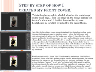
This is the photograph in which I added as the main image
on my cover page. I took the image on the college camera’s in
front of a white wall. I decided I wanted her to have
headphones in, in which would add to the music theme.
Here I decided to edit my image using the tools within photoshop to allow me to
enhance the image and make it stand out more. I edited the brightness and
contrast making it brighter and the background whiter. I also edited the colour
balance making her headphones stand out more and making the image look more
vibrant. I also added my masthead “lively” in which I wanted to stand out and come
of the page almost. In which I added stroke and a drop shadow. I also tried to
match the colour to the head phones to make them both stand out. I also decided to
put my masthead behind my main image. I did this by using the “quick selection
tool” and cutting her out and then placing the layer of my main image in front of
my masthead.
Here I decided to add a footer. I did this by drawing a rectangle. I decided that I
wanted my footer to be black and the text on top of it white to contrast the colours
and make the text stand out. I thought about my audience and based the text
within the footer “fashion” “news” “gigs” on both what I think would be within
their interests and also what would be within a typical music magazine. Here I
also added a barcode this was to make sure it had the conventions of a typical
music magazine ensuring it looked professional. I did this by adding it to a layer.
2. Here I used the text icon to add the price of the magazine the issue
number and the date. I did this because I wanted my magazine to
look professional. I used quite a heavy stroke on the price because I
know that it would important to the buyer and something which
would have to stand out. I also used the same colour as I did in the
masthead to ensure I kept the house style and the colours in which I
wanted to use. So far I have also used all the same font, “stencil std”
to ensure that I am keeping up with my house style. I also thought
that it was a font in which looked professional and looked like it
would be on a typical magazine.
Here I began to add my coverlines. I decided that I wanted
them white as I wanted my housestyle colours to bed white,
pink and black. I used quite a heavy stroke on most of my
coverlines because I thought it added a nice effect of making
them look as if they were coming off the page. I used the
coverline about my trends because I wanted my magazine to
be more than just a music magazine and I thought this would
portray this. I also ensured that my text was lined up against
the edge of the page ensuring it looked professional. I did this
using the left alignment tool and also moving my coverlines
around to ensure they were in the right place.
Furthermore I continued to add coverlines on the left hand
side. I think I maintained my house style by maintaining the
same font and using the same range of colours. I added a
black rectangle to the coverline in the middle to make it
stand out and differ from the other two. I ensured that the
“ever!” in the bottom coverline stood out more so compared to
the other text within that coverline as it was an important
word I wanted to add emphasis to. I ensured all the
coverlines were lined up ensuring they looked professional. I
realised that the left side of my magazine was quite busy and
decided to maintain this busy housestyle.
3. Here I began to add coverlines to the left side of my page to
ensure that there was no dead space. I tried to follow the “C”
convention in which helps ensure there is no dead space and
there are coverlines in appropriate places. I made sure the
right side of my page was also quite busy to match with the
right. I added a heavy stroke and drop shadow to the coverline
about Jessie J. I did this because I think it is an important
coverline as Jessie J is an artist of whom my audience will
have a particular interest in so I wanted to enhance this
ensuring it would stand out to them.
Here I started working on what I wanted to be my main coverline. I
wanted my main coverline to link to my main image and I decided upon
a name “Sophie Star” I found it difficult to differentiate between my
main coverline and my other ones. So to ensure it would look like my
main coverline I made the text bigger and added a drop shadow. Still
ensuring I was following my housestyle and aligning the coverlines up to
the left hand side of the page.
This is the finished content of my cover page. Lastly I realised I need
to link my main image to my main coverline so I came up with the
name “Sophie Star” in which I decided would be the main feature of
this magazine. To make sure it was obvious that this was going to be
the main attraction I made the font size 72 connoting importance. I
also changed the colour of the star to yellow. I did this because it
connoted the idea of “star” and also broke my housestyle enabling the
main coverline to stand out. I also added a star by making it on word
and copy and pasting it in to again enforce the idea of the star. I think
that by adding the “sophie star” I was able to maintain the business of
my cover page.
4. STEP BY STEP OF HOW I CREATED
MY CONTENTS PAGE.
Here I decided to use photoshop again for my contents page. I decided to
use photoshop because I wanted my contents page to be fairly image based.
I decided to have a plain white background because I wanted my images
and text to stand out. I added my masthead “contents” and ensured that is
was the same colour, font and size as my title “lively”. I also ensured I used
drop shadow and a stroke as I did on my original masthead ensuring I was
maintaining my housestyle.
Here I decided to add a line under my title enforcing the magazine title
“lively”. “whats going on in lively this week?” it also emphasises the fact
that this is a contents page. I used the same colour pink used in my
masthead for “lively” to reinforce the magazines main colours. I also used a
different font- mistral to differ it from the title. I also decided to add
columns following the conventions of a typical magazine. This would
ensure that all my images and text were laid out correctly and my
contents page had a good structure.
Here I started adding my images. I added “kieran boucher” another artist
who I wanted to feature within my magazine. I did this to ensure I would
have a range of artists. I also added a pull quote using the text tool. This
is a typical convention of a magazine to draw the readers in. I also used
the lasso tool in order to cut around the image of “Kieran Boucher” to
ensure that the white background followed through, this also enabled the
image to stand out.
5. Here I continued to add images and text of the features inside my
magazine. I added two images of my main artist- Sophie star. This was
to maintain continuity. I used the magic wand tool to cut them out so
they would fit in with the background. I Also added text about them
using the text tool and also a number- of what page they would be on.
Here I decided to add an editors not to make my magazine look more
professional. I also used the font “mistral” to do a signature almost of the
editor- adding a personal touch. I also put the editors email address on
there, again using the text tool and following conventions of a typical
music magazine.
Here was the finished version of my contents page. I decided
that in the column I’d created on the right had side of my page
using a rectangle- I would reinforce the artists and bands in
which my target audience would like and what pages they’d be
on in the magazine. I used the colours black and pink to follow
my housestyle.
6. STEP BY STEP OF HOW I CREATED
MY DOUBLE PAGE SPREAD.
I decided to do my double page spread in indesign. I did this
because I wanted my double page spread to be mainly text based
and indesign is easier when working with text. Here I placed my
image in. I decided I wanted my image to be on the right side of
the double page spread. I then decided that I would colour the
right hand side in which I drew a rectangle and then filled it a
light grey in order to make sure that my text would stand out
compared to my background.
Here I decided to add a border of flowers to make the right hand
side of my page stand out more. It also added to the idea of “Sophie
star” because it emphasises the girly theme in how I think she is
portrayed. I added a boarder using adobe illustrator. I then copied
into indesign. I also added the “Sophie star” name on the picture.
This is also on my cover page so it maintains the house style. I
saved this on photoshop and placed this into indesgin and just
edited the colours.
Here I decided to add a title page. I did this by again placing
it from photoshop into indesign. I did this to maintain the
house style again to make sure that you would be able to tell
that it’s lively magazine throughout. I used the title
“original, fresh, the next big thing” to emphasises my main
attraction, my interview with “Sophie star”.
7. Here, again I placed text into indesign from photoshop to make
sure my house style was maintained. I added “Lively exclusive!” in
the font mistral. I did this because it would link to both the
contents page and cover page where I stated that it was an
exclusive. I also added who was the interviewer and photographer.
I did this using the text tool. I used two different fonts here “stencil
std” and “minion”.
Here I decided to add my text. I did this by adding text from word
which I had previously written. I also added a drop cap. I decided to
go for quite a large one to emphasise it more. I also did a pull quote
from “Sophie Star” which I did in stencil std and then I added
“Sophie Star” which I did in the font “minion” this was meant to look
like a signature which I thought would add a personal touch.
I then added an email address and a page number using the
text tool. I did this to follow the conventions of a typical
magazine. This was the final of my double page spread.