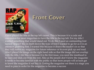
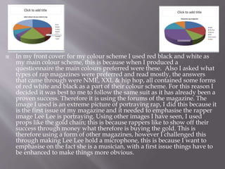
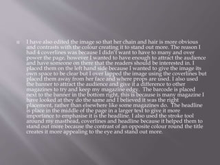
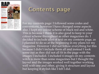
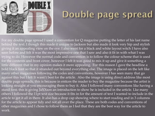
 My magazine is unique in itself to me, as it has
all been created by me; however I have used
magazines to help me create my finished
product. I did this through basing my product
on other magazines by copying there design
layout, following there layout gave me help
into designing my magazine helping it to look
professional and at a high quality. The
placement of images with the whole layout has
been reciprocated through different codes and
conventions.
I have placed the title in the top left corner. This is because it is a code and
convention for most magazines to have the title in the top left. For my title I
wanted something that would stand out. To do this I used an outstanding font
named ‘impact’ this in itself shows the type of font I wanted to go for as it is an
attention grabbing font. I wanted this because it draws the reader’s in so that
they will notice my magazine for future reference or to even pick up and read.
Also I placed the image on the right hand side so that the image did not overlap
with the title, I did this is because it is the first issue, you need the masthead to
be seen and stick out from the rest. Also as the people don’t know the magazine
it needs to become familiar with the public so that more people will at least get
to know the magazine if not buy it. Getting the magazine out there is a stage you
need to pass in order for the magazine to become a success
 In my front cover: for my colour scheme I used red black and white as
my main colour scheme, this is because when I produced a
questionnaire the main colours preferred were these. Also I asked what
types of rap magazines were preferred and read mostly, the answers
that came through were NME, XXL & hip hop, all contained some forms
of red white and black as a part of their colour scheme. For this reason I
decided it was best to me to follow the same suit as it has already been a
proven success. Therefore it is using the forums of the magazine. The
image I used is an extreme picture of portraying rap, I did this because it
is the first issue of my magazine and it needed to emphasise the rapper
image Lee Lee is portraying. Using other images I have seen, I used
props like the gold chain; this is because rappers like to show off their
success through money what therefore is buying the gold. This is
therefore using a form of other magazines, however I challenged this
through making Lee Lee hold a microphone, this is because I want to
emphasise on the fact she is a musician, with a first issue things have to
be enhanced to make things more obvious.
 I have also edited the image so that her chain and hair is more obvious
and contrasts with the colour creating it to stand out more. The reason I
had 4 coverlines was because I didn’t want to have to many and over
power the page, however I wanted to have enough to attract the audience
and have someone on there that the readers should be interested in. I
placed them on the left hand side because I wanted to give the image its
own space to be clear but I over lapped the image using the coverlines but
placed them away from her face and where props are used. I also used
the banner to attract the audience and give it a difference to other
magazines to try and keep my magazine edgy. The barcode is placed
next to the banner in the bottom right, this is because is many magazine I
have looked at they do the same and I believed it was the right
placement, rather than elsewhere like some magazines do. The headline
is place in the middle of the page in a larger text to give it more
importance to emphasise it is the headline. I also used the stroke tool
around my masthead, coverlines and headline because it helped them to
stand out more because the contrast of an opposite colour round the title
creates it more appealing to the eye and stand out more.
 For my contents page: I followed some codes and
conventions, however I have changed some aspects
also. I kept my colour scheme of black red and white.
This is because I think it is also good to keep to your
colour scheme throughout as other magazines do. I
decided to include allot of text on my contents page, as
I planned to do so at the beginning in my plans for my
magazine. However I did not follow everything for this
because I didn’t include them all and instead I took
some out as they did not all fit in the page with the
images I included. I included 4 images on my contents
witch is more than some magazines but I thought the
layout and the images worked well together working
well with one and other, giving it structure and layout
but keeping it stylish like I felt I did.
For my double page spread I used a convention for Q magazine putting the letter of his last name
behind the text. I though this made it unique to Jackson but also made it look very hip and stylish
giving it an appealing view on the eye. I also went for a black and white layout witch I have also
seen before and felt it was the most impressive one that I saw and also it fit in with what I was
trying to do. However the normal code and convention is to follow the colour scheme that is used
for the contents and front cover, however I felt it was good to mix it up and give it something a
little different that in my opinion makes it more appealing. For this reason I gave the headline a
bold black font so that it stranded out beyond everything else. The image is placed on the left like
many other magazines following the codes and conventions, however I has seen many that go
against this but I felt It wasn’t best for the article. Also the image is using direct address like most
double page spreads, this is because in entices the reader to buy the magazine because the artist is
looking straight at you encouraging them to buy it. Also I followed many conventions like having a
stand first; this is giving JaXXson an introduction to show he is included in the article. Lke many
others I followed the 11pt text size because it fits in for the amount of text I wanted to include in the
article to get it all in there. It also has a drop cap showing where to start reading and in 3 columns
for the article to appear tidy and not all over the place. These are both codes and conventions of
other magazines and I chose to follow them as I feel that they are the best way for the article to
work.

Q1

  • 2.
     My magazineis unique in itself to me, as it has all been created by me; however I have used magazines to help me create my finished product. I did this through basing my product on other magazines by copying there design layout, following there layout gave me help into designing my magazine helping it to look professional and at a high quality. The placement of images with the whole layout has been reciprocated through different codes and conventions.
  • 3.
    I have placedthe title in the top left corner. This is because it is a code and convention for most magazines to have the title in the top left. For my title I wanted something that would stand out. To do this I used an outstanding font named ‘impact’ this in itself shows the type of font I wanted to go for as it is an attention grabbing font. I wanted this because it draws the reader’s in so that they will notice my magazine for future reference or to even pick up and read. Also I placed the image on the right hand side so that the image did not overlap with the title, I did this is because it is the first issue, you need the masthead to be seen and stick out from the rest. Also as the people don’t know the magazine it needs to become familiar with the public so that more people will at least get to know the magazine if not buy it. Getting the magazine out there is a stage you need to pass in order for the magazine to become a success
  • 4.
     In myfront cover: for my colour scheme I used red black and white as my main colour scheme, this is because when I produced a questionnaire the main colours preferred were these. Also I asked what types of rap magazines were preferred and read mostly, the answers that came through were NME, XXL & hip hop, all contained some forms of red white and black as a part of their colour scheme. For this reason I decided it was best to me to follow the same suit as it has already been a proven success. Therefore it is using the forums of the magazine. The image I used is an extreme picture of portraying rap, I did this because it is the first issue of my magazine and it needed to emphasise the rapper image Lee Lee is portraying. Using other images I have seen, I used props like the gold chain; this is because rappers like to show off their success through money what therefore is buying the gold. This is therefore using a form of other magazines, however I challenged this through making Lee Lee hold a microphone, this is because I want to emphasise on the fact she is a musician, with a first issue things have to be enhanced to make things more obvious.
  • 5.
     I havealso edited the image so that her chain and hair is more obvious and contrasts with the colour creating it to stand out more. The reason I had 4 coverlines was because I didn’t want to have to many and over power the page, however I wanted to have enough to attract the audience and have someone on there that the readers should be interested in. I placed them on the left hand side because I wanted to give the image its own space to be clear but I over lapped the image using the coverlines but placed them away from her face and where props are used. I also used the banner to attract the audience and give it a difference to other magazines to try and keep my magazine edgy. The barcode is placed next to the banner in the bottom right, this is because is many magazine I have looked at they do the same and I believed it was the right placement, rather than elsewhere like some magazines do. The headline is place in the middle of the page in a larger text to give it more importance to emphasise it is the headline. I also used the stroke tool around my masthead, coverlines and headline because it helped them to stand out more because the contrast of an opposite colour round the title creates it more appealing to the eye and stand out more.
  • 6.
     For mycontents page: I followed some codes and conventions, however I have changed some aspects also. I kept my colour scheme of black red and white. This is because I think it is also good to keep to your colour scheme throughout as other magazines do. I decided to include allot of text on my contents page, as I planned to do so at the beginning in my plans for my magazine. However I did not follow everything for this because I didn’t include them all and instead I took some out as they did not all fit in the page with the images I included. I included 4 images on my contents witch is more than some magazines but I thought the layout and the images worked well together working well with one and other, giving it structure and layout but keeping it stylish like I felt I did.
  • 7.
    For my doublepage spread I used a convention for Q magazine putting the letter of his last name behind the text. I though this made it unique to Jackson but also made it look very hip and stylish giving it an appealing view on the eye. I also went for a black and white layout witch I have also seen before and felt it was the most impressive one that I saw and also it fit in with what I was trying to do. However the normal code and convention is to follow the colour scheme that is used for the contents and front cover, however I felt it was good to mix it up and give it something a little different that in my opinion makes it more appealing. For this reason I gave the headline a bold black font so that it stranded out beyond everything else. The image is placed on the left like many other magazines following the codes and conventions, however I has seen many that go against this but I felt It wasn’t best for the article. Also the image is using direct address like most double page spreads, this is because in entices the reader to buy the magazine because the artist is looking straight at you encouraging them to buy it. Also I followed many conventions like having a stand first; this is giving JaXXson an introduction to show he is included in the article. Lke many others I followed the 11pt text size because it fits in for the amount of text I wanted to include in the article to get it all in there. It also has a drop cap showing where to start reading and in 3 columns for the article to appear tidy and not all over the place. These are both codes and conventions of other magazines and I chose to follow them as I feel that they are the best way for the article to work.