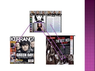
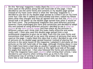
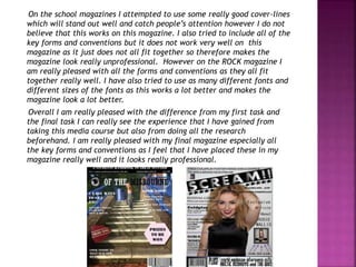
The document discusses the process of creating a rock music magazine by using existing professional magazines as inspiration and models. Key elements like mastheads, images, headlines, and layouts were adapted from magazines like NME, Kerrang, and Drummer. Photoshop was used to edit images for the cover and spreads. Indesign was used to design the overall magazine layout, but both programs were challenging to learn. The goal was to incorporate standard magazine conventions while putting an original spin on the designs.
Plans To Offer Rewards For Information In Los Angeles Hit-and-RunsCost U Less Direct
In a massive push to solve open hit-and-run cases and hopefully reduce their occurrence, Los Angeles city officials have devised a plan. The proposed plan is to launch an alert system by which information on fleeing drivers and vehicles linked to hit-and-run accidents can be shared, along with offering rewards of up to $50,000 for information leading to a conviction in the accident.
The Art Pastor's Guide to Sabbath | Steve ThomasonSteve Thomason
What is the purpose of the Sabbath Law in the Torah. It is interesting to compare how the context of the law shifts from Exodus to Deuteronomy. Who gets to rest, and why?
Ethnobotany and Ethnopharmacology:
Ethnobotany in herbal drug evaluation,
Impact of Ethnobotany in traditional medicine,
New development in herbals,
Bio-prospecting tools for drug discovery,
Role of Ethnopharmacology in drug evaluation,
Reverse Pharmacology.
2024.06.01 Introducing a competency framework for languag learning materials ...Sandy Millin
http://sandymillin.wordpress.com/iateflwebinar2024
Published classroom materials form the basis of syllabuses, drive teacher professional development, and have a potentially huge influence on learners, teachers and education systems. All teachers also create their own materials, whether a few sentences on a blackboard, a highly-structured fully-realised online course, or anything in between. Despite this, the knowledge and skills needed to create effective language learning materials are rarely part of teacher training, and are mostly learnt by trial and error.
Knowledge and skills frameworks, generally called competency frameworks, for ELT teachers, trainers and managers have existed for a few years now. However, until I created one for my MA dissertation, there wasn’t one drawing together what we need to know and do to be able to effectively produce language learning materials.
This webinar will introduce you to my framework, highlighting the key competencies I identified from my research. It will also show how anybody involved in language teaching (any language, not just English!), teacher training, managing schools or developing language learning materials can benefit from using the framework.
Palestine last event orientationfvgnh .pptxRaedMohamed3
An EFL lesson about the current events in Palestine. It is intended to be for intermediate students who wish to increase their listening skills through a short lesson in power point.
Read| The latest issue of The Challenger is here! We are thrilled to announce that our school paper has qualified for the NATIONAL SCHOOLS PRESS CONFERENCE (NSPC) 2024. Thank you for your unwavering support and trust. Dive into the stories that made us stand out!
We all have good and bad thoughts from time to time and situation to situation. We are bombarded daily with spiraling thoughts(both negative and positive) creating all-consuming feel , making us difficult to manage with associated suffering. Good thoughts are like our Mob Signal (Positive thought) amidst noise(negative thought) in the atmosphere. Negative thoughts like noise outweigh positive thoughts. These thoughts often create unwanted confusion, trouble, stress and frustration in our mind as well as chaos in our physical world. Negative thoughts are also known as “distorted thinking”.
How to Make a Field invisible in Odoo 17Celine George
It is possible to hide or invisible some fields in odoo. Commonly using “invisible” attribute in the field definition to invisible the fields. This slide will show how to make a field invisible in odoo 17.
MARUTI SUZUKI- A Successful Joint Venture in India.pptx
Media evaluation
1.
2.
3. The magazines named ‘NME’ and ‘KERRANG’ are both professional
magazines which I have used when creating my final magazines. Both of
these magazines include all the forms and conventions that a professional
magazine should have, these are things such as a masthead, buzz words,
cover-lines, sell lines, barcode, heading, central images and thumb nail
images. I have used these magazines to put together my final magazine,
the first thing that I used on my magazine was the big bold masthead
that they had used, however instead of placing my masthead in a straight
line I decided to adapt this and place the masthead diagonal directly over
the central image. I have also followed the typical placing of the cover-
lines and strap lines on the left hand side of the page and have placed
this in different sized fonts as I feel that this makes the magazine stand
out more. I have then also placed buzz words all over my magazine such
as ‘exclusive, win, world’ which I feel will stand out to people who are
looking at the magazine. I have then also only used one central image as
from doing all my research I found that the majority of all other genres
of magazines only used one main central image which will therefore draw
the reader in and try and grab their attention. I then also followed the
forms and convention of the image looking directly into the reader’s eyes
as this could give a sense of the image looking directly into the reader’s
eyes. The shot that I used was a natural medium-shot, I am really
pleased with this shot and the way the model has positioned herself as
we can see her facial expressions really well but also due to the
background it also makes the typography really easy to read. I then
decided to add in a sell-line as this could make people interested and
then therefore buy the magazine, I also tried to use one main cover-line
as from my research I found that this is also what the majority of
magazine genres do and then use smaller cover-lines to share other
stories that are going on in the magazine. However I made sure that the
central image and the main cover-line linked together along with the
article in the double page spread.
4. The contents page that I used to inspire me when creating my magazine is
called ‘Drummer’ magazine. I choose this contents page as when I was doing
my research on contents pages this one stood out to me the most as looks very
professional and also has a lot of key features on the magazine as well. The
professional magazine also includes all the key forms and conventions which is
what I want to therefore include on mine these are features such as a
masthead, central image, heading, cover-lines and images. I have used all of
this to put together my final contents page and to try and make it look as
much like a real media product. I have used the professional contents page
layout and then tried to copy the same layout for my magazine; however I
have also adapted it at the same time. I have placed the masthead in the
same place as the professional magazine and also placed the main central
image in the same spot although I have developed this media product and
decided to add cover-lines which also include buzz words onto the contents
page. I then also placed small images onto the page which should catch
people’s attention as I have also placed a small cover-line under the image to
which has not been used in the professional magazine. I then also decided to
link in the forms and conventions that I used on the front cover into the
contents page. However on the contents page I also decided to use images
above the cover-lines used. The main form and conventions that is one of a
key feature on real media products for contents pages is the page numbers. I
decided to use the same colour numbers that the professional magazine used
as I felt that the red is really eye-capturing and stands out a lot.
5.
6. On this ‘Kerrang’ magazine I really liked the forms and conventions that
were used on the photos along the left hand side of the page. I have
decided to use the same forms and contents in my double page spread
instead of my front cover which is what the ‘Kerrang’ magazine is. I
decided to use this on my double page spread as I tried it out on my front
cover but I felt like it looked to overcrowded and then I asked my fellow
peers what they thought and they all agreed with me that the photo strip
would look a lot better on the double page spread than what it would on
the front cover. The professional magazine also used different pictures
however I have challenged this form and convection and decided to adapt
this and instead of using different pictures I decided to use a close-up
picture of my main central image and then place all the pictures in
different colours and I think that this looks really effective and works
really well. I then also used this double page spread from a real
professional magazine to give me an idea; from this the main forms and
conventions that stood out to me were the amount of pictures that were
used on the page. I really liked this idea that is why I decided to use a lot
of pictures on my double page spread however instead of placing the
pictures in the same layout of the magazine I adapted it and place all the
pictures on the left hand side of the page. Although thinking about it now
this might have been a bad idea as usually if people are flicking through
the magazine they tend to look more at the right hand side of the page
for pages that stand out. I then also followed the forms and conventions
of how the magazine have used columns when writing their article, I also
decided to use columns when writing mine up as this is the most
professional way of writing it and also it will make the magazine look
more like a real media product.
7. The technology programme that I used to create my final magazine was
‘Indesign’, however I also used a website named ‘photoshop’ to edit all
of my picture that I had used throughout the magazine. Although I found
it really hard when using these two websites as I had never used either of
them beforehand so found it really difficult in knowing what all the tools
and features. To overcome this programme I had to use video tutorials
which I had to find online which would help me with what I wanted to do
as unfortunately none of my fellow peers knew how to use the software’s
and neither did my teachers.
The first photo that I edited was the central image from the front cover.
The first thing I did was made the picture a lot lighter as I felt like it was
quite dark beforehand, I also wanted to make the wall a lot lighter to
make it look whiter as this was where all my typography was going to be
placed. To do this I had to select the whole photo and then use the
brightness tool to decide what looked best and what I didn’t think
worked.
8. I then decided to edit the teeth as I wanted to make the teeth look a lot
whiter as before I felt they looked quite yellow and I did not like this at
all. In order to do this I had to select all of her teeth and then also use
the hue/saturation button on photoshop. By using the saturation button
this allowed me to choose the exact shade of white that I wanted the
models teeth to look like without them either looking too white or look
like they hadn’t changed at all. But overall I was really pleased with the
difference from the before and after picture of the model.
9. I then decided to make the models eyes a lot brighter, I wanted to do this
as I wanted the eyes to stand out on the front of the magazine and for
them to capture the readers attention. I did this by using the same tools
as I did for the editing of the teeth however instead of clicking on
‘yellow’ I clicked on ‘blues’ instead as I felt like blue eyes would have
really suited the model and I felt that It did really suite the model. I was
really pleased with the editing of the central image as overall I didn’t
want it to look like the picture had been edited and I think that I
achieved this via my editing and especially that I had never used
photoshop before.
After then developing my knowledge on photoshop I decided to edit another
photo that would be going onto my double page spread. I am really pleased
with this edit as I can really see the difference from before and after. The first
thing that was zoom in more on the central image herself and by doing this it
made the model look a lot more taller but also skinner at the same time. I then
really wanted to contrast this picture so I made the contrast really low and the
brightness really bright. I really liked this tool as it allowed me to mess around
with different shades and to see what I felt looked best on the model. Finally I
decided to add in some shadows around the outside of the model as I wanted
to really make sure that she stood out and I believe that I achieved this
through this picture and it looks really good on my final magazine. (next slide)
10. For this picture that was going on my double page spread, I decided to only
edit the colour of each individual picture and then group them all together in
a vertical line. This was one of the easiest things to do and I did not need to
use a tutorial to achieve this as all I had to do to edit this picture was edit
the colour of the overall picture.
11. In order to create a magazine for my final genre of ROCK, I had to do a lot of research
beforehand to see what the ROCK genre was like, especially if I was going to put
together a magazine for it.. The first task that I got given was to create a school
magazine, I started off by finding out all the conventions that had to be placed on a
magazine. This was the forms and conventions such as the masthead, headings, central
image, cover-lines, sell-lines and the basic features such as a barcode, price and date
which I was going to include on my magazine.
The genre for the magazine on the left hand side of the page is a school magazine. I
decided to name the magazine the ‘eye of the misbourne’ as the school that I would be
creating my magazine for was called ‘The Misbourne’. I also wanted to be different and
unique when creating my masthead. So instead of writing the word ‘eye’ I decided to use
a graphic image as I felt this looked better on the magazine. I then wrote the rest of the
masthead out however I wanted to be different and use two different colours for the
masthead. The main reason that I did this though was because I felt that it looked a lot
better on the central image that I had used. Although looking back on it now it is actually
really unclear and looking at my final task I can really see a difference in how far I have
come when creating a magazine. My final task was to create a music magazine and from
doing all my research beforehand on magazines I decided to follow the genre of ‘ROCK’
magazine as I felt this would let me be the most creative but also the funniest out of all
the genres. I placed my masthead on a black rectangle background and for my font I
went onto a website named ‘DAFONT’ and I found a really bold font which is named
‘Experimento’ I really liked this font especially how it stands out on the page but also
works really well with the central image that I decided to use. From looking at my first
attempt of my masthead on the school magazine I can really see the difference in the
masthead being clear and then the masthead being really unclear. I am really pleased
with how well it has come out on my music magazine.
12. Above the masthead I placed a heading that was stretched along the top of the page,
this also included a sell-line which was placed on a black background with white
typography so therefore it would be easy to read as if it wasn't easy to read then this
may have reflected on the magazine for looking poor and unprofessional meaning
people would not want to buy the magazine. In the heading I decided to place all the
key information such as the website of the school for people that wanted to find out
more information but then also the date of the magazine as this would tell people if it
was a weekly or monthly magazine. I decided for my magazine to be a monthly
magazine as I felt like I could therefore provide more information each month for the
students and parents. I then also looked at previous school magazines to see what they
had priced there magazine and I decided to price my magazine at £1.50 as I felt this
was not too expensive. However instead of just looking at previous rock magazines for
my heading for my final magazine, I decided to do a questionnaire to find out what
the best price would be voted for my final magazine. I think doing a questionnaire was
a really good idea as it therefore helped me and told me what price would be best
which was £1.99. I also placed the headings underneath the masthead this time as I
felt this looked a lot better but was also a lot more visible especially as it was on a
grey background meaning I decided to use a black font for the typography.
Another big difference is the difference between the central images, the picture on
the school magazine was taken by an iPhone which at the time on the iPhone it came
out really clear and looked really professional however looking back on the picture
now I can see that it is really blurry and I had not taken any thought into the picture
at all, especially as in the background I can see a picture of a bin and the majority of
the picture is stairs which looks really bad. The picture also clashes really bad with all
the typography on the page and overall makes the magazine look really unprofessional
and messy. However for the ROCK magazine the camera that was used was a
professional camera and from this I am really pleased with how the picture has come
out, especially as it looks really clear on the computer. It also reflect on the magazine
looking really professional looking which I am really pleased about. The typography on
the page also doesn’t clash at all with the central image on the page which I am really
glad about, this is because from doing all my previous research I saw that all the
typography should be placed on a clear background so I have used all the key forms
and conventions and made sure they do not clash with my central image.
13. On the school magazines I attempted to use some really good cover-lines
which will stand out well and catch people’s attention however I do not
believe that this works on this magazine. I also tried to include all of the
key forms and conventions but it does not work very well on this
magazine as it just does not all fit together so therefore makes the
magazine look really unprofessional. However on the ROCK magazine I
am really pleased with all the forms and conventions as they all fit
together really well. I have also tried to use as many different fonts and
different sizes of the fonts as this works a lot better and makes the
magazine look a lot better.
Overall I am really pleased with the difference from my first task and
the final task I can really see the experience that I have gained from
taking this media course but also from doing all the research
beforehand. I am really pleased with my final magazine especially all
the key forms and conventions as I feel that I have placed these in my
magazine really well and it looks really professional.
14. The audience that I have chosen for my final media magazine are males
and females who are aged between 16-23 years old and who are also into
the music genre of ROCK. I felt that this was the correct age for my final
magazine as I did not think anyone younger would be into the music
magazine and I do not think people over the age of 23 would buy my
magazine even though it would be a bonus. Inside the magazine it
includes lots of different information from different celebrities so the
audience that might buy the magazine might also therefore be interested
in these celebrities a long with the main central image on my magazine. I
have also used buzz words on my final magazine to attract people and
also used a sell-line with a thumb nail picture at the top of the magazine
to try and attract people to want to read and buy the magazine as well.
I am pleased with this target audience age and feel that the content
inside of this magazine will suite them a lot but also suite the majority of
people who also love rock as well.
15. I then knew that I needed to use a name that will stand out to people but
also link in with the genre of ‘ROCK’ this is why I decided to name my
magazine ‘SCREAM’ as one of the first things that comes to my mind
when thinking about the genre of ROCK music is really loud, screamy
music so this gave me the idea to name my final magazine ‘SCREAM’. I
got the font of a website named ‘dafont’ and I really like it as the white
stands out on the white background really well overall.
I then decided to place the names of other famous ROCK musicians on
the front of my magazine as if people did not know who my central image
was then they might know some of the other images that I have used. I
have then linked all of these people in with the cover-lines and strap
lines underneath to try and catch people’s attention by giving them a
sneak peak of what the different articles involve.
16. IPC Media: IPC Media which stands for international Publishing Corporation is
one of the biggest leading magazine and digital publishing institutions in the
UK which sells over 350 million copies each year. It is owned by Time Inc and It
was founded it 1968 and its main headquarters are located in London.
The Bauer Media Group is Europe’s largest privately owned publishing group.
The group also offers 300 magazines in 15 countries meaning it is pretty well
known all around the world. It also have its own website online and advertises
through tv and radio stations. One of the institutions that is part of the media
group is Bauer Media which joined the organisation in 2008. The group also
employees around 6400 people. The Bauer Media Group is also a large-
European media company which its main headquarters are located in
Germany, Hamburg. The group was founded In 1875 and in 2013 it made an
approximate revenue of 2,4 billion euros.
The institution in which I would want my magazine to be sold at is the Bauer
Media Group, I have decided to use this group as it is one of the most well-
known institutions all around the world meaning it would already have very
loyal customers who buy the magazines that they produce and sell to the
public audience. It would also help me in the future when designing my
magazines about what works well and what wouldn’t work well and due to the
fact that they produce magazines to around 15 countries this will mean that in
the future if my magazine were to be successful then I could start realising
magazines in countries other than the UK. The Bauer Media Group also
advertises their magazines through different social media groups but also
other technologies such as tv and radio stations. I believe that if they were to
agree in being the distribution organisation then my magazine could be a huge
hit and have huge potential. It would also allow my magazine to attract a lot
of readers that follow the Bauer Media Group Magazines.