SlideShare a Scribd company logo
Evaluation
research
• The research I conducted was both primary and secondary. One strength of this was the primary research. This was because
I could see what my demographic would wan to see. From my results I could see and answers. This showed me that I had to
include these things. This also helped me established the conventions of the products. This as well as the collection of
exiting products were strengths. Form the collection of images I could see that there was a specific layout to music event
posters. Overall though I think my research was a success. This was apart from my secondary research. This was the only
downside to it due to myself not being able to find many exiting music venue posters and guides. I also couldn't’t find any
like exiting music event posters for well known artist. This would of helped me because I could see what posters looked like
for the most famous performers. This would give me an idea of what works and like how to target my target audience. If I
was doing research again I would probably do more secondary research as well as primary. This would be to find out more
about my audience and more about exiting products. I would design a second survey and include more lengthy questions.
The secondary research was not as good as the primary however when looking at the demographic online I found some
useful sources. I then looked at these in more detail and broke these down. These were the genres that were most listened
to within my demographic. From this I could decide on which venues I was going to display. These would have regular artists
who play the music my demographic are into.
Planning
• The strengths of my planning was that it helped me firstly decide on what I was doing. To choose what I was doing I started
with a mind map and then put my interests as well as serious problems that are happening in the world as well as york. The
mind map helped me. This was because once I put the ideas down I could then follow them up with what I would make,
how I would make it and also how my idea would appeal to the audience. This was a big factor due to this project being to
advertise york essentially. From my mind map I could rule out ideas based on specific things, these wear; would it advertise
york well, how would I do it and also was it particle. From the mind map I decided to rule out the football and the
documentary idea. I ruled the football one out due to york not having a huge football team so not many people are
interested in seeing it. I ruled out the documentary. This was because the idea was to display the homeless problem in york
or to do something about climate change. I ruled out these ideas due to thinking that these would’t be most particle. I also
don’t think that I would be the best to show them problems. This is due to myself not having much knowledge. Overall one
part of the research which was a strength was the mind map I created. For my planning I also made a proposal. This laid out
my concept and let me think about what skills I would use. For this I could think about how I would do certain parts of my
product and also what programs I would use. Laying out my product and doing a concept really helped me with my project.
After my research I began to think that I should change my project. This was because I didn't’t think that I could make a
music venue guide. After doing my concept I then thought and understood my product more. One thing was the target
audience and how to target them. One weakness of my planning was that I only did a mind map and only came up with 3
ideas. This is a weakness as I could have thought of a new better idea if I did different ways of thinking of ideas. If I was
doing the planning again I would try to think of more ideas. This is because I could have done something better I think. I
could of also gone out of my comfort zone a bit more. This would of expanded my skillset.
Time management.
• For my time management I feel that I have done really well. This is because this project I feel that I have kept on top of
things and stuck to the deadlines. There was one slight hiccup whilst doing this. To fix this I had to finish my research at
home. For this I had to export my work into Google slides and then did this on my phone on one of my study days. Apart
from that I feel that I have kept on top of things pretty well. Firstly I started off with the planning I initially thought that this
would take a while. This was due to myself not knowing what I was going to do and not really understanding what this
project was. After I completed my mind map I didn't’t really struggle with it from then. The mind map did take me a while
however after that I started getting to grips as to what I was doing. I then started looking at my target audience and the
demographic I was trying to target. To look at this I carried out ways I had previously done in other projects, these were
surveys as well as carry out secondary research. I found that these things worked well in my previous projects. These ways
took some time to do. The survey I conducted took a while to do and also to get responses. This was probably the most
lengthy part to my research that and also finding exiting products. This probably took longer than it needed to however I got
this all done in time and within the time limit. Another problem I actually came across was that my idea changed. This was
because I got feedback on my initial idea which was just going to be a music guide however this was going to be just print
based. I then decided based on the feedback I got to do something a bit different. I then decided to do a cinema graph. This
was because it was suggested to me. This was something I never did so I expected it to take a bit of time. This didn't’t really
take me that long and got to grips to it fairly fast. If I had more time I would have probably done a more complex cinema
graph. This would have looked better and would have shown my skills better. The idea I would have implemented if I had
more time would have been maybe to add audio and also to have more things happing. The last thing I would have done if I
had more time would be to have spent more time on my music venue guides. This is because I don’t think they are the most
astatically pleasing things to look at. I would have maybe chose a different background for some and maybe added more
text. Overall I feel that they are a bit vague. Overall though I do feel I dealt with my time good in this project however had a
few things that took a bit longer. If I had done these things faster I could have had better products.
Technical qualities
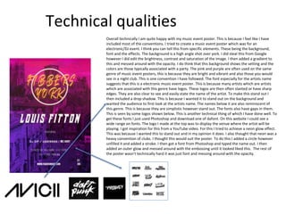
Overall technically I am quite happy with my music event poster. This is because I feel like I have
included most of the conventions. I tried to create a music event poster which was for an
electronic/DJ event. I think you can tell this from specific elements. These being the background,
font and the effects. The background is a high angle shot over york. I did steal this from Google
however I did edit the brightness, contrast and saturation of the image. I then added a gradient to
this and messed around with the opacity. I do think that this background shows the setting and the
colors are those typically associated with a party. The pink and purple are often used on the same
genre of music event posters, this is because they are bright and vibrant and also those you would
see in a night club. This is one convention I have followed. The font especially for the artists name
suggests that this is a electronic music event poster. This is because many artists which are artists
which are associated with this genre have logos. These logos are then often slanted or have sharp
edges. They are also clear to see and easily state the name of the artist. To make this stand out I
then included a drop shadow. This is because I wanted it to stand out on the background and
wanted the audience to first look at the artists name. The names below it are also reminiscent of
this genre. This is because they are simplistic however stand out. The fonts also have gaps in them.
This is seen by some logos shown below. This is another technical thing of which I have done well. To
get these fonts I just used Photoshop and download one of dafont. On this website I could see a
wide range on fonts. The logo I made at the top was to display the venue where the artist will be
playing. I got inspiration for this from a YouTube video. For this I tried to achieve a neon glow effect.
This was because I wanted this to stand out and in my opinion it does. I also thought that neon was a
heavy convention of clubs. I thought this would suit the poster. To do this I added a circle however
unfilled it and added a stroke. I then got a font from Photoshop and typed the name out. I then
added an outer glow and messed around with the embossing until it looked liked this. The rest of
the poster wasn’t technically hard it was just font and messing around with the opacity.
Aesthetic qualities
I think that my work does look aesthetically pleasing. This is because it does
look like a music event poster and I think you can easily tell that this is
advertising an event from a distance. This is because of the font that states
the artist. This is very music like. This is in the sense that it is slanted bold
and large and is also where it is centred is common in music event posters.
The logo I have included in my opinion does look quite good and it does
stand out. If I was going to do this again tho I would probably include
different colours. This is because the orange doesn’t stick out as much on
the pink as I thought however I do think it still stands out. I like the glows I
added on it. This gives it a neon effect and looks like something you would
see in a nightclub. The background is aesthetically pleasing. This is
because it shows York. This shows the audience that this event is in York.
This also links to the aim of the project which was to essentially advertise
York. The colours I have added to the background are very bright and
vibrant. This makes the poster pop out from a distance. This is something I
wanted because I haven’t seen that many event posters however that is
probably due to the place I live in. The colours are good to look at in my
opinion tho and do stand out. These colours kind of link to the wheel of
emotion in my opinion. This is because the pink colour suggests rage. Rage
however means angry although it has another meaning which is enjoying a
party. I don’t think that it links with the meaning of the purple colour
suggests dislike and hatred. This is not the meaning of why I used these
colours. I used them because they are bright and are something you would
see on a night out.
Audience appeal
In this music event poster I feel that I have targeted the audience well in some area. One area
being the background. This background consists of a picture of York which has had a purple
and pink overlay on it. The picture of York appeals to the audience because the demographic
I am trying to appeal to is students and young adults in York. This targets them as it shows
that this event is in York. When the demographic see this they will instantly know that this is
york die to the background consisting of the monster and the historic town. Another way I
have appealed to the audience is by using those colours. This appeals to them in more than
one way. One way being that the colours I have included are bright and vibrant. This targets
them as they will pop out from a distance. This will make them look at the product and then
they will read more about it. Another way is because these colours are associated with night
clubs. The demographic for night clubs are young people therefore this links to my
demographic. The final way I have appealed to my audience is by the font. This appeals to
them as it does stand out and does display information that the audience need to know. The
font of the artists is appealing I would say as it is reminiscent to artists logos from this genre.
This will also indicate to the audience what music will be played there. If I was to have more
time I would have tried to appeal to the audience more. One way would be by doing more
event posters. This would appeal to the audience more as I could try different things and do a
different genre of music. One such as hip hop or pop music, this is because they was the
most listened to genres in this age range. Overall I feel I have appealed to the audience
relatively well. This is because I have included the conventions and elements of which will
appeal to the demographic.
Technical qualities
Overall I think that my work is technically quite good. This is because I have used different things to
what I normally would. I would say when making my cinemagraphs I did have to dig into my
imagination and figure out what they was going to look like. For my cinemagraphs I had to first add a
photo of the venue or made a poster like image, I would then edit the image. After I had edited the
image and separated all the components I then started to move them. I was confident with creating
this part due to it bei the same process as when we made games in year one. For this I had to set up a
timeline and create frames. I then moved elements around as shown. I think my venue posters guides
could have been more technical. This is because they are quite basic and I didn’t really include
anything which was that skill full. For the title in my fibbers guide I copied it several times and then
changed the original title to white. This added a lengthy shadow effect and made it look thicker. I then
added a stroke around the box in the basement poster. I then included boxes for the others and
changed the opacity, this made them blend into the background. For the background on the fibbers
guide I delivered an image of the venue however I didn’t think that it looked very good. I liked the
colours on this so I used a gaussian blur to merge all the colours together and then the background
looked a lot better. If I was doing this project again I would try and be more technical. This is because
when looking back I feel like I could have done a bit better and made my products look more
professional.
Aesthetic qualities
I think that my work does look good. I think it looks aesthetic in areas however when looking back
at it I don’t think it does. One area I don’t think particularly looks the best is my basement venue
guide. This is because I think that is is quite simple. This is due to the font and the elements I have
included. If I was doing this project again I would probably get some peer feedback after I have
finished the product however I would leave time to make improvements after. Another thing that
doesn’t look very good is my fibbers cinemagraph, this is because the lighting looks different as I
remember. The lighting looks a lot lighter however seems to be dark at the start. If I was doing this
again I would change that and make it look better. The aesthetic qualities I do like about my
products are the fact they easily show the audience what they are and what they are doing. I like
the font I used on my fibbers venue poster. This is because it looks thick and stands out. This in
my opinion looks good. I also like the background I included on my event poster. This is because it
incorporates York and nightlife. This is unusual in the sense that York is a very old city. Another
thing I like about my products are the colours I have used. This is because I feel they all stand out
and suit the project I was doing.
Audience appeal
I think that I have appealed to my audience very well in these products. This is because I have
included elements of which the audience will want to look at. Looking further into it I think that I
have included to the 16-21 demographic. This is due to this demographic being very interested
in music this is shown in venues and events where the majority of people are from this age
group. I think I have appealed to the music demographic due to my products showing events and
when they are. These also are from various genres. I have also listed who has played at the
venue. This will appeal to the audience as they may be interested in one specific genre and an
artist from that genre might be playing. I have listed previous artists and bands who have played
at the venue due to the audience may have heard or being fans or them, this will make them
want to go where they have been. Overall I feel like I have appealed to the audience quite well. If
I was doing this project again I would try and appeal to my audience more. This would be to
make a second poster for an event. The genre of this one would be pop or hip hop due to these
being these being the most listens to genres. I would also include bright colours like I have done
here due to this making the poster stand out. The final thing I would do is to have font that
matches the genre by this I mean include font that is reminiscent of logos from that genre.
Peer feedback
I think that jacks products are unique and look quite good. One thing I really like is the videos or
cinema graphs he has playing next to the venues. This tells me what’s on or just shows the
venue in a unique way. Jack has also used colours and font that would appeal to me and I would
say his products stick out. Overall I feel jack has done well. One thing he could of done is to
have added 4 venues and not just 3 or to have integrated the videos into the poster however he
was trying to find out how to do that. One different thing I would have liked to have seen would
have been to see pictures jack has taken of these venues.
One week was would be that there isn’t much text on some of his venue posters, if I was jack
I would have added more text and would have had smaller font.
Peer feedback
I personally like jacks work however it does look like something you would see in a nightclub. This
may have been jacks aim. Another element I like is that he has shown York’s music venues well to
his audience. I didn’t know these places were in York. The final thing I like is that jack has included
font that links to the genre. The font gives off a dj sort of vibe and I assume this is what jack has
tried to do.
One weakness I think is that jacks logo on his event poster looks like something you would see in a
cafe or a takeaway, however I do like the neon effect, Another weakness is that jack has not written
much on his venue posters this doesn’t give the audience much information about them.
Peer feedback
I think that jacks work is okay. One thing I like about it is how it displays the venues in
York. I also like how jack has advertised an event in York. Overall in jacks work he has
appealed to me through the use of the colours and through the backgrounds, the colours
appeal to me as they are bright and are easily seen from a distance. One thing I think jack
should have done would have been to write more, this only applies to the music venue
posters. Another thing jack could have done different is to have a background including the
music venues, this is just and idea. The final thing jack should of done is to have included
is a 4th venue, this is because there are more than 3 in York and if ele 3 doesn’t really
York in its best way.
overall
Overall I am fairly happy with my products. One think I am slightly considering and thinking about is
that I could of done something different. By this I mean try out something I haven’t done before. One
thing I could of done differently would have been to film something or make a promotional video for
why people should come to york. I also could have made an app or a game. Filming is out of my
comfort zone so I think that I could of tried to improve my skills within that field. The things that worked
well for me was the research and planning and overall production. These things worked well as I
thought that I could easily expand on ideas I had, easily kept to the time limit and created my products
ith out to many problems. I also learnt something’s whilst doing this project. These things were mainly
photoshop based, things like editing text and adding glows and even messing around with bluring the
background. I also looked into the demographic more than I typically would and have in the previous
projects, I will continue to look further into my audience.

More Related Content

What's hot

The Grid Evaluation
The Grid EvaluationThe Grid Evaluation
The Grid Evaluation
ShaniceYates
 
Y2 FMP: Evaluation
Y2 FMP: EvaluationY2 FMP: Evaluation
Y2 FMP: Evaluation
EwanWild
 
Factual powerpoint
Factual powerpointFactual powerpoint
Factual powerpoint
thomasmoore143
 
Factual Evaluation
Factual EvaluationFactual Evaluation
Factual Evaluation
ShaniceYates
 
7. evaluation
7. evaluation7. evaluation
7. evaluation
Andrew Downes
 
7. Evaluation FMP (Liberty Whitehorn)
7. Evaluation FMP (Liberty Whitehorn)7. Evaluation FMP (Liberty Whitehorn)
7. Evaluation FMP (Liberty Whitehorn)
Libby Whitehorn
 
Daily reflections
Daily reflectionsDaily reflections
Daily reflections
ChloeRoss10
 
Daily reflections
Daily reflectionsDaily reflections
Daily reflections
ChloeRoss10
 
6. Reflection
6. Reflection6. Reflection
6. Reflection
Georgia Brown
 
2. proposal
2. proposal2. proposal
2. proposal
BenjaminLawrenson
 
Evaluation
Evaluation Evaluation
Evaluation
paige moorby
 
7. evaluation1
7. evaluation17. evaluation1
7. evaluation1
BenjaminLawrenson
 
Evaluation - FMP
Evaluation - FMPEvaluation - FMP
Evaluation - FMP
JoyLucyBuck
 
L3 cmpt y2 evaluation template
L3 cmpt y2 evaluation templateL3 cmpt y2 evaluation template
L3 cmpt y2 evaluation template
AlfieJones3
 
Factual proposal
Factual proposalFactual proposal
Factual proposal
matthewturley1
 
Development diary
Development diaryDevelopment diary
Development diary
HarryBorwell
 
7. evaluation fmp 2018
7. evaluation fmp 2018 7. evaluation fmp 2018
7. evaluation fmp 2018
Kieran Bradley
 
6.planning & pre production
6.planning & pre production6.planning & pre production
6.planning & pre production
GraceGilbert5
 
Job roles brief 2020 (002) (lloyd goddard)
Job roles brief 2020 (002) (lloyd goddard)Job roles brief 2020 (002) (lloyd goddard)
Job roles brief 2020 (002) (lloyd goddard)
LloydGoddard3
 
Evaluation copy
Evaluation copyEvaluation copy
Evaluation copy
BaileyFurman
 

What's hot (20)

The Grid Evaluation
The Grid EvaluationThe Grid Evaluation
The Grid Evaluation
 
Y2 FMP: Evaluation
Y2 FMP: EvaluationY2 FMP: Evaluation
Y2 FMP: Evaluation
 
Factual powerpoint
Factual powerpointFactual powerpoint
Factual powerpoint
 
Factual Evaluation
Factual EvaluationFactual Evaluation
Factual Evaluation
 
7. evaluation
7. evaluation7. evaluation
7. evaluation
 
7. Evaluation FMP (Liberty Whitehorn)
7. Evaluation FMP (Liberty Whitehorn)7. Evaluation FMP (Liberty Whitehorn)
7. Evaluation FMP (Liberty Whitehorn)
 
Daily reflections
Daily reflectionsDaily reflections
Daily reflections
 
Daily reflections
Daily reflectionsDaily reflections
Daily reflections
 
6. Reflection
6. Reflection6. Reflection
6. Reflection
 
2. proposal
2. proposal2. proposal
2. proposal
 
Evaluation
Evaluation Evaluation
Evaluation
 
7. evaluation1
7. evaluation17. evaluation1
7. evaluation1
 
Evaluation - FMP
Evaluation - FMPEvaluation - FMP
Evaluation - FMP
 
L3 cmpt y2 evaluation template
L3 cmpt y2 evaluation templateL3 cmpt y2 evaluation template
L3 cmpt y2 evaluation template
 
Factual proposal
Factual proposalFactual proposal
Factual proposal
 
Development diary
Development diaryDevelopment diary
Development diary
 
7. evaluation fmp 2018
7. evaluation fmp 2018 7. evaluation fmp 2018
7. evaluation fmp 2018
 
6.planning & pre production
6.planning & pre production6.planning & pre production
6.planning & pre production
 
Job roles brief 2020 (002) (lloyd goddard)
Job roles brief 2020 (002) (lloyd goddard)Job roles brief 2020 (002) (lloyd goddard)
Job roles brief 2020 (002) (lloyd goddard)
 
Evaluation copy
Evaluation copyEvaluation copy
Evaluation copy
 

Similar to Evaluation

Evaluation
EvaluationEvaluation
Evaluation
Thomas Haase
 
7. fmp evaluation
7. fmp evaluation7. fmp evaluation
7. fmp evaluation
kallum-sykes
 
L3 CMPT Y2 Evaluation Template fanzine.pptx
L3 CMPT Y2 Evaluation Template fanzine.pptxL3 CMPT Y2 Evaluation Template fanzine.pptx
L3 CMPT Y2 Evaluation Template fanzine.pptx
ElliPrince1
 
Diary
DiaryDiary
5. evaluation(1) 2
5. evaluation(1) 25. evaluation(1) 2
5. evaluation(1) 2
jackedwardsz
 
Extended project review
Extended project reviewExtended project review
Extended project reviewchantellleee
 
7. fmp evaluation submission
7. fmp evaluation submission 7. fmp evaluation submission
7. fmp evaluation submission
Kieran Bradley
 
Evaluation
Evaluation Evaluation
Evaluation
Sasha Tait
 
FMP: Weekly Reflection
FMP: Weekly ReflectionFMP: Weekly Reflection
FMP: Weekly Reflection
EwanWild
 
FMP: Weekly Reflection Finished
FMP: Weekly Reflection FinishedFMP: Weekly Reflection Finished
FMP: Weekly Reflection Finished
EwanWild
 
7. FMP Evaluation
7. FMP Evaluation7. FMP Evaluation
7. FMP Evaluation
Imogen Minto
 
Evaluation
Evaluation Evaluation
Evaluation
Sasha Tait
 
Evaluation
EvaluationEvaluation
Evaluation
Sasha Tait
 
FMP Reflections.pptx
FMP Reflections.pptxFMP Reflections.pptx
FMP Reflections.pptx
ShaniceYates
 
7. fmp evaluation
7. fmp evaluation7. fmp evaluation
7. fmp evaluation
celina smith
 
Production reflection
Production reflectionProduction reflection
Production reflection
Abbie Nicholls
 
7. evaluation
7. evaluation7. evaluation
7. evaluation
jackedwardsz
 
7. evaluation
7. evaluation7. evaluation
7. evaluation
jack-morton
 
7. fmp evaluation final
7. fmp evaluation final7. fmp evaluation final
7. fmp evaluation final
Kieran Bradley
 

Similar to Evaluation (20)

Evaluation
EvaluationEvaluation
Evaluation
 
7. fmp evaluation
7. fmp evaluation7. fmp evaluation
7. fmp evaluation
 
L3 CMPT Y2 Evaluation Template fanzine.pptx
L3 CMPT Y2 Evaluation Template fanzine.pptxL3 CMPT Y2 Evaluation Template fanzine.pptx
L3 CMPT Y2 Evaluation Template fanzine.pptx
 
Diary
DiaryDiary
Diary
 
Diary
DiaryDiary
Diary
 
5. evaluation(1) 2
5. evaluation(1) 25. evaluation(1) 2
5. evaluation(1) 2
 
Extended project review
Extended project reviewExtended project review
Extended project review
 
7. fmp evaluation submission
7. fmp evaluation submission 7. fmp evaluation submission
7. fmp evaluation submission
 
Evaluation
Evaluation Evaluation
Evaluation
 
FMP: Weekly Reflection
FMP: Weekly ReflectionFMP: Weekly Reflection
FMP: Weekly Reflection
 
FMP: Weekly Reflection Finished
FMP: Weekly Reflection FinishedFMP: Weekly Reflection Finished
FMP: Weekly Reflection Finished
 
7. FMP Evaluation
7. FMP Evaluation7. FMP Evaluation
7. FMP Evaluation
 
Evaluation
Evaluation Evaluation
Evaluation
 
Evaluation
EvaluationEvaluation
Evaluation
 
FMP Reflections.pptx
FMP Reflections.pptxFMP Reflections.pptx
FMP Reflections.pptx
 
7. fmp evaluation
7. fmp evaluation7. fmp evaluation
7. fmp evaluation
 
Production reflection
Production reflectionProduction reflection
Production reflection
 
7. evaluation
7. evaluation7. evaluation
7. evaluation
 
7. evaluation
7. evaluation7. evaluation
7. evaluation
 
7. fmp evaluation final
7. fmp evaluation final7. fmp evaluation final
7. fmp evaluation final
 

More from jackedwardsz

Presentation2 reaserch 1 (1)
Presentation2 reaserch 1 (1)Presentation2 reaserch 1 (1)
Presentation2 reaserch 1 (1)
jackedwardsz
 
Ual ucas pro forma (1)
Ual ucas pro forma (1)Ual ucas pro forma (1)
Ual ucas pro forma (1)
jackedwardsz
 
Problem solving 1 2
Problem solving 1 2Problem solving 1 2
Problem solving 1 2
jackedwardsz
 
Fmp proposal
Fmp proposalFmp proposal
Fmp proposal
jackedwardsz
 
Fmp pre proposal(1)
Fmp pre proposal(1)Fmp pre proposal(1)
Fmp pre proposal(1)
jackedwardsz
 
Fmp context
Fmp contextFmp context
Fmp context
jackedwardsz
 
Fmp context
Fmp contextFmp context
Fmp context
jackedwardsz
 
Reaserch current
Reaserch currentReaserch current
Reaserch current
jackedwardsz
 
Evanuation
EvanuationEvanuation
Evanuation
jackedwardsz
 
Recovered file 1 planning
Recovered file 1 planningRecovered file 1 planning
Recovered file 1 planning
jackedwardsz
 
Presentation2 pre production
Presentation2 pre productionPresentation2 pre production
Presentation2 pre production
jackedwardsz
 
Proposal year 2 level 3
Proposal year 2 level 3Proposal year 2 level 3
Proposal year 2 level 3
jackedwardsz
 
Planning york project
Planning york projectPlanning york project
Planning york project
jackedwardsz
 
Planning york project
Planning york projectPlanning york project
Planning york project
jackedwardsz
 
3. research(2) 6
3. research(2) 63. research(2) 6
3. research(2) 6
jackedwardsz
 
3. research(2) 5
3. research(2) 53. research(2) 5
3. research(2) 5
jackedwardsz
 
Pre production 3
Pre production 3Pre production 3
Pre production 3
jackedwardsz
 
Fmp proposal
Fmp proposalFmp proposal
Fmp proposal
jackedwardsz
 
Production reflection fmp
 Production reflection fmp Production reflection fmp
Production reflection fmp
jackedwardsz
 

More from jackedwardsz (20)

Presentation2 reaserch 1 (1)
Presentation2 reaserch 1 (1)Presentation2 reaserch 1 (1)
Presentation2 reaserch 1 (1)
 
Cv
CvCv
Cv
 
Ual ucas pro forma (1)
Ual ucas pro forma (1)Ual ucas pro forma (1)
Ual ucas pro forma (1)
 
Problem solving 1 2
Problem solving 1 2Problem solving 1 2
Problem solving 1 2
 
Fmp proposal
Fmp proposalFmp proposal
Fmp proposal
 
Fmp pre proposal(1)
Fmp pre proposal(1)Fmp pre proposal(1)
Fmp pre proposal(1)
 
Fmp context
Fmp contextFmp context
Fmp context
 
Fmp context
Fmp contextFmp context
Fmp context
 
Reaserch current
Reaserch currentReaserch current
Reaserch current
 
Evanuation
EvanuationEvanuation
Evanuation
 
Recovered file 1 planning
Recovered file 1 planningRecovered file 1 planning
Recovered file 1 planning
 
Presentation2 pre production
Presentation2 pre productionPresentation2 pre production
Presentation2 pre production
 
Proposal year 2 level 3
Proposal year 2 level 3Proposal year 2 level 3
Proposal year 2 level 3
 
Planning york project
Planning york projectPlanning york project
Planning york project
 
Planning york project
Planning york projectPlanning york project
Planning york project
 
3. research(2) 6
3. research(2) 63. research(2) 6
3. research(2) 6
 
3. research(2) 5
3. research(2) 53. research(2) 5
3. research(2) 5
 
Pre production 3
Pre production 3Pre production 3
Pre production 3
 
Fmp proposal
Fmp proposalFmp proposal
Fmp proposal
 
Production reflection fmp
 Production reflection fmp Production reflection fmp
Production reflection fmp
 

Recently uploaded

一比一原版(DU毕业证)迪肯大学毕业证成绩单
一比一原版(DU毕业证)迪肯大学毕业证成绩单一比一原版(DU毕业证)迪肯大学毕业证成绩单
一比一原版(DU毕业证)迪肯大学毕业证成绩单
zvaywau
 
2137ad - Characters that live in Merindol and are at the center of main stories
2137ad - Characters that live in Merindol and are at the center of main stories2137ad - Characters that live in Merindol and are at the center of main stories
2137ad - Characters that live in Merindol and are at the center of main stories
luforfor
 
Sundabet | Slot gacor dan terpercaya mudah menang
Sundabet | Slot gacor dan terpercaya mudah menangSundabet | Slot gacor dan terpercaya mudah menang
Sundabet | Slot gacor dan terpercaya mudah menang
Sundabet | Situs Slot gacor dan terpercaya
 
一比一原版UPenn毕业证宾夕法尼亚大学毕业证成绩单如何办理
一比一原版UPenn毕业证宾夕法尼亚大学毕业证成绩单如何办理一比一原版UPenn毕业证宾夕法尼亚大学毕业证成绩单如何办理
一比一原版UPenn毕业证宾夕法尼亚大学毕业证成绩单如何办理
beduwt
 
The Legacy of Breton In A New Age by Master Terrance Lindall
The Legacy of Breton In A New Age by Master Terrance LindallThe Legacy of Breton In A New Age by Master Terrance Lindall
The Legacy of Breton In A New Age by Master Terrance Lindall
BBaez1
 
ART FORMS OF KERALA: TRADITIONAL AND OTHERS
ART FORMS OF KERALA: TRADITIONAL AND OTHERSART FORMS OF KERALA: TRADITIONAL AND OTHERS
ART FORMS OF KERALA: TRADITIONAL AND OTHERS
Sandhya J.Nair
 
Inter-Dimensional Girl Boards Segment (Act 3)
Inter-Dimensional Girl Boards Segment (Act 3)Inter-Dimensional Girl Boards Segment (Act 3)
Inter-Dimensional Girl Boards Segment (Act 3)
CristianMestre
 
2137ad Merindol Colony Interiors where refugee try to build a seemengly norm...
2137ad  Merindol Colony Interiors where refugee try to build a seemengly norm...2137ad  Merindol Colony Interiors where refugee try to build a seemengly norm...
2137ad Merindol Colony Interiors where refugee try to build a seemengly norm...
luforfor
 
ashokathegreat project class 12 presentation
ashokathegreat project class 12 presentationashokathegreat project class 12 presentation
ashokathegreat project class 12 presentation
aditiyad2020
 
一比一原版(GU毕业证)格里菲斯大学毕业证成绩单
一比一原版(GU毕业证)格里菲斯大学毕业证成绩单一比一原版(GU毕业证)格里菲斯大学毕业证成绩单
一比一原版(GU毕业证)格里菲斯大学毕业证成绩单
zvaywau
 
IrishWritersCtrsPersonalEssaysMay29.pptx
IrishWritersCtrsPersonalEssaysMay29.pptxIrishWritersCtrsPersonalEssaysMay29.pptx
IrishWritersCtrsPersonalEssaysMay29.pptx
Aine Greaney Ellrott
 
acting board rough title here lolaaaaaaa
acting board rough title here lolaaaaaaaacting board rough title here lolaaaaaaa
acting board rough title here lolaaaaaaa
angelicafronda7
 
Memory Rental Store - The Ending(Storyboard)
Memory Rental Store - The Ending(Storyboard)Memory Rental Store - The Ending(Storyboard)
Memory Rental Store - The Ending(Storyboard)
SuryaKalyan3
 
Codes n Conventionss copy (2).pptx new new
Codes n Conventionss copy (2).pptx new newCodes n Conventionss copy (2).pptx new new
Codes n Conventionss copy (2).pptx new new
ZackSpencer3
 
thGAP - BAbyss in Moderno!! Transgenic Human Germline Alternatives Project
thGAP - BAbyss in Moderno!!  Transgenic Human Germline Alternatives ProjectthGAP - BAbyss in Moderno!!  Transgenic Human Germline Alternatives Project
thGAP - BAbyss in Moderno!! Transgenic Human Germline Alternatives Project
Marc Dusseiller Dusjagr
 
一比一原版(qut毕业证)昆士兰科技大学毕业证如何办理
一比一原版(qut毕业证)昆士兰科技大学毕业证如何办理一比一原版(qut毕业证)昆士兰科技大学毕业证如何办理
一比一原版(qut毕业证)昆士兰科技大学毕业证如何办理
taqyed
 
Caffeinated Pitch Bible- developed by Claire Wilson
Caffeinated Pitch Bible- developed by Claire WilsonCaffeinated Pitch Bible- developed by Claire Wilson
Caffeinated Pitch Bible- developed by Claire Wilson
ClaireWilson398082
 
CLASS XII- HISTORY-THEME 4-Thinkers, Bes
CLASS XII- HISTORY-THEME 4-Thinkers, BesCLASS XII- HISTORY-THEME 4-Thinkers, Bes
CLASS XII- HISTORY-THEME 4-Thinkers, Bes
aditiyad2020
 
The Last Polymath: Muntadher Saleh‎‎‎‎‎‎‎‎‎‎‎‎
The Last Polymath: Muntadher Saleh‎‎‎‎‎‎‎‎‎‎‎‎The Last Polymath: Muntadher Saleh‎‎‎‎‎‎‎‎‎‎‎‎
The Last Polymath: Muntadher Saleh‎‎‎‎‎‎‎‎‎‎‎‎
iraqartsandculture
 
Memory Rental Store - The Chase (Storyboard)
Memory Rental Store - The Chase (Storyboard)Memory Rental Store - The Chase (Storyboard)
Memory Rental Store - The Chase (Storyboard)
SuryaKalyan3
 

Recently uploaded (20)

一比一原版(DU毕业证)迪肯大学毕业证成绩单
一比一原版(DU毕业证)迪肯大学毕业证成绩单一比一原版(DU毕业证)迪肯大学毕业证成绩单
一比一原版(DU毕业证)迪肯大学毕业证成绩单
 
2137ad - Characters that live in Merindol and are at the center of main stories
2137ad - Characters that live in Merindol and are at the center of main stories2137ad - Characters that live in Merindol and are at the center of main stories
2137ad - Characters that live in Merindol and are at the center of main stories
 
Sundabet | Slot gacor dan terpercaya mudah menang
Sundabet | Slot gacor dan terpercaya mudah menangSundabet | Slot gacor dan terpercaya mudah menang
Sundabet | Slot gacor dan terpercaya mudah menang
 
一比一原版UPenn毕业证宾夕法尼亚大学毕业证成绩单如何办理
一比一原版UPenn毕业证宾夕法尼亚大学毕业证成绩单如何办理一比一原版UPenn毕业证宾夕法尼亚大学毕业证成绩单如何办理
一比一原版UPenn毕业证宾夕法尼亚大学毕业证成绩单如何办理
 
The Legacy of Breton In A New Age by Master Terrance Lindall
The Legacy of Breton In A New Age by Master Terrance LindallThe Legacy of Breton In A New Age by Master Terrance Lindall
The Legacy of Breton In A New Age by Master Terrance Lindall
 
ART FORMS OF KERALA: TRADITIONAL AND OTHERS
ART FORMS OF KERALA: TRADITIONAL AND OTHERSART FORMS OF KERALA: TRADITIONAL AND OTHERS
ART FORMS OF KERALA: TRADITIONAL AND OTHERS
 
Inter-Dimensional Girl Boards Segment (Act 3)
Inter-Dimensional Girl Boards Segment (Act 3)Inter-Dimensional Girl Boards Segment (Act 3)
Inter-Dimensional Girl Boards Segment (Act 3)
 
2137ad Merindol Colony Interiors where refugee try to build a seemengly norm...
2137ad  Merindol Colony Interiors where refugee try to build a seemengly norm...2137ad  Merindol Colony Interiors where refugee try to build a seemengly norm...
2137ad Merindol Colony Interiors where refugee try to build a seemengly norm...
 
ashokathegreat project class 12 presentation
ashokathegreat project class 12 presentationashokathegreat project class 12 presentation
ashokathegreat project class 12 presentation
 
一比一原版(GU毕业证)格里菲斯大学毕业证成绩单
一比一原版(GU毕业证)格里菲斯大学毕业证成绩单一比一原版(GU毕业证)格里菲斯大学毕业证成绩单
一比一原版(GU毕业证)格里菲斯大学毕业证成绩单
 
IrishWritersCtrsPersonalEssaysMay29.pptx
IrishWritersCtrsPersonalEssaysMay29.pptxIrishWritersCtrsPersonalEssaysMay29.pptx
IrishWritersCtrsPersonalEssaysMay29.pptx
 
acting board rough title here lolaaaaaaa
acting board rough title here lolaaaaaaaacting board rough title here lolaaaaaaa
acting board rough title here lolaaaaaaa
 
Memory Rental Store - The Ending(Storyboard)
Memory Rental Store - The Ending(Storyboard)Memory Rental Store - The Ending(Storyboard)
Memory Rental Store - The Ending(Storyboard)
 
Codes n Conventionss copy (2).pptx new new
Codes n Conventionss copy (2).pptx new newCodes n Conventionss copy (2).pptx new new
Codes n Conventionss copy (2).pptx new new
 
thGAP - BAbyss in Moderno!! Transgenic Human Germline Alternatives Project
thGAP - BAbyss in Moderno!!  Transgenic Human Germline Alternatives ProjectthGAP - BAbyss in Moderno!!  Transgenic Human Germline Alternatives Project
thGAP - BAbyss in Moderno!! Transgenic Human Germline Alternatives Project
 
一比一原版(qut毕业证)昆士兰科技大学毕业证如何办理
一比一原版(qut毕业证)昆士兰科技大学毕业证如何办理一比一原版(qut毕业证)昆士兰科技大学毕业证如何办理
一比一原版(qut毕业证)昆士兰科技大学毕业证如何办理
 
Caffeinated Pitch Bible- developed by Claire Wilson
Caffeinated Pitch Bible- developed by Claire WilsonCaffeinated Pitch Bible- developed by Claire Wilson
Caffeinated Pitch Bible- developed by Claire Wilson
 
CLASS XII- HISTORY-THEME 4-Thinkers, Bes
CLASS XII- HISTORY-THEME 4-Thinkers, BesCLASS XII- HISTORY-THEME 4-Thinkers, Bes
CLASS XII- HISTORY-THEME 4-Thinkers, Bes
 
The Last Polymath: Muntadher Saleh‎‎‎‎‎‎‎‎‎‎‎‎
The Last Polymath: Muntadher Saleh‎‎‎‎‎‎‎‎‎‎‎‎The Last Polymath: Muntadher Saleh‎‎‎‎‎‎‎‎‎‎‎‎
The Last Polymath: Muntadher Saleh‎‎‎‎‎‎‎‎‎‎‎‎
 
Memory Rental Store - The Chase (Storyboard)
Memory Rental Store - The Chase (Storyboard)Memory Rental Store - The Chase (Storyboard)
Memory Rental Store - The Chase (Storyboard)
 

Evaluation

  • 2. research • The research I conducted was both primary and secondary. One strength of this was the primary research. This was because I could see what my demographic would wan to see. From my results I could see and answers. This showed me that I had to include these things. This also helped me established the conventions of the products. This as well as the collection of exiting products were strengths. Form the collection of images I could see that there was a specific layout to music event posters. Overall though I think my research was a success. This was apart from my secondary research. This was the only downside to it due to myself not being able to find many exiting music venue posters and guides. I also couldn't’t find any like exiting music event posters for well known artist. This would of helped me because I could see what posters looked like for the most famous performers. This would give me an idea of what works and like how to target my target audience. If I was doing research again I would probably do more secondary research as well as primary. This would be to find out more about my audience and more about exiting products. I would design a second survey and include more lengthy questions. The secondary research was not as good as the primary however when looking at the demographic online I found some useful sources. I then looked at these in more detail and broke these down. These were the genres that were most listened to within my demographic. From this I could decide on which venues I was going to display. These would have regular artists who play the music my demographic are into.
  • 3. Planning • The strengths of my planning was that it helped me firstly decide on what I was doing. To choose what I was doing I started with a mind map and then put my interests as well as serious problems that are happening in the world as well as york. The mind map helped me. This was because once I put the ideas down I could then follow them up with what I would make, how I would make it and also how my idea would appeal to the audience. This was a big factor due to this project being to advertise york essentially. From my mind map I could rule out ideas based on specific things, these wear; would it advertise york well, how would I do it and also was it particle. From the mind map I decided to rule out the football and the documentary idea. I ruled the football one out due to york not having a huge football team so not many people are interested in seeing it. I ruled out the documentary. This was because the idea was to display the homeless problem in york or to do something about climate change. I ruled out these ideas due to thinking that these would’t be most particle. I also don’t think that I would be the best to show them problems. This is due to myself not having much knowledge. Overall one part of the research which was a strength was the mind map I created. For my planning I also made a proposal. This laid out my concept and let me think about what skills I would use. For this I could think about how I would do certain parts of my product and also what programs I would use. Laying out my product and doing a concept really helped me with my project. After my research I began to think that I should change my project. This was because I didn't’t think that I could make a music venue guide. After doing my concept I then thought and understood my product more. One thing was the target audience and how to target them. One weakness of my planning was that I only did a mind map and only came up with 3 ideas. This is a weakness as I could have thought of a new better idea if I did different ways of thinking of ideas. If I was doing the planning again I would try to think of more ideas. This is because I could have done something better I think. I could of also gone out of my comfort zone a bit more. This would of expanded my skillset.
  • 4. Time management. • For my time management I feel that I have done really well. This is because this project I feel that I have kept on top of things and stuck to the deadlines. There was one slight hiccup whilst doing this. To fix this I had to finish my research at home. For this I had to export my work into Google slides and then did this on my phone on one of my study days. Apart from that I feel that I have kept on top of things pretty well. Firstly I started off with the planning I initially thought that this would take a while. This was due to myself not knowing what I was going to do and not really understanding what this project was. After I completed my mind map I didn't’t really struggle with it from then. The mind map did take me a while however after that I started getting to grips as to what I was doing. I then started looking at my target audience and the demographic I was trying to target. To look at this I carried out ways I had previously done in other projects, these were surveys as well as carry out secondary research. I found that these things worked well in my previous projects. These ways took some time to do. The survey I conducted took a while to do and also to get responses. This was probably the most lengthy part to my research that and also finding exiting products. This probably took longer than it needed to however I got this all done in time and within the time limit. Another problem I actually came across was that my idea changed. This was because I got feedback on my initial idea which was just going to be a music guide however this was going to be just print based. I then decided based on the feedback I got to do something a bit different. I then decided to do a cinema graph. This was because it was suggested to me. This was something I never did so I expected it to take a bit of time. This didn't’t really take me that long and got to grips to it fairly fast. If I had more time I would have probably done a more complex cinema graph. This would have looked better and would have shown my skills better. The idea I would have implemented if I had more time would have been maybe to add audio and also to have more things happing. The last thing I would have done if I had more time would be to have spent more time on my music venue guides. This is because I don’t think they are the most astatically pleasing things to look at. I would have maybe chose a different background for some and maybe added more text. Overall I feel that they are a bit vague. Overall though I do feel I dealt with my time good in this project however had a few things that took a bit longer. If I had done these things faster I could have had better products.
  • 5. Technical qualities Overall technically I am quite happy with my music event poster. This is because I feel like I have included most of the conventions. I tried to create a music event poster which was for an electronic/DJ event. I think you can tell this from specific elements. These being the background, font and the effects. The background is a high angle shot over york. I did steal this from Google however I did edit the brightness, contrast and saturation of the image. I then added a gradient to this and messed around with the opacity. I do think that this background shows the setting and the colors are those typically associated with a party. The pink and purple are often used on the same genre of music event posters, this is because they are bright and vibrant and also those you would see in a night club. This is one convention I have followed. The font especially for the artists name suggests that this is a electronic music event poster. This is because many artists which are artists which are associated with this genre have logos. These logos are then often slanted or have sharp edges. They are also clear to see and easily state the name of the artist. To make this stand out I then included a drop shadow. This is because I wanted it to stand out on the background and wanted the audience to first look at the artists name. The names below it are also reminiscent of this genre. This is because they are simplistic however stand out. The fonts also have gaps in them. This is seen by some logos shown below. This is another technical thing of which I have done well. To get these fonts I just used Photoshop and download one of dafont. On this website I could see a wide range on fonts. The logo I made at the top was to display the venue where the artist will be playing. I got inspiration for this from a YouTube video. For this I tried to achieve a neon glow effect. This was because I wanted this to stand out and in my opinion it does. I also thought that neon was a heavy convention of clubs. I thought this would suit the poster. To do this I added a circle however unfilled it and added a stroke. I then got a font from Photoshop and typed the name out. I then added an outer glow and messed around with the embossing until it looked liked this. The rest of the poster wasn’t technically hard it was just font and messing around with the opacity.
  • 6. Aesthetic qualities I think that my work does look aesthetically pleasing. This is because it does look like a music event poster and I think you can easily tell that this is advertising an event from a distance. This is because of the font that states the artist. This is very music like. This is in the sense that it is slanted bold and large and is also where it is centred is common in music event posters. The logo I have included in my opinion does look quite good and it does stand out. If I was going to do this again tho I would probably include different colours. This is because the orange doesn’t stick out as much on the pink as I thought however I do think it still stands out. I like the glows I added on it. This gives it a neon effect and looks like something you would see in a nightclub. The background is aesthetically pleasing. This is because it shows York. This shows the audience that this event is in York. This also links to the aim of the project which was to essentially advertise York. The colours I have added to the background are very bright and vibrant. This makes the poster pop out from a distance. This is something I wanted because I haven’t seen that many event posters however that is probably due to the place I live in. The colours are good to look at in my opinion tho and do stand out. These colours kind of link to the wheel of emotion in my opinion. This is because the pink colour suggests rage. Rage however means angry although it has another meaning which is enjoying a party. I don’t think that it links with the meaning of the purple colour suggests dislike and hatred. This is not the meaning of why I used these colours. I used them because they are bright and are something you would see on a night out.
  • 7. Audience appeal In this music event poster I feel that I have targeted the audience well in some area. One area being the background. This background consists of a picture of York which has had a purple and pink overlay on it. The picture of York appeals to the audience because the demographic I am trying to appeal to is students and young adults in York. This targets them as it shows that this event is in York. When the demographic see this they will instantly know that this is york die to the background consisting of the monster and the historic town. Another way I have appealed to the audience is by using those colours. This appeals to them in more than one way. One way being that the colours I have included are bright and vibrant. This targets them as they will pop out from a distance. This will make them look at the product and then they will read more about it. Another way is because these colours are associated with night clubs. The demographic for night clubs are young people therefore this links to my demographic. The final way I have appealed to my audience is by the font. This appeals to them as it does stand out and does display information that the audience need to know. The font of the artists is appealing I would say as it is reminiscent to artists logos from this genre. This will also indicate to the audience what music will be played there. If I was to have more time I would have tried to appeal to the audience more. One way would be by doing more event posters. This would appeal to the audience more as I could try different things and do a different genre of music. One such as hip hop or pop music, this is because they was the most listened to genres in this age range. Overall I feel I have appealed to the audience relatively well. This is because I have included the conventions and elements of which will appeal to the demographic.
  • 8. Technical qualities Overall I think that my work is technically quite good. This is because I have used different things to what I normally would. I would say when making my cinemagraphs I did have to dig into my imagination and figure out what they was going to look like. For my cinemagraphs I had to first add a photo of the venue or made a poster like image, I would then edit the image. After I had edited the image and separated all the components I then started to move them. I was confident with creating this part due to it bei the same process as when we made games in year one. For this I had to set up a timeline and create frames. I then moved elements around as shown. I think my venue posters guides could have been more technical. This is because they are quite basic and I didn’t really include anything which was that skill full. For the title in my fibbers guide I copied it several times and then changed the original title to white. This added a lengthy shadow effect and made it look thicker. I then added a stroke around the box in the basement poster. I then included boxes for the others and changed the opacity, this made them blend into the background. For the background on the fibbers guide I delivered an image of the venue however I didn’t think that it looked very good. I liked the colours on this so I used a gaussian blur to merge all the colours together and then the background looked a lot better. If I was doing this project again I would try and be more technical. This is because when looking back I feel like I could have done a bit better and made my products look more professional.
  • 9. Aesthetic qualities I think that my work does look good. I think it looks aesthetic in areas however when looking back at it I don’t think it does. One area I don’t think particularly looks the best is my basement venue guide. This is because I think that is is quite simple. This is due to the font and the elements I have included. If I was doing this project again I would probably get some peer feedback after I have finished the product however I would leave time to make improvements after. Another thing that doesn’t look very good is my fibbers cinemagraph, this is because the lighting looks different as I remember. The lighting looks a lot lighter however seems to be dark at the start. If I was doing this again I would change that and make it look better. The aesthetic qualities I do like about my products are the fact they easily show the audience what they are and what they are doing. I like the font I used on my fibbers venue poster. This is because it looks thick and stands out. This in my opinion looks good. I also like the background I included on my event poster. This is because it incorporates York and nightlife. This is unusual in the sense that York is a very old city. Another thing I like about my products are the colours I have used. This is because I feel they all stand out and suit the project I was doing.
  • 10. Audience appeal I think that I have appealed to my audience very well in these products. This is because I have included elements of which the audience will want to look at. Looking further into it I think that I have included to the 16-21 demographic. This is due to this demographic being very interested in music this is shown in venues and events where the majority of people are from this age group. I think I have appealed to the music demographic due to my products showing events and when they are. These also are from various genres. I have also listed who has played at the venue. This will appeal to the audience as they may be interested in one specific genre and an artist from that genre might be playing. I have listed previous artists and bands who have played at the venue due to the audience may have heard or being fans or them, this will make them want to go where they have been. Overall I feel like I have appealed to the audience quite well. If I was doing this project again I would try and appeal to my audience more. This would be to make a second poster for an event. The genre of this one would be pop or hip hop due to these being these being the most listens to genres. I would also include bright colours like I have done here due to this making the poster stand out. The final thing I would do is to have font that matches the genre by this I mean include font that is reminiscent of logos from that genre.
  • 11. Peer feedback I think that jacks products are unique and look quite good. One thing I really like is the videos or cinema graphs he has playing next to the venues. This tells me what’s on or just shows the venue in a unique way. Jack has also used colours and font that would appeal to me and I would say his products stick out. Overall I feel jack has done well. One thing he could of done is to have added 4 venues and not just 3 or to have integrated the videos into the poster however he was trying to find out how to do that. One different thing I would have liked to have seen would have been to see pictures jack has taken of these venues. One week was would be that there isn’t much text on some of his venue posters, if I was jack I would have added more text and would have had smaller font.
  • 12. Peer feedback I personally like jacks work however it does look like something you would see in a nightclub. This may have been jacks aim. Another element I like is that he has shown York’s music venues well to his audience. I didn’t know these places were in York. The final thing I like is that jack has included font that links to the genre. The font gives off a dj sort of vibe and I assume this is what jack has tried to do. One weakness I think is that jacks logo on his event poster looks like something you would see in a cafe or a takeaway, however I do like the neon effect, Another weakness is that jack has not written much on his venue posters this doesn’t give the audience much information about them.
  • 13. Peer feedback I think that jacks work is okay. One thing I like about it is how it displays the venues in York. I also like how jack has advertised an event in York. Overall in jacks work he has appealed to me through the use of the colours and through the backgrounds, the colours appeal to me as they are bright and are easily seen from a distance. One thing I think jack should have done would have been to write more, this only applies to the music venue posters. Another thing jack could have done different is to have a background including the music venues, this is just and idea. The final thing jack should of done is to have included is a 4th venue, this is because there are more than 3 in York and if ele 3 doesn’t really York in its best way.
  • 14. overall Overall I am fairly happy with my products. One think I am slightly considering and thinking about is that I could of done something different. By this I mean try out something I haven’t done before. One thing I could of done differently would have been to film something or make a promotional video for why people should come to york. I also could have made an app or a game. Filming is out of my comfort zone so I think that I could of tried to improve my skills within that field. The things that worked well for me was the research and planning and overall production. These things worked well as I thought that I could easily expand on ideas I had, easily kept to the time limit and created my products ith out to many problems. I also learnt something’s whilst doing this project. These things were mainly photoshop based, things like editing text and adding glows and even messing around with bluring the background. I also looked into the demographic more than I typically would and have in the previous projects, I will continue to look further into my audience.