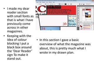
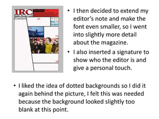
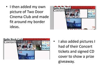
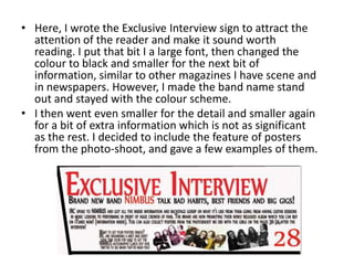
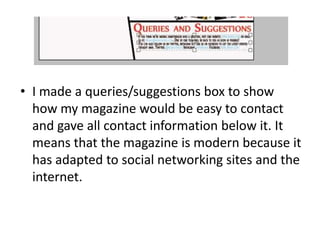
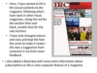
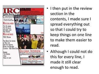
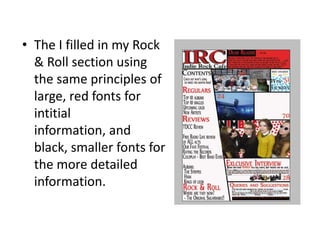
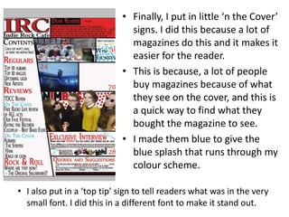
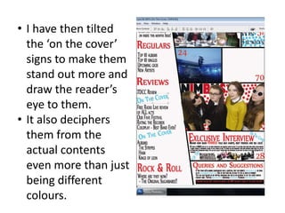
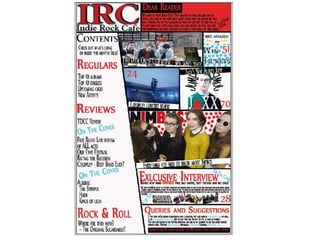
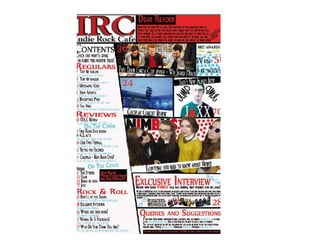
1) The document describes the process of designing the contents page for a magazine, including adding images, text, colors, and layout elements.
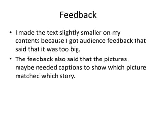
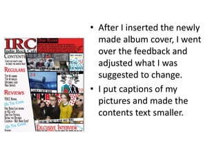
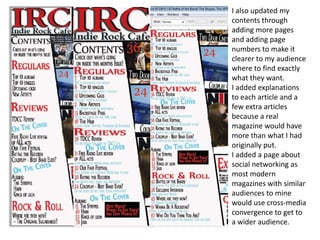
2) Feedback was received on making the text smaller and adding captions to images. Changes were made based on this feedback.
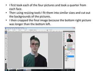
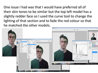
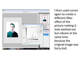
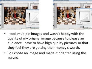
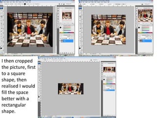
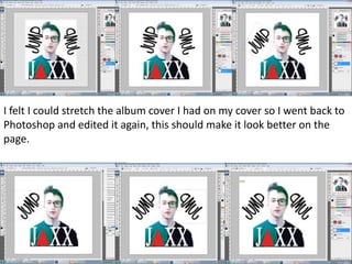
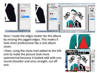
3) An album cover was designed by combining faces from different images. Additional editing was done to improve the quality and layout of the album cover image.
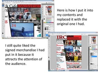
4) The final contents page was updated by replacing the original album cover image, adding more pages and page numbers, and including additional articles and explanations.

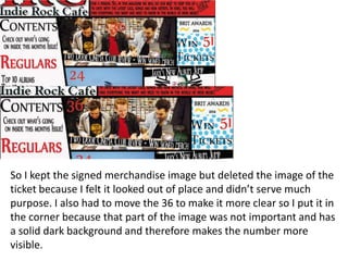


![Final%20 magazine%20–%20double%20page%20spread[2]](https://cdn.slidesharecdn.com/ss_thumbnails/final20magazine2020double20page20spread2-120511045804-phpapp02-thumbnail.jpg?width=640&height=640&fit=bounds)


