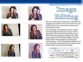
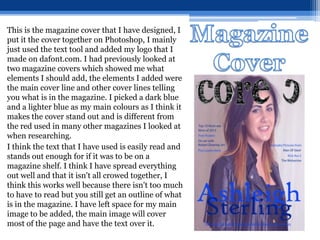
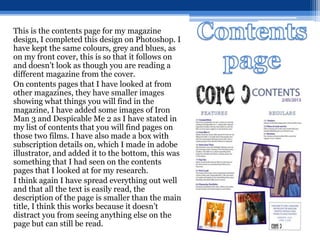
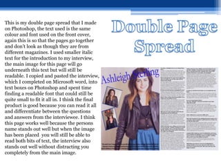
SlideShare a Scribd company logo
Magazine Design Evaluation
Cesca Haig
For my initial research I created a
questionnaire and gave it to people
around college and to people in my
class to fill in, I put all the results in a
table so that I could compare the
results for each question and find the
things that I should include in my
magazine.
My results showed that I should
include advertisement for free posters
and interviews with different
actors/actresses. They also showed
that people were more likely to buy a
magazine if they were offered free
things and had more pictures than
writing. The results showed me what
type of cover people were most drawn
to so I used that magazine as
inspiration for my magazine cover.
For my product I compared two magazine covers,
as I originally was going to do a music magazine
I compared two music magazine, from this I
learnt about all the different parts of a magazine
and how they are made to stand out. This
research showed me that I should include things
such as cover lines and a main selling line. It also
showed me that I should have a bold title to stand
out as this would help if I was actually selling my
magazine.
I also compared two double page spreads and two
contents pages, so that I could see what elements
I should add to mine, this helped me decide how
to set out my double page spread and what things
I should have on my contents page.
This is my logo design, I picked it
from a selection of five that I found
on the website www.dafont.com.
I liked this design best out of all of
them because I thought it stood out
the most as all the others were a
thinner font. This font is more
scribbly, rather than a computer
text which the others were. I think
this goes more with my magazine
design because I didn’t want my
magazine to be too strict looking,
this is because I wanted it to appeal
to young teenagers as well as older,
more mature people.
These are some of the images that I edited for my
magazine, the bottom one is the one for the cover
and the others were used on the contents and
double page spread.
For each image I cropped them down so there
was less background and more person. I then
changed the hue and saturation of the image, I
did to make the images less bright and to take
away the glare from the light slightly. The next
thing I did to these images was changed the
colour balance, I only changed them slightly as to
not changed the colouring too much but to make
all the colours match up on the image.
This is the magazine cover that I have designed, I
put it the cover together on Photoshop, I mainly
just used the text tool and added my logo that I
made on dafont.com. I had previously looked at
two magazine covers which showed me what
elements I should add, the elements I added were
the main cover line and other cover lines telling
you what is in the magazine. I picked a dark blue
and a lighter blue as my main colours as I think it
makes the cover stand out and is different from
the red used in many other magazines I looked at
when researching.
I think the text that I have used is easily read and
stands out enough for if it was to be on a
magazine shelf. I think I have spread everything
out well and that it isn't all crowed together, I
think this works well because there isn't too much
to have to read but you still get an outline of what
is in the magazine. I have left space for my main
image to be added, the main image will cover
most of the page and have the text over it.
This is the contents page for my magazine
design, I completed this design on Photoshop. I
have kept the same colours, grey and blues, as
on my front cover, this is so that it follows on
and doesn’t look as though you are reading a
different magazine from the cover.
On contents pages that I have looked at from
other magazines, they have smaller images
showing what things you will find in the
magazine, I have added some images of Iron
Man 3 and Despicable Me 2 as I have stated in
my list of contents that you will find pages on
those two films. I have also made a box with
subscription details on, which I made in adobe
illustrator, and added it to the bottom, this was
something that I had seen on the contents
pages that I looked at for my research.
I think again I have spread everything out well
and that all the text is easily read, the
description of the page is smaller than the main
title, I think this works because it doesn’t
distract you from seeing anything else on the
page but can still be read.
This is my double page spread that I made
on Photoshop, the text used is the same
colour and font used on the front cover,
again this is so that the pages go together
and don’t look as though they are from
different magazines. I used smaller italic
text for the introduction to my interview,
the main image for this page will go
underneath this text but will still be
readable. I copied and pasted the interview,
which I completed on Microsoft word, into
text boxes on Photoshop and spent time
finding a readable font that could still be
quite small to fit it all in. I think the final
product is good because you can read it all
and differentiate between the questions
and answers from the interviewee. I think
this page works well because the persons
name stands out well but when the image
has been placed you will still be able to
read both bits of text, the interview also
stands out well without distracting you
completely from the main image.
To gather feedback on my magazine I made a survey on
a website called survey monkey, I put a link to the
survey and my magazine on to a blog, I thought this
was an easier way for people to see what they are giving
feedback on and for them to find the feedback survey. I
then asked 10 people to complete the survey.
Link to survey - http://www.surveymonkey.com/s/RW8C5MY
Link to Blog - http://cescamagsurvey.blogspot.co.uk/
Results -
I think that the task I did best were the
research into magazine covers, contents
and double page spreads.
I think that my finished cover is good as I
have used the covers I researched and
others that I have seen and used different
elements from them on my magazine, this
shows that I have used the research that I
did and used it to help me make my
magazine look more professional.
I have been consistent with the house style
throughout the magazine and I think it is
all easily read and well set out.
I do think my research was my biggest
strength in this project, this is possibly
because it is something that I enjoy doing
as in other projects that has been my
strength also.
My weaknesses on this project were time
management, I didn’t get my images until
the very end when I had completed
everything else. It took me a while to
actually get into the project and I spent a
few weeks wasting time not doing anything.
This was not an ideal thing to do as it
meant that some of my work might look
rushed although I did go back and try to
improve this.
I am easily distracted by the internet and
this is another reason why my work took a
while longer than it should of done. While
we were doing this project we swapped
teachers and for a while he was unsure of
what work to set us but this was sorted out
by our original tutor and our new one
within a week.

More Related Content

What's hot

Pr11 Production Commentary
Pr11 Production CommentaryPr11 Production Commentary
Pr11 Production Commentary
ryansharman
 
7. evaluation(2) powerpoint
7. evaluation(2) powerpoint7. evaluation(2) powerpoint
7. evaluation(2) powerpoint
thomasmoore143
 
Fmp evaluation
Fmp evaluationFmp evaluation
Fmp evaluation
stefan hughes
 
7. evaluation(1)
7. evaluation(1)7. evaluation(1)
7. evaluation(1)
OliverKeppie
 
Contents construction
Contents constructionContents construction
Contents construction
Lewis Thickpenny
 
Cover construction
Cover constructionCover construction
Cover construction
Lewis Thickpenny
 
Preliminary task
Preliminary taskPreliminary task
Preliminary task
10bertal
 
Evaluation Question 7: Looking back at your preliminary task, what do you fee...
Evaluation Question 7: Looking back at your preliminary task, what do you fee...Evaluation Question 7: Looking back at your preliminary task, what do you fee...
Evaluation Question 7: Looking back at your preliminary task, what do you fee...
Sandra Palpuchowska
 
Plans for front cover, contents page & double page spread
Plans for front cover, contents page & double page spreadPlans for front cover, contents page & double page spread
Plans for front cover, contents page & double page spread
SuzyQuinn13
 
Fmp evaluation real
Fmp evaluation realFmp evaluation real
Fmp evaluation real
stefan hughes
 
Evaluation
EvaluationEvaluation
Evaluation
Imogen Minto
 
Evaluation
EvaluationEvaluation
Evaluation
Ellie Marsh
 
Evaluation
EvaluationEvaluation
Evaluation
Ellie Marsh
 

What's hot (20)

Pr11 Production Commentary
Pr11 Production CommentaryPr11 Production Commentary
Pr11 Production Commentary
 
7. evaluation(2) powerpoint
7. evaluation(2) powerpoint7. evaluation(2) powerpoint
7. evaluation(2) powerpoint
 
Evaluation
EvaluationEvaluation
Evaluation
 
Fmp evaluation
Fmp evaluationFmp evaluation
Fmp evaluation
 
7. evaluation(1)
7. evaluation(1)7. evaluation(1)
7. evaluation(1)
 
Contents construction
Contents constructionContents construction
Contents construction
 
Dps construction
Dps constructionDps construction
Dps construction
 
Cover construction
Cover constructionCover construction
Cover construction
 
Preliminary task
Preliminary taskPreliminary task
Preliminary task
 
Evaluation Question 7: Looking back at your preliminary task, what do you fee...
Evaluation Question 7: Looking back at your preliminary task, what do you fee...Evaluation Question 7: Looking back at your preliminary task, what do you fee...
Evaluation Question 7: Looking back at your preliminary task, what do you fee...
 
Q7
Q7Q7
Q7
 
Plans for front cover, contents page & double page spread
Plans for front cover, contents page & double page spreadPlans for front cover, contents page & double page spread
Plans for front cover, contents page & double page spread
 
Fmp evaluation real
Fmp evaluation realFmp evaluation real
Fmp evaluation real
 
Evaluation
EvaluationEvaluation
Evaluation
 
Task 7
Task 7Task 7
Task 7
 
Evaluation
EvaluationEvaluation
Evaluation
 
Evaluation (4)
Evaluation (4)Evaluation (4)
Evaluation (4)
 
Task 8
Task 8Task 8
Task 8
 
Evaluation
EvaluationEvaluation
Evaluation
 
Evaluation
EvaluationEvaluation
Evaluation
 

Similar to Magazine design evaluation

7. evaluation(3)
7. evaluation(3)7. evaluation(3)
7. evaluation(3)
Jordannekay99
 
Step by step contents
Step by step contentsStep by step contents
Step by step contentskatebrindley
 
evaluation 7
evaluation 7evaluation 7
evaluation 7
FelixStanton
 
7. evaluation
7. evaluation7. evaluation
7. evaluation
tonigibson2
 
Evaluation question 1
Evaluation question 1Evaluation question 1
Evaluation question 1
sophiemaiboston
 
7. evaluation(1)
7. evaluation(1)7. evaluation(1)
7. evaluation(1)
jackedwards46
 
Question 7- Evaluation
Question 7- EvaluationQuestion 7- Evaluation
Question 7- Evaluation
jackrichards96
 
Production reflection fmp
 Production reflection fmp Production reflection fmp
Production reflection fmp
jackedwardsz
 
Music magazine evaluation
Music magazine evaluationMusic magazine evaluation
Music magazine evaluationRE2707
 
Evaluation on main task
Evaluation on main taskEvaluation on main task
Evaluation on main taskToddy888
 
3. experiments finished
3. experiments finished3. experiments finished
3. experiments finished
amy foster
 
Flatplans of all 3 pages
Flatplans of all 3 pagesFlatplans of all 3 pages
Flatplans of all 3 pagestheresakuhn4
 

Similar to Magazine design evaluation (20)

7. evaluation(3)
7. evaluation(3)7. evaluation(3)
7. evaluation(3)
 
Final
FinalFinal
Final
 
Step by step contents
Step by step contentsStep by step contents
Step by step contents
 
Magazine Evaluation PowerPoint
Magazine Evaluation PowerPointMagazine Evaluation PowerPoint
Magazine Evaluation PowerPoint
 
Q7
Q7Q7
Q7
 
evaluation 7
evaluation 7evaluation 7
evaluation 7
 
Evaluation
Evaluation Evaluation
Evaluation
 
7. evaluation
7. evaluation7. evaluation
7. evaluation
 
Evaluation question 1
Evaluation question 1Evaluation question 1
Evaluation question 1
 
7. evaluation(1)
7. evaluation(1)7. evaluation(1)
7. evaluation(1)
 
Evaluation
EvaluationEvaluation
Evaluation
 
Question 7- Evaluation
Question 7- EvaluationQuestion 7- Evaluation
Question 7- Evaluation
 
Production reflection fmp
 Production reflection fmp Production reflection fmp
Production reflection fmp
 
Music magazine evaluation
Music magazine evaluationMusic magazine evaluation
Music magazine evaluation
 
Evaluation
EvaluationEvaluation
Evaluation
 
Evaluation
EvaluationEvaluation
Evaluation
 
Evaluation
EvaluationEvaluation
Evaluation
 
Evaluation on main task
Evaluation on main taskEvaluation on main task
Evaluation on main task
 
3. experiments finished
3. experiments finished3. experiments finished
3. experiments finished
 
Flatplans of all 3 pages
Flatplans of all 3 pagesFlatplans of all 3 pages
Flatplans of all 3 pages
 

More from WanderingHalle (20)

Sound recording d corridor
Sound recording d corridorSound recording d corridor
Sound recording d corridor
 
Joel meyerowitz
Joel meyerowitzJoel meyerowitz
Joel meyerowitz
 
Joel meyerowitz
Joel meyerowitzJoel meyerowitz
Joel meyerowitz
 
Mary ellen mark[1]
Mary ellen mark[1]Mary ellen mark[1]
Mary ellen mark[1]
 
Proposal for portrait shoot
Proposal for portrait shootProposal for portrait shoot
Proposal for portrait shoot
 
Making of spocnet
Making of spocnetMaking of spocnet
Making of spocnet
 
Contact
ContactContact
Contact
 
Review of portrait images
Review of portrait imagesReview of portrait images
Review of portrait images
 
How i edited do this toda cesc x
How i edited   do this toda cesc xHow i edited   do this toda cesc x
How i edited do this toda cesc x
 
Proposal
Proposal Proposal
Proposal
 
Reviewthingdothiscesca
ReviewthingdothiscescaReviewthingdothiscesca
Reviewthingdothiscesca
 
Andy
AndyAndy
Andy
 
Reviewthingdothiscesca
ReviewthingdothiscescaReviewthingdothiscesca
Reviewthingdothiscesca
 
Iron Man 3
Iron Man 3 Iron Man 3
Iron Man 3
 
Presentation1
Presentation1Presentation1
Presentation1
 
Magaizne Pages
Magaizne Pages Magaizne Pages
Magaizne Pages
 
Glossary
GlossaryGlossary
Glossary
 
Pitch powerpoint
Pitch powerpointPitch powerpoint
Pitch powerpoint
 
Research
ResearchResearch
Research
 
Final major project proposal form
Final major project proposal formFinal major project proposal form
Final major project proposal form
 

Recently uploaded

Codes n Conventionss copy (2).pptx new new
Codes n Conventionss copy (2).pptx new newCodes n Conventionss copy (2).pptx new new
Codes n Conventionss copy (2).pptx new new
ZackSpencer3
 
2137ad Merindol Colony Interiors where refugee try to build a seemengly norm...
2137ad  Merindol Colony Interiors where refugee try to build a seemengly norm...2137ad  Merindol Colony Interiors where refugee try to build a seemengly norm...
2137ad Merindol Colony Interiors where refugee try to build a seemengly norm...
luforfor
 
IrishWritersCtrsPersonalEssaysMay29.pptx
IrishWritersCtrsPersonalEssaysMay29.pptxIrishWritersCtrsPersonalEssaysMay29.pptx
IrishWritersCtrsPersonalEssaysMay29.pptx
Aine Greaney Ellrott
 
Sundabet | Slot gacor dan terpercaya mudah menang
Sundabet | Slot gacor dan terpercaya mudah menangSundabet | Slot gacor dan terpercaya mudah menang
Sundabet | Slot gacor dan terpercaya mudah menang
Sundabet | Situs Slot gacor dan terpercaya
 
ashokathegreat project class 12 presentation
ashokathegreat project class 12 presentationashokathegreat project class 12 presentation
ashokathegreat project class 12 presentation
aditiyad2020
 
The Last Polymath: Muntadher Saleh‎‎‎‎‎‎‎‎‎‎‎‎
The Last Polymath: Muntadher Saleh‎‎‎‎‎‎‎‎‎‎‎‎The Last Polymath: Muntadher Saleh‎‎‎‎‎‎‎‎‎‎‎‎
The Last Polymath: Muntadher Saleh‎‎‎‎‎‎‎‎‎‎‎‎
iraqartsandculture
 
一比一原版(DU毕业证)迪肯大学毕业证成绩单
一比一原版(DU毕业证)迪肯大学毕业证成绩单一比一原版(DU毕业证)迪肯大学毕业证成绩单
一比一原版(DU毕业证)迪肯大学毕业证成绩单
zvaywau
 
一比一原版(qut毕业证)昆士兰科技大学毕业证如何办理
一比一原版(qut毕业证)昆士兰科技大学毕业证如何办理一比一原版(qut毕业证)昆士兰科技大学毕业证如何办理
一比一原版(qut毕业证)昆士兰科技大学毕业证如何办理
taqyed
 
CLASS XII- HISTORY-THEME 4-Thinkers, Bes
CLASS XII- HISTORY-THEME 4-Thinkers, BesCLASS XII- HISTORY-THEME 4-Thinkers, Bes
CLASS XII- HISTORY-THEME 4-Thinkers, Bes
aditiyad2020
 
thGAP - BAbyss in Moderno!! Transgenic Human Germline Alternatives Project
thGAP - BAbyss in Moderno!!  Transgenic Human Germline Alternatives ProjectthGAP - BAbyss in Moderno!!  Transgenic Human Germline Alternatives Project
thGAP - BAbyss in Moderno!! Transgenic Human Germline Alternatives Project
Marc Dusseiller Dusjagr
 
2137ad - Characters that live in Merindol and are at the center of main stories
2137ad - Characters that live in Merindol and are at the center of main stories2137ad - Characters that live in Merindol and are at the center of main stories
2137ad - Characters that live in Merindol and are at the center of main stories
luforfor
 
Memory Rental Store - The Ending(Storyboard)
Memory Rental Store - The Ending(Storyboard)Memory Rental Store - The Ending(Storyboard)
Memory Rental Store - The Ending(Storyboard)
SuryaKalyan3
 
acting board rough title here lolaaaaaaa
acting board rough title here lolaaaaaaaacting board rough title here lolaaaaaaa
acting board rough title here lolaaaaaaa
angelicafronda7
 
一比一原版UPenn毕业证宾夕法尼亚大学毕业证成绩单如何办理
一比一原版UPenn毕业证宾夕法尼亚大学毕业证成绩单如何办理一比一原版UPenn毕业证宾夕法尼亚大学毕业证成绩单如何办理
一比一原版UPenn毕业证宾夕法尼亚大学毕业证成绩单如何办理
beduwt
 
Caffeinated Pitch Bible- developed by Claire Wilson
Caffeinated Pitch Bible- developed by Claire WilsonCaffeinated Pitch Bible- developed by Claire Wilson
Caffeinated Pitch Bible- developed by Claire Wilson
ClaireWilson398082
 
一比一原版(GU毕业证)格里菲斯大学毕业证成绩单
一比一原版(GU毕业证)格里菲斯大学毕业证成绩单一比一原版(GU毕业证)格里菲斯大学毕业证成绩单
一比一原版(GU毕业证)格里菲斯大学毕业证成绩单
zvaywau
 
The Legacy of Breton In A New Age by Master Terrance Lindall
The Legacy of Breton In A New Age by Master Terrance LindallThe Legacy of Breton In A New Age by Master Terrance Lindall
The Legacy of Breton In A New Age by Master Terrance Lindall
BBaez1
 
ART FORMS OF KERALA: TRADITIONAL AND OTHERS
ART FORMS OF KERALA: TRADITIONAL AND OTHERSART FORMS OF KERALA: TRADITIONAL AND OTHERS
ART FORMS OF KERALA: TRADITIONAL AND OTHERS
Sandhya J.Nair
 
Inter-Dimensional Girl Boards Segment (Act 3)
Inter-Dimensional Girl Boards Segment (Act 3)Inter-Dimensional Girl Boards Segment (Act 3)
Inter-Dimensional Girl Boards Segment (Act 3)
CristianMestre
 

Recently uploaded (20)

Codes n Conventionss copy (2).pptx new new
Codes n Conventionss copy (2).pptx new newCodes n Conventionss copy (2).pptx new new
Codes n Conventionss copy (2).pptx new new
 
2137ad Merindol Colony Interiors where refugee try to build a seemengly norm...
2137ad  Merindol Colony Interiors where refugee try to build a seemengly norm...2137ad  Merindol Colony Interiors where refugee try to build a seemengly norm...
2137ad Merindol Colony Interiors where refugee try to build a seemengly norm...
 
IrishWritersCtrsPersonalEssaysMay29.pptx
IrishWritersCtrsPersonalEssaysMay29.pptxIrishWritersCtrsPersonalEssaysMay29.pptx
IrishWritersCtrsPersonalEssaysMay29.pptx
 
Sundabet | Slot gacor dan terpercaya mudah menang
Sundabet | Slot gacor dan terpercaya mudah menangSundabet | Slot gacor dan terpercaya mudah menang
Sundabet | Slot gacor dan terpercaya mudah menang
 
ashokathegreat project class 12 presentation
ashokathegreat project class 12 presentationashokathegreat project class 12 presentation
ashokathegreat project class 12 presentation
 
European Cybersecurity Skills Framework Role Profiles.pdf
European Cybersecurity Skills Framework Role Profiles.pdfEuropean Cybersecurity Skills Framework Role Profiles.pdf
European Cybersecurity Skills Framework Role Profiles.pdf
 
The Last Polymath: Muntadher Saleh‎‎‎‎‎‎‎‎‎‎‎‎
The Last Polymath: Muntadher Saleh‎‎‎‎‎‎‎‎‎‎‎‎The Last Polymath: Muntadher Saleh‎‎‎‎‎‎‎‎‎‎‎‎
The Last Polymath: Muntadher Saleh‎‎‎‎‎‎‎‎‎‎‎‎
 
一比一原版(DU毕业证)迪肯大学毕业证成绩单
一比一原版(DU毕业证)迪肯大学毕业证成绩单一比一原版(DU毕业证)迪肯大学毕业证成绩单
一比一原版(DU毕业证)迪肯大学毕业证成绩单
 
一比一原版(qut毕业证)昆士兰科技大学毕业证如何办理
一比一原版(qut毕业证)昆士兰科技大学毕业证如何办理一比一原版(qut毕业证)昆士兰科技大学毕业证如何办理
一比一原版(qut毕业证)昆士兰科技大学毕业证如何办理
 
CLASS XII- HISTORY-THEME 4-Thinkers, Bes
CLASS XII- HISTORY-THEME 4-Thinkers, BesCLASS XII- HISTORY-THEME 4-Thinkers, Bes
CLASS XII- HISTORY-THEME 4-Thinkers, Bes
 
thGAP - BAbyss in Moderno!! Transgenic Human Germline Alternatives Project
thGAP - BAbyss in Moderno!!  Transgenic Human Germline Alternatives ProjectthGAP - BAbyss in Moderno!!  Transgenic Human Germline Alternatives Project
thGAP - BAbyss in Moderno!! Transgenic Human Germline Alternatives Project
 
2137ad - Characters that live in Merindol and are at the center of main stories
2137ad - Characters that live in Merindol and are at the center of main stories2137ad - Characters that live in Merindol and are at the center of main stories
2137ad - Characters that live in Merindol and are at the center of main stories
 
Memory Rental Store - The Ending(Storyboard)
Memory Rental Store - The Ending(Storyboard)Memory Rental Store - The Ending(Storyboard)
Memory Rental Store - The Ending(Storyboard)
 
acting board rough title here lolaaaaaaa
acting board rough title here lolaaaaaaaacting board rough title here lolaaaaaaa
acting board rough title here lolaaaaaaa
 
一比一原版UPenn毕业证宾夕法尼亚大学毕业证成绩单如何办理
一比一原版UPenn毕业证宾夕法尼亚大学毕业证成绩单如何办理一比一原版UPenn毕业证宾夕法尼亚大学毕业证成绩单如何办理
一比一原版UPenn毕业证宾夕法尼亚大学毕业证成绩单如何办理
 
Caffeinated Pitch Bible- developed by Claire Wilson
Caffeinated Pitch Bible- developed by Claire WilsonCaffeinated Pitch Bible- developed by Claire Wilson
Caffeinated Pitch Bible- developed by Claire Wilson
 
一比一原版(GU毕业证)格里菲斯大学毕业证成绩单
一比一原版(GU毕业证)格里菲斯大学毕业证成绩单一比一原版(GU毕业证)格里菲斯大学毕业证成绩单
一比一原版(GU毕业证)格里菲斯大学毕业证成绩单
 
The Legacy of Breton In A New Age by Master Terrance Lindall
The Legacy of Breton In A New Age by Master Terrance LindallThe Legacy of Breton In A New Age by Master Terrance Lindall
The Legacy of Breton In A New Age by Master Terrance Lindall
 
ART FORMS OF KERALA: TRADITIONAL AND OTHERS
ART FORMS OF KERALA: TRADITIONAL AND OTHERSART FORMS OF KERALA: TRADITIONAL AND OTHERS
ART FORMS OF KERALA: TRADITIONAL AND OTHERS
 
Inter-Dimensional Girl Boards Segment (Act 3)
Inter-Dimensional Girl Boards Segment (Act 3)Inter-Dimensional Girl Boards Segment (Act 3)
Inter-Dimensional Girl Boards Segment (Act 3)
 

Magazine design evaluation

  • 2. For my initial research I created a questionnaire and gave it to people around college and to people in my class to fill in, I put all the results in a table so that I could compare the results for each question and find the things that I should include in my magazine. My results showed that I should include advertisement for free posters and interviews with different actors/actresses. They also showed that people were more likely to buy a magazine if they were offered free things and had more pictures than writing. The results showed me what type of cover people were most drawn to so I used that magazine as inspiration for my magazine cover.
  • 3. For my product I compared two magazine covers, as I originally was going to do a music magazine I compared two music magazine, from this I learnt about all the different parts of a magazine and how they are made to stand out. This research showed me that I should include things such as cover lines and a main selling line. It also showed me that I should have a bold title to stand out as this would help if I was actually selling my magazine. I also compared two double page spreads and two contents pages, so that I could see what elements I should add to mine, this helped me decide how to set out my double page spread and what things I should have on my contents page.
  • 4. This is my logo design, I picked it from a selection of five that I found on the website www.dafont.com. I liked this design best out of all of them because I thought it stood out the most as all the others were a thinner font. This font is more scribbly, rather than a computer text which the others were. I think this goes more with my magazine design because I didn’t want my magazine to be too strict looking, this is because I wanted it to appeal to young teenagers as well as older, more mature people.
  • 5. These are some of the images that I edited for my magazine, the bottom one is the one for the cover and the others were used on the contents and double page spread. For each image I cropped them down so there was less background and more person. I then changed the hue and saturation of the image, I did to make the images less bright and to take away the glare from the light slightly. The next thing I did to these images was changed the colour balance, I only changed them slightly as to not changed the colouring too much but to make all the colours match up on the image.
  • 6. This is the magazine cover that I have designed, I put it the cover together on Photoshop, I mainly just used the text tool and added my logo that I made on dafont.com. I had previously looked at two magazine covers which showed me what elements I should add, the elements I added were the main cover line and other cover lines telling you what is in the magazine. I picked a dark blue and a lighter blue as my main colours as I think it makes the cover stand out and is different from the red used in many other magazines I looked at when researching. I think the text that I have used is easily read and stands out enough for if it was to be on a magazine shelf. I think I have spread everything out well and that it isn't all crowed together, I think this works well because there isn't too much to have to read but you still get an outline of what is in the magazine. I have left space for my main image to be added, the main image will cover most of the page and have the text over it.
  • 7. This is the contents page for my magazine design, I completed this design on Photoshop. I have kept the same colours, grey and blues, as on my front cover, this is so that it follows on and doesn’t look as though you are reading a different magazine from the cover. On contents pages that I have looked at from other magazines, they have smaller images showing what things you will find in the magazine, I have added some images of Iron Man 3 and Despicable Me 2 as I have stated in my list of contents that you will find pages on those two films. I have also made a box with subscription details on, which I made in adobe illustrator, and added it to the bottom, this was something that I had seen on the contents pages that I looked at for my research. I think again I have spread everything out well and that all the text is easily read, the description of the page is smaller than the main title, I think this works because it doesn’t distract you from seeing anything else on the page but can still be read.
  • 8. This is my double page spread that I made on Photoshop, the text used is the same colour and font used on the front cover, again this is so that the pages go together and don’t look as though they are from different magazines. I used smaller italic text for the introduction to my interview, the main image for this page will go underneath this text but will still be readable. I copied and pasted the interview, which I completed on Microsoft word, into text boxes on Photoshop and spent time finding a readable font that could still be quite small to fit it all in. I think the final product is good because you can read it all and differentiate between the questions and answers from the interviewee. I think this page works well because the persons name stands out well but when the image has been placed you will still be able to read both bits of text, the interview also stands out well without distracting you completely from the main image.
  • 9. To gather feedback on my magazine I made a survey on a website called survey monkey, I put a link to the survey and my magazine on to a blog, I thought this was an easier way for people to see what they are giving feedback on and for them to find the feedback survey. I then asked 10 people to complete the survey. Link to survey - http://www.surveymonkey.com/s/RW8C5MY Link to Blog - http://cescamagsurvey.blogspot.co.uk/ Results -
  • 10.
  • 11. I think that the task I did best were the research into magazine covers, contents and double page spreads. I think that my finished cover is good as I have used the covers I researched and others that I have seen and used different elements from them on my magazine, this shows that I have used the research that I did and used it to help me make my magazine look more professional. I have been consistent with the house style throughout the magazine and I think it is all easily read and well set out. I do think my research was my biggest strength in this project, this is possibly because it is something that I enjoy doing as in other projects that has been my strength also.
  • 12. My weaknesses on this project were time management, I didn’t get my images until the very end when I had completed everything else. It took me a while to actually get into the project and I spent a few weeks wasting time not doing anything. This was not an ideal thing to do as it meant that some of my work might look rushed although I did go back and try to improve this. I am easily distracted by the internet and this is another reason why my work took a while longer than it should of done. While we were doing this project we swapped teachers and for a while he was unsure of what work to set us but this was sorted out by our original tutor and our new one within a week.