FMP Evaluation
Your name
Production Process Evaluation
Research
• For my final project I looked at several different magazines and websites I
thought may influence my own, the strengths I noticed while doing this is
that it helped me find a certain magazine and website. I then took and
used it as a starting point of ideas and similarities, also it helped me find
out what I should include and where things go o n my pages. It showed me
how I must lay the magazine out to certain proportions and use rulers too
lay it out perfectly.
• Although I would have like to of made a mind map of my ideas for my
research, as I think it allows you to have a starting point of ideas and
something I can work from. Not doing this idea meant I only had the vice
magazine to work from making mine not as completely original as I would
have liked mi ne to be.
Planning
• When planning my magazine I used several methods of planning, I think
my biggest strength in planning was my style sheets which allowed me too
chose what colours and fonts I was going to use before hand saving me
lots of time. Also the layout pages I made gave me the chance to see what
the fonts I chose look like on the page and shows me whether or not they
will fit my genre and the colour scheme.
• Although with my planning I believe I could of planned more in advance,
making more layouts for the several other pages I made giving me a head
start and not having too start from scratch.
• Also I think I could collected my images I used sooner due to me being left
with nothing to do because I didn’t have the images or text I needed ready
yet, this would have given me more time on production to help me finesse
the pages.
Time Management
• I believe that I did manage my time well at first due to the fact I made six
pages when my initial plan was to only make four. But after I made my
pages I didn’t estimate the time I had left, and tried too make another
page taking away my time from adding the finish touches to the other
pages and making the rulers perfect.
• I believe if I didn’t waste my time at the end I would have gone back and
touched up the pages I did complete, making the boarders for the ruler
perfect on each page making it look far more professional.
• I also believe if I had more time I also would have made more graphic art
for the poster page I made, adding to the punks body and more related
images (e.g anarchy symbol). Because I believe it was a bit rushed at the
end and looked a bit boring.
Technical Qualities
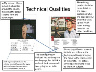
Both my own product and the
existing product have similar layout
with the image the main centre
focus, with the text below it.
In My product I have
included a boarder
around the image,
matching the colour
scheme from the
other pages.
On my page I have chosen to
include less colour in the
background image bringing
the focus to the main center
of the photo. This acts as
white space drawing focus
to the main subject.,
The existing
product includes
more detail on
the pages
explaining what
the page covers, I
think this takes
up too much
room leaving
none for the
other headlines.
The existing product
includes less white space
on the page, but I think it
makes it look messy and I
was going for an indie
genre.
Aesthetic Qualities
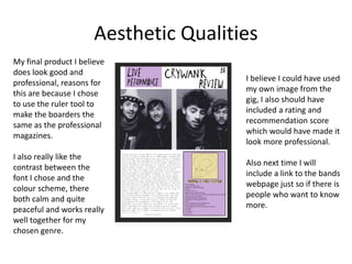
My final product I believe
does look good and
professional, reasons for
this are because I chose
to use the ruler tool to
make the boarders the
same as the professional
magazines.
I also really like the
contrast between the
font I chose and the
colour scheme, there
both calm and quite
peaceful and works really
well together for my
chosen genre.
I believe I could have used
my own image from the
gig, I also should have
included a rating and
recommendation score
which would have made it
look more professional.
Also next time I will
include a link to the bands
webpage just so if there is
people who want to know
more.
Audience Appeal
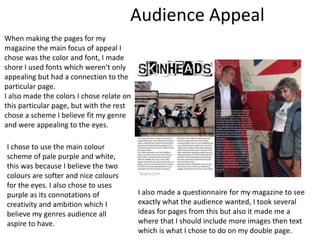
When making the pages for my
magazine the main focus of appeal I
chose was the color and font, I made
shore I used fonts which weren't only
appealing but had a connection to the
particular page.
I also made the colors I chose relate on
this particular page, but with the rest
chose a scheme I believe fit my genre
and were appealing to the eyes.
I chose to use the main colour
scheme of pale purple and white,
this was because I believe the two
colours are softer and nice colours
for the eyes. I also chose to uses
purple as its connotations of
creativity and ambition which I
believe my genres audience all
aspire to have.
I also made a questionnaire for my magazine to see
exactly what the audience wanted, I took several
ideas for pages from this but also it made me a
where that I should include more images then text
which is what I chose to do on my double page.
Peer
Feedback
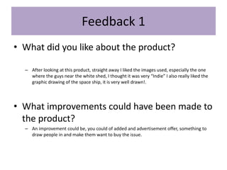
Feedback 1
• What did you like about the product?
– After looking at this product, straight away I liked the images used, especially the one
where the guys near the white shed, I thought it was very “Indie” I also really liked the
graphic drawing of the space ship, it is very well drawn!.
• What improvements could have been made to
the product?
– An improvement could be, you could of added and advertisement offer, something to
draw people in and make them want to buy the issue.
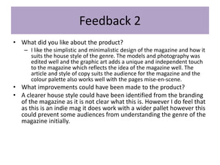
Feedback 2
• What did you like about the product?
– I like the simplistic and minimalistic design of the magazine and how it
suits the house style of the genre. The models and photography was
edited well and the graphic art adds a unique and independent touch
to the magazine which reflects the idea of the magazine well. The
article and style of copy suits the audience for the magazine and the
colour palette also works well with the pages mise-en-scene.
• What improvements could have been made to the product?
• A clearer house style could have been identified from the branding
of the magazine as it is not clear what this is. However I do feel that
as this is an indie mag it does work with a wider pallet however this
could prevent some audiences from understanding the genre of the
magazine initially.
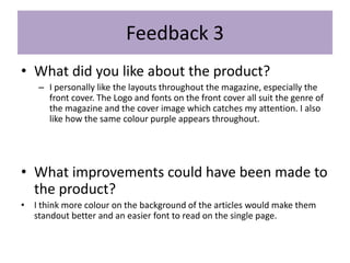
Feedback 3
• What did you like about the product?
– I personally like the layouts throughout the magazine, especially the
front cover. The Logo and fonts on the front cover all suit the genre of
the magazine and the cover image which catches my attention. I also
like how the same colour purple appears throughout.
• What improvements could have been made to
the product?
• I think more colour on the background of the articles would make them
standout better and an easier font to read on the single page.
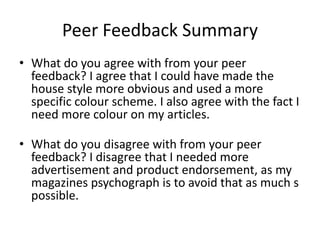
Peer Feedback Summary
• What do you agree with from your peer
feedback? I agree that I could have made the
house style more obvious and used a more
specific colour scheme. I also agree with the fact I
need more colour on my articles.
• What do you disagree with from your peer
feedback? I disagree that I needed more
advertisement and product endorsement, as my
magazines psychograph is to avoid that as much s
possible.
Peer Feedback Summary
From my peer feedback I have several improvements I believe I could make for
my magazine, firstly I believe I could make the house genre of the magazine
clearer including more colours to make the genre of the magazine stand out.
I also believe I should include more colour on my article and review, as I believe
it will make the images and text I used stand out more and be more eye
popping.
I think if I was to make these improvements to the magazine it would increase
the amount of people who will be interested, I believe this because if I were to
make the house theme more obvious a larger number of people may recognise
the genre and be more interested to find out more about what's inside the
magazine.

7. fmp evaluation 2

  • 1.
  • 2.
  • 3.
    Research • For myfinal project I looked at several different magazines and websites I thought may influence my own, the strengths I noticed while doing this is that it helped me find a certain magazine and website. I then took and used it as a starting point of ideas and similarities, also it helped me find out what I should include and where things go o n my pages. It showed me how I must lay the magazine out to certain proportions and use rulers too lay it out perfectly. • Although I would have like to of made a mind map of my ideas for my research, as I think it allows you to have a starting point of ideas and something I can work from. Not doing this idea meant I only had the vice magazine to work from making mine not as completely original as I would have liked mi ne to be.
  • 4.
    Planning • When planningmy magazine I used several methods of planning, I think my biggest strength in planning was my style sheets which allowed me too chose what colours and fonts I was going to use before hand saving me lots of time. Also the layout pages I made gave me the chance to see what the fonts I chose look like on the page and shows me whether or not they will fit my genre and the colour scheme. • Although with my planning I believe I could of planned more in advance, making more layouts for the several other pages I made giving me a head start and not having too start from scratch. • Also I think I could collected my images I used sooner due to me being left with nothing to do because I didn’t have the images or text I needed ready yet, this would have given me more time on production to help me finesse the pages.
  • 5.
    Time Management • Ibelieve that I did manage my time well at first due to the fact I made six pages when my initial plan was to only make four. But after I made my pages I didn’t estimate the time I had left, and tried too make another page taking away my time from adding the finish touches to the other pages and making the rulers perfect. • I believe if I didn’t waste my time at the end I would have gone back and touched up the pages I did complete, making the boarders for the ruler perfect on each page making it look far more professional. • I also believe if I had more time I also would have made more graphic art for the poster page I made, adding to the punks body and more related images (e.g anarchy symbol). Because I believe it was a bit rushed at the end and looked a bit boring.
  • 6.
    Technical Qualities Both myown product and the existing product have similar layout with the image the main centre focus, with the text below it. In My product I have included a boarder around the image, matching the colour scheme from the other pages. On my page I have chosen to include less colour in the background image bringing the focus to the main center of the photo. This acts as white space drawing focus to the main subject., The existing product includes more detail on the pages explaining what the page covers, I think this takes up too much room leaving none for the other headlines. The existing product includes less white space on the page, but I think it makes it look messy and I was going for an indie genre.
  • 7.
    Aesthetic Qualities My finalproduct I believe does look good and professional, reasons for this are because I chose to use the ruler tool to make the boarders the same as the professional magazines. I also really like the contrast between the font I chose and the colour scheme, there both calm and quite peaceful and works really well together for my chosen genre. I believe I could have used my own image from the gig, I also should have included a rating and recommendation score which would have made it look more professional. Also next time I will include a link to the bands webpage just so if there is people who want to know more.
  • 8.
    Audience Appeal When makingthe pages for my magazine the main focus of appeal I chose was the color and font, I made shore I used fonts which weren't only appealing but had a connection to the particular page. I also made the colors I chose relate on this particular page, but with the rest chose a scheme I believe fit my genre and were appealing to the eyes. I chose to use the main colour scheme of pale purple and white, this was because I believe the two colours are softer and nice colours for the eyes. I also chose to uses purple as its connotations of creativity and ambition which I believe my genres audience all aspire to have. I also made a questionnaire for my magazine to see exactly what the audience wanted, I took several ideas for pages from this but also it made me a where that I should include more images then text which is what I chose to do on my double page.
  • 9.
  • 10.
    Feedback 1 • Whatdid you like about the product? – After looking at this product, straight away I liked the images used, especially the one where the guys near the white shed, I thought it was very “Indie” I also really liked the graphic drawing of the space ship, it is very well drawn!. • What improvements could have been made to the product? – An improvement could be, you could of added and advertisement offer, something to draw people in and make them want to buy the issue.
  • 11.
    Feedback 2 • Whatdid you like about the product? – I like the simplistic and minimalistic design of the magazine and how it suits the house style of the genre. The models and photography was edited well and the graphic art adds a unique and independent touch to the magazine which reflects the idea of the magazine well. The article and style of copy suits the audience for the magazine and the colour palette also works well with the pages mise-en-scene. • What improvements could have been made to the product? • A clearer house style could have been identified from the branding of the magazine as it is not clear what this is. However I do feel that as this is an indie mag it does work with a wider pallet however this could prevent some audiences from understanding the genre of the magazine initially.
  • 12.
    Feedback 3 • Whatdid you like about the product? – I personally like the layouts throughout the magazine, especially the front cover. The Logo and fonts on the front cover all suit the genre of the magazine and the cover image which catches my attention. I also like how the same colour purple appears throughout. • What improvements could have been made to the product? • I think more colour on the background of the articles would make them standout better and an easier font to read on the single page.
  • 13.
    Peer Feedback Summary •What do you agree with from your peer feedback? I agree that I could have made the house style more obvious and used a more specific colour scheme. I also agree with the fact I need more colour on my articles. • What do you disagree with from your peer feedback? I disagree that I needed more advertisement and product endorsement, as my magazines psychograph is to avoid that as much s possible.
  • 14.
    Peer Feedback Summary Frommy peer feedback I have several improvements I believe I could make for my magazine, firstly I believe I could make the house genre of the magazine clearer including more colours to make the genre of the magazine stand out. I also believe I should include more colour on my article and review, as I believe it will make the images and text I used stand out more and be more eye popping. I think if I was to make these improvements to the magazine it would increase the amount of people who will be interested, I believe this because if I were to make the house theme more obvious a larger number of people may recognise the genre and be more interested to find out more about what's inside the magazine.

Editor's Notes

  • #4 What were the strengths of your research? How did your research help your product? What were the weaknesses of your research? What could you have done better/improve? What effect would this have had on your product?
  • #5 What were the strengths of your planning? How did your planning help your product? What were the weaknesses of your planning? What could you have done better/improve? What effect would this have had on your product?
  • #6 Did you manage your time well? Did you complete your project on time or would your products have improved with additional time? What would you have done if you had more time to produce your work?
  • #7 Compare your work to similar existing products and discuss the similarities and differences Put your final piece(s) in the centre of a page alongside an existing product Use text boxes and arrows
  • #8 Does your work look good? Was it creative? What aspects of your game’s visuals do you like? What would you improve? How would you improve it? Discuss the strengths and weaknesses Put your final piece(s) in the centre of a page and analyse them Use text boxes and arrows
  • #9 How have you appealed to your target audience? What specific bits of content would appeal to your target audience. Refer to your findings from your questionnaire. Put your final piece(s) in the centre of a page and analyse them Use text boxes and arrows
  • #15 What changes would you make to your product based upon your peer feedback and why?