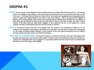
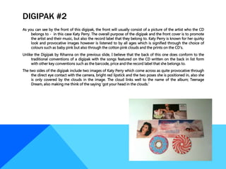
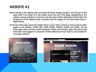
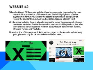
TataKelola dan KamSiber Kecerdasan Buatan v022.pdf
Product research draft 2
1.
2.
3. DIGIPAK #1
FRONT: As you can see by this digipak, the front usually consists of an image of the artist whose CD it is – the purpose
of this is to highlight to the audience who the CD was produced by and also to promote the star who is on the
front cover – in this case Rihanna. Rihanna is known for her provocative and suggesting nature, especially when it
comes to videos and images related to her career in the music industry – this is the case with this digipak of
Rihanna, she is staring directly at the camera and is wearing minimal clothing which will help lure an audience of
both males and also females as they are the ones who tend to listen to her music anyway. The colour scheme
consists of the basic black and white which suggests to the consumers that this is not suitable for a young
audience, this idea is also backed up by the choice of pictures on the front.
BACK: In my personal opinion, the back of this digipak does not conform to the similarities as others as it is not
obvious to the consumers of this product what tracks are on the album. The key feature on the back of the digipak
is a full image of Rihanna herself. However, it does conform to the other typical conventions such as having a
barcode and the promotion of the music label she belongs to.
SIDES AND CD COMPARTMENT: The theme throughout is consistent to the front and back of the digipak with
the black and white theme and the provocative images of Rihanna herself. The difference is that there has been an
inclusion of a newspaper which to me suggests it is a promotion within itself. The actual CD also is consistent with
the theme on the inner ‘pages’ of the digipak.
4. DIGIPAK #2
As you can see by the front of this digipak, the front will usually consist of a picture of the artist who the CD
belongs to - in this case Katy Perry. The overall purpose of the digipak and the front cover is to promote
the artist and their music, but also the record label that they belong to. Katy Perry is known for her quirky
look and provocative images however is listened to by all ages which is signified through the choice of
colours such as baby pink but also through the cotton pink clouds and the prints on the CD’s.
Unlike the Digipak by Rihanna on the previous slide, I believe that the back of this one does conform to the
traditional conventions of a digipak with the songs featured on the CD written on the back in list form
with other key conventions such as the barcode, price and the record label that she belongs to.
The two sides of the digipak include two images of Katy Perry which come across as quite provocative through
the direct eye contact with the camera, bright red lipstick and the two poses she is positioned in, also she
is only covered by the clouds in the image. The cloud links well to the name of the album; Teenage
Dream, also making me think of the saying ‘got your head in the clouds.’
5.
6. WEBSITE #1
When looking at the website which promotes the band ‘Imagine Dragons’ the first part of the
page which I am drawn to is the header across the top of the page, highlighting to the
audience whose website it is, but also it has the name of their latest album below that. The
background of the website is also consistent with the imagery on the bands latest album –
Night Visions.
At the top of the page, above the header, there is a bar which consists of various links to other
pages on the website: HOME; BIO; TOUR; MUSIC; VIDEOS; STORE; and LYRICS. On the
home page, there are links to their Facebook, Twitter and YouTube. Again the colours that
have been used suggest to consumers of their website and music that it is not suitable for
a younger audience.
7. WEBSITE #2
When looking at Ed Sheeran’s website, there is a page prior to entering the main
site which is a promotion of his new album X which highlights to possible
buyers which format you can buy his second album in such as digitally on
iTunes, the standard CD, deluxe CD, Box set and special addition vinyl.
On the actual website, there is a header across the top of the page which displays
the artist’s name in a familiar font which is seen on all of his products, but also
there are links to various social medium accounts such as Facebook, Twitter,
Myspace, Tumblr and YouTube.
Down the side of the page are links to various pages on the website such as song
lyrics, places to buy his UK tour tickets and latest news.
8.
9. MAGAZINE ADVERT #1
This is the magazine advert for the band ‘Stereophonics’
and their album ‘Keep Calm and Carry On.’ Starting
with the image chosen for the advert is in keeping
with the front cover of the artist’s album cover. In my
opinion, this image does not fit with general
conventions of an advert as there is barely any direct
eye contact with the camera which tends to be used
in promotion to draw the attention of potential
consumers of the product, however, in this case, all
members of the bands are looking in various
directions and seem quite distant. The main point of
the advert is promotion of the album which is done
so at the bottom of the advert which highlights when
it will be released and the various platforms you can
get it on. Having a successful advert campaign will fit
in well with other forms of promotion such as reviews
and through various mediums of social media. This
‘poster’ itself can easily be transmitted through paper
format in magazines but also digitally on the internet.
10. MAGAZINE ADVERT #2
Here is a magazine advert for the band Green Day and their
album ‘American Idiot.’ Green day are best known for
their punk rock music which is reflected through the
dark eye makeup of lead singer Billie Joe Armstrong and
the grungy font promoting one of their singles ‘Wake
me up when September Ends.’
The choice of colours - black, red and white – signify the
edgy look of the band and reflect the genre of music
that they perform. The colours chosen are also those
used on the CD of their album American Idiot.
There is a small picture near the centre bottom of the page,
however the main picture on the advert is the picture of
the lead singer who is probably the most known
member of the band. In the picture, Armstrong is
looking away from the camera which could reflect the
rebellion linked to the punk rock genre of music.