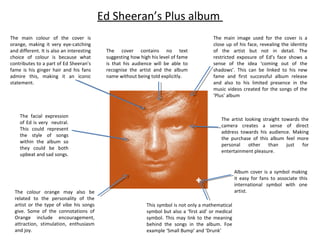
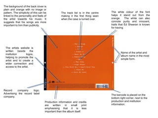
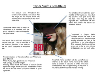
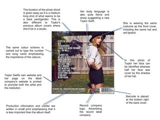
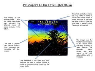
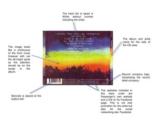
Ed Sheeran’s Plus album
The main colour of the cover is
orange, making it very eye-catching
and different. It is also an interesting
choice of colour is because what
contributes to a part of Ed Sheeran’s
fame is his ginger hair and his fans
admire this, making it an iconic
statement.

The facial expression
of Ed is very neutral.
This could represent
the style of songs
within the album so
they could be both
upbeat and sad songs.

The colour orange may also be
related to the personality of the
artist or the type of vibe his songs
give. Some of the connotations of
Orange include encouragement,
attraction, stimulation, enthusiasm
and joy.

The cover contains no text
suggesting how high his level of fame
is that his audience will be able to
recognise the artist and the album
name without being told explicitly.

The main image used for the cover is a
close up of his face, revealing the identity
of the artist but not in detail. The
restricted exposure of Ed’s face shows a
sense of the idea ‘coming out of the
shadows’. This can be linked to his new
fame and first successful album release
and also to his limited presence in the
music videos created for the songs of the
‘Plus’ album

The artist looking straight towards the
camera creates a sense of direct
address towards his audience. Making
the purchase of this album feel more
personal
other than
just
for
entertainment pleasure.

Album cover is a symbol making
it easy for fans to associate this
international symbol with one
artist.
This symbol is not only a mathematical
symbol but also a ‘first aid’ or medical
symbol. This may link to the meaning
behind the songs in the album. Foe
example ‘Small Bump’ and ‘Drunk’
The background of the back cover is
plain and orange with no image or
pattern. The simplicity of this can be
linked to the personality and feels of
the artist towards his music. It
suggests that his songs are more
important to him than publicity.

The track list is in the centre
making it the first thing seen
when the case is turned over.

The artists website is
written
beside
the
institution
logos,
helping to promote the
artist and to create a
wider connection and
access to the artist.

The white colour of the font
helps it stand out from the
orange. The white can also
connote purity and innocent,
traits that Ed Sheeran is known
for having.

Name of the artist and
album name in the most
simple form.

Record
company
logo;
Advertising the record label
company.
Production information and credits
are
written
in
small
print
emphasising that it is less
important than the album itself.

The barcode is placed on the
bottom right corner, next to the
production and institution
information.
Taylor Swift’s Red Album
The colours used throughout the
cover is very natural. It is clear that
the image did not require much edit
allowing the natural feature to show
itself more.

The lipstick colour used by Taylor is
convenient as it matches both the
album name and the colour used for
the typed name.

The album title is the first thing that
catches the eye. This is because of
the size and boldness of the font and
the red colour compared to any other
text.

The connotations of the colours Red and White hare
quite different.
White: Purity, light, goodness and innocence
Red: Energy, love and danger.
Knowing Taylor Swift, this choice of colours would
represent songs about love and heartbreaks within
the album so the choice of colour scheme is quite
significant.

The shadow of her hat hides clear
visibility of her eyes and nose but
the shadow ends just above her
red lips. This may be used to
highlight the importance of the
colour Red within the album for
whatever reason.

Compared to Taylor Swifts
previous albums the style of her
has changed and become more
simple whereas her hair is the
main focus in her other albums.
This suggests that the artist has
grown up to be a more simple
and possibly and laid back artist.

The artists name is written with the same font and
boldness of the album name. However the artists
name is smaller in size and is white. The white
could connote the new personality of the artist as
her previous album covers are very striking.
The location of the photo shoot
is given away as it is a medium
long shot of what seems to be
a back yard/garden. This is
also different to Taylor’s
previous album covers where
she’d be in a studio.

Her body language is
also quite fierce and
sharp suggesting a new
Taylor Swift.

She is wearing the same
costume as the front cover,
including the same hat and
red lipstick.

The same colour scheme is
carried out to type the number
and song name emphasising
the importance of the colours.
In this photo of
Taylor her face can
be identified whereas
half her face was
cover by the shadow
of her hat.

Taylor Swifts own website and
her page on the label
company’s website is printed
to promote both the artist and
the institution.

Production information and credits are
written in small print emphasising that it
is less important than the album itself.

Record company
logo; Advertising
the record label
company.

Barcode is placed
at the bottom right
of the back cover.
Passenger’s All The Little Lights album
The artists and album name
are very similar in terms of
font but the artists name is
larger and this is because
the cover does not give any
other clue or evidence that
Passenger is the artist.

The display of the
sunrise/sunset
and
the darker sky above
can represent the
different mood of
songs available in the
album.

The image used for
the front cover relates
to the album name
but using a variety of
‘light’ sources. For
example
starts,
sunset
and
what
seems to be multi
coloured fairy lights in
the trees.

The use of neutral
yet natural colours
may represent the
simplicity
of
the
music.

The silhouette of the trees and bush
indicate the idea of nature. Nature is
quite an obvious theme throughout the
cover photo.
The track list is typed in
White without number
indicating the order.

The image looks
like a continuous
of the front cover
however with out
the all bright spots
as the attention
should be on the
songs
in
the
album.

Barcode is placed at the
bottom left.

The album and artist
name for the side of
the CD case.

Record company logo;
Advertising the record
label company.

The websites included in
this back cover are
Passenger’s own website
and a link to his Facebook
page. This is not only
promotion for the artist but
also
for
the
social
networking site- Facebook.

Cover analysis

  • 1.
    Ed Sheeran’s Plusalbum The main colour of the cover is orange, making it very eye-catching and different. It is also an interesting choice of colour is because what contributes to a part of Ed Sheeran’s fame is his ginger hair and his fans admire this, making it an iconic statement. The facial expression of Ed is very neutral. This could represent the style of songs within the album so they could be both upbeat and sad songs. The colour orange may also be related to the personality of the artist or the type of vibe his songs give. Some of the connotations of Orange include encouragement, attraction, stimulation, enthusiasm and joy. The cover contains no text suggesting how high his level of fame is that his audience will be able to recognise the artist and the album name without being told explicitly. The main image used for the cover is a close up of his face, revealing the identity of the artist but not in detail. The restricted exposure of Ed’s face shows a sense of the idea ‘coming out of the shadows’. This can be linked to his new fame and first successful album release and also to his limited presence in the music videos created for the songs of the ‘Plus’ album The artist looking straight towards the camera creates a sense of direct address towards his audience. Making the purchase of this album feel more personal other than just for entertainment pleasure. Album cover is a symbol making it easy for fans to associate this international symbol with one artist. This symbol is not only a mathematical symbol but also a ‘first aid’ or medical symbol. This may link to the meaning behind the songs in the album. Foe example ‘Small Bump’ and ‘Drunk’
  • 2.
    The background ofthe back cover is plain and orange with no image or pattern. The simplicity of this can be linked to the personality and feels of the artist towards his music. It suggests that his songs are more important to him than publicity. The track list is in the centre making it the first thing seen when the case is turned over. The artists website is written beside the institution logos, helping to promote the artist and to create a wider connection and access to the artist. The white colour of the font helps it stand out from the orange. The white can also connote purity and innocent, traits that Ed Sheeran is known for having. Name of the artist and album name in the most simple form. Record company logo; Advertising the record label company. Production information and credits are written in small print emphasising that it is less important than the album itself. The barcode is placed on the bottom right corner, next to the production and institution information.
  • 3.
    Taylor Swift’s RedAlbum The colours used throughout the cover is very natural. It is clear that the image did not require much edit allowing the natural feature to show itself more. The lipstick colour used by Taylor is convenient as it matches both the album name and the colour used for the typed name. The album title is the first thing that catches the eye. This is because of the size and boldness of the font and the red colour compared to any other text. The connotations of the colours Red and White hare quite different. White: Purity, light, goodness and innocence Red: Energy, love and danger. Knowing Taylor Swift, this choice of colours would represent songs about love and heartbreaks within the album so the choice of colour scheme is quite significant. The shadow of her hat hides clear visibility of her eyes and nose but the shadow ends just above her red lips. This may be used to highlight the importance of the colour Red within the album for whatever reason. Compared to Taylor Swifts previous albums the style of her has changed and become more simple whereas her hair is the main focus in her other albums. This suggests that the artist has grown up to be a more simple and possibly and laid back artist. The artists name is written with the same font and boldness of the album name. However the artists name is smaller in size and is white. The white could connote the new personality of the artist as her previous album covers are very striking.
  • 4.
    The location ofthe photo shoot is given away as it is a medium long shot of what seems to be a back yard/garden. This is also different to Taylor’s previous album covers where she’d be in a studio. Her body language is also quite fierce and sharp suggesting a new Taylor Swift. She is wearing the same costume as the front cover, including the same hat and red lipstick. The same colour scheme is carried out to type the number and song name emphasising the importance of the colours. In this photo of Taylor her face can be identified whereas half her face was cover by the shadow of her hat. Taylor Swifts own website and her page on the label company’s website is printed to promote both the artist and the institution. Production information and credits are written in small print emphasising that it is less important than the album itself. Record company logo; Advertising the record label company. Barcode is placed at the bottom right of the back cover.
  • 5.
    Passenger’s All TheLittle Lights album The artists and album name are very similar in terms of font but the artists name is larger and this is because the cover does not give any other clue or evidence that Passenger is the artist. The display of the sunrise/sunset and the darker sky above can represent the different mood of songs available in the album. The image used for the front cover relates to the album name but using a variety of ‘light’ sources. For example starts, sunset and what seems to be multi coloured fairy lights in the trees. The use of neutral yet natural colours may represent the simplicity of the music. The silhouette of the trees and bush indicate the idea of nature. Nature is quite an obvious theme throughout the cover photo.
  • 6.
    The track listis typed in White without number indicating the order. The image looks like a continuous of the front cover however with out the all bright spots as the attention should be on the songs in the album. Barcode is placed at the bottom left. The album and artist name for the side of the CD case. Record company logo; Advertising the record label company. The websites included in this back cover are Passenger’s own website and a link to his Facebook page. This is not only promotion for the artist but also for the social networking site- Facebook.
  • 7.
    The track listis typed in White without number indicating the order. The image looks like a continuous of the front cover however with out the all bright spots as the attention should be on the songs in the album. Barcode is placed at the bottom left. The album and artist name for the side of the CD case. Record company logo; Advertising the record label company. The websites included in this back cover are Passenger’s own website and a link to his Facebook page. This is not only promotion for the artist but also for the social networking site- Facebook.