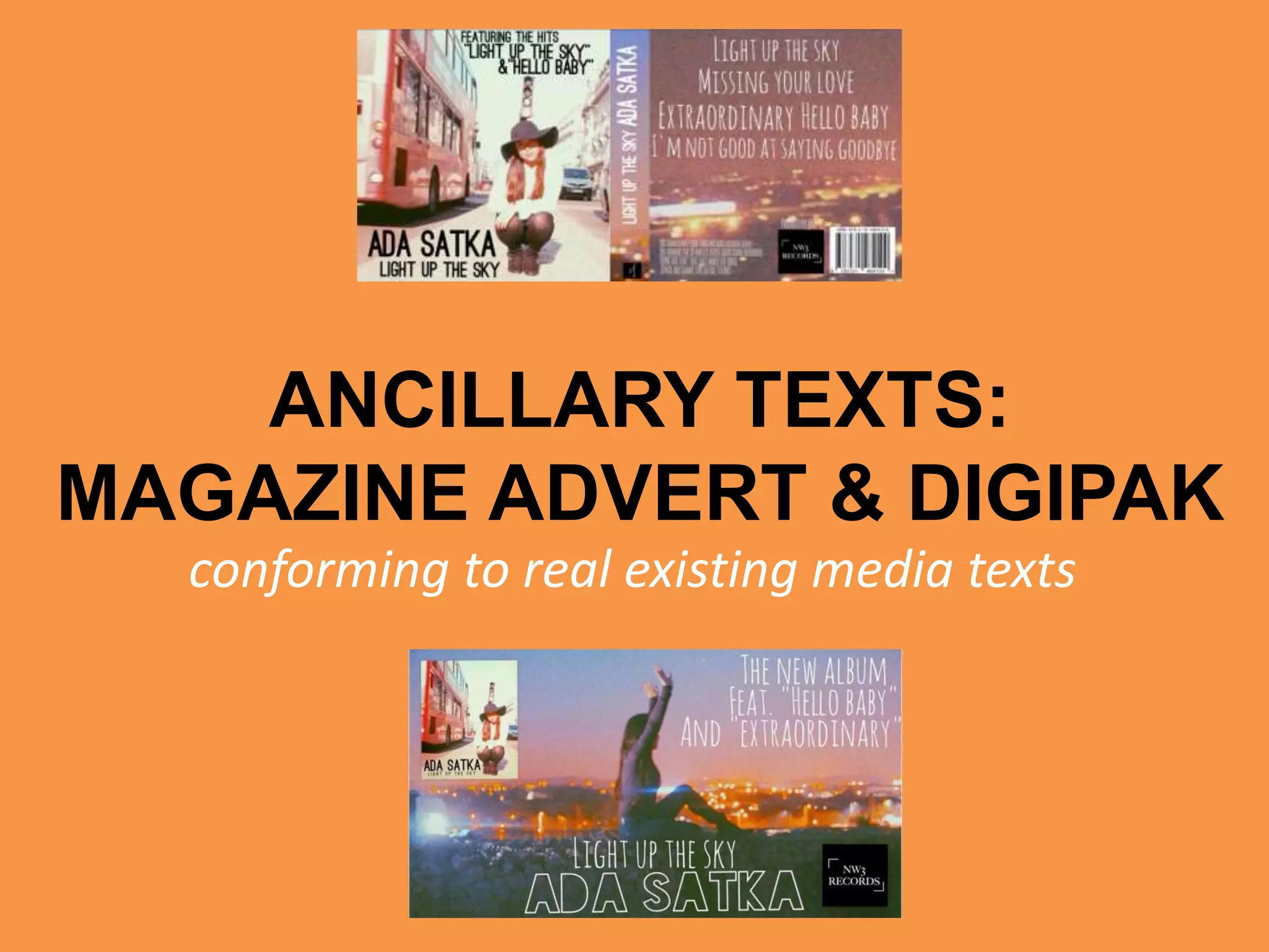
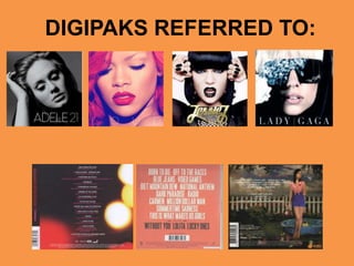
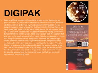
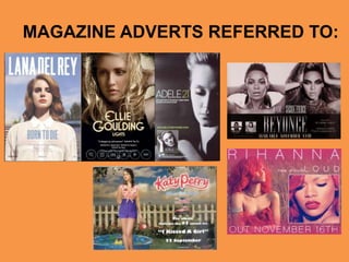
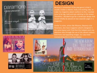
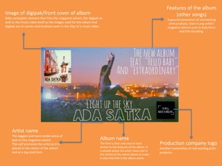
This document discusses conventions seen in digipaks and magazine advertisements for pop music. It notes that digipaks typically feature prominent images of the artist to promote recognition. Images are often edited for a youthful look and continuity across products. Connections between visuals and lyrics are also common. Magazine ads usually have a bold, vibrant design and feature the artist name, album name, and images linking the ad to other materials like the digipak and music video. Conventions are followed to make the designed materials seem professional and aligned with real pop music media texts.
The perfect Sundabet Slot mudah menang Promo new member Animated PDF for your conversation. Discover and Share the best GIFs on Tenor
Admin Ramah Cantik Aktif 24 Jam Nonstop siap melayani pemain member Sundabet login via apk sundabet rtp daftar slot gacor daftar
2137ad Merindol Colony Interiors where refugee try to build a seemengly norm...luforfor
This are the interiors of the Merindol Colony in 2137ad after the Climate Change Collapse and the Apocalipse Wars. Merindol is a small Colony in the Italian Alps where there are around 4000 humans. The Colony values mainly around meritocracy and selection by effort.
thGAP - BAbyss in Moderno!! Transgenic Human Germline Alternatives ProjectMarc Dusseiller Dusjagr
thGAP - Transgenic Human Germline Alternatives Project, presents an evening of input lectures, discussions and a performative workshop on artistic interventions for future scenarios of human genetic and inheritable modifications.
To begin our lecturers, Marc Dusseiller aka "dusjagr" and Rodrigo Martin Iglesias, will give an overview of their transdisciplinary practices, including the history of hackteria, a global network for sharing knowledge to involve artists in hands-on and Do-It-With-Others (DIWO) working with the lifesciences, and reflections on future scenarios from the 8-bit computer games of the 80ies to current real-world endeavous of genetically modifiying the human species.
We will then follow up with discussions and hands-on experiments on working with embryos, ovums, gametes, genetic materials from code to slime, in a creative and playful workshop setup, where all paticipant can collaborate on artistic interventions into the germline of a post-human future.
The Legacy of Breton In A New Age by Master Terrance LindallBBaez1
Brave Destiny 2003 for the Future for Technocratic Surrealmageddon Destiny for Andre Breton Legacy in Agenda 21 Technocratic Great Reset for Prison Planet Earth Galactica! The Prophecy of the Surreal Blasphemous Desires from the Paradise Lost Governments!
2137ad - Characters that live in Merindol and are at the center of main storiesluforfor
Kurgan is a russian expatriate that is secretly in love with Sonia Contado. Henry is a british soldier that took refuge in Merindol Colony in 2137ad. He is the lover of Sonia Contado.
3. DIGIPAK• Like pop music videos, a convention that is seen in many of the
digipaks/album covers that I had analyzed and researched, is the focus on
the artist. It is essential for the audience to be able to recognise the artist in
order to promote them and their music. Therefore, the main images in my
digipak (album cover and lyric booklet) include images of myself
(supposefly the artist of the album ‘Ada Satka’). This is very common in real
media texts, especially in the digipaks of female artists. This is because it
causes the audience (particularly the male audience, which is called the
‘male gaze’ according to Laura Mulvey) to be attracted to the digipak
through the use of female beauty and youth, that is also depicted in my
own design. Again, this conforms to Goodwin’s theory as it is referred to as
voyeurism, where women are presented as physically and sexually desirable
to men.
• The front cover mainly focuses on the artist and it is vital to grab the
attention of the audience to promote them. Therefore, it is essential to
have the artist name be the biggest and boldest piece of text seen.
• All the images in the digipak have been edited using Photoshop and the app
VSCO cam to create the youthful, filtered effects. I find that this finish really
conforms to the young and hip vibe that runs throughout the entire digipak
to make it as continuous and fluent as possible. It is important for all the
print products to follow the same appearance and formats as this is also a
convention seen in many of the digipaks that I had researched. For instance,
here with Rihanna’s digipak, all of the images are from the same photo
shoot with the artist wearing the same makeup, the same clothing in the
same locations. This continuity and consistency within the products help
create that synergistic element making it as professional and real as
4. • Again to add that synergistic element that is seen in most digipaks of any
genre, I wanted to connect my print products with my music video therefore, I
used actual screen grabs from my music video within my digipak. The CD
design includes an image of a sparkler that is seen in the first few clips of my
music video and I found that this works nicely next to the album name ‘Light
Up The Sky’ which also conforms to Goodwin’s theory of having a connection
between the lyrics and the visuals. I also used a screen grab of a location shot
also seen in the first few seconds of my music video for the back cover. I found
that using a location shot as my image really enhanced the text making it
clearer and more visible to read. My back cover can be compared to a real
media text; David Guetta’s back cover of his digipak for the album ‘Pop Life’.
The text is very clear as the background image is not as sharp, similar to my
own. The focus of the back cover is on the songs (what the album contains)
therefore, Instead of using another image of the artist, I wanted to focus on
the song list also and keep the main artist image for the front cover as it
focuses more on the artist there.
DIGIPAK
6. Because a convention of the pop genre is that it
usually creates a vibrant, lively and exciting vibe, to
make my magazine advert conform to this, I wanted
mine to be big, bold and eye-catching to the viewer.
Therefore, I decided to go for a landscape design that
would initially be placed on two separate pages in a
magazine.
Similar to mine, artists like Rihanna, Beyonce and
Paramore, also have magazine adverts designed in
the same layout and I find that this helped catch my
attention also through the use of the vibrant colours,
bold fonts and appealing images. So I also tried
incorporating this in my own layout.
DESIGN
7. Features of the album
(other songs)
A general convention of real existing
print products. Seen in pop artist’s
magazine adverts such as Katy Perry
and Ellie Goulding.
Production company logo
Another convention of real existing print
products.
Artist name
The biggest and most visible piece of
text on the magazine advert.
This self promotes the artist as it is
placed in the centre of the advert
and at a big sized font.
Album name
The font is clear and easy to read
similar to the features of the album. It
is placed above the artist name and in
the centre of the entire advert to make
it clear that this is the album name.
Image of digipak/front cover of album
Adds synergistic element that links the magazine advert, the digipak as
well as the music video itself as the images used for the advert and
digipak are at scenes and locations seen in the clips of a music video.