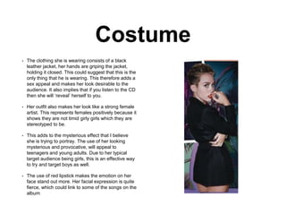
Ancillary task: Miley
Cyrus Digi-pak analysis
The Digi-pak in general
follows the common
conventions of an album
cover. It includes an image of
her on the front, her name,
barcode, track list, same
theme is used throughout and
bold, clear writing.
Front cover
• The image of Miley shows the audience her back and her looking over her shoulder. It
focusses on her making eye contact, which is a an effective conventional feature in album
covers as it allows the audience to make eye contact with the artist and it is also a way to
draw them in. Miley is also posed in a position that makes her look as if she is confident
with herself. Her fierce facial expression which is staring directly into the camera makes her
look like she is strong women.
• Another effective feature which she used is having the shot of her hands over her mouth. It
gives the impression that she wants to say something but instead she is hiding it.
• This makes her look mysterious and secretive, which is a sufficient way to get people to buy
the album, as they believe the music on the CD you can listen to and try to understand what
she is trying to say.
• Also on the front cover is Miley (the artist) standing in front of of a palm tree with the album
name ‘bangerz’ in front of it. The could imply that it is a fun holiday CD thats fun to listen to.
You usually typically associate and see light up signs and palm trees on a warm hot holiday.
• The album also implies fun. This is due to the album name ‘Bangerz’, giving connotations of
teenagers describing something good. By using the word ‘Bangerz’, it is a way to connect
with the target audience, but also to suggest her songs are young and fun to listen to. The
typography of the title is also very creative, it is styled and edited as a wall light, allowing it
to stand out on the cover.
• The artists name is written boldly across the top and bottom of the album cover, which
allows the audience to clearly identify who she is. The colour of the text is appropriate to the
rest of the colour scheme, red, blue and vibrant and fun colours.
• The background has a gradient colour of peachy orange and purple, and also has palm
tress across it. The background is colourful, however dark enough to still make the artist the
main focus. I think that the background is unique and quirky. It is not as simple as others,
which reflects the artist well.
• The image of the artist looks as if she has been cut out and stuck not the album, which
gives it more depth and makes it look more 3D.
Costume
• The clothing she is wearing consists of a black
leather jacket, her hands are griping the jacket,
holding it closed. This could suggest that this is the
only thing that he is wearing. This therefore adds a
sex appeal and makes her look desirable to the
audience. It also implies that if you listen to the CD
then she will ‘reveal’ herself to you.
• Her outfit also makes her look like a strong female
artist. This represents females positively because it
shows they are not timid girly girls which they are
stereotyped to be.
• This adds to the mysterious effect that I believe
she is trying to portray. The use of her looking
mysterious and provocative, will appeal to
teenagers and young adults. Due to her typical
target audience being girls, this is an effective way
to try and target boys as well.
• The use of red lipstick makes the emotion on her
face stand out more. Her facial expression is quite
fierce, which could link to some of the songs on the
album
Editing and colour
• The editing of the image looks low budget and you can see
the crops where she has been cropped out. I believe that
this has been done deliberately, it allows her to stand out
from the background- making her the main focus.
• It is also a way to show she is unique and original, not like
every other typical pop artist.
• The signs which have been edited in is commonly used
outside clubs and bars in order to draw in the public as
they flash.
• Clubs are typically for young people and could therefore be
metaphorical for her ‘flashing her sign’ to draw in her target
audience.
• Around her image there is a lot of empty space. She has
used a colour scheme of an ombre of purple and pink and
blue.
• This almost looks like a sunset on a horizon, which could
aid her holiday theme of the cd and having fun.
• Also by filling her album with colour instead of loads of
pictures, it could suggest she isn't focusing on how the
cover looks, what is more important is the music within the
cd.
Mise en scene
• The digi-pak is eye catching, and appeals to
her target audience, due to her looking sexual
and seductive.
• The makeup and hair they have styled her
with looks very natural. She is being subtle as
she is supposedly naked, however the only
skin she is showing is her legs. Even though
she is portraying a seductive look, we also
get the impression that she doesn't need to
take her clothes off in order to draw in her
audience.
• Miley’s look on the album is a lot different to
previous albums which she has made. She
now looks more mature which could
encourage people to buy the CD. Portraying
the message that she isn't young anymore.
• People will then want to see what her new
music is, like along side her ‘new image’.
Back cover
• The album shows a narrative throughout the
piece, the image at the start shows her
covering herself up but when you turn over to
the back she has her jacket open. This could
suggest she is starting to lose the mystery and
starting to reveal what she is trying to say the
closer you get to open the CD. This then
encourages you to buy the album to find out
what is going on and what they message is.
• The back cover also follows the colour scheme
with light pinks and purples. This allows the
artist to stand out, in connection with the use of
dark coloured clothing.
• The songs have been written in small font, and
have been given transitions to turn it side ways.
This is an effective way to portray the songs,
as it shows Miley to be different and quite fun
and quirky, not having your original and typical
straight lines as a list on the back page.
Ancillary task:
Miley Cyrus
Website
Front page
• There is a big image of the artist as soon as you go onto the website. This
is effective as it catches the audiences eye an reminds you about what the
artist is all about. It is a unique picture and shows that the artist isn't your
typical artist, but instead is quirky and fun. This fits in well with the pop
genre, as the typical codes and conventions, are bright, fun and upbeat, it
doesn't have to be structured, but can be different and unique to the artist.
• The website front cover also has moving images and plays music at the
same time. As you click not eh website, the screen starts to run down to
reveal a new image of her. This could create a mysterious feel to the
website, trying to find out what different looks and ideas she has. Whist
having music playing at the same time, it allows the audience to listen to
small sections of the song, and therefore may enjoy it and want to listen
and find out about the whole song, which may lead them into buying or
purchasing the album or the single.
• In the bottom corner there is a small picture which is a link to her latest
video; allowing quick access to her latest music. This is very effective as
the picture s bright and interactive, drawing the audience into clicking it
and then they re able to listen and find out about her song.
• More conventions of the pop genre are followed throughout the website.
One key feature is the bold writing and drop down menu. The writing of her
name is displayed in bold, colourful lettering reminding you that she is the
main feature on the website.
• The use of bright and eye catching colours is effective as it is a way to
attract her younger audience and to make it representative of her style as
a pop artist.
• Also in the bottom corner of the website, it features the logo of her charity
foundation that takes you to the aspects of the website dedicated to this
area. This represents a different side to the artist, showing she is down to
earth and wants to help and represent the charity that she is supporting.
• After clicking off the front page, the artists
name is still located int he top left colour in
bright bold writing, to remind the viewers what
the website is all about.
• The video sections allows you to view the
video but it also has other options to view
more videos thats she has released.
• The drop down menu is allowing the viewer to
navigate around the website and and find
what they are looking for. This includes
merchandise, events, news,etc. The fact that
it is bordered with interactive colours and
images, it makes in more interesting for he
viewer an more of a chance for them to click
on it.
• There is also links to her social media sites
which is way to promote her image more and
build views for her music video and posts.
• The search bar at the top of the screen is so
you can navigate around the website, and
narrow down what you are actually looking
for.
• The images o her website are useful as they
show you what things you can buy and you
can see what is on offer.
• The words ‘new merchandise’ is written in
bold to draw you in and catch your attention,
this is a useful technique and it draws the
audience in and causes them to look and
want to buy the product more.
• The use of pinks purples and blues are used
throughout the website to keep a colour
theme, but also to stick with following pop
conventions by having bright, eye catching
colours.
• Her name still remains in bold
writing in the top left corner.
• Important text (upcoming events)
in written in bold to attract it to the
views getting them to click onto it
and see more bout the information
and events taking place.
• Her upcoming events are
contained together and presented
in a simple neat table, to make it
easy for the viewer to see whats
going on and when her events
are.

Miley cyrus ancillary task

  • 1.
    Ancillary task: Miley CyrusDigi-pak analysis The Digi-pak in general follows the common conventions of an album cover. It includes an image of her on the front, her name, barcode, track list, same theme is used throughout and bold, clear writing.
  • 2.
    Front cover • Theimage of Miley shows the audience her back and her looking over her shoulder. It focusses on her making eye contact, which is a an effective conventional feature in album covers as it allows the audience to make eye contact with the artist and it is also a way to draw them in. Miley is also posed in a position that makes her look as if she is confident with herself. Her fierce facial expression which is staring directly into the camera makes her look like she is strong women. • Another effective feature which she used is having the shot of her hands over her mouth. It gives the impression that she wants to say something but instead she is hiding it. • This makes her look mysterious and secretive, which is a sufficient way to get people to buy the album, as they believe the music on the CD you can listen to and try to understand what she is trying to say. • Also on the front cover is Miley (the artist) standing in front of of a palm tree with the album name ‘bangerz’ in front of it. The could imply that it is a fun holiday CD thats fun to listen to. You usually typically associate and see light up signs and palm trees on a warm hot holiday. • The album also implies fun. This is due to the album name ‘Bangerz’, giving connotations of teenagers describing something good. By using the word ‘Bangerz’, it is a way to connect with the target audience, but also to suggest her songs are young and fun to listen to. The typography of the title is also very creative, it is styled and edited as a wall light, allowing it to stand out on the cover. • The artists name is written boldly across the top and bottom of the album cover, which allows the audience to clearly identify who she is. The colour of the text is appropriate to the rest of the colour scheme, red, blue and vibrant and fun colours. • The background has a gradient colour of peachy orange and purple, and also has palm tress across it. The background is colourful, however dark enough to still make the artist the main focus. I think that the background is unique and quirky. It is not as simple as others, which reflects the artist well. • The image of the artist looks as if she has been cut out and stuck not the album, which gives it more depth and makes it look more 3D.
  • 3.
    Costume • The clothingshe is wearing consists of a black leather jacket, her hands are griping the jacket, holding it closed. This could suggest that this is the only thing that he is wearing. This therefore adds a sex appeal and makes her look desirable to the audience. It also implies that if you listen to the CD then she will ‘reveal’ herself to you. • Her outfit also makes her look like a strong female artist. This represents females positively because it shows they are not timid girly girls which they are stereotyped to be. • This adds to the mysterious effect that I believe she is trying to portray. The use of her looking mysterious and provocative, will appeal to teenagers and young adults. Due to her typical target audience being girls, this is an effective way to try and target boys as well. • The use of red lipstick makes the emotion on her face stand out more. Her facial expression is quite fierce, which could link to some of the songs on the album
  • 4.
    Editing and colour •The editing of the image looks low budget and you can see the crops where she has been cropped out. I believe that this has been done deliberately, it allows her to stand out from the background- making her the main focus. • It is also a way to show she is unique and original, not like every other typical pop artist. • The signs which have been edited in is commonly used outside clubs and bars in order to draw in the public as they flash. • Clubs are typically for young people and could therefore be metaphorical for her ‘flashing her sign’ to draw in her target audience. • Around her image there is a lot of empty space. She has used a colour scheme of an ombre of purple and pink and blue. • This almost looks like a sunset on a horizon, which could aid her holiday theme of the cd and having fun. • Also by filling her album with colour instead of loads of pictures, it could suggest she isn't focusing on how the cover looks, what is more important is the music within the cd.
  • 5.
    Mise en scene •The digi-pak is eye catching, and appeals to her target audience, due to her looking sexual and seductive. • The makeup and hair they have styled her with looks very natural. She is being subtle as she is supposedly naked, however the only skin she is showing is her legs. Even though she is portraying a seductive look, we also get the impression that she doesn't need to take her clothes off in order to draw in her audience. • Miley’s look on the album is a lot different to previous albums which she has made. She now looks more mature which could encourage people to buy the CD. Portraying the message that she isn't young anymore. • People will then want to see what her new music is, like along side her ‘new image’.
  • 6.
    Back cover • Thealbum shows a narrative throughout the piece, the image at the start shows her covering herself up but when you turn over to the back she has her jacket open. This could suggest she is starting to lose the mystery and starting to reveal what she is trying to say the closer you get to open the CD. This then encourages you to buy the album to find out what is going on and what they message is. • The back cover also follows the colour scheme with light pinks and purples. This allows the artist to stand out, in connection with the use of dark coloured clothing. • The songs have been written in small font, and have been given transitions to turn it side ways. This is an effective way to portray the songs, as it shows Miley to be different and quite fun and quirky, not having your original and typical straight lines as a list on the back page.
  • 7.
  • 8.
    Front page • Thereis a big image of the artist as soon as you go onto the website. This is effective as it catches the audiences eye an reminds you about what the artist is all about. It is a unique picture and shows that the artist isn't your typical artist, but instead is quirky and fun. This fits in well with the pop genre, as the typical codes and conventions, are bright, fun and upbeat, it doesn't have to be structured, but can be different and unique to the artist. • The website front cover also has moving images and plays music at the same time. As you click not eh website, the screen starts to run down to reveal a new image of her. This could create a mysterious feel to the website, trying to find out what different looks and ideas she has. Whist having music playing at the same time, it allows the audience to listen to small sections of the song, and therefore may enjoy it and want to listen and find out about the whole song, which may lead them into buying or purchasing the album or the single. • In the bottom corner there is a small picture which is a link to her latest video; allowing quick access to her latest music. This is very effective as the picture s bright and interactive, drawing the audience into clicking it and then they re able to listen and find out about her song. • More conventions of the pop genre are followed throughout the website. One key feature is the bold writing and drop down menu. The writing of her name is displayed in bold, colourful lettering reminding you that she is the main feature on the website. • The use of bright and eye catching colours is effective as it is a way to attract her younger audience and to make it representative of her style as a pop artist. • Also in the bottom corner of the website, it features the logo of her charity foundation that takes you to the aspects of the website dedicated to this area. This represents a different side to the artist, showing she is down to earth and wants to help and represent the charity that she is supporting.
  • 9.
    • After clickingoff the front page, the artists name is still located int he top left colour in bright bold writing, to remind the viewers what the website is all about. • The video sections allows you to view the video but it also has other options to view more videos thats she has released. • The drop down menu is allowing the viewer to navigate around the website and and find what they are looking for. This includes merchandise, events, news,etc. The fact that it is bordered with interactive colours and images, it makes in more interesting for he viewer an more of a chance for them to click on it. • There is also links to her social media sites which is way to promote her image more and build views for her music video and posts.
  • 10.
    • The searchbar at the top of the screen is so you can navigate around the website, and narrow down what you are actually looking for. • The images o her website are useful as they show you what things you can buy and you can see what is on offer. • The words ‘new merchandise’ is written in bold to draw you in and catch your attention, this is a useful technique and it draws the audience in and causes them to look and want to buy the product more. • The use of pinks purples and blues are used throughout the website to keep a colour theme, but also to stick with following pop conventions by having bright, eye catching colours.
  • 11.
    • Her namestill remains in bold writing in the top left corner. • Important text (upcoming events) in written in bold to attract it to the views getting them to click onto it and see more bout the information and events taking place. • Her upcoming events are contained together and presented in a simple neat table, to make it easy for the viewer to see whats going on and when her events are.