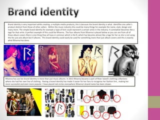
The combination of brand identity elements across Rihanna's music albums, clothing line, and other products has helped make her brand highly recognizable and successful. Her consistent use of the letter "R" logo builds brand awareness and allows fans to easily identify her various works.
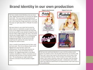
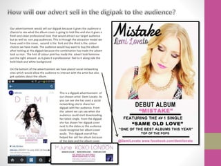
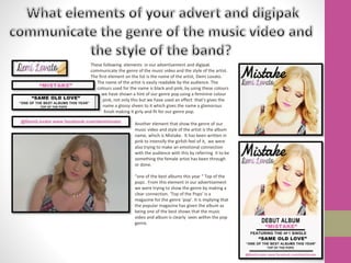
Similarly, the band in the document has established a unified brand identity using consistent font styles, colors, and imagery across their music video, advertisements, CD cover, and digital packaging. Elements like the album name in italic font and inclusion of pinks and blacks help connect the products and communicate the band's pop genre to audiences. Maintaining cohesive branding across multiple media helps promote and sell all of the band's works.