Lana Del Ray ‘Born To Die’
Digipak Analysis
By Sam Fairhead
Front Cover
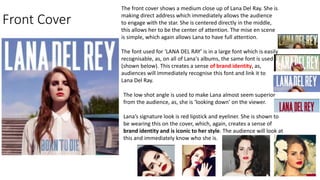
The front cover shows a medium close up of Lana Del Ray. She is
making direct address which immediately allows the audience
to engage with the star. She is centered directly in the middle,
this allows her to be the center of attention. The mise en scene
is simple, which again allows Lana to have full attention.
The font used for ‘LANA DEL RAY’ is in a large font which is easily
recognisable, as, on all of Lana's albums, the same font is used
(shown below). This creates a sense of brand identity, as,
audiences will immediately recognise this font and link it to
Lana Del Ray.
The low shot angle is used to make Lana almost seem superior
from the audience, as, she is ‘looking down’ on the viewer.
Lana’s signature look is red lipstick and eyeliner. She is shown to
be wearing this on the cover, which, again, creates a sense of
brand identity and is iconic to her style. The audience will look at
this and immediately know who she is.
The inside
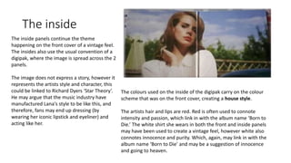
The inside panels continue the theme
happening on the front cover of a vintage feel.
The insides also use the usual convention of a
digipak, where the image is spread across the 2
panels.
The image does not express a story, however it
represents the artists style and character, this
could be linked to Richard Dyers ‘Star Theory’.
He may argue that the music industry have
manufactured Lana's style to be like this, and
therefore, fans may end up dressing (by
wearing her iconic lipstick and eyeliner) and
acting like her.
The colours used on the inside of the digipak carry on the colour
scheme that was on the front cover, creating a house style.
The artists hair and lips are red. Red is often used to connote
intensity and passion, which link in with the album name ‘Born to
Die.’ The white shirt she wears in both the front and inside panels
may have been used to create a vintage feel, however white also
connotes innocence and purity. Which, again, may link in with the
album name ‘Born to Die’ and may be a suggestion of innocence
and going to heaven.
THE CD THE BACK
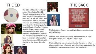
The CD is white with red flowers
across the outside of the CD.
There is no title or name of the
artist on the CD which suggests
that Lana Del Ray has such a well
known brand identity, she does
not need text for the audience to
know that this CD belongs to her.
Lana Del Ray’s style often includes
wearing flower crowns, this is
iconic to her style and, again,
creates a sense of brand identity.
The flowers have connotations of
love, or, roses are often used at
funerals, which would link in with
the title of the album ‘Born To
Die.’
The back cover shows a completely red cover complimented
with white text.
The font used for the track listing is the same font as used
throughout all of Lana’s albums – house style.
The track listings are not conventionally the same as other
albums, as they are informally spaced out, whereas usually the
track listings are under one another and numbered.

Lana del ray Digipak analysis

  • 1.
    Lana Del Ray‘Born To Die’ Digipak Analysis By Sam Fairhead
  • 2.
    Front Cover The frontcover shows a medium close up of Lana Del Ray. She is making direct address which immediately allows the audience to engage with the star. She is centered directly in the middle, this allows her to be the center of attention. The mise en scene is simple, which again allows Lana to have full attention. The font used for ‘LANA DEL RAY’ is in a large font which is easily recognisable, as, on all of Lana's albums, the same font is used (shown below). This creates a sense of brand identity, as, audiences will immediately recognise this font and link it to Lana Del Ray. The low shot angle is used to make Lana almost seem superior from the audience, as, she is ‘looking down’ on the viewer. Lana’s signature look is red lipstick and eyeliner. She is shown to be wearing this on the cover, which, again, creates a sense of brand identity and is iconic to her style. The audience will look at this and immediately know who she is.
  • 3.
    The inside The insidepanels continue the theme happening on the front cover of a vintage feel. The insides also use the usual convention of a digipak, where the image is spread across the 2 panels. The image does not express a story, however it represents the artists style and character, this could be linked to Richard Dyers ‘Star Theory’. He may argue that the music industry have manufactured Lana's style to be like this, and therefore, fans may end up dressing (by wearing her iconic lipstick and eyeliner) and acting like her. The colours used on the inside of the digipak carry on the colour scheme that was on the front cover, creating a house style. The artists hair and lips are red. Red is often used to connote intensity and passion, which link in with the album name ‘Born to Die.’ The white shirt she wears in both the front and inside panels may have been used to create a vintage feel, however white also connotes innocence and purity. Which, again, may link in with the album name ‘Born to Die’ and may be a suggestion of innocence and going to heaven.
  • 4.
    THE CD THEBACK The CD is white with red flowers across the outside of the CD. There is no title or name of the artist on the CD which suggests that Lana Del Ray has such a well known brand identity, she does not need text for the audience to know that this CD belongs to her. Lana Del Ray’s style often includes wearing flower crowns, this is iconic to her style and, again, creates a sense of brand identity. The flowers have connotations of love, or, roses are often used at funerals, which would link in with the title of the album ‘Born To Die.’ The back cover shows a completely red cover complimented with white text. The font used for the track listing is the same font as used throughout all of Lana’s albums – house style. The track listings are not conventionally the same as other albums, as they are informally spaced out, whereas usually the track listings are under one another and numbered.