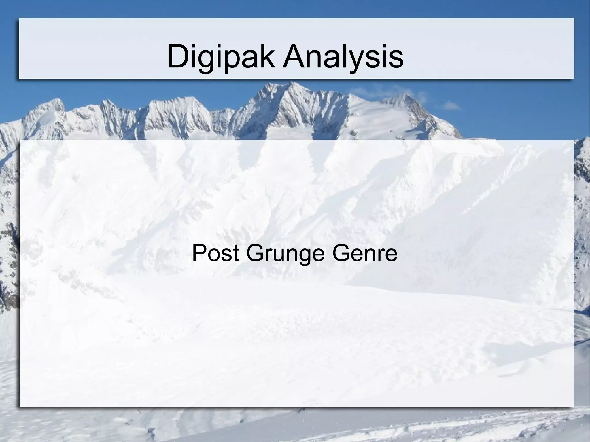
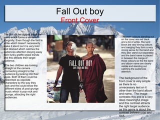
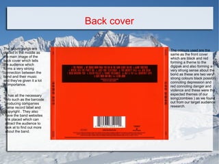
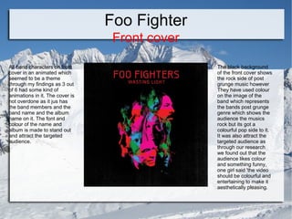
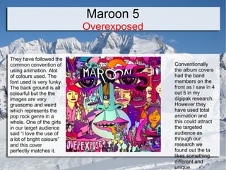
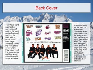
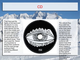
The document analyzes several post-grunge album digipaks in terms of design conventions and target audiences. For Fall Out Boy, the font and strong colors catch attention while the image contrasts pop and rock sides. Foo Fighters uses animated band images on the front with colorful pop elements contrasting the black rock background. Maroon 5 breaks conventions by using animation on the front and spreading song names creatively on the back in different colors.
2. Fall Out boy
Front Cover
The font on the digipak stays the
same which forms a sense of
congruity. Even though the font Is
white which doesn't necessarily
make it stand out it is very bold
and blocked which catches the
audiences attention staying away
from funky graffiti styled trends
and this attracts their target
audience.
The two children are looking
straight at the camera
connecting straight to the
audience by looking into their
eyes. Both of them could be
described as opposite
characters by the way they
look and this could show the
different sides of post grunge
music which is pop rock and
grunge, attracting the right
audiences.
The main colours standing out
on the cover are red black
and a bit of white. Red and
black are very strong colours
and merging they form a very
strong sense for the band and
they also stand out separately
and the band name is placed
in between the merge of
these colours so the the band
and album name are clearly
visible and standing out
catching the audiences
attention.
The background of the
front cover is very simple
as there Is no
unnecessary text on it
other than the band album
and name. The image
contrasts this and is a very
deep meaningful image
and this contrast attracts
the right target audience
as this genre is about the
contrast between pop and
rock.
3. Back cover
The album songs are
placed in the middle as
the main image of the
back cover which tells
the audience which
forms a very strong
connection between the
band and their music
and they've given it a lot
of importance.
It has all the necessary
info such as the barcode
producing companies
name record label and
copyright . They also
have the band websites
link placed which can
attract the audience to
look at to find out more
about the band.
The colours used are the
same as the front cover
which are black and red
forming a theme to the
digipak and also forming a
very strong sense about the
bond as these are two very
strong colours black possibly
connoting depression and
red connoting danger and
violence and these were the
expected themes of our
song(zombies ) as we found
out from our target audience
research.
4. CD Cover
The colours on the cd cover
follow the same thing forming a
sense of loyalty within the band
and their songs.
However the font used is totally
different from the rest of the
digipak. When the cd cover is
opened the cd really stands out
catching the audiences attention
straight away.
They have followed the common
convention of funky writing here
by adding fall out boy initials with
a crown showing their superiority
to the audience.
They have got the name of the
production company on the cd
aswell promoting that asellll
5. Foo Fighter
Front cover
All band characters on front
cover in an animated which
seemed to be a theme
through my findings as 3 out
of 6 had some kind of
animations in it. The cover is
not overdone as it jus has
the band members and the
band name and the album
name on it. The font and
colour of the name and
album is made to stand out
and attract the targeted
audience.
The black background
of the front cover shows
the rock side of post
grunge music however
They have used colour
on the image of the
band which represents
the bands post grunge
genre which shows the
audience the musics
rock but its got a
colourful pop side to it.
It was also attract the
targeted audience as
through our research
we found out that the
audience likes colour
and something funny,
one girl said 'the video
should be colourful and
entertaining to make it
aesthetically pleasing.
6. Back Cover
The name of the all
the songs are
mentioned on the
back cover are in
capital letters and
have got two different
colours to it which
catches the
audiences attention
and makes them
spend more time on
the band songs which
could market the style
of their songs and get
a wider audience.
The name of the
production company
sony music is made to
stand out at the back
to tell the targeted
audience their group
is managed by a big
music group
marketing the band.
All the necessary
information is
situated at the
bottom of the back
cover so the
audience has to
turn to the back to
find out more
about the band
where there is the
bands website etc
which markets the
band. There is a
very mysterious
abstract image in
the background
which catches the
audiences
attention when
they turn to the
back cover and
gives the band a
mysterious theme
and the audience
would want to buy
it to listen to the
album to see how
it relates.
7. CD cover
The colours
used on the cd
of the album
are very
different from
the general
theme of the
album cover
however it
matches the
colour of the
Sony music
mentioned again
along with the
producers name
However the
font stays the
same unlike the
cd of fall out boy
8. Maroon 5
Overexposed
They have followed the
common convention of
using animation. Alot
of colours used. The
font used is very funky.
The back ground is all
colourful but the the
images are very
gruesome and weird
which represents the
pop rock genre in a
whole. One of the girls
in our target audience
said “i love the use of
a lot of bright colours”
and this cover
perfectly matches it.
Conventionally
the album covers
had the band
members on the
front as I saw in 4
out 5 in my
digipak research.
However they
have used total
animation and
this could attract
the targeted
audience as
through our
research we
found out the ta
likes something
different and
unique.
9. Back Cover
They have went
against the
convention of
putting the band
on the front and
put it on the
back which
would make
their target
audience turn to
the back of the
cover where
they would read
the song names
and this would
attract the right
target audience.
They have really
set the back out
against the
convention again
by spreading the
the song names
over half the area
rather then adding
a list. They have
also given each
name a different
colour in a very
funky style which
would look
aesthetically
pleasing to the
audiences eyes
and catch their
attention.
10. CD
They have got the
Name of the band and
the album in a very
subverted way as it
really blends into the
eye in the middle and
this goes against the
common convention
as normally cds are
made to stand out in
the album cover. They
have used the theme
of uniqueness to
attract their audience
and the post grunge
audience likes
something different
and new.
The colours they
have used are
dull however the
white does stand
out on the black
background but
the fact that the
name of the band
and album blends
in means the
audience will
spend more time
looking at the cd
which means it
would attract the
target audience
as they spend
time looking at it.
It could be
described us a
piece of art.