PRODUCT RESEARCH
Zoe Ramsdale-Clark
DIGIPAK
DIGIPAK #1
FRONT: As you can see by this digipak, the front usually consists of an image of the artist whose CD it is –
the purpose of this is to highlight to the audience who the CD was produced by and also to promote the
star who is on the front cover – in this case Rihanna. Rihanna is known for her provocative and suggestive
nature, especially when it comes to videos and images related to her career in the music industry, for
example her video for S&M was considered too graphic and had to be taken down from YouTube – this is
also the case with this digipak of Rihanna, she is staring directly at the camera and is wearing minimal
clothing which will help lure an audience of both males and also females as they are the ones who tend
to listen to her music anyway. The colour scheme consists of the basic black and white which suggests to
the consumers that this is not suitable for a young audience, for example, the black and white could
signify a parent advisory sign, warning parents of possible bad language in the song. This idea is also
backed up by the choice of pictures on the front as from the close up image we can see smoke being
blown from her mouth which could be a signifier for smoking, something that would be considered
inappropriate for some of he younger audience.
BACK: In my personal opinion, the back of this digipak does not conform to the similarities as others as it
is not obvious to the consumers of this product what tracks are on the album. The key feature on the back
of the digipak is a full image of Rihanna herself. However, it does conform to the other typical conventions
such as having a barcode and the promotion of the music label she belongs to. Linking to the front, the
main image that is featured of Rihanna is one of her smoking. Parents would unlikely want their child
seeing imagery like this, deeming it unacceptable, not wanting someone like this as a role model for their
child. The track listing for the album is written in a red small front down the side of the digipak which could
connote the provocative nature that is seen in the pictures. Red is seen as a colour that represents danger
and being daring, as well as love which could link to songs titled ‘We Found Love.’
SIDES AND CD COMPARTMENT: The theme throughout is consistent to the front and back of the
digipak with the black and white theme and the provocative images of Rihanna herself. The difference is
that there has been an inclusion of a newspaper which to me suggests it is a promotion within itself. The
actual CD also is consistent with the theme on the inner ‘pages’ of the digipak. Newspapers tend to be
quite influential sources of information, and can make a big impact on people’s personal opinions of
people and various situations that they cover.
DIGIPAK #2
FRONT: As you can see by the front of this digipak, the front will usually consist of a picture of the artist who
the CD belongs to - in this case Katy Perry. The overall purpose of the digipak and the front cover is to
promote the artist and their music, but also the record label that they belong to. Katy Perry is known for
her quirky look and provocative images however is listened to by all ages which is signified through the
choice of colours such as baby pink but also through the cotton pink clouds and the prints on the CD’s.
Yet again, another female recording artist has included images that could be deemed as inappropriate
for her younger audience and is unlikely to be something a parent would want their child to be exposed
to. However, she is somewhat covered by the pink clouds of candy floss. The clouds of candy floss could
signify the artist metaphorically being on ‘cloud nine’ in terms of her having an extremely successful music
career – it also has a direct link to the title of the album and one of her songs – ‘Teenage Dream.' In the
bottom right hand corner of the front cover, there is a parental advisory logo. The black and white stands
out against the light pastel pinks and blues that are commonly featured throughout.
BACK: Unlike the Digipak by Rihanna on the previous slide, I believe that the back of this one does
conform to the traditional conventions of a digipak with the songs featured on the CD written on the back
in list form with other key conventions such as the barcode, price and the record label that she belongs
to. Again there is this common theme of the pinks and blues, however, there is the use of the bright red
which stands out against the lighter colours. The red could be signifying the slight use of inappropriate or
suggestive nature of her songs, linking to the parental advisory warning that is featured on the front of the
digipak.
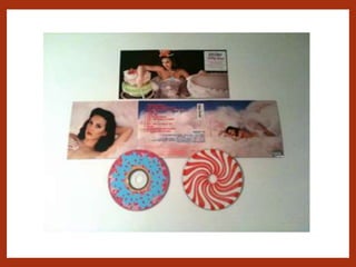
SIDES AND CD COMPARTMENT: The two sides of the digipak include two images of Katy Perry which come
across as quite provocative through the direct eye contact with the camera, bright red lipstick and the
two poses she is positioned in, also she is only covered by the clouds in the image. The cloud links well to
the name of the album; Teenage Dream, also making me think of the saying ‘got your head in the
clouds.’ Also there are 2 CD’s included in the Digipak, this could possibly be the deluxe version of the CD
as sometimes artists’ choose to release more than one product in which they are able to produce it and
sell it for a couple more pounds. One CD looks similar to a doughnut with the blue icing and sprinkles on
top, whilst the other is red and white looking like a strawberries and cream flavoured swirly sweet. Sweet
things are often featured in Perry’s work, for example; in her music for California Girls, she is in some form of
‘Candy land’ – similar to that of Charlie and Chocolate Factory’ – and also on her tour, there were big
gingerbread men characters and other sweet things, all linking back to the candy floss clouds that are
seen on the front cover of the video. This could signify Perry’s wanting to appeal and target all age groups
– the sweets to entice a younger audience, but the more provocative images could suggest that there is
some maturity to her music.
MAGAZINE ADVERT
MAGAZINE ADVERT #1
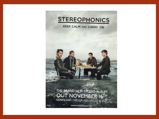
IMAGERY: This is the magazine advert for the band ‘Stereophonics’ and their 2009 album ‘Keep Calm and
Carry On.’ Starting with the image chosen for the advert is in keeping with the front cover of the artist’s
album cover. In my opinion, this image does not fit with general conventions of an advert as there is
barely any direct eye contact with the camera which tends to be used in promotion to draw the
attention of potential consumers of the product, however, in this case, all members of the bands are
looking in various directions and seem quite distant. All 4 members of the band are sat at a table
positioned in the middle of the sea – which does look quite rocky. This could signify the need to power on
through this storm, referencing the title of the album – ‘Keep Calm and Carry On.’ There has not been a
lot of colour used, with most of the colours used being some form of grey scaled tone – including the sky,
the sea and the clothes that all the 4 men are wearing. ‘Keep Calm and Carry On’ was a phrase that was
introduced by the government for propaganda in World War 2. Indie music does tend to have some raw
emotion in the music, including the notion of fighting some sense of wrong. For example, some tracks
listed on the album include “Trouble,” “Stuck in a Rut,” and ”Show Me How” – all of these titles express
some sort of questioning or inability to solve a problem.
The main point of the advert is the promotion of the album which is done so at the bottom of the advert.
The advert is being used to highlight when the album will be released and the various platforms you can
get it on. Having a successful advert campaign will fit in well with other forms of promotion such as reviews
and through various mediums of social media. This ‘poster’ itself can easily be transmitted through paper
format in magazines but also digitally on the internet. The use of the simple, yet bold century gothic font
and the white against the dark grey background is a good advertising technique as it is clear and easy to
read whilst doing exactly what the promoter would want to be done – the promotion of the album.
MAGAZINE ADVERT #2
Here is a magazine advert for the band Green Day and their album ‘American Idiot.’ Green day are best
known for their punk rock music which is reflected through the dark eye makeup of lead singer Billie Joe
Armstrong and the grungy typography used when promoting one of their singles ‘Wake me up when
September Ends’ from their 2004 album ‘American Idiot.’ The main picture featured on the advert is that of
the band’s lead singer Armstrong. In the picture, Armstrong is looking upwards, which could reflect the
rebellious link to the punk rock genre of music, however in relation to the single advertised on the front –
‘Wake me up when September Ends’ – it could signify the meaning behind the song which was written in
relation to the death of his father. By looking up, it could suggest that he is looking up to heaven, wanting
to know how his father is and whether he is proud of him.
The choice of colours - black, red and white – signify the edgy look of the band and reflect the genre of
music that they perform. The colours chosen are also those used on the CD of their album American Idiot.
The consistency with the choice of colours can allow the band to create some what of a brand for
themselves through the choice of typography and colours that have been used. It would be unlikely that
they would use too much colour due to the genre of music that the band performs, however, the choice
of the colour red could signify the power and rebellion that would typically be seen within punk rock
music.
At the bottom of the advert, there is a black box which is advertising a new single that they are releasing –
‘Wake me up when September Ends’ – and the album that the advert is advertising and the album the
song is featured on – ‘American Idiot.’ yet again the same colours have been used – red, white and black
– but there has been a more simple font used – most likely impact – as when the promoter is trying to get
across information to their audience, they do not want to use something too fancy or complicated as it
would be illegible to the reader.

Product research

  • 1.
  • 2.
  • 4.
    DIGIPAK #1 FRONT: Asyou can see by this digipak, the front usually consists of an image of the artist whose CD it is – the purpose of this is to highlight to the audience who the CD was produced by and also to promote the star who is on the front cover – in this case Rihanna. Rihanna is known for her provocative and suggestive nature, especially when it comes to videos and images related to her career in the music industry, for example her video for S&M was considered too graphic and had to be taken down from YouTube – this is also the case with this digipak of Rihanna, she is staring directly at the camera and is wearing minimal clothing which will help lure an audience of both males and also females as they are the ones who tend to listen to her music anyway. The colour scheme consists of the basic black and white which suggests to the consumers that this is not suitable for a young audience, for example, the black and white could signify a parent advisory sign, warning parents of possible bad language in the song. This idea is also backed up by the choice of pictures on the front as from the close up image we can see smoke being blown from her mouth which could be a signifier for smoking, something that would be considered inappropriate for some of he younger audience. BACK: In my personal opinion, the back of this digipak does not conform to the similarities as others as it is not obvious to the consumers of this product what tracks are on the album. The key feature on the back of the digipak is a full image of Rihanna herself. However, it does conform to the other typical conventions such as having a barcode and the promotion of the music label she belongs to. Linking to the front, the main image that is featured of Rihanna is one of her smoking. Parents would unlikely want their child seeing imagery like this, deeming it unacceptable, not wanting someone like this as a role model for their child. The track listing for the album is written in a red small front down the side of the digipak which could connote the provocative nature that is seen in the pictures. Red is seen as a colour that represents danger and being daring, as well as love which could link to songs titled ‘We Found Love.’ SIDES AND CD COMPARTMENT: The theme throughout is consistent to the front and back of the digipak with the black and white theme and the provocative images of Rihanna herself. The difference is that there has been an inclusion of a newspaper which to me suggests it is a promotion within itself. The actual CD also is consistent with the theme on the inner ‘pages’ of the digipak. Newspapers tend to be quite influential sources of information, and can make a big impact on people’s personal opinions of people and various situations that they cover.
  • 6.
    DIGIPAK #2 FRONT: Asyou can see by the front of this digipak, the front will usually consist of a picture of the artist who the CD belongs to - in this case Katy Perry. The overall purpose of the digipak and the front cover is to promote the artist and their music, but also the record label that they belong to. Katy Perry is known for her quirky look and provocative images however is listened to by all ages which is signified through the choice of colours such as baby pink but also through the cotton pink clouds and the prints on the CD’s. Yet again, another female recording artist has included images that could be deemed as inappropriate for her younger audience and is unlikely to be something a parent would want their child to be exposed to. However, she is somewhat covered by the pink clouds of candy floss. The clouds of candy floss could signify the artist metaphorically being on ‘cloud nine’ in terms of her having an extremely successful music career – it also has a direct link to the title of the album and one of her songs – ‘Teenage Dream.' In the bottom right hand corner of the front cover, there is a parental advisory logo. The black and white stands out against the light pastel pinks and blues that are commonly featured throughout. BACK: Unlike the Digipak by Rihanna on the previous slide, I believe that the back of this one does conform to the traditional conventions of a digipak with the songs featured on the CD written on the back in list form with other key conventions such as the barcode, price and the record label that she belongs to. Again there is this common theme of the pinks and blues, however, there is the use of the bright red which stands out against the lighter colours. The red could be signifying the slight use of inappropriate or suggestive nature of her songs, linking to the parental advisory warning that is featured on the front of the digipak. SIDES AND CD COMPARTMENT: The two sides of the digipak include two images of Katy Perry which come across as quite provocative through the direct eye contact with the camera, bright red lipstick and the two poses she is positioned in, also she is only covered by the clouds in the image. The cloud links well to the name of the album; Teenage Dream, also making me think of the saying ‘got your head in the clouds.’ Also there are 2 CD’s included in the Digipak, this could possibly be the deluxe version of the CD as sometimes artists’ choose to release more than one product in which they are able to produce it and sell it for a couple more pounds. One CD looks similar to a doughnut with the blue icing and sprinkles on top, whilst the other is red and white looking like a strawberries and cream flavoured swirly sweet. Sweet things are often featured in Perry’s work, for example; in her music for California Girls, she is in some form of ‘Candy land’ – similar to that of Charlie and Chocolate Factory’ – and also on her tour, there were big gingerbread men characters and other sweet things, all linking back to the candy floss clouds that are seen on the front cover of the video. This could signify Perry’s wanting to appeal and target all age groups – the sweets to entice a younger audience, but the more provocative images could suggest that there is some maturity to her music.
  • 7.
  • 9.
    MAGAZINE ADVERT #1 IMAGERY:This is the magazine advert for the band ‘Stereophonics’ and their 2009 album ‘Keep Calm and Carry On.’ Starting with the image chosen for the advert is in keeping with the front cover of the artist’s album cover. In my opinion, this image does not fit with general conventions of an advert as there is barely any direct eye contact with the camera which tends to be used in promotion to draw the attention of potential consumers of the product, however, in this case, all members of the bands are looking in various directions and seem quite distant. All 4 members of the band are sat at a table positioned in the middle of the sea – which does look quite rocky. This could signify the need to power on through this storm, referencing the title of the album – ‘Keep Calm and Carry On.’ There has not been a lot of colour used, with most of the colours used being some form of grey scaled tone – including the sky, the sea and the clothes that all the 4 men are wearing. ‘Keep Calm and Carry On’ was a phrase that was introduced by the government for propaganda in World War 2. Indie music does tend to have some raw emotion in the music, including the notion of fighting some sense of wrong. For example, some tracks listed on the album include “Trouble,” “Stuck in a Rut,” and ”Show Me How” – all of these titles express some sort of questioning or inability to solve a problem. The main point of the advert is the promotion of the album which is done so at the bottom of the advert. The advert is being used to highlight when the album will be released and the various platforms you can get it on. Having a successful advert campaign will fit in well with other forms of promotion such as reviews and through various mediums of social media. This ‘poster’ itself can easily be transmitted through paper format in magazines but also digitally on the internet. The use of the simple, yet bold century gothic font and the white against the dark grey background is a good advertising technique as it is clear and easy to read whilst doing exactly what the promoter would want to be done – the promotion of the album.
  • 11.
    MAGAZINE ADVERT #2 Hereis a magazine advert for the band Green Day and their album ‘American Idiot.’ Green day are best known for their punk rock music which is reflected through the dark eye makeup of lead singer Billie Joe Armstrong and the grungy typography used when promoting one of their singles ‘Wake me up when September Ends’ from their 2004 album ‘American Idiot.’ The main picture featured on the advert is that of the band’s lead singer Armstrong. In the picture, Armstrong is looking upwards, which could reflect the rebellious link to the punk rock genre of music, however in relation to the single advertised on the front – ‘Wake me up when September Ends’ – it could signify the meaning behind the song which was written in relation to the death of his father. By looking up, it could suggest that he is looking up to heaven, wanting to know how his father is and whether he is proud of him. The choice of colours - black, red and white – signify the edgy look of the band and reflect the genre of music that they perform. The colours chosen are also those used on the CD of their album American Idiot. The consistency with the choice of colours can allow the band to create some what of a brand for themselves through the choice of typography and colours that have been used. It would be unlikely that they would use too much colour due to the genre of music that the band performs, however, the choice of the colour red could signify the power and rebellion that would typically be seen within punk rock music. At the bottom of the advert, there is a black box which is advertising a new single that they are releasing – ‘Wake me up when September Ends’ – and the album that the advert is advertising and the album the song is featured on – ‘American Idiot.’ yet again the same colours have been used – red, white and black – but there has been a more simple font used – most likely impact – as when the promoter is trying to get across information to their audience, they do not want to use something too fancy or complicated as it would be illegible to the reader.