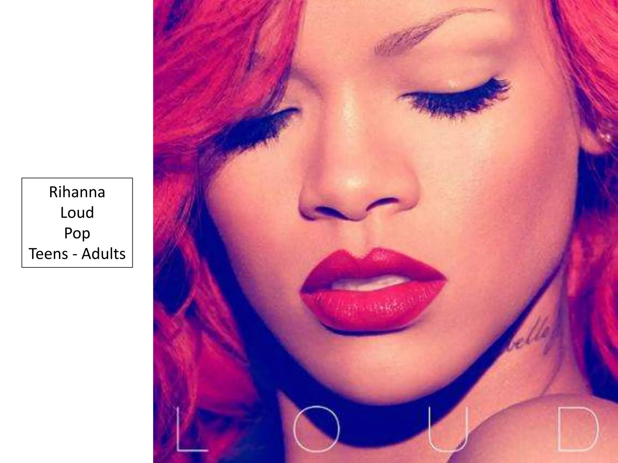
Rihanna
Loud
Pop
Teens - Adults
The main colour on this
magazine advert is red- this
compliments the name of the
album which is LOUD, red
connotates danger, rebellion
whilst being seductive and
romance- this could reflect her
music therefore the audience
would want to listen to them
furthermore the name
reinforces these things giving
the audience an insight to what
the artist is like, selling her in a
very seductive and dangerous
way- making it appealing to both
genders which means that
they’d purchase the album as
they are compelled with what
they are looking at.
All the text among the magazine
advert is in capital letters
therefore making it aware to the
audience that this is the artist
and this is her album; its bold
and stands out ensuring it
captures the audiences’
attention and making it
memorable to them therefore
when it releases- they will
remember it and want to
purchase it.
The extremely large image of her
shows her female prominence
The typography stands out as it is is
contrasting against her skin and the
black coming through, this
connotates the idea that within the
darkness there is purity and
innocence within the artist making
the magazine advert intriguing and
mysterious which would persuade
the audience to purchase the
album as they want to explore into
this.
The writing is below the artist as
among this magazine advert, the
artist is the most significant
therefore the text doesn’t take this
away- the artist is being sold more
than the music as she is a popstar
rather than a pop performer.
Recogniseable songs are listed
below as these are hits which
people would have heard therefore
will recognise them which would
make them want to purchase the
album when it is released.
The magazine states that the album
contains a #1 hit is appealing to
the audience as they would be
aware that this is a popular artist
reassuring them that this is a artist
worth buying the album of.
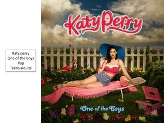
Katy perry
One of the boys
Pop
Teens-Adults
The artist is directly looking at the
audience creating a link between
them; to the audience it may feel as
if the artist is personally telling the
audience to purchase the album
creating a link between them both.
The setting and costume
connotates that the
artist’s target audience
is females which is
furthermore supported
by the colours which are
pink and purple.
The artist is
positioned in a
slightly seductive
way which would be
aimed at males, as
she is wearing a
revealing outfit
therefore they
would find this
attractive and want
to purchase the
album.
The artist is the
largest thing within
the magazine advert
which ensures that
she is the main
attraction therefore
if people that know
her, see this, they
would be interested
in the magazine
advert.
The typography of
the artist’s name
stands out the
most as it is the
largest and is in a
font used for all
Katy Perry items
meaning that there
is an association
between that and
is easily
recognisable to the
audience therefore
if they have bought
something which is
Katy Perry prior to
seeing this
magazine advert,
they would be
interested.
There is an image of the front cover
of the album showing what it is
that’s being advertised therefore
the audience would be aware of
what the album is- making it easier
when purchasing it.
There is a
minimalism of
writing which
would be intriguing
to the audience as
it would work as an
enigma and they
would want to find
out more.
The artist’s new successful single
is placed at the front as it attracts
the audience as if someone had
heard the song they would know
it was by this artist therefore this
may make them want to purchase
the album more.
The writing is written in white
therefore stands out the most
among the magazine advert; this is
as the release date is written and
artist’s website- this is so the
audience can be aware of where to
purchase the album or find out
more about the artist.
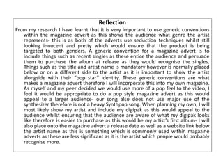
Reflection
From my research I have learnt that it is very important to use generic conventions
within the magazine advert as this shows the audience what genre the artist
represents- this is as both of the adverts use seduction techniques whilst still
looking innocent and pretty which would ensure that the product is being
targeted to both genders. A generic convention for a magazine advert is to
include things such as recent singles as these entice the audience and persuade
them to purchase the album at release as they would recognise the singles.
Things such as the title and artist name is mandatory however is normally placed
below or on a different side to the artist as it is important to show the artist
alongside with their “pop star” identity. These generic conventions are what
makes a magazine advert therefore I will incorporate this into my own magazine.
As myself and my peer decided we would use more of a pop feel to the video, I
feel it would be appropriate to do a pop style magazine advert as this would
appeal to a larger audience- our song also does not use major use of the
synthesizer therefore is not a heavy Synthpop song. When planning my own, I will
most likely show my artist and include my digipak as this would appeal to the
audience whilst ensuring that the audience are aware of what my digipak looks
like therefore is easier to purchase as this would be my artist’s first album- I will
also place onto the magazine advert a release date as well as a website link below
the artist name as this is something which is commonly used within magazine
adverts as these are less significant as it is the artist which people would probably
recognise more.

Magazine advert analysis

  • 1.
  • 2.
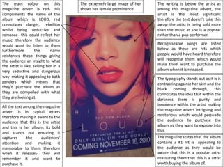
    The main colouron this magazine advert is red- this compliments the name of the album which is LOUD, red connotates danger, rebellion whilst being seductive and romance- this could reflect her music therefore the audience would want to listen to them furthermore the name reinforces these things giving the audience an insight to what the artist is like, selling her in a very seductive and dangerous way- making it appealing to both genders which means that they’d purchase the album as they are compelled with what they are looking at. All the text among the magazine advert is in capital letters therefore making it aware to the audience that this is the artist and this is her album; its bold and stands out ensuring it captures the audiences’ attention and making it memorable to them therefore when it releases- they will remember it and want to purchase it. The extremely large image of her shows her female prominence The typography stands out as it is is contrasting against her skin and the black coming through, this connotates the idea that within the darkness there is purity and innocence within the artist making the magazine advert intriguing and mysterious which would persuade the audience to purchase the album as they want to explore into this. The writing is below the artist as among this magazine advert, the artist is the most significant therefore the text doesn’t take this away- the artist is being sold more than the music as she is a popstar rather than a pop performer. Recogniseable songs are listed below as these are hits which people would have heard therefore will recognise them which would make them want to purchase the album when it is released. The magazine states that the album contains a #1 hit is appealing to the audience as they would be aware that this is a popular artist reassuring them that this is a artist worth buying the album of.
  • 3.
    Katy perry One ofthe boys Pop Teens-Adults
  • 4.
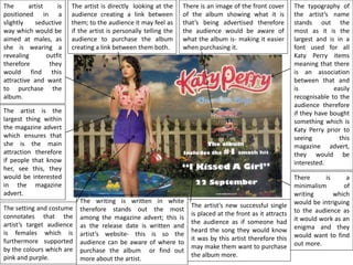
    The artist isdirectly looking at the audience creating a link between them; to the audience it may feel as if the artist is personally telling the audience to purchase the album creating a link between them both. The setting and costume connotates that the artist’s target audience is females which is furthermore supported by the colours which are pink and purple. The artist is positioned in a slightly seductive way which would be aimed at males, as she is wearing a revealing outfit therefore they would find this attractive and want to purchase the album. The artist is the largest thing within the magazine advert which ensures that she is the main attraction therefore if people that know her, see this, they would be interested in the magazine advert. The typography of the artist’s name stands out the most as it is the largest and is in a font used for all Katy Perry items meaning that there is an association between that and is easily recognisable to the audience therefore if they have bought something which is Katy Perry prior to seeing this magazine advert, they would be interested. There is an image of the front cover of the album showing what it is that’s being advertised therefore the audience would be aware of what the album is- making it easier when purchasing it. There is a minimalism of writing which would be intriguing to the audience as it would work as an enigma and they would want to find out more. The artist’s new successful single is placed at the front as it attracts the audience as if someone had heard the song they would know it was by this artist therefore this may make them want to purchase the album more. The writing is written in white therefore stands out the most among the magazine advert; this is as the release date is written and artist’s website- this is so the audience can be aware of where to purchase the album or find out more about the artist.
  • 5.
    Reflection From my researchI have learnt that it is very important to use generic conventions within the magazine advert as this shows the audience what genre the artist represents- this is as both of the adverts use seduction techniques whilst still looking innocent and pretty which would ensure that the product is being targeted to both genders. A generic convention for a magazine advert is to include things such as recent singles as these entice the audience and persuade them to purchase the album at release as they would recognise the singles. Things such as the title and artist name is mandatory however is normally placed below or on a different side to the artist as it is important to show the artist alongside with their “pop star” identity. These generic conventions are what makes a magazine advert therefore I will incorporate this into my own magazine. As myself and my peer decided we would use more of a pop feel to the video, I feel it would be appropriate to do a pop style magazine advert as this would appeal to a larger audience- our song also does not use major use of the synthesizer therefore is not a heavy Synthpop song. When planning my own, I will most likely show my artist and include my digipak as this would appeal to the audience whilst ensuring that the audience are aware of what my digipak looks like therefore is easier to purchase as this would be my artist’s first album- I will also place onto the magazine advert a release date as well as a website link below the artist name as this is something which is commonly used within magazine adverts as these are less significant as it is the artist which people would probably recognise more.