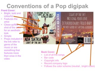
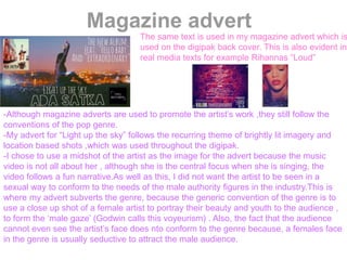
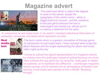
D
i
g
i
p
a
k
A
n
a
l
y
s
i
s
-Throughout the digipak the same
theme,pictures and colours were used. This
is because from the research I had done
beforehand , this was a recurring theme
throughout each digipak I analysed, like …
Rihanna’s “Loud”. As well as this, the colour
scheme across my digipak stayed the same
because this is a convention of the pop
genre.For example, “loud” has the colour
red, pictures of the artist and roses on all
panels of the digipak.
-The decision to only feature the artist
on the front cover and the lyric booklet
subverts the genre because , a
convention of the pop genre is to
include stills of the artist in every
panel of the digipak.However , I
decided not to do this because in real
media texts I think by including the
artist too much , it diverts the
audiences attention from the album
and onto the artist
Real media texts
Front cover
These existing pop digipak covers are eyecatching,
which is a steretypical element of the pop genre,
because everything is bold and makes a statement.
-I chose to look at Arianna Grande’s “My everything”
and Iggy Azalea’s “The new classic”, because they
stand out amongst different covers in the charts.
-The thin, bold text on our cover is in black because we
did not want to present the song as something that it
isn’t , because it is not extravagant , but the content of
it is relatable. (people having fun,living life to the fullest)
-The brightness and contrast of the picture conform to
the convention of the genre because , in real media
texts it was apparent that this is what they use to
distinguish their genre.
Subverting the genre?
-the use of iconographic imagery
A convention of the pop genre is to have the
artist in the center of the album cover, and a
plain background to emphasise the
artist.However, I chose to have the
stereotypical “big red London bus” next to the
artist because in our music video , I decided
to equally involve extras into the shots.
Back cover
-An obvious convention of the pop genre
and any genre, is to list the songs which
are on the cd on the back cover to inform
it’s audience.
-The back
cover of a
digipak
always
includes a
barcode,cop
yright info
and record
company
logo to make
it look
professional
-I wanted to make the background image
follow the color scheme of the digipak ,
keeping it bright but simple enough to
catch the audiences attention.As well as
this,the location captured has
connotations to the song I did for the
music video “Light up the sky”.But, I did
subvert the genre by not including an
image of the artist because, I wanted to
portray how them music video does not
solely consist of the artist.In comparison to
the stereotype o the genre , where I would
have used a beautiful image of the artist
with no connotations to the song
Real media texts
Lyric booklet
-I have included images of the artist looking over a brightly lit
city because is is relevant to my music video , and it is a
connotation of the lyrics : “tonight we’ll light up the sky , live a
life ,form a natural high”, which conveys the literal meaning of
the song.As well as this, the images used are also visual motifs
from the video. This convention can be found in real media
texts like Taylor Swift, who uses a still from her music video
“Love Story”
-I conformed to the pop genre by using stills of the artist in the
lyric booklet, because in the pop industry the artist’s image is
important, and how I portray her in the booklet is how others
should perceive her
-The text used is bold and simple, to follow the theme used
throughout the digipak, in comparison with real media texts. For
example , Avril Lavigne consistently uses a stars and pink
theme.
-For the lyric booklet I used images which relate to my music
video , as I found many examples of this from real media texts
because it is a convention of the pop genre.
Conventions of a Pop digipak
Front Cover:
• Bright, bold and
colourful
• Features the
artist
• Close-up/Mid
shot of the artist
for an aesthetic
look
• Simple
• Props included in
the link refer to
genre of the
music or are
something that
features more
than once in the
video
Back Cover:
• List of all the songs
• Bar code
• Copyright info
• Record company logo
• Follows the color scheme (neutral , bright colors)
Magazine advert
The same text is used in my magazine advert which is
used on the digipak back cover. This is also evident in
real media texts for example Rihannas “Loud”
-Although magazine adverts are used to promote the artist’s work ,they still follow the
conventions of the pop genre.
-My advert for “Light up the sky” follows the recurring theme of brightly lit imagery and
location based shots ,which was used throughout the digipak.
-I chose to use a midshot of the artist as the image for the advert because the music
video is not all about her , although she is the central focus when she is singing, the
video follows a fun narrative.As well as this, I did not want the artist to be seen in a
sexual way to conform to the needs of the male authority figures in the industry.This is
where my advert subverts the genre, because the generic convention of the genre is to
use a close up shot of a female artist to portray their beauty and youth to the audience ,
to form the ‘male gaze’ (Godwin calls this voyeurism) . Also, the fact that the audience
cannot even see the artist’s face does nto conform to the genre because, a females face
in the genre is usually seductive to attract the male audience.
Magazine advert
-The same text which is used in the digipak
is used on the advert, except the
typography of the artist’s name , which is
bigger,bold and unusual , and this conforms
to the pop genre because the text is
extravagant and stands out, almost as if it
is making a statement for the artist.
-In comparison to real media texts, in my advert I included institutional information of
production companies and labels which represent my artist.
-The text is white which is a generic convention of the pop genre
-In comparison to real media texts, I have included what songs the
album features and the single representing the album and music
video ‘Light up the sky’
Real
media
text
-I chose to subvert the typical representation of a magazine advert,
by making mine A4 Landscape instead of portrait because my music
video subverts the pop genre by not using the “male gaze’ to attract
an audience, so to represent this difference , a landscape magazine
advert conveys a lot of contrast and an atmosphere of freedom and
security. A real media text example of this is MUSE “Breaking
through”

Print products

  • 1.
    D i g i p a k A n a l y s i s -Throughout the digipakthe same theme,pictures and colours were used. This is because from the research I had done beforehand , this was a recurring theme throughout each digipak I analysed, like … Rihanna’s “Loud”. As well as this, the colour scheme across my digipak stayed the same because this is a convention of the pop genre.For example, “loud” has the colour red, pictures of the artist and roses on all panels of the digipak. -The decision to only feature the artist on the front cover and the lyric booklet subverts the genre because , a convention of the pop genre is to include stills of the artist in every panel of the digipak.However , I decided not to do this because in real media texts I think by including the artist too much , it diverts the audiences attention from the album and onto the artist Real media texts
  • 2.
    Front cover These existingpop digipak covers are eyecatching, which is a steretypical element of the pop genre, because everything is bold and makes a statement. -I chose to look at Arianna Grande’s “My everything” and Iggy Azalea’s “The new classic”, because they stand out amongst different covers in the charts. -The thin, bold text on our cover is in black because we did not want to present the song as something that it isn’t , because it is not extravagant , but the content of it is relatable. (people having fun,living life to the fullest) -The brightness and contrast of the picture conform to the convention of the genre because , in real media texts it was apparent that this is what they use to distinguish their genre. Subverting the genre? -the use of iconographic imagery A convention of the pop genre is to have the artist in the center of the album cover, and a plain background to emphasise the artist.However, I chose to have the stereotypical “big red London bus” next to the artist because in our music video , I decided to equally involve extras into the shots.
  • 3.
    Back cover -An obviousconvention of the pop genre and any genre, is to list the songs which are on the cd on the back cover to inform it’s audience. -The back cover of a digipak always includes a barcode,cop yright info and record company logo to make it look professional -I wanted to make the background image follow the color scheme of the digipak , keeping it bright but simple enough to catch the audiences attention.As well as this,the location captured has connotations to the song I did for the music video “Light up the sky”.But, I did subvert the genre by not including an image of the artist because, I wanted to portray how them music video does not solely consist of the artist.In comparison to the stereotype o the genre , where I would have used a beautiful image of the artist with no connotations to the song Real media texts
  • 4.
    Lyric booklet -I haveincluded images of the artist looking over a brightly lit city because is is relevant to my music video , and it is a connotation of the lyrics : “tonight we’ll light up the sky , live a life ,form a natural high”, which conveys the literal meaning of the song.As well as this, the images used are also visual motifs from the video. This convention can be found in real media texts like Taylor Swift, who uses a still from her music video “Love Story” -I conformed to the pop genre by using stills of the artist in the lyric booklet, because in the pop industry the artist’s image is important, and how I portray her in the booklet is how others should perceive her -The text used is bold and simple, to follow the theme used throughout the digipak, in comparison with real media texts. For example , Avril Lavigne consistently uses a stars and pink theme. -For the lyric booklet I used images which relate to my music video , as I found many examples of this from real media texts because it is a convention of the pop genre.
  • 5.
    Conventions of aPop digipak Front Cover: • Bright, bold and colourful • Features the artist • Close-up/Mid shot of the artist for an aesthetic look • Simple • Props included in the link refer to genre of the music or are something that features more than once in the video Back Cover: • List of all the songs • Bar code • Copyright info • Record company logo • Follows the color scheme (neutral , bright colors)
  • 6.
    Magazine advert The sametext is used in my magazine advert which is used on the digipak back cover. This is also evident in real media texts for example Rihannas “Loud” -Although magazine adverts are used to promote the artist’s work ,they still follow the conventions of the pop genre. -My advert for “Light up the sky” follows the recurring theme of brightly lit imagery and location based shots ,which was used throughout the digipak. -I chose to use a midshot of the artist as the image for the advert because the music video is not all about her , although she is the central focus when she is singing, the video follows a fun narrative.As well as this, I did not want the artist to be seen in a sexual way to conform to the needs of the male authority figures in the industry.This is where my advert subverts the genre, because the generic convention of the genre is to use a close up shot of a female artist to portray their beauty and youth to the audience , to form the ‘male gaze’ (Godwin calls this voyeurism) . Also, the fact that the audience cannot even see the artist’s face does nto conform to the genre because, a females face in the genre is usually seductive to attract the male audience.
  • 7.
    Magazine advert -The sametext which is used in the digipak is used on the advert, except the typography of the artist’s name , which is bigger,bold and unusual , and this conforms to the pop genre because the text is extravagant and stands out, almost as if it is making a statement for the artist. -In comparison to real media texts, in my advert I included institutional information of production companies and labels which represent my artist. -The text is white which is a generic convention of the pop genre -In comparison to real media texts, I have included what songs the album features and the single representing the album and music video ‘Light up the sky’ Real media text -I chose to subvert the typical representation of a magazine advert, by making mine A4 Landscape instead of portrait because my music video subverts the pop genre by not using the “male gaze’ to attract an audience, so to represent this difference , a landscape magazine advert conveys a lot of contrast and an atmosphere of freedom and security. A real media text example of this is MUSE “Breaking through”