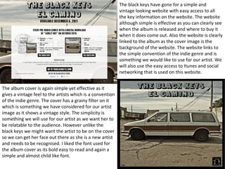
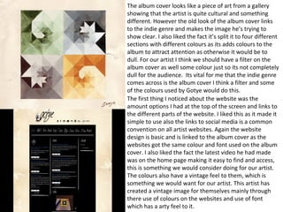
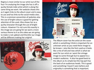
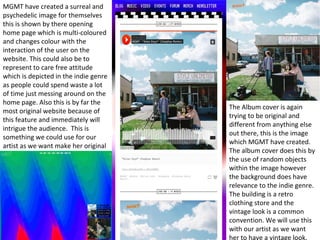
Ancillary 
●We're studying other album covers and websites so we 
can discover the common conventions of a website and 
album cover of the indie genre. We will take what we've 
found from our research and apply it into making our own 
Digi pack for our artist, however we will not copy the artist 
as it needs to be original and branded to our artist. This 
will also help us to discover how the artist has created 
there image and how we will create an image for our 
artist.
Synergy 
The use of websites, posters and Digi packs are to 
help promote an artist and help promote their 
individuality to the audience. It is important that the 
website is easy to use and find key information 
and for posters have the most useful information in 
bold and easy to see. It will also need to include 
things such as there latest song or album and key 
theme linking to the bands image. When creating 
an image for our artist will need to consider these 
things in making the poster, website or Digi pack
The black keys have gone for a simple and 
vintage looking website with easy access to all 
the key information on the website. The website 
although simple is effective as you can clearly see 
when the album is released and where to buy it 
when it does come out. Also the website is clearly 
linked to the album as the cover image is the 
background of the website. The website links to 
the simple convention of the indie genre and is 
something we would like to use for our artist. We 
will also use the easy access to Itunes and social 
networking that is used on this website. 
The album cover is again simple yet effective as it 
gives a vintage feel to the artists which is a convention 
of the indie genre. The cover has a grainy filter on it 
which is something we have considered for our artist 
image as it shows a vintage style. The simplicity is 
something we will use for our artist as we want her to 
be relatable to the audience. However unlike the 
black keys we might want the artist to be on the cover 
so we can get her face out there as she is a new artist 
and needs to be recognised. I liked the font used for 
the album cover as its bold easy to read and again a 
simple and almost child like font.
The album cover looks like a piece of art from a gallery 
showing that the artist is quite cultural and something 
different. However the old look of the album cover links 
to the indie genre and makes the image he’s trying to 
show clear. I also liked the fact it’s split it to four different 
sections with different colours as its adds colours to the 
album to attract attention as otherwise it would be to 
dull. For our artist I think we should have a filter on the 
album cover as well some colour just so its not completely 
dull for the audience. Its vital for me that the indie genre 
comes across is the album cover I think a filter and some 
of the colours used by Gotye would do this. 
The first thing I noticed about the website was the 
amount options I had at the top of the screen and links to 
the different parts of the website. I liked this as it made it 
simple to use also the links to social media is a common 
convention on all artist websites. Again the website 
design is basic and is linked to the album cover as the 
websites got the same colour and font used on the album 
cover. I also liked the fact the latest video he had made 
was on the home page making it easy to find and access, 
this is something we would consider doing for our artist. 
The colours also have a vintage feel to them, which is 
something we would want for our artist. This artist has 
created a vintage image for themselves mainly through 
there use of colours on the websites and use of font 
which has a arty feel to it.
Regina is most similar to our artist out of the 
four I’m analysing the image she has is off a 
quirky female indie artist which is along the 
same thing we want. Her website shows this 
as it again links to the album cover and is easy 
to use and has links to the social media sites. 
This is a common convention of websites also 
the use of bright colours is good for getting 
attention of the used. Also shows her as a 
quirky character through the use of bright 
colours. However I’m not sure this exactly is 
the image we are going for we want a more 
serious theme to it as the video we are going 
to make is not upbeat and therefor our image 
will be different making her original. 
The Album cover has the artist on the cover 
which is something I think is important for an 
unknown artist as you need there image to 
be known. I also like the font used as it looks 
like a mix of old and new which is what we 
want for our artist as I want the vintage 
image to come through but to appeal to a 
modern audience. It also has good back to 
the album as its simple but the top part has 
the back of an audiences heads. This is good 
and something I haven’t seen before and 
originality is something that is important.
MGMT have created a surreal and 
psychedelic image for themselves 
this is shown by there opening 
home page which is multi-coloured 
and changes colour with the 
interaction of the user on the 
website. This could also be to 
represent to care free attitude 
which is depicted in the indie genre 
as people could spend waste a lot 
of time just messing around on the 
home page. Also this is by far the 
most original website because of 
this feature and immediately will 
intrigue the audience. This is 
something we could use for our 
artist as we want make her original 
The Album cover is again 
trying to be original and 
different from anything else 
out there, this is the image 
which MGMT have created. 
The album cover does this by 
the use of random objects 
within the image however 
the background does have 
relevance to the indie genre. 
The building is a retro 
clothing store and the 
vintage look is a common 
convention. We will use this 
with our artist as we want 
her to have a vintage look.
Summary 
After looking at these four artist’s it has helped me to see what 
a common convention in websites and album covers. It has 
also helped me to see what sort image we would like for our 
artist which is a female indie artist but with a more serious 
theme to her. I also think a grainy filter or vintage colours are 
needed for showing the image of our artist and is linking to 
indie genre. Keeping a link between the album and the 
website is also vital as we want it to be obvious to the viewer 
the artists image.

Ancillary research

  • 1.
    Ancillary ●We're studyingother album covers and websites so we can discover the common conventions of a website and album cover of the indie genre. We will take what we've found from our research and apply it into making our own Digi pack for our artist, however we will not copy the artist as it needs to be original and branded to our artist. This will also help us to discover how the artist has created there image and how we will create an image for our artist.
  • 2.
    Synergy The useof websites, posters and Digi packs are to help promote an artist and help promote their individuality to the audience. It is important that the website is easy to use and find key information and for posters have the most useful information in bold and easy to see. It will also need to include things such as there latest song or album and key theme linking to the bands image. When creating an image for our artist will need to consider these things in making the poster, website or Digi pack
  • 3.
    The black keyshave gone for a simple and vintage looking website with easy access to all the key information on the website. The website although simple is effective as you can clearly see when the album is released and where to buy it when it does come out. Also the website is clearly linked to the album as the cover image is the background of the website. The website links to the simple convention of the indie genre and is something we would like to use for our artist. We will also use the easy access to Itunes and social networking that is used on this website. The album cover is again simple yet effective as it gives a vintage feel to the artists which is a convention of the indie genre. The cover has a grainy filter on it which is something we have considered for our artist image as it shows a vintage style. The simplicity is something we will use for our artist as we want her to be relatable to the audience. However unlike the black keys we might want the artist to be on the cover so we can get her face out there as she is a new artist and needs to be recognised. I liked the font used for the album cover as its bold easy to read and again a simple and almost child like font.
  • 4.
    The album coverlooks like a piece of art from a gallery showing that the artist is quite cultural and something different. However the old look of the album cover links to the indie genre and makes the image he’s trying to show clear. I also liked the fact it’s split it to four different sections with different colours as its adds colours to the album to attract attention as otherwise it would be to dull. For our artist I think we should have a filter on the album cover as well some colour just so its not completely dull for the audience. Its vital for me that the indie genre comes across is the album cover I think a filter and some of the colours used by Gotye would do this. The first thing I noticed about the website was the amount options I had at the top of the screen and links to the different parts of the website. I liked this as it made it simple to use also the links to social media is a common convention on all artist websites. Again the website design is basic and is linked to the album cover as the websites got the same colour and font used on the album cover. I also liked the fact the latest video he had made was on the home page making it easy to find and access, this is something we would consider doing for our artist. The colours also have a vintage feel to them, which is something we would want for our artist. This artist has created a vintage image for themselves mainly through there use of colours on the websites and use of font which has a arty feel to it.
  • 5.
    Regina is mostsimilar to our artist out of the four I’m analysing the image she has is off a quirky female indie artist which is along the same thing we want. Her website shows this as it again links to the album cover and is easy to use and has links to the social media sites. This is a common convention of websites also the use of bright colours is good for getting attention of the used. Also shows her as a quirky character through the use of bright colours. However I’m not sure this exactly is the image we are going for we want a more serious theme to it as the video we are going to make is not upbeat and therefor our image will be different making her original. The Album cover has the artist on the cover which is something I think is important for an unknown artist as you need there image to be known. I also like the font used as it looks like a mix of old and new which is what we want for our artist as I want the vintage image to come through but to appeal to a modern audience. It also has good back to the album as its simple but the top part has the back of an audiences heads. This is good and something I haven’t seen before and originality is something that is important.
  • 6.
    MGMT have createda surreal and psychedelic image for themselves this is shown by there opening home page which is multi-coloured and changes colour with the interaction of the user on the website. This could also be to represent to care free attitude which is depicted in the indie genre as people could spend waste a lot of time just messing around on the home page. Also this is by far the most original website because of this feature and immediately will intrigue the audience. This is something we could use for our artist as we want make her original The Album cover is again trying to be original and different from anything else out there, this is the image which MGMT have created. The album cover does this by the use of random objects within the image however the background does have relevance to the indie genre. The building is a retro clothing store and the vintage look is a common convention. We will use this with our artist as we want her to have a vintage look.
  • 7.
    Summary After lookingat these four artist’s it has helped me to see what a common convention in websites and album covers. It has also helped me to see what sort image we would like for our artist which is a female indie artist but with a more serious theme to her. I also think a grainy filter or vintage colours are needed for showing the image of our artist and is linking to indie genre. Keeping a link between the album and the website is also vital as we want it to be obvious to the viewer the artists image.