Download to read offline
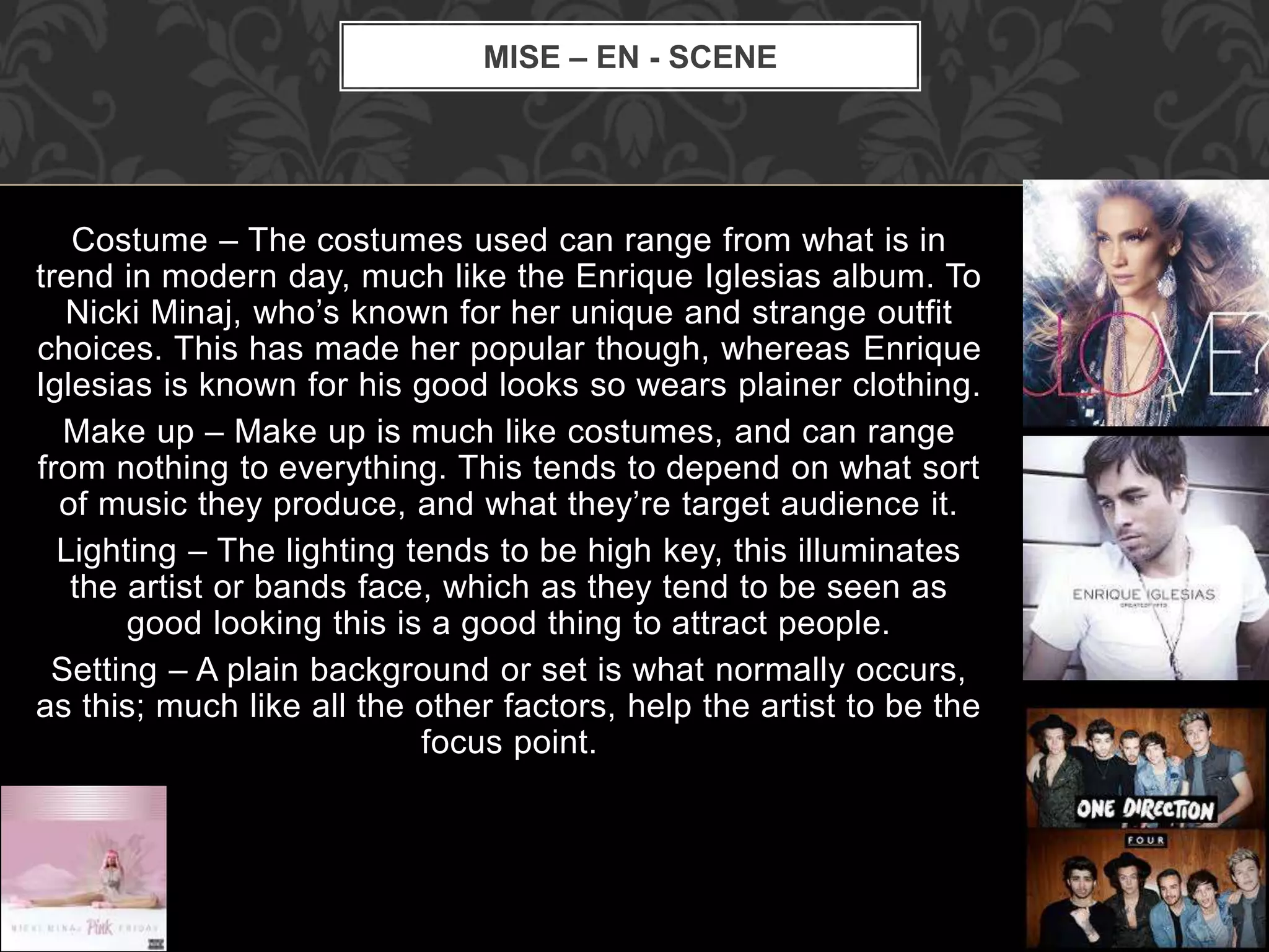
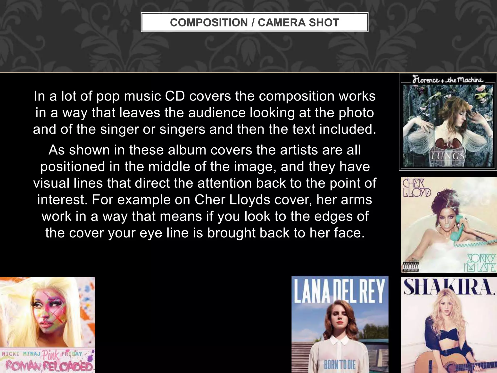
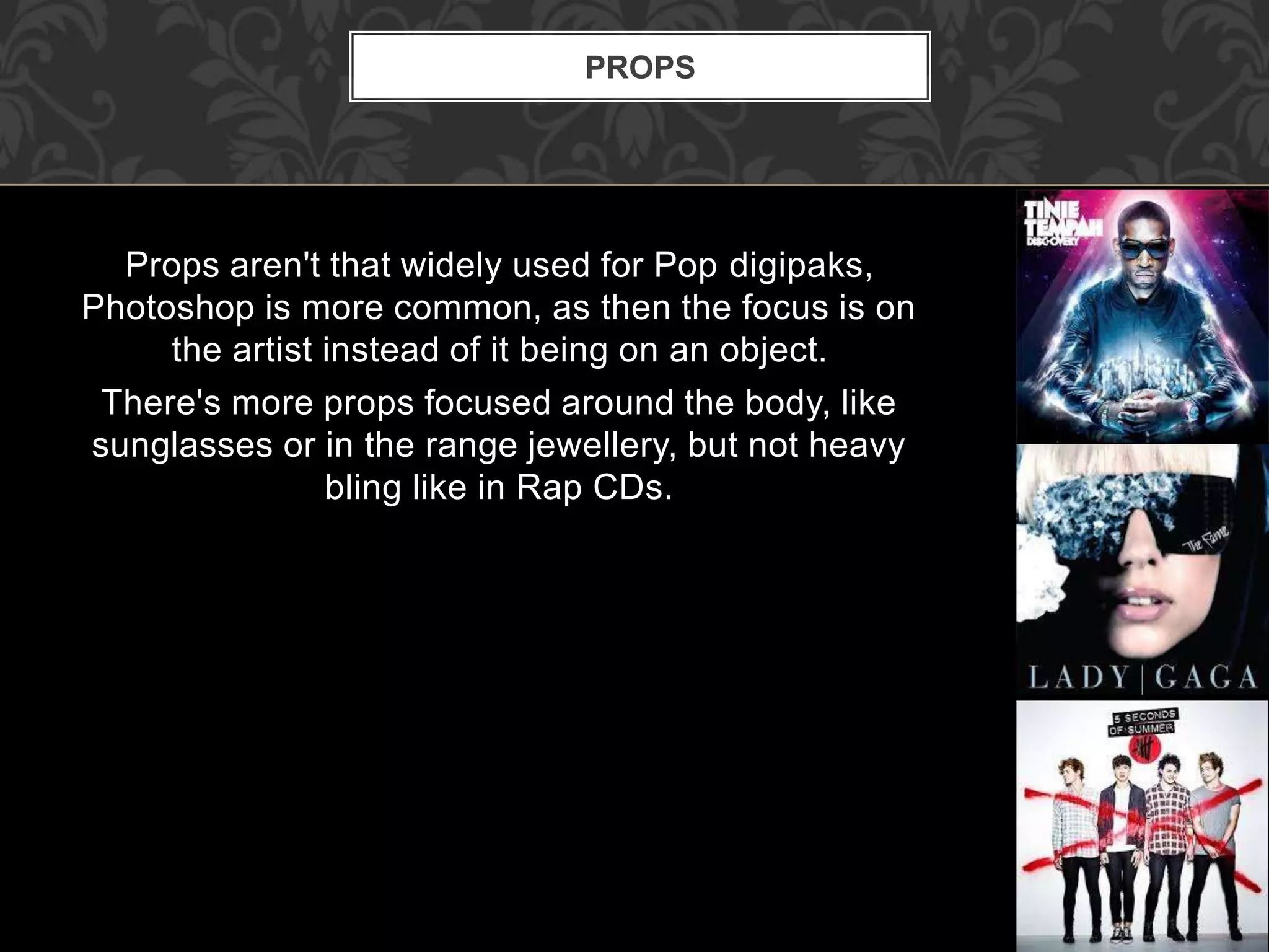
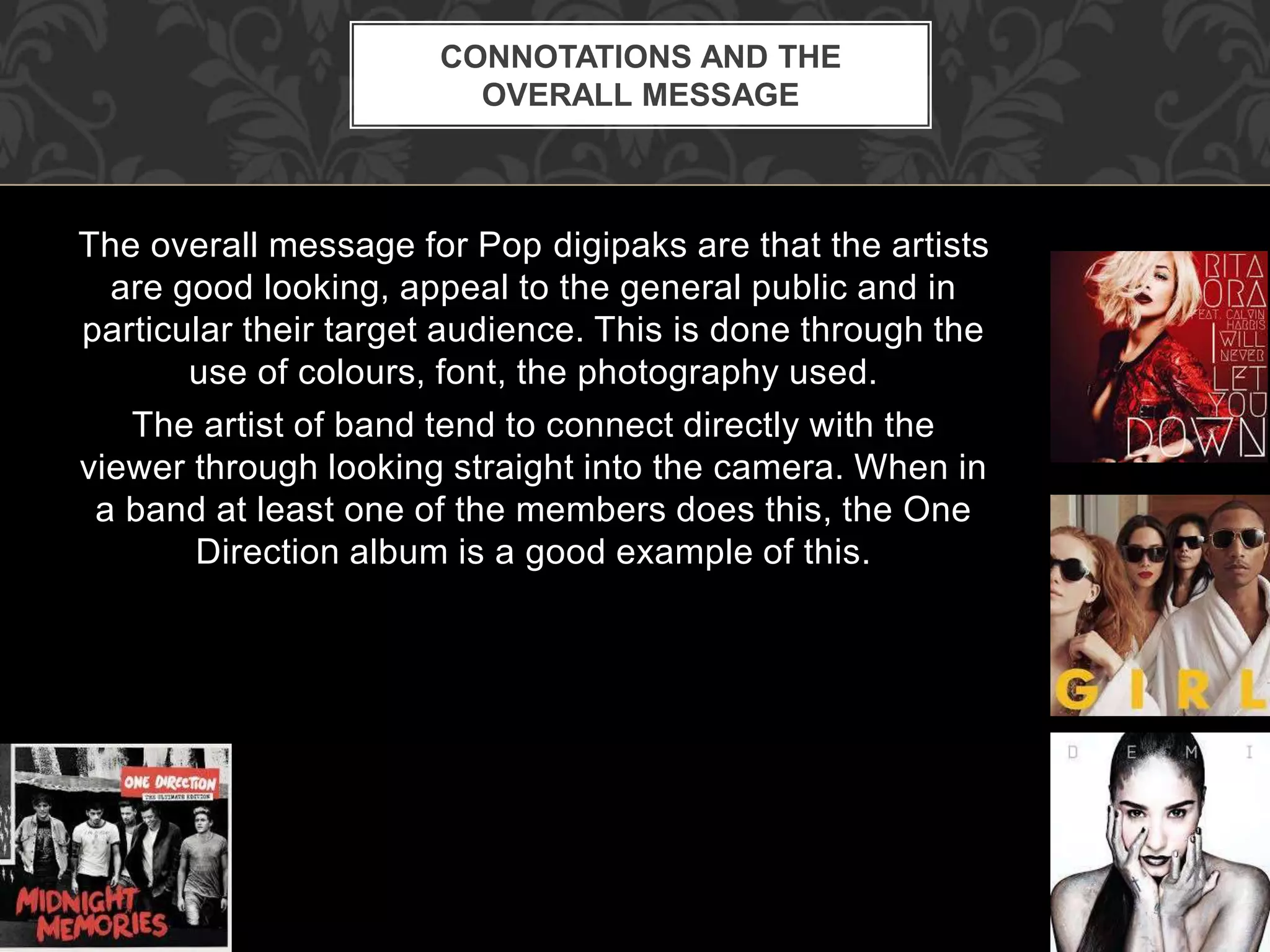

Generic conventions in pop music digipak album covers include large, bold titles overlapping a central image of the artist to draw attention. Fonts for female artists tend to be more ornate while male artists have plainer fonts. Artists generally make direct eye contact with the viewer and are the sole focus against plain backgrounds with high key lighting. Colors are bright primary hues to stand out from other genres, and minimal props emphasize the artist's appearance over objects. The overall message conveys the artist as good-looking and appealing to broad audiences.


