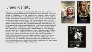
How effective is the
combination of your main
product and ancillary texts?
Evaluation Question 2
Brand Identity
To create a brand identity, I had to create distinct features that would allow
audiences to recognise each product piece and be able to refer them back to the
same artist (Jake Dylan). To be able to do this, I had to conduct research into the
specific conventions of pop-soul artists, but also, look into general pop artists and
the way in which they use things like locations, fonts, colours, camera techniques
and props to create this brand identity that is recognisable to them. The main
ways in which artists create a brand identity is their image which is a combination
of their photographing style, their clothing and even their personality. They also
almost always have a recognisable logo whether it is a symbol – usually applicable
to a band - or their artist name in a specific font; there is also the way in which
they use colours to be recognisable, this can be applied to just their imagery in
general or their logo. For example, Ed Sheeran with the colour orange, and One
Direction with red. An artist I looked into was Ellie Goulding; each of her media
pieces such as posters or album covers has the same ‘logo’ of her name in a
specific font. She also used colours like black and gold in many of her artworks,
making that her distinct recognisable colours that would catch peoples eye –
especially those who are fans of her and would instantly recognise them. Like all
artists and brands in general, they tend to innovate and develop their logos to stay
changing just as the music world does. (3rd picture).
My artists’ brand identity
When creating a brand identity for my artist, I ensured to stick to the pop-soul genre conventions that
would make his audience recognise his other products, but also, new audiences to be able to
recognise the genre of the music that could make them look into the artist. Firstly, I created a logo of
the artist’s name (Jake Dylan) in a specific font and colour. I used this particular font because it is
conventional for pop-soul artists to have an almost soft font with not a lot of harsh edges and spikes
that would usually be associated with artist from the pop-punk genre. I also wanted to keep the font
with the traditional, British theme with the typewriter style to associate with the convention of
realism and traditionalism, since most pop-soul artists refer to themselves as just ‘normal’ people.
Therefore, if I were to use a very ‘out-there’ font such as this: jake dylan, then I would be conforming to
the genre of pop for children/teenagers and would not be targeting the audience of 16-25. In terms of
the colour, I wanted to keep it simple with white and not have my artist associated with a particular
colour as that usually conforms with conventions of the general pop genre with artists such as Justin
Bieber; pop-soul artists will usually keep it neutral to black or white and then have other things like
fonts and locations that create a brand identity. With the creation of my production label logo, I
ensured to have it on each of my ancillaries to have another recognisable logo that, could, be
associated with my artist if ‘Jake Dylan’s’ audience will have only seen that logo on these pieces, and
not on any other artists work. Therefore, this is evidence of the way in which audiences will be able to
recognise each media product from the artist, even just by the use of the same logo with the font and
colour.
My artists’ brand identity
Along with the layout of my poster, I took inspiration from pop-soul artists such as Jake Bugg with his element of simplicity and neutralism. I
did this because I did want to conform to the genre but also to allow my poster to target not only my target audiences, but other people
because it would not look too crazy and cramped with props and images like a pop poster would have by Katy Perry, for example. I made sure
to have an image of the artist as the main imagery of the poster and also digipak; some artists tend to use artwork or colours that are
recognisable to their brand, such as Kasabian and Coldplay. Conforming with the conventions, I also made to artists brand identity towards
countryside locations. The poster was taken in a field with a sunset where you can only see the artist’s silhouette, I wanted to do this to show
that the artists’ looks and appearance are not the main thing that the audience is attracted to like it is for male pop artists and bands such as
The Vamps and Shawn Mendes, for example. However, since the artist is aimed at teenagers, I did want to make it slightly obvious that he was
a young male that could clearly be recognised from other pictures such as those from the album cover. The digipak contains 3 pictures of the
artist all in countryside locations, once again, to conform to this brand identity. Here, I am creating synergy between the two media products
by showing the same person in countryside locations that can all relate back to the same artist.
My artists brand identity – mise-en-scene
The mise-en-scene with my artist and each of the products make it instantly recognisable to audiences since I ensured to conform to each one
aspect the same in each one. The costume in each was very casual ‘boy next door’ clothing with jeans, trainers, t shirt and denim jacket in the
digipak images. I used pictures from the same photoshoot where the artist is wearing the same clothes to make them unique to the album and
the album have its own brand in itself. In the poster, he had similar clothing on, and since the lighting was very low and you can barely see the
outfit, it allows the imagery to take the primary sight of the image, rather than the clothing which is less important for a pop-soul artist. Pop-
RNB artists, for example, tend to take more importance in their style and their costumes they wear as it adds to their brand identity and
personality.
In both photoshoots there were no props; I didn’t think they were necessary other than if it was an instrument like a guitar which is seen to be
popular and conventional in the pop-soul genre to show their use of instruments and their involvement into the songs instrumentals. Pop
artists are more likely to have props that add to the imagery of their brand and/or photoshoot with themes and bright colours, examples for
this are Katy Perry and Ariana Grande. The same with make up, since the artist is a conventional male artist, it is stereotypical for them not to
wear make-up. However, they can and do wear it for photoshoots etc, I just chose not to since both images were long shots and not close ups.
The lighting I kept to a minimum; I didn’t use any artificial lighting for any of my photoshoots, I simply waited until I got the lighting I wanted
which was a very dusky, nightfall lighting – neither high or low key. Luckily, for the poster photo I got a good sunset that added to the ambience
of the image and created more of a professional looking picture. For the digipak photoshoot, I used the same kind of lighting that was ambient
with the sun setting, I wanted to create pathetic fallacy to reflect the chilled vibe of the album and almost a sad feeling since some of the songs
could be sad songs, rather than up-beat pop songs.
Evaluation
In conclusion, I think I have successfully created a brand identity that conforms to the pop-soul genre. The
fonts and logo both allow for people to instantly recognise any typography by the artist; this is useful for
eye-catching posters or album covers which essentially, could generate more sales, which I believe is one of
the primary reasons for creating a recognisable brand. I think that each piece are similar enough to be able
to conform with the brand identity and be recognised as products from the same artist; the logo is probably
the most important aspect for this. The other important aspect of the brand identity I think is the way in
which the locations are very similar in both ancillaries, this allows for the artist’s personality to show
through in the artwork and imagery. This iconography of the logo and countryside locations such as trees
and the sky create a recognisable image for audiences and a strong brand identity that can be referred to in
any future pieces of media that may come from the artist.
The music video, however, does not include the artist nor the countryside locations, therefore, the only way
in which that the video would be recognisable to that artist would be from the way in which the camera and
shots are used, along with the song and the message it portrays. The music video is set in a city location
since that is what reflects the narrative of the song and video of the story of a homeless girl who is addicted
to drugs. In effect of this, the music video does not conform to the brand identity of the artist with the use
of countryside locations. However, I believe that music videos are a way in which artists can be more
creative with their media and can specifically portray the message the song gives; music videos are more of
a way to represent the song, rather than the artist which is what the posters and albums do.
Evaluation – Audience theory
The main aim of my music video is to convey a message through the narrative of the video in conjunction with the lyrics of the song; I wanted
audiences to be able to relate to the message or maybe just a situation within the story, allowing them to connect with the music video and
artist. This, therefore, can link to the Effects Model within the audience theory since my music video has such a powerful message within it, it
could have an effect on the audience and maybe, even be influenced by it. For example, they could be convinced or persuaded to quit taking
drugs as they have seen the monumental knock-on effects they can have not only on yourself but on other people. In terms of the hypodermic
needle theory, I think my video could relate to this in the sense that the audience would believe what happened in the music video and the
information that they took from the video is true: that they could die from taking drugs. This, effectively, is positive since the audience are
effected positively in he sense that they could stop taking drugs. The hypodermic needle theory is usually taken negatively in the sense that
people are so gullible that they will believe anything they are told in the media and are usually criticised by this theory.
People watch music videos for many different reasons which can be explained by the Uses and Gratifications theory that categorises peoples’
motive behind watching/reading a media piece: personal identity, information, social and entertainment. I would apply my music video to the
entertainment aspect of why an audience would watch my music video since music videos are usually watched because the audience likes the
song and they watch the video for pleasure. It could also be applied to the information aspect since it provides an insight into what can happen
from abusing drugs – however, I would argue it does not wholly apply to this reason like a documentary would wear people watch them
primarily to receive information. In terms of my poster advertisement, that would be read on the basis of gaining information on the album
along with the artist; the poster advertises the album release dates along with social media links etc. where people can look at the artist and
find more information. The digipak I created however, I would not apply to this theory since that is merely a way in which to provide imagery
for a CD and is more for the artist to expand and publicise their brand identity further.
The reception theory refers to the way in which an audience interprets the meaning of a music video; I think this strongly applies to my music
video. The producer encodes a meaning of a text and the audience decode that meaning either in the preferred, negotiated or oppositional
way. My music video, I imagine, is interpreted in the preferred way and they agree with the message given that drugs can, effectively, ruin your
life. My other ancillary pieces, however, I would argue do not apply to this theory since they are more giving information to the audience
rather than trying to put across a message.
Evaluation - representation
For my artist, I wanted him to come across as just an ‘ordinary teenager’ without any strong representations from any social groups. He does
conform with a stereotypical teenager as he wears casual clothing of jeans and jackets and the simplicity of the media pieces. Since the artist
only appears on the poster and digipak, it is difficult to pick out the stereotypical features of a young male that he could be presenting.
The music video, on the other hand, has a strong representation of homeless people. Firstly, it automatically is non-stereotypical for a woman
to be homeless (a woman is the protagonist of the video) and it is usually a man who is used for these types of media pieces because it is more
stereotypical for homeless people to be male. However, the homeless character did fit the stereotype that they take drugs and smoke – this is
usually because they have mental health issues, struggling with depression and anxiety and end up turning to drug use. Homeless people are
also shown to be smelly, uneducated, filthy and hungry because they live on the streets. I tried to create this persona with my actress; we used
black eyeliner and dark shadow to create small, tired looking eyes, she also dressed in ‘old’ looking, bland clothing – a hoodie, a coat that was
too big and beaten up shoes. I did want her to conform to this stereotype to make it blatant that she was homeless, since it is not as if the
audience are told that she is, therefore, I had to use things like costumes to create this stereotype.
Within the representation of the protagonist in my music video, I ensured to create Mulvey’s male gaze, purely because she is a girl. Part of the
narrative includes her sleeping with someone for money. With camera techniques, I used a POV shot to create the male gaze through the
camera as if the camera was a man, looking down on the protagonist and taking her somewhere. Therefore, this conforms to the stereotypical
fact that men just want sex and that she is still seen as an object, even more so because she is homeless.
Ideology refers to the meaning behind a text and the attitudes, values and beliefs that producers portray through the media. This can be
applied to my music video as people could argue that the producer (me) agrees with the male gaze and how women are treated as objects and
therefore, implemented it into a music video to convey a message.
Evaluation – narrative theory
Narrative theories generally tend to apply to film pieces like TV and film, but they can also apply to music videos, especially when there is a
strong storyline to the video, which mine has. Propp’s character roles theory, I would say, does not entirely apply to my music video since there
is not enough characters; it only includes a protagonist (hero) and, maybe, an antagonist (villain). However, the video is wholly based on one
character and her life, rather than an entire story line with characters Propp mentions such as the donor, princess, despatcher, false hero and
the helper – all of which he argues are contained in most films.
I do argue that my music video follows Todorov’s narrative theory: the equilibrium which is the homeless girl living in the streets; the
disruption of drugs and how she has to have sex to afford it; the new equilibrium in which she dies. However, I would go against the fact that
in the equilibrium the protagonist is happy, as she is not, she is just trying to get by with her normal life.
Throughout the video, I did incorporate the sense of Straus’ binary opposites with the contradicton of the protagonist, to passers by who are
completely opposite. I would use a close up shot of the protagonist, showing her watching or looking at someone, then jump cutting to her
view (from the camera) to other individuals such as men, families or children, to emphasise their differences and how she feels like an outsider.

Evaluation q 2

  • 1.
    How effective isthe combination of your main product and ancillary texts? Evaluation Question 2
  • 2.
    Brand Identity To createa brand identity, I had to create distinct features that would allow audiences to recognise each product piece and be able to refer them back to the same artist (Jake Dylan). To be able to do this, I had to conduct research into the specific conventions of pop-soul artists, but also, look into general pop artists and the way in which they use things like locations, fonts, colours, camera techniques and props to create this brand identity that is recognisable to them. The main ways in which artists create a brand identity is their image which is a combination of their photographing style, their clothing and even their personality. They also almost always have a recognisable logo whether it is a symbol – usually applicable to a band - or their artist name in a specific font; there is also the way in which they use colours to be recognisable, this can be applied to just their imagery in general or their logo. For example, Ed Sheeran with the colour orange, and One Direction with red. An artist I looked into was Ellie Goulding; each of her media pieces such as posters or album covers has the same ‘logo’ of her name in a specific font. She also used colours like black and gold in many of her artworks, making that her distinct recognisable colours that would catch peoples eye – especially those who are fans of her and would instantly recognise them. Like all artists and brands in general, they tend to innovate and develop their logos to stay changing just as the music world does. (3rd picture).
  • 3.
    My artists’ brandidentity When creating a brand identity for my artist, I ensured to stick to the pop-soul genre conventions that would make his audience recognise his other products, but also, new audiences to be able to recognise the genre of the music that could make them look into the artist. Firstly, I created a logo of the artist’s name (Jake Dylan) in a specific font and colour. I used this particular font because it is conventional for pop-soul artists to have an almost soft font with not a lot of harsh edges and spikes that would usually be associated with artist from the pop-punk genre. I also wanted to keep the font with the traditional, British theme with the typewriter style to associate with the convention of realism and traditionalism, since most pop-soul artists refer to themselves as just ‘normal’ people. Therefore, if I were to use a very ‘out-there’ font such as this: jake dylan, then I would be conforming to the genre of pop for children/teenagers and would not be targeting the audience of 16-25. In terms of the colour, I wanted to keep it simple with white and not have my artist associated with a particular colour as that usually conforms with conventions of the general pop genre with artists such as Justin Bieber; pop-soul artists will usually keep it neutral to black or white and then have other things like fonts and locations that create a brand identity. With the creation of my production label logo, I ensured to have it on each of my ancillaries to have another recognisable logo that, could, be associated with my artist if ‘Jake Dylan’s’ audience will have only seen that logo on these pieces, and not on any other artists work. Therefore, this is evidence of the way in which audiences will be able to recognise each media product from the artist, even just by the use of the same logo with the font and colour.
  • 4.
    My artists’ brandidentity Along with the layout of my poster, I took inspiration from pop-soul artists such as Jake Bugg with his element of simplicity and neutralism. I did this because I did want to conform to the genre but also to allow my poster to target not only my target audiences, but other people because it would not look too crazy and cramped with props and images like a pop poster would have by Katy Perry, for example. I made sure to have an image of the artist as the main imagery of the poster and also digipak; some artists tend to use artwork or colours that are recognisable to their brand, such as Kasabian and Coldplay. Conforming with the conventions, I also made to artists brand identity towards countryside locations. The poster was taken in a field with a sunset where you can only see the artist’s silhouette, I wanted to do this to show that the artists’ looks and appearance are not the main thing that the audience is attracted to like it is for male pop artists and bands such as The Vamps and Shawn Mendes, for example. However, since the artist is aimed at teenagers, I did want to make it slightly obvious that he was a young male that could clearly be recognised from other pictures such as those from the album cover. The digipak contains 3 pictures of the artist all in countryside locations, once again, to conform to this brand identity. Here, I am creating synergy between the two media products by showing the same person in countryside locations that can all relate back to the same artist.
  • 5.
    My artists brandidentity – mise-en-scene The mise-en-scene with my artist and each of the products make it instantly recognisable to audiences since I ensured to conform to each one aspect the same in each one. The costume in each was very casual ‘boy next door’ clothing with jeans, trainers, t shirt and denim jacket in the digipak images. I used pictures from the same photoshoot where the artist is wearing the same clothes to make them unique to the album and the album have its own brand in itself. In the poster, he had similar clothing on, and since the lighting was very low and you can barely see the outfit, it allows the imagery to take the primary sight of the image, rather than the clothing which is less important for a pop-soul artist. Pop- RNB artists, for example, tend to take more importance in their style and their costumes they wear as it adds to their brand identity and personality. In both photoshoots there were no props; I didn’t think they were necessary other than if it was an instrument like a guitar which is seen to be popular and conventional in the pop-soul genre to show their use of instruments and their involvement into the songs instrumentals. Pop artists are more likely to have props that add to the imagery of their brand and/or photoshoot with themes and bright colours, examples for this are Katy Perry and Ariana Grande. The same with make up, since the artist is a conventional male artist, it is stereotypical for them not to wear make-up. However, they can and do wear it for photoshoots etc, I just chose not to since both images were long shots and not close ups. The lighting I kept to a minimum; I didn’t use any artificial lighting for any of my photoshoots, I simply waited until I got the lighting I wanted which was a very dusky, nightfall lighting – neither high or low key. Luckily, for the poster photo I got a good sunset that added to the ambience of the image and created more of a professional looking picture. For the digipak photoshoot, I used the same kind of lighting that was ambient with the sun setting, I wanted to create pathetic fallacy to reflect the chilled vibe of the album and almost a sad feeling since some of the songs could be sad songs, rather than up-beat pop songs.
  • 6.
    Evaluation In conclusion, Ithink I have successfully created a brand identity that conforms to the pop-soul genre. The fonts and logo both allow for people to instantly recognise any typography by the artist; this is useful for eye-catching posters or album covers which essentially, could generate more sales, which I believe is one of the primary reasons for creating a recognisable brand. I think that each piece are similar enough to be able to conform with the brand identity and be recognised as products from the same artist; the logo is probably the most important aspect for this. The other important aspect of the brand identity I think is the way in which the locations are very similar in both ancillaries, this allows for the artist’s personality to show through in the artwork and imagery. This iconography of the logo and countryside locations such as trees and the sky create a recognisable image for audiences and a strong brand identity that can be referred to in any future pieces of media that may come from the artist. The music video, however, does not include the artist nor the countryside locations, therefore, the only way in which that the video would be recognisable to that artist would be from the way in which the camera and shots are used, along with the song and the message it portrays. The music video is set in a city location since that is what reflects the narrative of the song and video of the story of a homeless girl who is addicted to drugs. In effect of this, the music video does not conform to the brand identity of the artist with the use of countryside locations. However, I believe that music videos are a way in which artists can be more creative with their media and can specifically portray the message the song gives; music videos are more of a way to represent the song, rather than the artist which is what the posters and albums do.
  • 7.
    Evaluation – Audiencetheory The main aim of my music video is to convey a message through the narrative of the video in conjunction with the lyrics of the song; I wanted audiences to be able to relate to the message or maybe just a situation within the story, allowing them to connect with the music video and artist. This, therefore, can link to the Effects Model within the audience theory since my music video has such a powerful message within it, it could have an effect on the audience and maybe, even be influenced by it. For example, they could be convinced or persuaded to quit taking drugs as they have seen the monumental knock-on effects they can have not only on yourself but on other people. In terms of the hypodermic needle theory, I think my video could relate to this in the sense that the audience would believe what happened in the music video and the information that they took from the video is true: that they could die from taking drugs. This, effectively, is positive since the audience are effected positively in he sense that they could stop taking drugs. The hypodermic needle theory is usually taken negatively in the sense that people are so gullible that they will believe anything they are told in the media and are usually criticised by this theory. People watch music videos for many different reasons which can be explained by the Uses and Gratifications theory that categorises peoples’ motive behind watching/reading a media piece: personal identity, information, social and entertainment. I would apply my music video to the entertainment aspect of why an audience would watch my music video since music videos are usually watched because the audience likes the song and they watch the video for pleasure. It could also be applied to the information aspect since it provides an insight into what can happen from abusing drugs – however, I would argue it does not wholly apply to this reason like a documentary would wear people watch them primarily to receive information. In terms of my poster advertisement, that would be read on the basis of gaining information on the album along with the artist; the poster advertises the album release dates along with social media links etc. where people can look at the artist and find more information. The digipak I created however, I would not apply to this theory since that is merely a way in which to provide imagery for a CD and is more for the artist to expand and publicise their brand identity further. The reception theory refers to the way in which an audience interprets the meaning of a music video; I think this strongly applies to my music video. The producer encodes a meaning of a text and the audience decode that meaning either in the preferred, negotiated or oppositional way. My music video, I imagine, is interpreted in the preferred way and they agree with the message given that drugs can, effectively, ruin your life. My other ancillary pieces, however, I would argue do not apply to this theory since they are more giving information to the audience rather than trying to put across a message.
  • 8.
    Evaluation - representation Formy artist, I wanted him to come across as just an ‘ordinary teenager’ without any strong representations from any social groups. He does conform with a stereotypical teenager as he wears casual clothing of jeans and jackets and the simplicity of the media pieces. Since the artist only appears on the poster and digipak, it is difficult to pick out the stereotypical features of a young male that he could be presenting. The music video, on the other hand, has a strong representation of homeless people. Firstly, it automatically is non-stereotypical for a woman to be homeless (a woman is the protagonist of the video) and it is usually a man who is used for these types of media pieces because it is more stereotypical for homeless people to be male. However, the homeless character did fit the stereotype that they take drugs and smoke – this is usually because they have mental health issues, struggling with depression and anxiety and end up turning to drug use. Homeless people are also shown to be smelly, uneducated, filthy and hungry because they live on the streets. I tried to create this persona with my actress; we used black eyeliner and dark shadow to create small, tired looking eyes, she also dressed in ‘old’ looking, bland clothing – a hoodie, a coat that was too big and beaten up shoes. I did want her to conform to this stereotype to make it blatant that she was homeless, since it is not as if the audience are told that she is, therefore, I had to use things like costumes to create this stereotype. Within the representation of the protagonist in my music video, I ensured to create Mulvey’s male gaze, purely because she is a girl. Part of the narrative includes her sleeping with someone for money. With camera techniques, I used a POV shot to create the male gaze through the camera as if the camera was a man, looking down on the protagonist and taking her somewhere. Therefore, this conforms to the stereotypical fact that men just want sex and that she is still seen as an object, even more so because she is homeless. Ideology refers to the meaning behind a text and the attitudes, values and beliefs that producers portray through the media. This can be applied to my music video as people could argue that the producer (me) agrees with the male gaze and how women are treated as objects and therefore, implemented it into a music video to convey a message.
  • 9.
    Evaluation – narrativetheory Narrative theories generally tend to apply to film pieces like TV and film, but they can also apply to music videos, especially when there is a strong storyline to the video, which mine has. Propp’s character roles theory, I would say, does not entirely apply to my music video since there is not enough characters; it only includes a protagonist (hero) and, maybe, an antagonist (villain). However, the video is wholly based on one character and her life, rather than an entire story line with characters Propp mentions such as the donor, princess, despatcher, false hero and the helper – all of which he argues are contained in most films. I do argue that my music video follows Todorov’s narrative theory: the equilibrium which is the homeless girl living in the streets; the disruption of drugs and how she has to have sex to afford it; the new equilibrium in which she dies. However, I would go against the fact that in the equilibrium the protagonist is happy, as she is not, she is just trying to get by with her normal life. Throughout the video, I did incorporate the sense of Straus’ binary opposites with the contradicton of the protagonist, to passers by who are completely opposite. I would use a close up shot of the protagonist, showing her watching or looking at someone, then jump cutting to her view (from the camera) to other individuals such as men, families or children, to emphasise their differences and how she feels like an outsider.