MUSIC VIDEO EVALUATION
In what ways does your media product use, develop or
challenge forms or conventions of real media products?
OVERALL THEME/IDEA
The song ‘Dreamsville’ is an example of Uk Rap also referred to as
  ‘Grime’ as a group we wanted to achieve a unit of work that
  challenged the stereotypical boundaries and roles of this genre of
  music. We hoped to do this by portraying ambition and a artist living
  and fulfilling a dream however we still wanted to incorporate the
  urban undertones Uk Rap has in order to demonstrate our genre
  through the work we produced and attract not only the stereotypical
  rap audience base but also widen our audience base.
From research it is evident that adhering to stereotypes associated with
  Rap the performers look was key as it would help form and shape our
  brand. As a group through our research we also learnt that colours
  are important as many artists in the music industry that support
  these genres use their music videos, Cd’s and posters to promote and
  represent their gang cultures through their use of colours.
As a group we hoped our performers look would adhere to the regular
  conventions of Rap however our approach to the video as well as the
  supporting Cd cover and Poster would challenge these stereotypes
  artistically.
FRONT COVER COMPARISON
              Real Media Product Examples
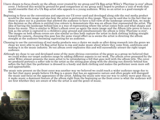
I have chosen to focus closely on the album cover created by my group and Uk Rap artist Wiley’s ‘Playtime is over’ album
    cover. I believed this would be ground for good comparison as my group and I hoped to produce a unit of work that
    would resemble that of a Uk Rap artist who appeals to a young audience. Wiley as an artist is a good example of
    this.
Beginning to focus on the conventions and aspects our Cd cover used and developed along side the real media product
    would be the main image and also how the artist is portrayed in this image. This can be said due to the fact that we
    chose to place our in a position that allowed the audience to have a full view of the landscape around him, we made
    this decision as the album is entitled true colours to demonstrate this was an album that represented the artist. The
    idea of having the landscape behind him is a way of representing where the artist comes from and what shapes and
    forms his music. This is similar to Wiley’s album cover as again the main image and the Album title prove to have a
    link as the artist is captured in a children’s play ground and simultaneously the album is titles ‘Playtime is over’.
    The images on both album covers are also similar as they both capture the artist in dark clothing looking straight
    toward the camera, choosing this pose has the same visual effect as is seems the artist is directing the album
    straight at the audience becoming captivating for an audience.
Choosing to use the conventions of real media products was a choice we made as after doing research into the genre we
    chose we were able to see Uk Rap artist focus to rap and make music about where they come from, ambitions and
    making it in the music industry. So out album cover replicates this and will successfully attract the right target
    audience.
Although we chose to use and developed some of the more obvious convention of the genre as a group we believed that
    we could widen our target audience range by adding different aspects to out work. The album cover presented by the
    artist Wiley almost presents the main artist to be intimidating a fell that goes well with the album title. The cover
    we produced portrays a softer side to the artist as the sitting pose along with the shining sun directly behind him
    soften the fact that the performer is dressed in a hoody and dark clothing and makes the performer seem more soft
    and approachable.
The music note present on the front cover was another way we believed we could reach a wider audience range due to
    the fact that many people believe Uk Rap is a genre that has an aggressive nature and often people will disregard
    the music and focus on the appearance of the artist. Adding the music note was our way to subtly move past this as
    it make music a dominant feature of the album right from the beginning as the front cover is what the audience will
    see first whether they are aware of who the artist is and the genre of music.
ALBUM INLAY COMPARISON
              Real Media Product Examples
Once again I have chosen to focus on another Uk artist of the same genre as oppose to an artist
  from America as it is clear the differences in the rap industry between the two countries will
  have an effect on how the artist portrays themselves through these products.
An album inlay is a chance for the artist to represent themselves in a way that is separate from
  the album however it can have an effect on the audiences assumptions of the music present
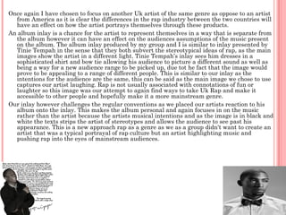
  on the album. The album inlay produced by my group and I is similar to inlay presented by
  Tinie Tempah in the sense that they both subvert the stereotypical ideas of rap, as the main
  images show the artist in a different light. Tinie Tempah’s inlay sees him dresses in a
  sophisticated shirt and bow tie allowing his audience to picture a different sound as well as
  being a way for a new audience range to be picked up, due tot he fact that the image would
  prove to be appealing to a range of different people. This is similar to our inlay as the
  intentions for the audience are the same, this can be said as the main image we chose to use
  captures our artist laughing. Rap is not usually associated with connotations of fun or
  laughter so this image was our attempt to again find ways to take Uk Rap and make it
  accessible to other people and hopefully make it a more mainstream genre.
Our inlay however challenges the regular conventions as we placed our artists reaction to his
  album onto the inlay. This makes the album personal and again focuses in on the music
  rather than the artist because the artists musical intentions and as the image is in black and
  white the texts strips the artist of stereotypes and allows the audience to see past his
  appearance. This is a new approach rap as a genre as we as a group didn't want to create an
  artist that was a typical portrayal of rap culture but an artist highlighting music and
  pushing rap into the eyes of mainstream audiences.
BACK COVER COMPARISON
              Real Media Product Examples
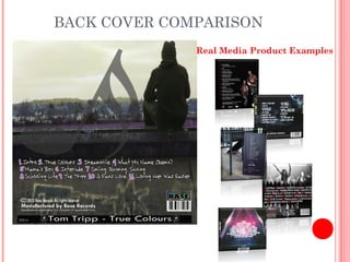
In my opinion i believe the back cover we produced is the piece of our work
  that uses and adheres to the conventions associated with the rap genre. I
  say this because our back cover incorporated things such as layout,
  typography and main images that are seen on many examples of
  products from the same genre.
Beginning with layout the idea of having a main image and then the text
  placed the way it has been presented on our back cover is one that during
  research I saw many times. For this reason we chose to replicate this as
  we do believe keeping some aspects of appearance similar is a good way
  to enhance the genre during advertising and promotion.
The typography used on our back cover is key as again as a group we chose
  to replicate the style of examples we had researched previously. This is
  where we incorporated our element of colour much like the Lil Wayne
  example shown below. We have opted for a white font for the titles of the
  songs however chose a contrasting purple to number them. This way our
  way of making our colour scheme consistent and relevant. The back cover
  of Lil Wayne’s album cover was inspiration for this however the red
  resent on his back cover is representing and incorporating elements of
  gang culture.
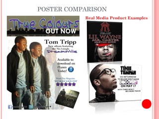
POSTER COMPARISON
           Real Media Product Examples
As one of our main objectives when creating our unit of work was to hopefully push
  rap into the eyes of a mainstream audience we had to be careful when creating
  out poster. Tinie Tempah being an artist that is now widely recognised for his
  music that derived from rap was a perfect example for us as a group to take
  inspiration from due to the fact that the simplicity of his poster makes its
  accessible but at the same time promotes the music to the fullest as the title is
  the most eye catching feature on the poster.
As a group we chose to use and incorporate the urban feel of rap music by adding
  the border of the city above the artist this was a way to connote the urban culture
  regularly associated with this type of music. This urban feeling was again
  demonstrated through the main image we chose again to have out artist in a
  hoody but this time it is open to reveal a brighter coloured shirt replicating our
  album name true colours as it shows the artist may wear a hoody but underneath
  has a smarter but more casual polo shirt that challenges the original conventions.
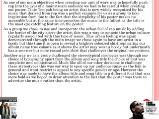
Another way we as a group challenged the stereotypical ideologies was through our
  choice of typography apart from the album and song title the choice of font was
  simplistic and sophisticated. Much like all of our other decisions to challenge
  these stereotypes this was our way to open up our audience range as the font is
  general and wont restrict is appeal to any specific gender or age. However the
  choice was made to have the album title and song title in a different font that was
  more bold as we hoped to draw attention to the fact that the poster was there to
  advertise the music rather than the artist.
MUSIC VIDEO COMPARISON
           Real Media Product Examples
The final video that we presented was a video that aimed to have an underlying narrative that went
along with the lyrics to represent the artists progression. This is not something that usually appears
in Uk rap videos as they are regularly made up of mainly performance based scenes and shots.

Conventional Shots                                      Unconventional shots


The shots shown above are examples of                   The shots shown above are examples of our
performance based shots taken from our video, as        narrative based shots as explained before it
in many other videos of the genre the artist is seen
                                                        is not a regular occurrence for a rap video
to perform the lyrics straight to the camera. We
believed it was important to in our videos for          from a Uk artist to show a narrative. This
moments like these to be present as they                was our way of again pushing audience
significantly built on the narrative as over time our   boundaries as these shots could be seen to
artist went from the streets, to the studio and on to   replicate videos from other genres such as
a concert so these moments helped demonstrate our       pop, examples of similar shots are below.
narrative, they are also similar to shots from real
media products shown below.

Music video evaluation 1

  • 1.
    MUSIC VIDEO EVALUATION Inwhat ways does your media product use, develop or challenge forms or conventions of real media products?
  • 2.
    OVERALL THEME/IDEA The song‘Dreamsville’ is an example of Uk Rap also referred to as ‘Grime’ as a group we wanted to achieve a unit of work that challenged the stereotypical boundaries and roles of this genre of music. We hoped to do this by portraying ambition and a artist living and fulfilling a dream however we still wanted to incorporate the urban undertones Uk Rap has in order to demonstrate our genre through the work we produced and attract not only the stereotypical rap audience base but also widen our audience base. From research it is evident that adhering to stereotypes associated with Rap the performers look was key as it would help form and shape our brand. As a group through our research we also learnt that colours are important as many artists in the music industry that support these genres use their music videos, Cd’s and posters to promote and represent their gang cultures through their use of colours. As a group we hoped our performers look would adhere to the regular conventions of Rap however our approach to the video as well as the supporting Cd cover and Poster would challenge these stereotypes artistically.
  • 3.
    FRONT COVER COMPARISON Real Media Product Examples
  • 4.
    I have chosento focus closely on the album cover created by my group and Uk Rap artist Wiley’s ‘Playtime is over’ album cover. I believed this would be ground for good comparison as my group and I hoped to produce a unit of work that would resemble that of a Uk Rap artist who appeals to a young audience. Wiley as an artist is a good example of this. Beginning to focus on the conventions and aspects our Cd cover used and developed along side the real media product would be the main image and also how the artist is portrayed in this image. This can be said due to the fact that we chose to place our in a position that allowed the audience to have a full view of the landscape around him, we made this decision as the album is entitled true colours to demonstrate this was an album that represented the artist. The idea of having the landscape behind him is a way of representing where the artist comes from and what shapes and forms his music. This is similar to Wiley’s album cover as again the main image and the Album title prove to have a link as the artist is captured in a children’s play ground and simultaneously the album is titles ‘Playtime is over’. The images on both album covers are also similar as they both capture the artist in dark clothing looking straight toward the camera, choosing this pose has the same visual effect as is seems the artist is directing the album straight at the audience becoming captivating for an audience. Choosing to use the conventions of real media products was a choice we made as after doing research into the genre we chose we were able to see Uk Rap artist focus to rap and make music about where they come from, ambitions and making it in the music industry. So out album cover replicates this and will successfully attract the right target audience. Although we chose to use and developed some of the more obvious convention of the genre as a group we believed that we could widen our target audience range by adding different aspects to out work. The album cover presented by the artist Wiley almost presents the main artist to be intimidating a fell that goes well with the album title. The cover we produced portrays a softer side to the artist as the sitting pose along with the shining sun directly behind him soften the fact that the performer is dressed in a hoody and dark clothing and makes the performer seem more soft and approachable. The music note present on the front cover was another way we believed we could reach a wider audience range due to the fact that many people believe Uk Rap is a genre that has an aggressive nature and often people will disregard the music and focus on the appearance of the artist. Adding the music note was our way to subtly move past this as it make music a dominant feature of the album right from the beginning as the front cover is what the audience will see first whether they are aware of who the artist is and the genre of music.
  • 5.
    ALBUM INLAY COMPARISON Real Media Product Examples
  • 6.
    Once again Ihave chosen to focus on another Uk artist of the same genre as oppose to an artist from America as it is clear the differences in the rap industry between the two countries will have an effect on how the artist portrays themselves through these products. An album inlay is a chance for the artist to represent themselves in a way that is separate from the album however it can have an effect on the audiences assumptions of the music present on the album. The album inlay produced by my group and I is similar to inlay presented by Tinie Tempah in the sense that they both subvert the stereotypical ideas of rap, as the main images show the artist in a different light. Tinie Tempah’s inlay sees him dresses in a sophisticated shirt and bow tie allowing his audience to picture a different sound as well as being a way for a new audience range to be picked up, due tot he fact that the image would prove to be appealing to a range of different people. This is similar to our inlay as the intentions for the audience are the same, this can be said as the main image we chose to use captures our artist laughing. Rap is not usually associated with connotations of fun or laughter so this image was our attempt to again find ways to take Uk Rap and make it accessible to other people and hopefully make it a more mainstream genre. Our inlay however challenges the regular conventions as we placed our artists reaction to his album onto the inlay. This makes the album personal and again focuses in on the music rather than the artist because the artists musical intentions and as the image is in black and white the texts strips the artist of stereotypes and allows the audience to see past his appearance. This is a new approach rap as a genre as we as a group didn't want to create an artist that was a typical portrayal of rap culture but an artist highlighting music and pushing rap into the eyes of mainstream audiences.
  • 7.
    BACK COVER COMPARISON Real Media Product Examples
  • 8.
    In my opinioni believe the back cover we produced is the piece of our work that uses and adheres to the conventions associated with the rap genre. I say this because our back cover incorporated things such as layout, typography and main images that are seen on many examples of products from the same genre. Beginning with layout the idea of having a main image and then the text placed the way it has been presented on our back cover is one that during research I saw many times. For this reason we chose to replicate this as we do believe keeping some aspects of appearance similar is a good way to enhance the genre during advertising and promotion. The typography used on our back cover is key as again as a group we chose to replicate the style of examples we had researched previously. This is where we incorporated our element of colour much like the Lil Wayne example shown below. We have opted for a white font for the titles of the songs however chose a contrasting purple to number them. This way our way of making our colour scheme consistent and relevant. The back cover of Lil Wayne’s album cover was inspiration for this however the red resent on his back cover is representing and incorporating elements of gang culture.
  • 9.
    POSTER COMPARISON Real Media Product Examples
  • 10.
    As one ofour main objectives when creating our unit of work was to hopefully push rap into the eyes of a mainstream audience we had to be careful when creating out poster. Tinie Tempah being an artist that is now widely recognised for his music that derived from rap was a perfect example for us as a group to take inspiration from due to the fact that the simplicity of his poster makes its accessible but at the same time promotes the music to the fullest as the title is the most eye catching feature on the poster. As a group we chose to use and incorporate the urban feel of rap music by adding the border of the city above the artist this was a way to connote the urban culture regularly associated with this type of music. This urban feeling was again demonstrated through the main image we chose again to have out artist in a hoody but this time it is open to reveal a brighter coloured shirt replicating our album name true colours as it shows the artist may wear a hoody but underneath has a smarter but more casual polo shirt that challenges the original conventions. Another way we as a group challenged the stereotypical ideologies was through our choice of typography apart from the album and song title the choice of font was simplistic and sophisticated. Much like all of our other decisions to challenge these stereotypes this was our way to open up our audience range as the font is general and wont restrict is appeal to any specific gender or age. However the choice was made to have the album title and song title in a different font that was more bold as we hoped to draw attention to the fact that the poster was there to advertise the music rather than the artist.
  • 11.
    MUSIC VIDEO COMPARISON Real Media Product Examples
  • 12.
    The final videothat we presented was a video that aimed to have an underlying narrative that went along with the lyrics to represent the artists progression. This is not something that usually appears in Uk rap videos as they are regularly made up of mainly performance based scenes and shots. Conventional Shots Unconventional shots The shots shown above are examples of The shots shown above are examples of our performance based shots taken from our video, as narrative based shots as explained before it in many other videos of the genre the artist is seen is not a regular occurrence for a rap video to perform the lyrics straight to the camera. We believed it was important to in our videos for from a Uk artist to show a narrative. This moments like these to be present as they was our way of again pushing audience significantly built on the narrative as over time our boundaries as these shots could be seen to artist went from the streets, to the studio and on to replicate videos from other genres such as a concert so these moments helped demonstrate our pop, examples of similar shots are below. narrative, they are also similar to shots from real media products shown below.