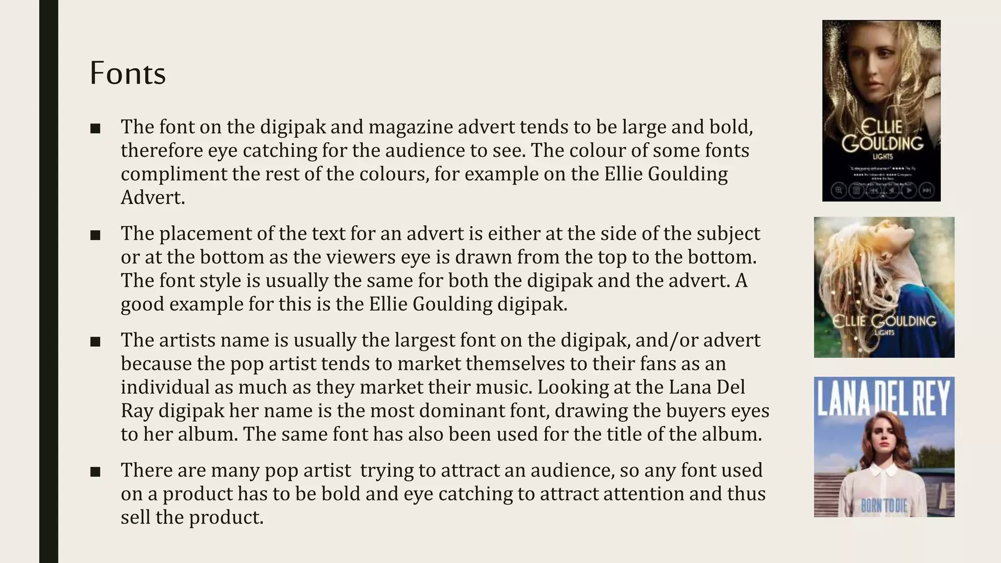
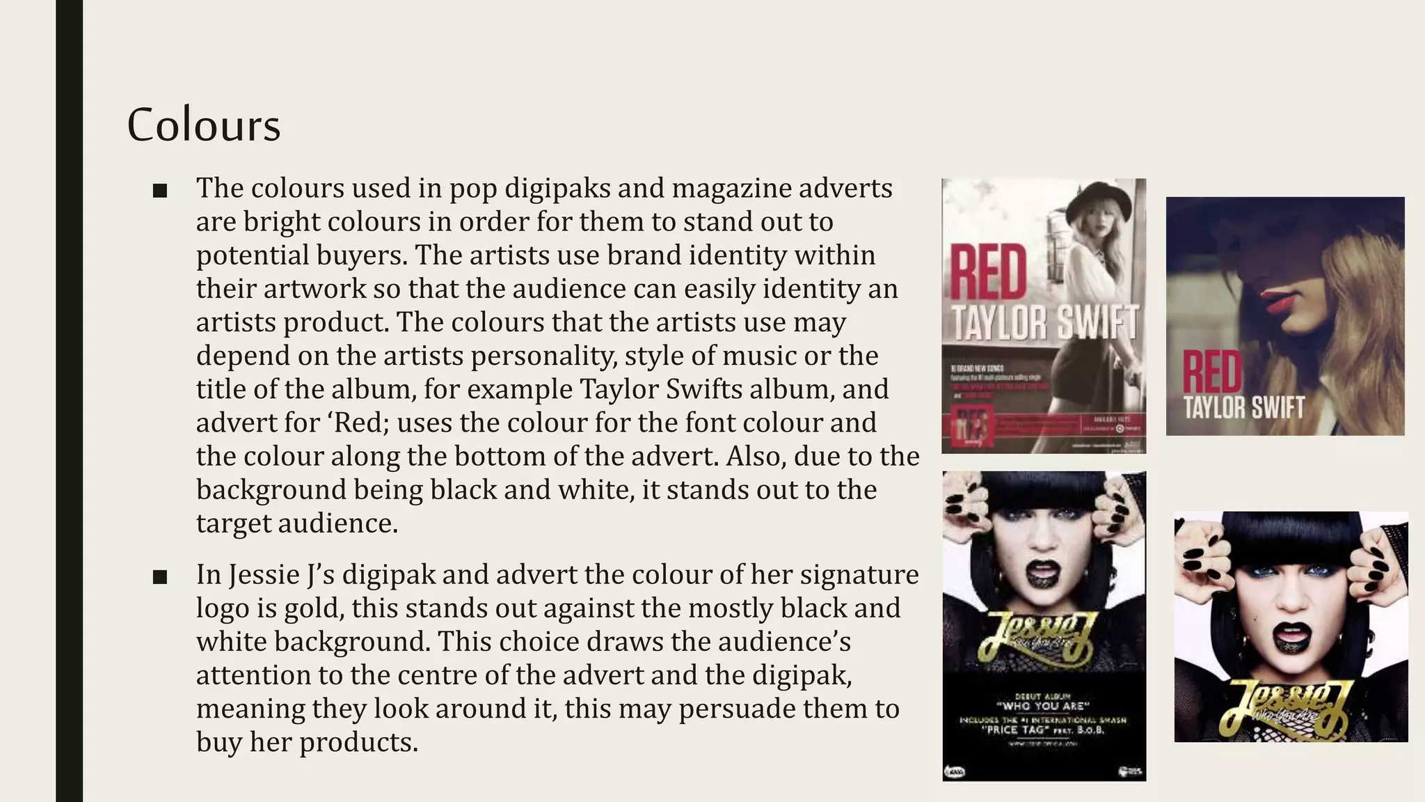
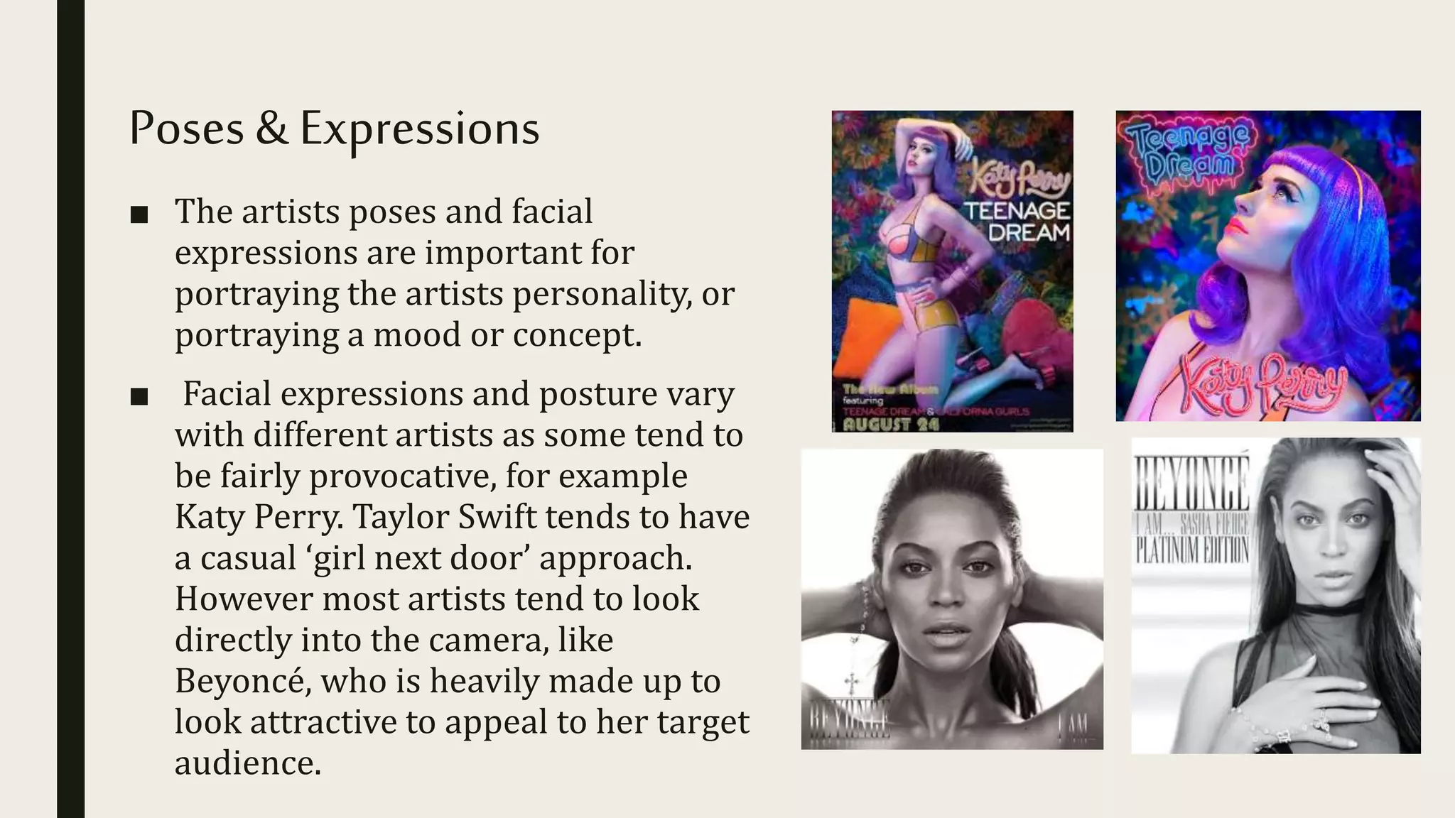
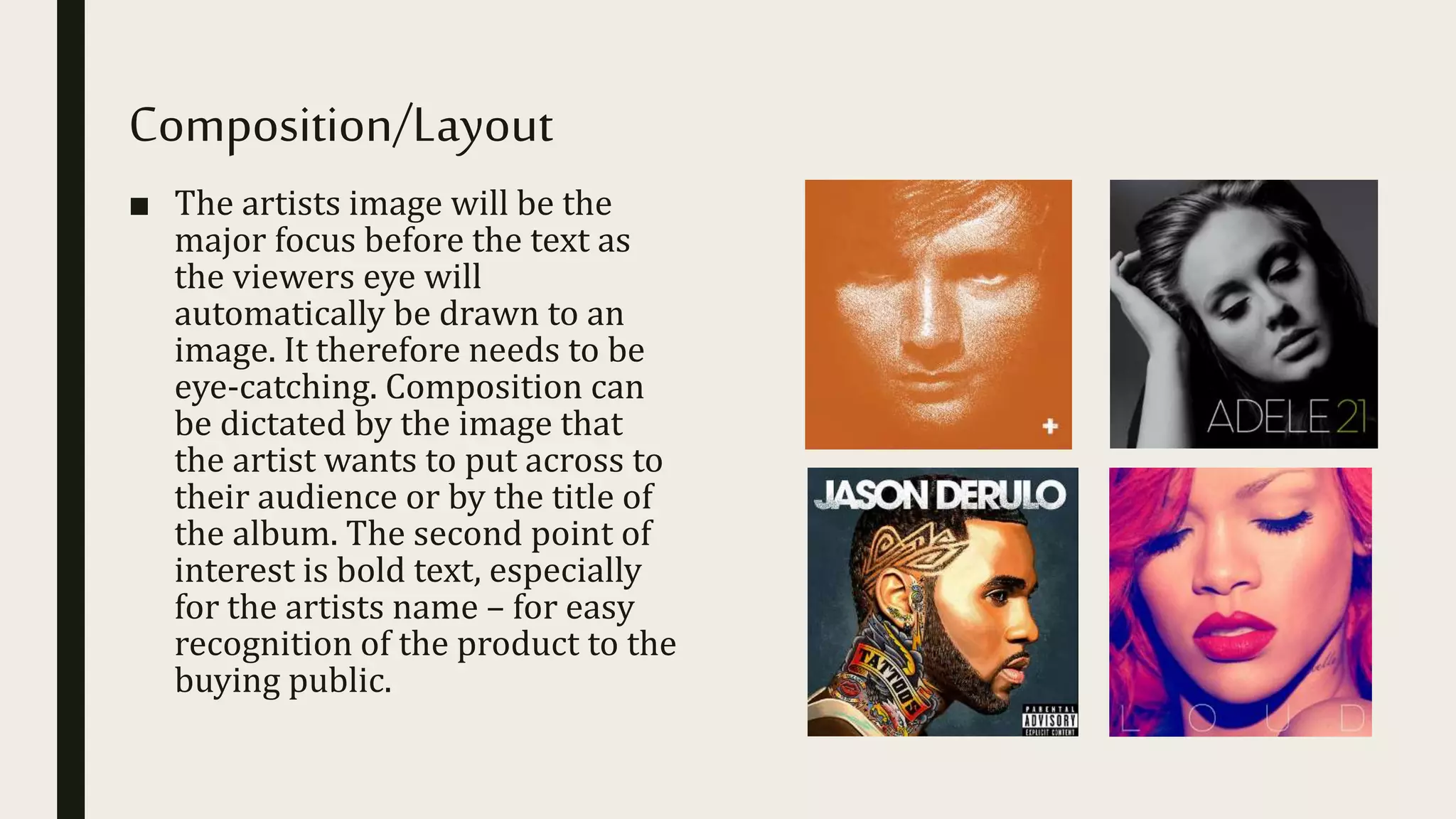
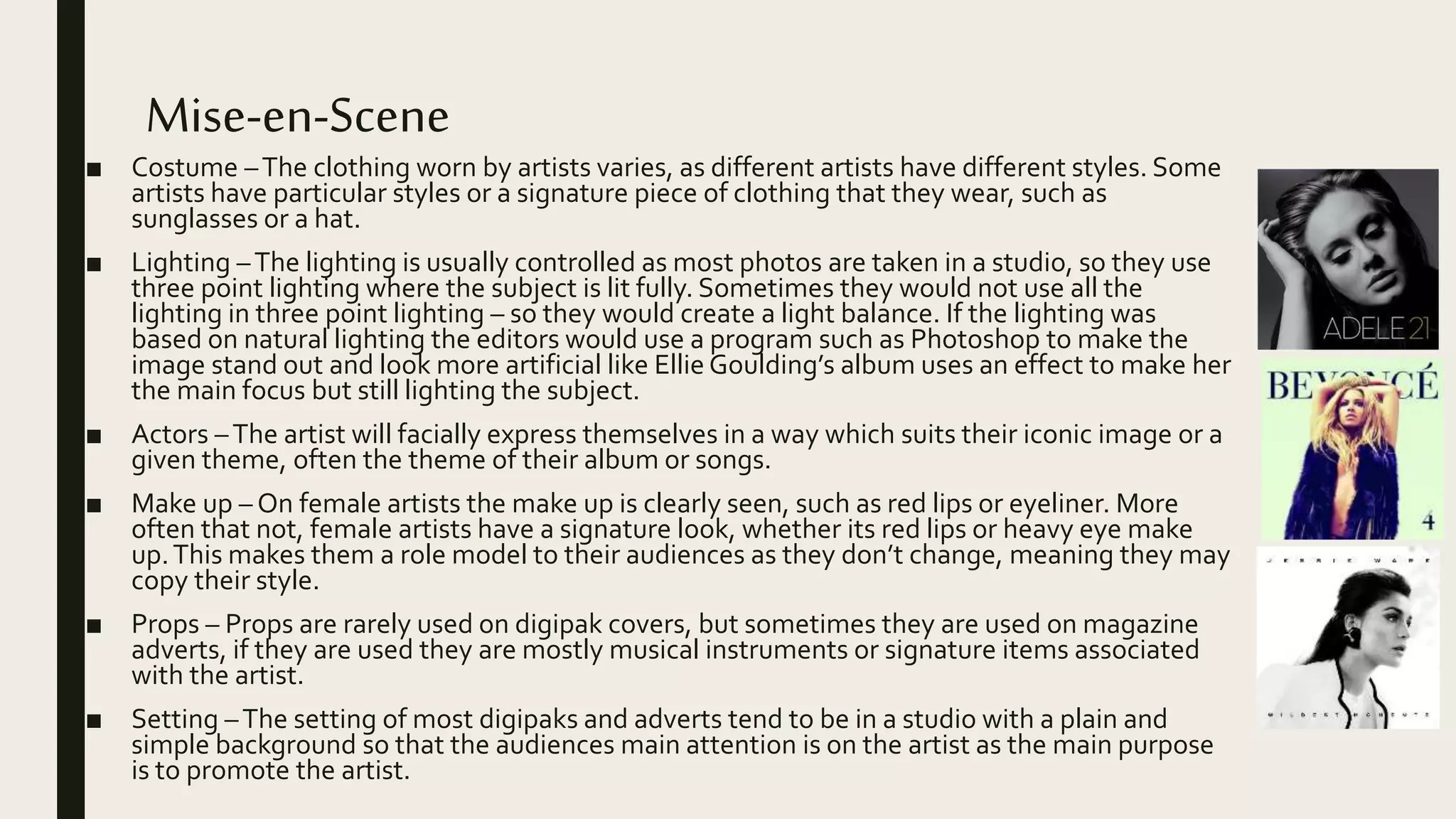
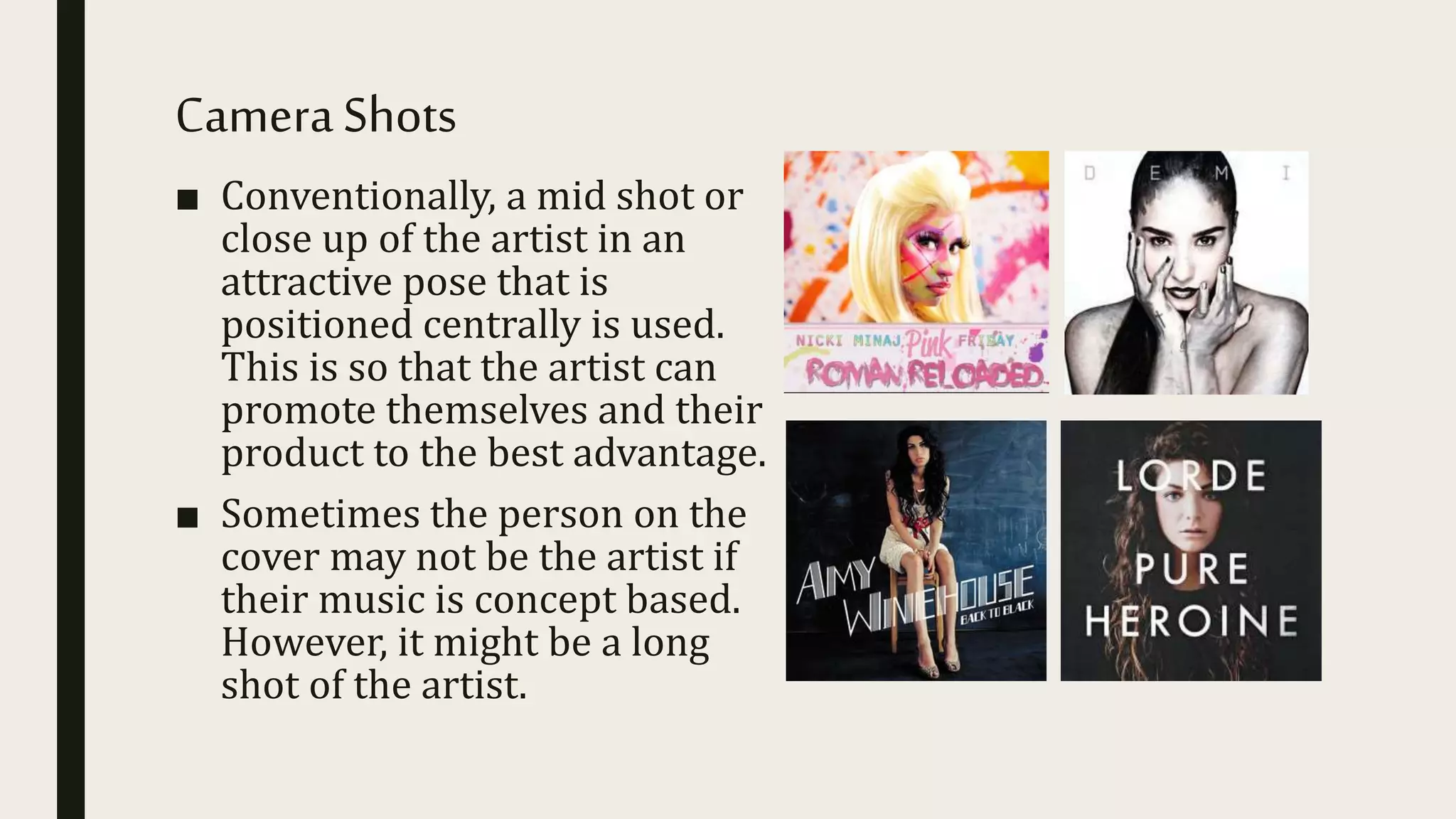
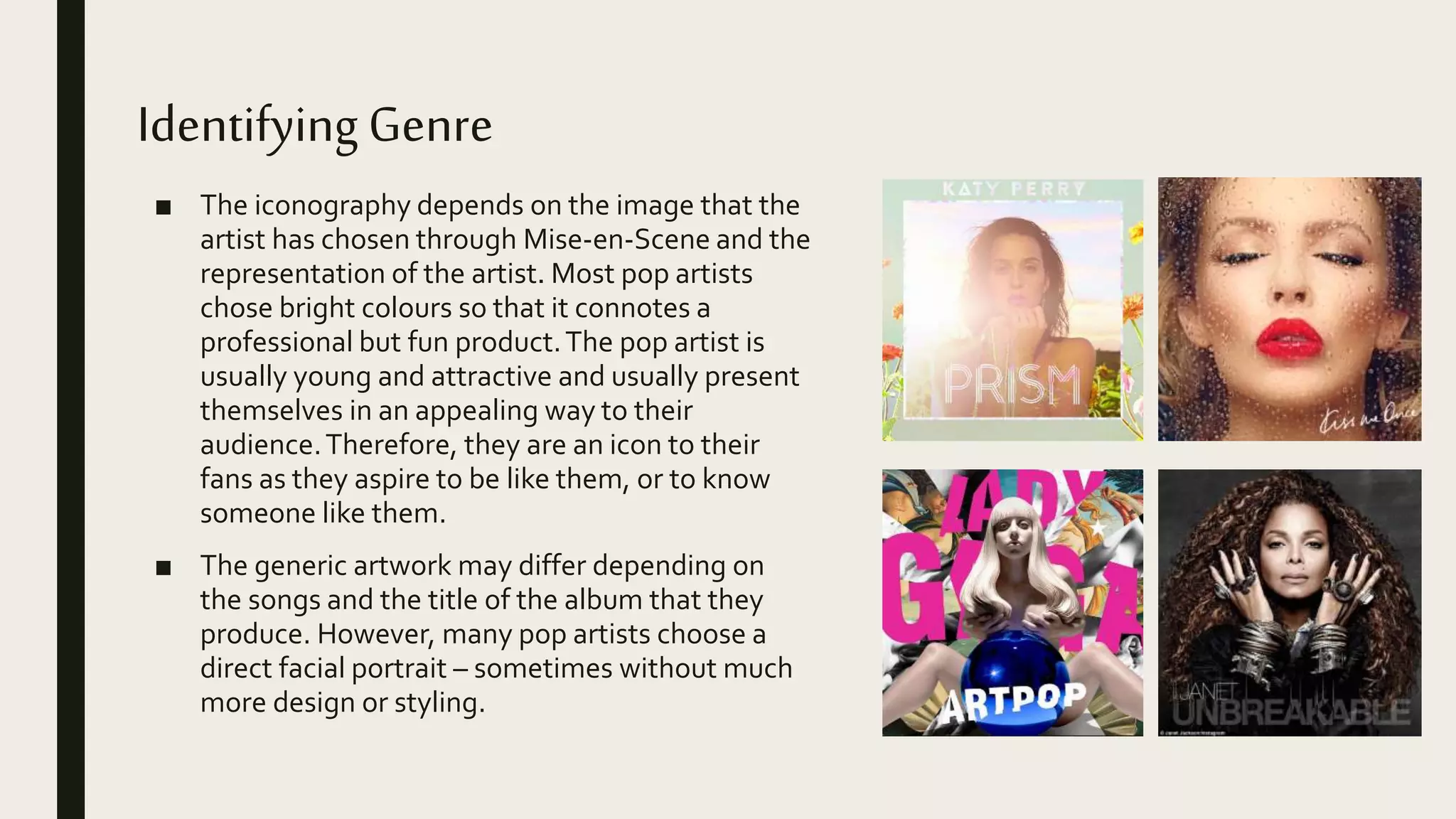
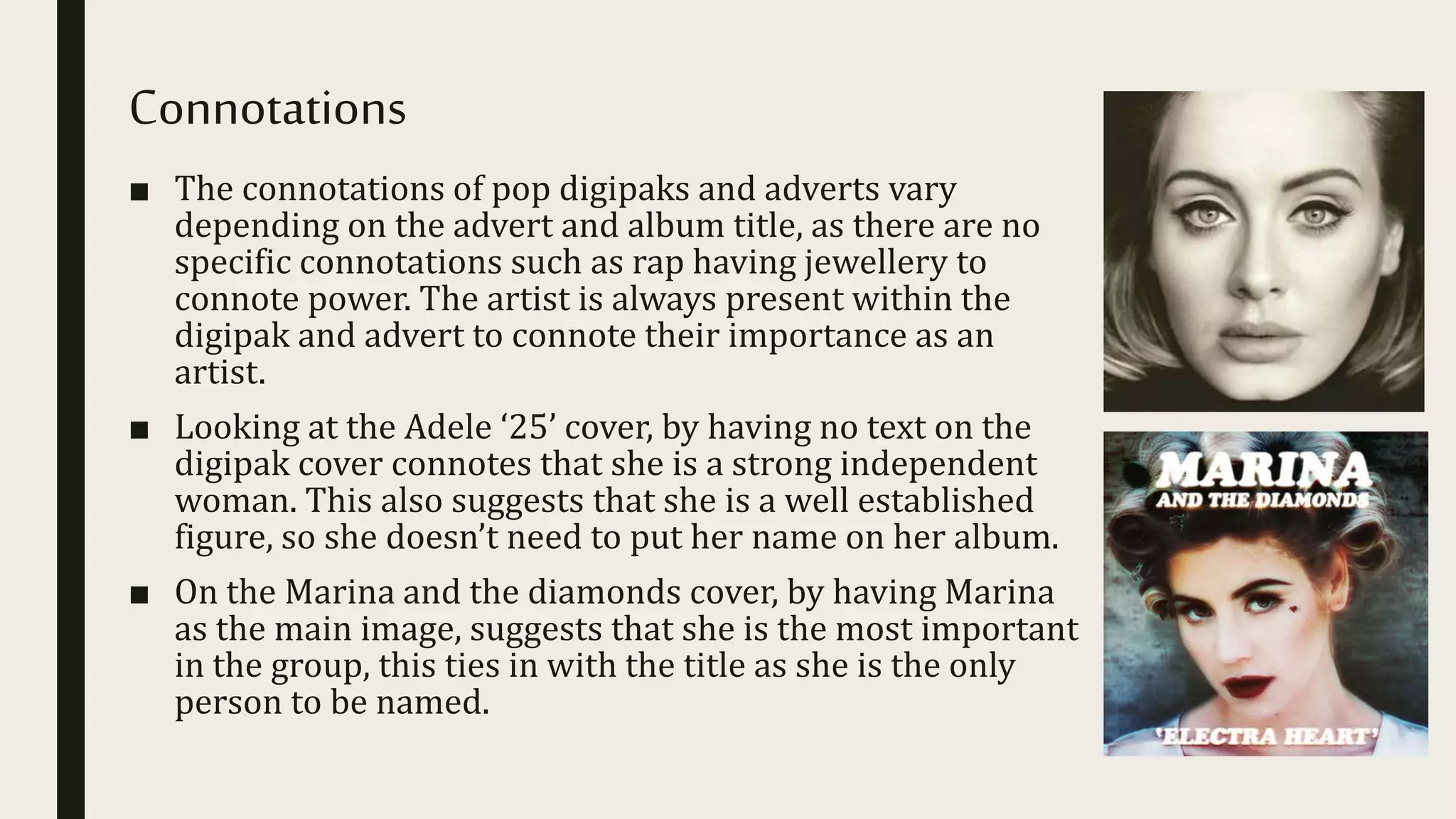
2. Introduction
■ In this PowerPoint, I will look at existing digipak and
magazine adverts to see if there are any common themes.
Pop digipak and adverts have different styles depending on
the artist or album name, Some artists have brand identity
where there is a visual connection in the artists album
cover and other media products the artist have released in
order to promote them. The target audience of pop tends to
be a young audience so the artwork has to appeal to them.
3. Fonts
■ The font on the digipak and magazine advert tends to be large and bold,
therefore eye catching for the audience to see. The colour of some fonts
compliment the rest of the colours, for example on the Ellie Goulding
Advert.
■ The placement of the text for an advert is either at the side of the subject
or at the bottom as the viewers eye is drawn from the top to the bottom.
The font style is usually the same for both the digipak and the advert. A
good example for this is the Ellie Goulding digipak.
■ The artists name is usually the largest font on the digipak, and/or advert
because the pop artist tends to market themselves to their fans as an
individual as much as they market their music. Looking at the Lana Del
Ray digipak her name is the most dominant font, drawing the buyers eyes
to her album. The same font has also been used for the title of the album.
■ There are many pop artist trying to attract an audience, so any font used
on a product has to be bold and eye catching to attract attention and thus
sell the product.
4. Colours
■ The colours used in pop digipaks and magazine adverts
are bright colours in order for them to stand out to
potential buyers. The artists use brand identity within
their artwork so that the audience can easily identity an
artists product. The colours that the artists use may
depend on the artists personality, style of music or the
title of the album, for example Taylor Swifts album, and
advert for ‘Red; uses the colour for the font colour and
the colour along the bottom of the advert. Also, due to the
background being black and white, it stands out to the
target audience.
■ In Jessie J’s digipak and advert the colour of her signature
logo is gold, this stands out against the mostly black and
white background. This choice draws the audience’s
attention to the centre of the advert and the digipak,
meaning they look around it, this may persuade them to
buy her products.
5. Poses & Expressions
■ The artists poses and facial
expressions are important for
portraying the artists personality, or
portraying a mood or concept.
■ Facial expressions and posture vary
with different artists as some tend to
be fairly provocative, for example
Katy Perry. Taylor Swift tends to have
a casual ‘girl next door’ approach.
However most artists tend to look
directly into the camera, like
Beyoncé, who is heavily made up to
look attractive to appeal to her target
audience.
6. Composition/Layout
■ The artists image will be the
major focus before the text as
the viewers eye will
automatically be drawn to an
image. It therefore needs to be
eye-catching. Composition can
be dictated by the image that
the artist wants to put across to
their audience or by the title of
the album. The second point of
interest is bold text, especially
for the artists name – for easy
recognition of the product to the
buying public.
7. Mise-en-Scene
■ Costume –The clothing worn by artists varies, as different artists have different styles. Some
artists have particular styles or a signature piece of clothing that they wear, such as
sunglasses or a hat.
■ Lighting –The lighting is usually controlled as most photos are taken in a studio, so they use
three point lighting where the subject is lit fully. Sometimes they would not use all the
lighting in three point lighting – so they would create a light balance. If the lighting was
based on natural lighting the editors would use a program such as Photoshop to make the
image stand out and look more artificial like Ellie Goulding’s album uses an effect to make her
the main focus but still lighting the subject.
■ Actors –The artist will facially express themselves in a way which suits their iconic image or a
given theme, often the theme of their album or songs.
■ Make up – On female artists the make up is clearly seen, such as red lips or eyeliner. More
often that not, female artists have a signature look, whether its red lips or heavy eye make
up.This makes them a role model to their audiences as they don’t change, meaning they may
copy their style.
■ Props – Props are rarely used on digipak covers, but sometimes they are used on magazine
adverts, if they are used they are mostly musical instruments or signature items associated
with the artist.
■ Setting –The setting of most digipaks and adverts tend to be in a studio with a plain and
simple background so that the audiences main attention is on the artist as the main purpose
is to promote the artist.
8. CameraShots
■ Conventionally, a mid shot or
close up of the artist in an
attractive pose that is
positioned centrally is used.
This is so that the artist can
promote themselves and their
product to the best advantage.
■ Sometimes the person on the
cover may not be the artist if
their music is concept based.
However, it might be a long
shot of the artist.
9. IdentifyingGenre
■ The iconography depends on the image that the
artist has chosen through Mise-en-Scene and the
representation of the artist. Most pop artists
chose bright colours so that it connotes a
professional but fun product.The pop artist is
usually young and attractive and usually present
themselves in an appealing way to their
audience.Therefore, they are an icon to their
fans as they aspire to be like them, or to know
someone like them.
■ The generic artwork may differ depending on
the songs and the title of the album that they
produce. However, many pop artists choose a
direct facial portrait – sometimes without much
more design or styling.
10. Connotations
■ The connotations of pop digipaks and adverts vary
depending on the advert and album title, as there are no
specific connotations such as rap having jewellery to
connote power. The artist is always present within the
digipak and advert to connote their importance as an
artist.
■ Looking at the Adele ‘25’ cover, by having no text on the
digipak cover connotes that she is a strong independent
woman. This also suggests that she is a well established
figure, so she doesn’t need to put her name on her album.
■ On the Marina and the diamonds cover, by having Marina
as the main image, suggests that she is the most important
in the group, this ties in with the title as she is the only
person to be named.
11. Conclusion
■ In conclusion, the generic conventions of pop help show some
features I should use for my digipak and advert, such as the use of
bright colours. I will ensure that I pay attention to the layout of my
digipak and advert, as I realise the importance of a strong facial
image to promote the artist. I will make sure that I use the features
that I have researched to make an outstanding digipak and magazine
advert.
■ These features vary between different artists so I will carefully
examine my artist to see what features should be included.