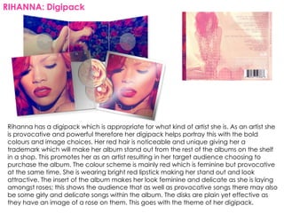
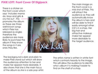
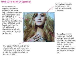
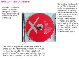
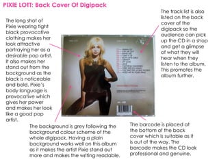
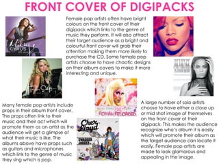
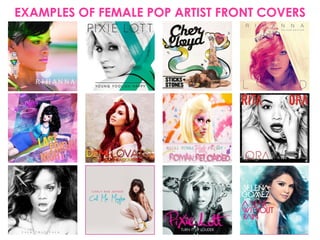
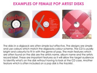
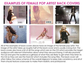
The document analyzes and compares the digipacks of several pop artists, including Rihanna, Leona Lewis, and Pixie Lott. Key elements discussed include image choices that portray the artists' brands, color schemes used to attract audiences, and inclusion of track lists and other details to make the packaging recognizable and promote album sales. Overall design aims to emphasize the artists' attractiveness while reflecting their styles through visual elements of the digipacks.
The album cover uses a colour scheme of light blue and black to make Beyoncé's name and the number 4 stand out. The main photo depicts Beyoncé looking independent in an attractive outfit. Additional photos show Beyoncé posing confidently in minimal clothing, representing common objectification of women in the R&B genre.
Album Cover and Magazine Adverts for Album Releases Analysislelicordell
The album cover features a close-up of Rihanna's face in bold red lipstick and hair against a plain background, drawing attention to her. The font with the album name is barely noticeable against her skin tone. There is no text identifying the artist, but it is implied to be Rihanna based on her image. The simple design allows fans to interpret the music in their own way.
The document discusses options for ancillary products to promote a new music video, including a website, digipak, and magazine advertisement. The author chooses to design the digipak and magazine ad, as they enjoy photography and art. Examples of digipaks and ads are analyzed from the acoustic/indie pop genre. Photos taken of the artist in a woodland setting are presented for audience feedback to select images for the promotional products.
The document discusses the color schemes, text, and pictures used on several album covers. For Rihanna's album, her hair and lips are bright red, matching the album's title. Adele's cover uses black and white to seem old-fashioned, with her name in white and the album title in green. Beyoncé's name is in black which contrasts the light blue background, and her picture overlaps the text to appear most prominent. Common R&B album cover tropes like exposing skin are seen in Beyoncé's pictures. Color, font, and photo placement are described as highlighting important details to attract the audience's attention.
The document discusses the color schemes, text, and pictures used on several album covers. It analyzes how these design elements are used to convey information about the artist and the type of music contained in the albums. For Rihanna's album, her hair and lips are bright red, signaling a bold color scheme. Adele's cover uses a black and white photo to suggest old-fashioned music styles. Beyoncé's cover features her name in black text on a light blue background for visibility, and her photo depicts an independent, powerful woman.
The poster uses bold colors like red and yellow to advertise Britney Spears' album "Circus" in a circus-themed style. Her name stands out against the yellow background with red shadowing. No image is needed as her name alone sells the album. Details like the tracklist and website are kept small as the focus is on the famous artist. The circus theme and colors imply an upbeat album and match the continuity from the album cover.
The document analyzes and summarizes several music album digipaks. It begins by explaining what a digipak is and then examines specific digipaks in detail. For the Hed Kandi "Serve Chilled: Electronic Summer" digipak, it analyzes the colors, images, and text used and how they convey that the music is dance genre. It also summarizes the Ella Eyre "Feline" and "Comeback" digipaks and how the visual elements portray Ella Eyre as powerful. The Calvin Harris digipaks are summarized as using hints and visuals to indicate the dance music genre. In conclusion, analyzing these digipaks provided lessons for effectively designing a digipak to represent a
The document analyzes and compares the album covers, packaging, and promotional materials for albums by Beyoncé, Rihanna, and Katy Perry. Some key themes and techniques identified across the materials include a connection to nature, consistent fonts and imagery to build recognition of the artist and album, close-up shots of the faces to highlight them as the selling point, strategic use of colors, and themes or imagery that relate to the music or artist's public persona.
This document discusses conventions used in music album magazine advertisements. It analyzes several advertisements, noting that they typically feature an eye-catching image, prominent display of the artist's name in a unique font style, and a consistent color theme. Specific advertisements are then examined in more detail, highlighting aspects like iconic images, use of fonts, inclusion of reviews or song names, and integration of online sales promotion. Overall trends as well as genre-specific approaches are covered.
The CD cover uses bright colors, fun designs, and a childlike font to attract children as the target audience. Random everyday objects on the cover relate to themes and videos from songs on the album. Both the front and back covers incorporate consistent colors, images, and fonts to clearly identify the artist and genre of upbeat, playful music.
The document discusses the album cover design for Mika's album "Life in Cartoon Motion". It summarizes:
1) The album cover uses bright colors, fun designs, and a childlike font to attract Mika's target audience of children and signal the happy, playful genre of his music.
2) Imagery on the front cover relates to Mika's music videos and songs, establishing a connection between the visuals and music.
3) Consistent use of color, imagery and font carry the theme through the front and back covers to easily identify the artist and genre.
The digipak uses dark earth tones and red colors to convey discomfort and a sense of darkness or hell. There are no images of the band, instead using random smudges and images of holes and scratches in a wall that symbolize insanity. This is meant to make the audience feel negative emotions. The two CDs add value for fans and the fossil-like CD design hints that the album should be treasured, while also conveying a sense of aging in a natural way.
The document discusses design elements to consider when creating a digipak, including:
1) Researching digipaks in the same genre from music platforms and CD covers to get ideas.
2) Analyzing existing digipaks and noting design features like bright colors, writing on the spine, colorful CDs, images, barcodes, and song lists.
3) Determining that for a target audience of 10-15 year olds, bright colors, exciting images, and minimal writing would be most appealing, based on analyzing digipaks from artists like Little Mix and Katy Perry.
The group will create a music video for the song "Youth" by Daughter. The video will tell the narrative of a teenage girl leaving home after an argument with her mother. She will encounter masked figures representing her feelings and emotions. Throughout the video, the main character will be isolated and on the edges of frames. Bright colors and powder paint will be used to contrast the typically moody indie folk genre. The video aims to explore themes of teenage development and rebellion through an unconventional use of color.
The document analyzes Ed Sheeran's debut album cover and ancillary artwork. [1] The album cover uses a simple font, Ed Sheeran's face with minimal manipulation, and an orange color scheme to represent his "ginger brand" in a warm, passionate way that appeals to his female audience. [2] The artwork and advertisements continue this minimal, hand-drawn style with black, white, and orange colors to reinforce Ed Sheeran's brand identity as a sincere, independent artist. [3] Even unofficial fan art sticks to these conventions to show what the core audience expects from Ed Sheeran's visual style.
Research and planning cd covers case studiesNicky Campbell
The magazine advert uses a simple dark image of the artist taking up most of the space to promote her album. Bold colors and lighting create a dark, rough theme suggesting a more rebellious album different than her usual pop music. Only the artist's name is in bold text while the album title is smaller to focus attention solely on her and make the album memorable.
The document provides an in-depth analysis of the visual elements and symbolism used in the digipack design for Rihanna's single "Loud". Key elements analyzed include:
- The predominant use of the color red throughout to symbolize love, passion and sexuality.
- Rihanna's image, makeup and poses which are intended to attract the male gaze and portray her as beautiful, sensual and flirtatious yet subtly made up.
- Symbolic imagery like roses that represent love and passion and link the different elements of the design together.
- Design choices like the pale pink color palette, typography and lighting intended to create a soft feminine vibe matching the implied calm,
This document analyzes magazine advertisements for music albums. It discusses the text, imagery, colors and layouts used in ads for albums by Lucy Rose, Ben Howard, Kings of Leon and The Script. Key elements included are the placement of the artist's name, album title and release date, as well as the use of quotes, natural lighting and relaxed poses to convey the music's style and genre. Color palettes and font styles are also examined for how they relate to the implied musical genres. Overall promotional strategies of the ads are considered, such as using positive quotes to draw in audiences.
The document summarizes the album covers of three different albums:
1) Rihanna's "Loud" album cover features dark red colors and roses to portray love and romance, matching Rihanna's facial expression.
2) Katy Perry's "Teenage Dream" cover is bright and colorful, reflecting her fun personality and targeting females. It features images of Perry promoting her song "California Gurls".
3) Oasis' "Acoustic" cover is simple, featuring an abstract guitar image to represent their music and acoustic style. It clearly displays the band name and album title.
The group will create a music video for the song "Youth" by Daughter. The video will tell the narrative of a teenage girl rebelling against her mother. She will wander through town and end up alone in a dark room where faceless figures throw colorful powder paint, representing her turbulent feelings. Inspired by Skins and Beyonce's "Hold Up" video, the video aims to juxtapose dull scenes with bright colors and use reverse shots to create an unconventional video for the indie folk genre that keeps the audience engaged.
Coldplay is promoting their new album with an advertisement featuring only the lead singer, Chris Martin. Using the lead singer alone is an effective unique selling point since most people would recognize Chris Martin over the other band members. The advertisement follows conventions by including the release date, song and band name, and logos. It places extra track information at the bottom so the focus remains on Chris Martin and the album contents.
Rihanna is promoting her new album "Loud" with a bright red advertisement that features her image twice. The bold red color connotes lust and sexuality, fitting Rihanna's pop image and the tone of her music. Key information like her name, the album name, and release date stand out
How effective is the combination of your product and ancillary texts?fabihasjcmediastudies
1) The document discusses the creative choices made in designing the packaging, advertising, and visual components for a pop album by artist Madelyniris.
2) Key elements like outfits, locations, and color palettes were chosen to create continuity across the music video, album cover, and additional marketing materials.
3) Photographic styles ranging from close-ups to landscape shots were selected deliberately based on research of successful indie pop artists, with the goal of representing the artist and appealing to their target audience.
The CD cover represents Eminem's journey to recovery from drug addiction through the image of him walking down a lonely road. Medical symbols like the red cross also reference his recovery. The title and artist's name stand out clearly against the plain background for visibility on store shelves.
The cover of Rihanna's 'Rated R' album shows her as the artist in a dark and mysterious way through her heavy makeup and jewelry, implying a darker sound than her previous albums. Paramore's 'Riot' cover stands out with its bright red title against a monochrome background with graffiti, representing their rock music. Britney Spears' 'Circus' cover depicts her as relaxed and feminine, fitting with the circus theme and being different than her prior albums. Cheryl Cole's '3 Words' cover presents her as very feminine and distant behind a veil, showing the album's focus on her femininity. Eminem's 'Recovery' cover is initially simple but reveals details about his
El documento presenta varias imágenes tomadas desde satélites que muestran las luces nocturnas de ciudades en diferentes partes del mundo al anochecer, incluyendo Europa, África, Brasil, América del Norte y el Caribe. Resalta las vistas de las plataformas continentales y la capacidad de identificar distintas ciudades basadas en las configuraciones de luces. Concluye reflexionando sobre la importancia de preservar este "espectáculo" para las futuras generaciones.
The front cover depicts the artist lying in a grassy field surrounded by flowers with her eyes closed. Her facial expression suggests she is shutting out the world to be at peace with her thoughts. The medium shot allows viewers to connect with her and pick up details despite her lack of overt emotion. The white color represents purity and peace while her red nails represent strength and passion.
The back cover lists song titles in simple white typography against a dark background. The titles become more numerous across sections labeled "Side A" and "Side B", possibly representing different stages in the artist's past.
Overall, the covers portray the artist as having endured a troubled past but now seeking mental clarity, strength and a fresh beginning through
The document analyzes the album cover and back cover for Katy Perry's "Teenage Dream" album. On the front cover, Katy Perry is prominently featured looking skyward with bright colors and bubble text for the title that appeals to teenagers. The background features brightly colored flowers creating a magical dream-like atmosphere, with Perry as the focus in the light. The back cover maintains consistency with the same background and bold text styles while ensuring necessary information like copyright and barcodes are clearly displayed.
This document analyzes the cover art for Katy Perry's album "Teenage Dream". The cover depicts Katy laying on clouds, implying she is flawless. The clouds resemble cotton candy, enforcing the candy theme of her brand. Katy is barely covered, appealing to both male and female audiences in a provocative yet feminine way. The album title "Teenage Dream" is smaller than Katy's name, showing she is more important. The melting text represents the album being hot and fun like summer. The re-release cover again features a near-naked Katy as the focus, showing her importance through simplicity. Her crown and candy necklace symbolize her success while keeping her sweet image.
The document summarizes the process taken to design the front and back covers of a CD. For the front cover, a photo was selected and elements were copied and pasted to fill space. Effects were added to make it black and white with added lighting. Text was added from an online font site. The same process was followed for the back cover, including matching effects and fonts to maintain consistency across the covers. Minor positioning adjustments were made to elements to improve the overall layout.
1) The document discusses choosing a font for a band's album cover and advertisement. Several handwritten-style fonts were considered.
2) Five fonts were selected as good options. These were evaluated based on how much they looked like actual handwriting and their thickness, boldness, and other aesthetic qualities.
3) In the end, one font was chosen because it incorporated larger first letters well without looking unprofessional or "too cartoon like." This simple, slim font was deemed to have a memorable yet not intimidating look.
The CD cover analysis discusses the symbolism and imagery within the album cover. It notes that the artist's name is prominently displayed in large white text, implying his self-importance. In contrast, the album title is barely visible in small white text, appearing to be hidden. The cover is in black and white, meant to evoke nostalgia for "old good times". The artist is surrounded by men trying to light his cigar, suggesting he has power and influence over others. Various details like jewelry worn by the men indicate they are of high social class. The target audience is identified as those between ages 15-30 who can relate to feelings of emptiness and difficulty trusting others.
This document analyzes and summarizes the key elements and intended meanings conveyed by the CD covers of albums by Beyonce, Jessie J, and Nicki Minaj. For Beyonce's album "I Am Sasha Fierce", the summary notes that the blurred background emphasizes Beyonce as the main focus, and her lack of color, makeup, and clothing is meant to portray her natural self. For Jessie J's "Who You Are", the close-up of her face with minimal makeup is said to represent showing the real Jessie J. And for Nicki Minaj's "The Pink Print", the pink color scheme, sexualized imagery, and parental advisory sticker are described as representing
The document analyzes the cover of Eminem's "Recovery" album. It summarizes that the cover represents Eminem's journey of recovery from past violence and drug abuse. He is walking alone on the cover to symbolize overcoming his struggles independently. All focus is on Eminem in the blurred background, and the backwards "E" stands for his longevity and persistence in the music industry.
The document analyzes and summarizes the meaning and symbolism portrayed on two different CD covers:
1) Eminem's CD cover shows his run-down childhood home, overgrown grass and blocked windows/doors, suggesting he has had a difficult, lonely life and career. The dull colors further depict his gloomy life.
2) In contrast, George Ezra's CD cover shows many happy people of both genders, indicating his music appeals to a wide audience and creates a happier mood compared to Eminem's. The mix of bright foreground colors against a dull background also symbolize this.
This document analyzes and summarizes the conventions of successful CD/DVD covers through examples. It discusses four covers in detail, focusing on how they use elements like images, lighting, fonts and backgrounds to convey messages about the artist and appeal to target audiences. Common techniques highlighted include contrasting images against plain backgrounds, emphasizing faces through lighting, and using bold fonts and imagery to depict themes of power, wealth and coolness.
The front cover of Nicki Minaj's album "The Pinkprint" features a highly sexualized image of the artist wearing tight, revealing clothing. The parental advisory sticker is prominently placed at the top left corner rather than the usual bottom right. Minaj's pink hair and excessive makeup portray her as a bold, outgoing persona. The pink color scheme and title emphasize the album's femininity. Lights in the background suggest themes of bars or strip clubs. The back cover features Nicki Minaj's signature, implying she created the album herself, and lists executive producers in the same large text as song titles, showing their importance. Pink print on the back continues themes of femininity.
The CD cover depicts Michael Jackson wearing a mask with a globe and ladder, suggesting danger is coming from anywhere. A hand is grabbing a child, and an eye watches closely, implying no one is safe. The cover conveys themes of danger, harm, and the need for help through its dark imagery and symbolism.
Justin Bieber's CD cover uses a simple black and white mid-shot photo of himself with his name and album title in white and purple fonts. Miley Cyrus' cover also keeps it simple with a photo of her smiling and holding a microphone, with her album name in small red bold font. Taylor Swift's cover features a close-up photo of her face lit up by the sun's rays, with her name and song title across the bottom in orange and black fonts. The Jonas Brothers cover shows them all together leaning on a table in a park, looking serious with their band name and crest in blue italic writing and the album name below in small grey font.
Emily analyzed improvements made to the CD covers for her band, Those Youths. For the front cover, she changed the word "Fun" to yellow and enlarged the font. For the tray card, she colored part of the swing bar, used a bigger font for the song titles, and spread them out more. The covers are meant to represent the band's fun, youthful style and target a young alternative rock audience.
1. The relationship between this album cover and other material by the artist is consistency in color scheme, font style, and direct images of the artist to create a recognizable brand identity.
2. The cover image features the artist prominently, using contrast and sizing of text to draw attention, representing wealth through clothing and vehicles common to the genre.
3. The layout is simple with a full-page image and minimal text on the sides to avoid clutter while clearly showing genre characteristics through imagery.
Album Cover and Magazine Adverts for Album Release Analysislelicordell
The advertisement features a picture of a gorilla eating plants with minimal text. The band name "Basement Jaxx" is in the largest, most colorful font to draw attention. The album name is in a smaller white font with limited additional information provided. A black background with starry sky design and pink scribbles make the advertisement bold and eye catching through strong contrasting colors.
The album cover features a close-up of Rihanna's face in bold red lipstick and hair against a plain background, drawing attention to her. The font with the album name is barely noticeable against her skin and makeup tones. There is no text identifying the album or artist by name, but it is implied to be Rihanna's based on her image being the focal point.
The front cover of Miley Cyrus's CD features a serif font and white text against a black background to represent purity. A purple gemstone on her ring symbolizes royalty and power. Her partially covered face suggests there is more to her public image. The CD label matches the color scheme and includes the record label logo to identify the producer. Positioning the barcode in the top corner represents Miley's uniqueness as an artist blending genres.
This document analyzes and summarizes the representation, fonts, and iconography used on the album covers of Beyoncé's "I Am Sasha Fierce", Nicki Minaj's "Pink Friday Roman Reloaded", and Ciara's "Basic Instinct". It discusses how the album covers portray the artists' different sides or personalities and aim to attract their target audiences through visual elements like gaze, color palette, and stylization of text.
A digi-pak is a form of CD packaging that protects the disk. It can hold one or two disks and includes pictures on the inside and outside, usually promoting the artist. Album covers normally display the artist's name so audiences know who it is, as well as the album name so consumers know what they are buying. Covers also commonly feature pictures of the artist to create iconography that allows audiences to identify them. Continuity is important, so elements like color schemes, text styles, and images are often repeated across the front and back covers.
Analysis Of Magazine Posters and Digipaksdanielbruce22
The 1975 and Lana Del Rey both maintain consistent black and white imagery across their album packaging to reinforce their artistic brands. They use simple, repetitive visuals that focus on the artist and force audiences to judge based on the music rather than flashy images. Both artists also name their debut albums after themselves to more easily identify the project with their band/name. This consistency of visual style across different marketing materials effectively builds recognition with their audiences over time.
Analysis Of Magazine Posters And Digipaksdanielbruce22
The 1975 and Lana Del Rey both maintain consistent black and white imagery across their album packaging to reinforce their artistic brands. They use simple, repetitive designs that let the music speak for itself rather than distracting packaging. Both artists also name their debut albums after their band/stage name to clearly identify the source of the music for audiences. Lana Del Rey cultivates a vintage aesthetic through her retro styling and cars that appeals to fans of indie music, while The 1975 emphasizes consistency through their rectangular logo.
This document discusses and analyzes the digipak design for Katy Perry's album "Teenage Dreams". It notes that the target audience is girls aged 16-20 and that the design uses motifs of sweets and the color pink which appeal to this audience. The poses and limited clothing on the cover are intended to attract male viewers as well. Overall, the design aims to attract Katy Perry's young female target audience through fun, colorful visuals related to sweets and youth.
The document discusses the album cover design for Mika's album "Life in Cartoon Motion". It summarizes:
1) The album cover uses bright colors, fun designs, and a childlike font to attract Mika's target audience of children more than other adult-oriented album covers.
2) Random everyday objects on the cover relate to Mika's music videos and songs, creating a strong connection between the visual design and the music.
3) The use of consistent colors, fonts, and imagery across the front and back covers allows viewers to easily identify the artist and genre even just by seeing one side.
The document analyzes Katy Perry's "Teenage Dream" digipak packaging. It notes that the front cover features only Perry's instantly recognizable face without text. The back cover includes pink clouds and maintains the candy theme while portraying the artist as "up in the clouds." Inside images further depict Perry in a suggestive manner to attract male audiences. Throughout, the digipak consistently features a candy theme to convey the album's vibrant pop feel and Perry's fun personality. In conclusion, the analysis commends maintaining a cohesive theme to inform audiences and employing various techniques to appeal to different demographic groups.
Leona Lewis is a British pop and R&B singer who gained fame after winning The X Factor in 2006. Some of her most successful songs include "Bleeding Love," which reached #1 in many charts worldwide. Her debut album Spirit was a huge commercial success, becoming the fastest selling debut album ever in the UK. Lewis has since released two more successful albums and has transitioned to more revealing and mature imagery in her music videos over the years to better suit pop and R&B conventions.
Leona Lewis is a British pop and R&B singer who gained fame after winning The X Factor in 2006. Some of her most successful songs include "Bleeding Love," which reached #1 in many countries. Her debut album Spirit was a huge commercial success, becoming the fastest-selling debut album in the UK. She has since released two more albums and her song "Run" sold over 69,000 copies in two days. Lewis has evolved her style and image over the years to better fit pop and R&B conventions as her success and fanbase has grown.
The document discusses several CD covers and how they convey information about the music to the target audience. It explains that the Scripts' simple cover shows the band members looking in different directions, conveying their music has calm and emotional songs. Rihanna's self-portrait cover allows her existing fans to recognize her but may not attract new fans. Devlin's cover depicts him near graffiti of his name, suggesting his music will have a "gangster" style. Rizzle Kicks' natural photo shows them playing casually to indicate their music will be upbeat and fun rather than emotional.
The document discusses several CD covers and how they convey information about the music to the target audience. It explains that the Scripts' simple cover shows the band members looking in different directions, conveying their music has calm and emotional songs. Rihanna's self-portrait cover allows her fans to easily recognize her but may not attract new fans. Devlin's cover depicts him near graffiti of his name, suggesting his music will have a "gangster" style reflecting his background. Rizzle Kicks' natural photo shows them playing casually to indicate their music will be upbeat and fun rather than emotional.
This magazine advert promotes Chris Brown's album "Fortune". The album title is the main focus, displayed prominently in a simple font at the top to draw attention. Chris Brown's name is in a smaller font below. Consistent colors and positioning link the advert clearly to the album. The commercial for the album also emphasizes the title, showing it is the primary promotional element over the artist's name.
This image uses the rule of thirds well by positioning the CD disk in the center of the cover, making it the focal point. The name of the artist, Beyoncé, is in very large writing at the top to attract audiences. In contrast, the title of the CD is simple and small, connoting that the name of the artist is more important than the title. The bright neutral colors on the front could suggest upbeat music, while the dark color of Beyoncé's jacket hints at complexity within the music.
This album cover uses photo manipulation techniques like those employed by Kanye West and Pharrell Williams to create a surreal image. The neutral colors and animation emphasis the indie genre. Though simple, the keyboard highlights the artist's passion for music while the messy room and wires create a sense of her distorted life. Small details about her life are meant to give the viewer a sense of her fun and relaxed personality to entice listeners without overstating her image.
Leona Lewis is a British pop and R&B singer who gained fame after winning The X Factor in 2006. She has since released three successful albums - Spirit, Echo, and Glassheart. Her debut album Spirit was the fastest selling debut album in the UK in 2007 and topped the Billboard 200 chart, selling over 7 million copies worldwide. Her hit single "Bleeding Love" reached number one in many countries. Lewis has evolved her style and sound over the years to continue appealing to fans as her popularity and success has grown.
- The document discusses the digipak design for Katy Perry's album "Teenage Dreams".
- It notes that the design uses motifs of sweets and the color pink, which appeal to Katy Perry's target audience of young girls.
- The poses and limited clothing on the digipak are intended to attract both female and male audiences.
1) The document analyzes and summarizes the key elements and intended messages of three different album digipaks - Beyonce's, Kanye West's, and David Guetta's.
2) Common elements examined across the digipaks include the use of colors, images, and fonts to convey messages about the artist's image and the potential genres and themes of the music.
3) The analyses suggest the digipaks aim to attract different target audiences and manipulate viewers into listening to the albums through their visual design elements.
The Future of Independent Filmmaking Trends and Job OpportunitiesLetsFAME
The landscape of independent filmmaking is evolving at an unprecedented pace. Technological advancements, changing consumer preferences, and new distribution models are reshaping the industry, creating new opportunities and challenges for filmmakers and film industry jobs. This article explores the future of independent filmmaking, highlighting key trends and emerging job opportunities.
Orpah Winfrey Dwayne Johnson: Titans of Influence and Inspirationgreendigital
Introduction
In the realm of entertainment, few names resonate as Orpah Winfrey Dwayne Johnson. Both figures have carved unique paths in the industry. achieving unparalleled success and becoming iconic symbols of perseverance, resilience, and inspiration. This article delves into the lives, careers. and enduring legacies of Orpah Winfrey Dwayne Johnson. exploring how their journeys intersect and what we can learn from their remarkable stories.
Follow us on: Pinterest
Early Life and Backgrounds
Orpah Winfrey: From Humble Beginnings to Media Mogul
Orpah Winfrey, often known as Oprah due to a misspelling on her birth certificate. was born on January 29, 1954, in Kosciusko, Mississippi. Raised in poverty by her grandmother, Winfrey's early life was marked by hardship and adversity. Despite these challenges. she demonstrated a keen intellect and an early talent for public speaking.
Winfrey's journey to success began with a scholarship to Tennessee State University. where she studied communication. Her first job in media was as a co-anchor for the local evening news in Nashville. This role paved the way for her eventual transition to talk show hosting. where she found her true calling.
Dwayne Johnson: From Wrestling Royalty to Hollywood Superstar
Dwayne Johnson, also known by his ring name "The Rock," was born on May 2, 1972, in Hayward, California. He comes from a family of professional wrestlers, with both his father, Rocky Johnson. and his grandfather, Peter Maivia, being notable figures in the wrestling world. Johnson's early life was spent moving between New Zealand and the United States. experiencing a variety of cultural influences.
Before entering the world of professional wrestling. Johnson had aspirations of becoming a professional football player. He played college football at the University of Miami. where he was part of a national championship team. But, injuries curtailed his football career, leading him to follow in his family's footsteps and enter the wrestling ring.
Career Milestones
Orpah Winfrey: The Queen of All Media
Winfrey's career breakthrough came in 1986 when she launched "The Oprah Winfrey Show." The show became a cultural phenomenon. drawing millions of viewers daily and earning many awards. Winfrey's empathetic and candid interviewing style resonated with audiences. helping her tackle diverse and often challenging topics.
Beyond her talk show, Winfrey expanded her empire to include the creation of Harpo Productions. a multimedia production company. She also launched "O, The Oprah Magazine" and OWN: Oprah Winfrey Network, further solidifying her status as a media mogul.
Dwayne Johnson: From The Ring to The Big Screen
Dwayne Johnson's wrestling career took off in the late 1990s. when he became one of the most charismatic and popular figures in WWE. His larger-than-life persona and catchphrases endeared him to fans. making him a household name. But, Johnson had ambitions beyond the wrestling ring.
In the early 20
Barbie Movie Review - The Astras.pdffffftheastras43
Barbie Movie Review has gotten brilliant surveys for its fun and creative story. Coordinated by Greta Gerwig, it stars Margot Robbie as Barbie and Ryan Gosling as Insight. Critics adore its perky humor, dynamic visuals, and intelligent take on the notorious doll's world. It's lauded for being engaging for both kids and grown-ups. The Astras profoundly prescribes observing the Barbie Review for a delightful and colorful cinematic involvement.https://theastras.com/hca-member-gradebooks/hca-gradebook-barbie/
Leonardo DiCaprio House: A Journey Through His Extravagant Real Estate Portfoliogreendigital
Introduction
Leonardo DiCaprio, A name synonymous with Hollywood excellence. is not only known for his stellar acting career but also for his impressive real estate investments. The "Leonardo DiCaprio house" is a topic that piques the interest of many. as the Oscar-winning actor has amassed a diverse portfolio of luxurious properties. DiCaprio's homes reflect his varied tastes and commitment to sustainability. from retreats to historic mansions. This article will delve into the fascinating world of Leonardo DiCaprio's real estate. Exploring the details of his most notable residences. and the unique aspects that make them stand out.
Follow us on: Pinterest
Leonardo DiCaprio House: Malibu Beachfront Retreat
A Prime Location
His Malibu beachfront house is one of the most famous properties in Leonardo DiCaprio's real estate portfolio. Situated in the exclusive Carbon Beach. also known as "Billionaire's Beach," this property boasts stunning ocean views and private beach access. The "Leonardo DiCaprio house" in Malibu is a testament to the actor's love for the sea and his penchant for luxurious living.
Architectural Highlights
The Malibu house features a modern design with clean lines, large windows. and open spaces blending indoor and outdoor living. The expansive deck and patio areas provide ample space for entertaining guests or enjoying a quiet sunset. The house has state-of-the-art amenities. including a gourmet kitchen, a home theatre, and many guest suites.
Sustainable Features
Leonardo DiCaprio is a well-known environmental activist. whose Malibu house reflects his commitment to sustainability. The property incorporates solar panels, energy-efficient appliances, and sustainable building materials. The landscaping around the house is also designed to be water-efficient. featuring drought-resistant plants and intelligent irrigation systems.
Leonardo DiCaprio House: Hollywood Hills Hideaway
Privacy and Seclusion
Another remarkable property in Leonardo DiCaprio's collection is his Hollywood Hills house. This secluded retreat offers privacy and tranquility. making it an ideal escape from the hustle and bustle of Los Angeles. The "Leonardo DiCaprio house" in Hollywood Hills nestled among lush greenery. and offers panoramic views of the city and surrounding landscapes.
Design and Amenities
The Hollywood Hills house is a mid-century modern gem characterized by its sleek design and floor-to-ceiling windows. The open-concept living space is perfect for entertaining. while the cozy bedrooms provide a comfortable retreat. The property also features a swimming pool, and outdoor dining area. and a spacious deck that overlooks the cityscape.
Environmental Initiatives
The Hollywood Hills house incorporates several green features that are in line with DiCaprio's environmental values. The home has solar panels, energy-efficient lighting, and a rainwater harvesting system. Additionally, the landscaping designed to support local wildlife and promote
At Digidev, we are working to be the leader in interactive streaming platforms of choice by smart device users worldwide.
Our goal is to become the ultimate distribution service of entertainment content. The Digidev application will offer the next generation television highway for users to discover and engage in a variety of content. While also providing a fresh and
innovative approach towards advertainment with vast revenue opportunities. Designed and developed by Joe Q. Bretz
The Evolution of the Leonardo DiCaprio Haircut: A Journey Through Style and C...greendigital
Leonardo DiCaprio, a name synonymous with Hollywood stardom and acting excellence. has captivated audiences for decades with his talent and charisma. But, the Leonardo DiCaprio haircut is one aspect of his public persona that has garnered attention. From his early days as a teenage heartthrob to his current status as a seasoned actor and environmental activist. DiCaprio's hairstyles have evolved. reflecting both his personal growth and the changing trends in fashion. This article delves into the many phases of the Leonardo DiCaprio haircut. exploring its significance and impact on pop culture.
From Teacher to OnlyFans: Brianna Coppage's Story at 28get joys
At 28, Brianna Coppage left her teaching career to become an OnlyFans content creator. This bold move into digital entrepreneurship allowed her to harness her creativity and build a new identity. Brianna's experience highlights the intersection of technology and personal branding in today's economy.
The Unbelievable Tale of Dwayne Johnson Kidnapping: A Riveting Sagagreendigital
Introduction
The notion of Dwayne Johnson kidnapping seems straight out of a Hollywood thriller. Dwayne "The Rock" Johnson, known for his larger-than-life persona, immense popularity. and action-packed filmography, is the last person anyone would envision being a victim of kidnapping. Yet, the bizarre and riveting tale of such an incident, filled with twists and turns. has captured the imagination of many. In this article, we delve into the intricate details of this astonishing event. exploring every aspect, from the dramatic rescue operation to the aftermath and the lessons learned.
Follow us on: Pinterest
The Origins of the Dwayne Johnson Kidnapping Saga
Dwayne Johnson: A Brief Background
Before discussing the specifics of the kidnapping. it is crucial to understand who Dwayne Johnson is and why his kidnapping would be so significant. Born May 2, 1972, Dwayne Douglas Johnson is an American actor, producer, businessman. and former professional wrestler. Known by his ring name, "The Rock," he gained fame in the World Wrestling Federation (WWF, now WWE) before transitioning to a successful career in Hollywood.
Johnson's filmography includes blockbuster hits such as "The Fast and the Furious" series, "Jumanji," "Moana," and "San Andreas." His charismatic personality, impressive physique. and action-star status have made him a beloved figure worldwide. Thus, the news of his kidnapping would send shockwaves across the globe.
Setting the Scene: The Day of the Kidnapping
The incident of Dwayne Johnson's kidnapping began on an ordinary day. Johnson was filming his latest high-octane action film set to break box office records. The location was a remote yet scenic area. chosen for its rugged terrain and breathtaking vistas. perfect for the film's climactic scenes.
But, beneath the veneer of normalcy, a sinister plot was unfolding. Unbeknownst to Johnson and his team, a group of criminals had planned his abduction. hoping to leverage his celebrity status for a hefty ransom. The stage was set for an event that would soon dominate worldwide headlines and social media feeds.
The Abduction: Unfolding the Dwayne Johnson Kidnapping
The Moment of Capture
On the day of the kidnapping, everything seemed to be proceeding as usual on set. Johnson and his co-stars and crew were engrossed in shooting a particularly demanding scene. As the day wore on, the production team took a short break. providing the kidnappers with the perfect opportunity to strike.
The abduction was executed with military precision. A group of masked men, armed and organized, infiltrated the set. They created chaos, taking advantage of the confusion to isolate Johnson. Johnson was outnumbered and caught off guard despite his formidable strength and fighting skills. The kidnappers overpowered him, bundled him into a waiting vehicle. and sped away, leaving everyone on set in a state of shock and disbelief.
The Immediate Aftermath
The immediate aftermath of the Dwayne Johnson kidnappin
Top IPTV UK Providers of A Comprehensive Review.pdfXtreame HDTV
The television landscape in the UK has evolved significantly with the rise of Internet Protocol Television (IPTV). IPTV offers a modern alternative to traditional cable and satellite TV, allowing viewers to stream live TV, on-demand videos, and other multimedia content directly to their devices over the internet. This review provides an in-depth look at the top IPTV UK providers, their features, pricing, and what sets them apart.
2. RIHANNA: Digipack
Rihanna has a digipack which is appropriate for what kind of artist she is. As an artist she
is provocative and powerful therefore her digipack helps portray this with the bold
colours and image choices. Her red hair is noticeable and unique giving her a
trademark which will make her album stand out from the rest of the albums on the shelf
in a shop. This promotes her as an artist resulting in her target audience choosing to
purchase the album. The colour scheme is mainly red which is feminine but provocative
at the same time. She is wearing bright red lipstick making her stand out and look
attractive. The insert of the album makes her look feminine and delicate as she is laying
amongst roses; this shows the audience that as well as provocative songs there may also
be some girly and delicate songs within the album. The disks are plain yet effective as
they have an image of a rose on them. This goes with the theme of her digipack.
3. LEONA LEWIS: Front Cover Of Digipack The main image of the
front cover of the CD is
In the main image, a mid shot of the artist
Leona has glamorous Leona Lewis. This will
makeup making her look promote the artist and
more attractive which attract her target
will attract the audience. audience as they will
She is wearing bright red see the image of her on
lipstick giving her a the front of the CD and
provocative image automatically know it’s
which links to her her album. Therefore
provocative facial using an image of the
expression and pose. Her artists face will attract
red lips contrast to the more buyers making her
dull background making CD more successful.
her stand out from the
background putting
The grey dress she is
emphasis on her as an
wearing is flattering
artist and making the
and feminine making
digipack cover appear
her appear
more appealing.
glamorous. She is
showing a lot of skin
The plain grey background The writing ‘Leona Lewis’ is which female pop
makes Leona appear to pop out white which stands out from the artists often do to
as she stands out. Even though image making it easy to read make them look
the background is simple, it works so the audience can easily more desirable.
well on this CD cover as it makes identify who's album it is. The
the image of Leona appear even title ‘Echo’ is grey which fits in
more appealing and glamorous. with the colour scheme.
4. LEONA LEWIS: Insert and CD Of Digipack
The insert of the digipack is a close up of Leona Lewis. This will further
promote her as an artist and attract her target audience as they will
want to see images of the artist herself. In the image she looks
attractive as she is wearing glamorous makeup which presents her well.
The CD disk is grey which fits in with the overall colour
Female pop artists often scheme of the digipack. There is no image on the CD
have close ups of themselves which giving it a simple but effective appearance. The
in their digipack to attract CD has the same font on it as the front cover to give the
their target audience and to digipack a consistent style. The name of the album and
emphasize their glamorous artist are on the CD disk so the target audience can
and attractive image. identify the disk easily making it hard to lose.
5. LEONA LEWIS: Back Cover Of Digipack The simplicity of the back
cover works well as it is
The back cover of the usually one of the last
digipack is simple things the audience will
which works well as see of a digipack.
the whole digipack Almost all album back
layout and style is covers have a list of the
simple but effective. songs which are on the
The grey colours CD. This will inform the
match the colour audience of what songs
scheme giving it they are purchasing.
consistency. The
colour scheme also fits
in with Leona's music The tracks have numbers
as she sings many slow beside them to inform the
pop songs about love target audience of which
and heartbreak which song is which number
links to the dull grey when they are listening to
colours used. the CD. This will allow
them to choose which
song they want to listen
The back cover of a digipack often to easily. I shall include
has a barcode on. This is so the item track numbers on my
can be sold in shops. To make my album back cover to
digipack look professional I should make it look realistic and
put a barcode on the back cover professional which will
which will make it look like it is a attract my target
genuine media product. audience.
6. PIXIE LOTT: Front Cover Of Digipack
The main image on
the front cover is a
There is a sticker on
mid shot of Pixie. This
the front cover which
will attract the
says ‘includes mama
audience as they will
do, boys and girls &
automatically know
cry me out’. This
the album is hers and
promotes the album
will be able to find it
as these are three
easily amongst other
well known songs
CD’s in a shop. Her
which Pixie has
big hair and
released as singles
attractive makeup
therefore the
make her appear
audience are more
more desirable to
likely to purchase the
the target audience.
album if they know
the songs in it are
ones they like.
The background is dark and plain to The artists name is written in white font
make Pixie stand out which will draw which contrasts heavily to the image.
the audiences attention to her and This will allow the audience to identify
make her appear more desirable. It who’s album it is making it easier to
also shows that she is the main focus find on the shelf of a shop.
of the album as she is a solo pop artist.
7. PIXIE LOTT: Insert Of Digipack
Her makeup is subtle
The insert of the but still makes her
digipack is often a look attractive and
picture of the artist. appealing.
Pop female artists want
to appear glamorous
and attractive to
appeal to their
audience therefore this
image of Pixie is used
to promote her. Her
hair is big and
glamorous which will
make people aspire to
be like her. The colours in this
image are neutral
giving it a simple but
effective appearance.
This makes Pixie the
main focus of the
Her pose with her hands on her image as she is a
chest make her look innocent, female pop artist and
vulnerable and girly which may her music is all about
make the audience relate to her.
her as an artist.
8. PIXIE LOTT: Disk Of Digipack
The disk has the track list
of the CD on it which is
The grey symbol on
useful as the audience
the disk is unique
will be able to identify
and gives the disk
each track name even
more detail making
if they lose the CD case.
it look visual more
It also adds some
interesting.
interest to the disk so it
isn’t plain and boring.
Many pop artists choose
to have their track list on
the disk; therefore I will
consider this when
making my digipack.
The disk is a bright red colour which makes it
stand out. This vibrant colour reflects Pixies music
as she is a pop artist who sings upbeat and
exciting songs. The colour also contrasts from the
background colour of the digipack which is grey.
9. PIXIE LOTT: Back Cover Of Digipack
The track list is also
listed on the back
The long shot of
cover of the
Pixie wearing tight
digipack so the
black provocative
audience can pick
clothing makes her
up the CD in a shop
look attractive
and get a glimpse
portraying her as a
of what they will
desirable pop artist.
hear when they
It also makes her
listen to the album.
stand out from the
This promotes the
background as the
album further.
black is noticeable
and bold. Pixie’s
body language is
provocative which
gives her power
and makes her look
like a good pop
artist.
The background is grey following the The barcode is placed at
background colour scheme of the the bottom of the back
whole digipack. Having a plain cover which is suitable as it
background works well on this album is out of the way. The
as it makes the artist Pixie stand out barcode makes the CD look
more and makes the writing readable. professional and genuine.
10. FRONT COVER OF DIGIPACKS
Female pop artists often have bright
colours on the front cover of their
digipack which links to the genre of
music they perform. It will also attract
their target audience as a bright and
colourful front cover will grab their
attention making them more likely to
purchase the CD. Some female pop
artists choose to have chaotic designs
on their album covers to make it more
interesting and unique.
A large number of solo artists
Many female pop artists include
choose to have either a close up
props in their album front cover.
or mid shot image of themselves
The props often link to their
on the front cover of their
music and their act which will
digipack. This makes the audience
promote them as an artist as the
recognize who’s album it is easily
audience will get a glimpse of
which will promote their album as
what their music is like. The
the target audience can locate it
albums above have props such
easily. Female pop artists are
as guitars and microphones
made to look glamorous and
which link to the genre of music
appealing in the image.
they sing which is pop.
12. EXAMPLES OF FEMALE POP ARTIST DISKS
The disks in a digipack are often simple but effective. The designs are simple
and use colours which match the digipacks colour scheme. The CD is usually
bright and colourful to fit in with the genre of pop. The main features which
are often found on the disk are the artists name, album name and the artists
record label. These are important features as it will allow the target audience
to identify what's on the disk without having to look at the CD case. Another
feature which is often included on a pop disk is the tracklist.
13. EXAMPLES OF FEMALE POP ARTIST BACK COVERS
All of the examples of back covers above have an image of the female pop artist. The
image of the artist takes up roughly half of the back cover and is usually a long shot. The
back covers also have a list of all the songs which are on the CD which provides the target
audience with relevant information about what they are purchasing. It will also promote
the CD and give the audience a glimpse of what they are likely to get when they listen to
the CD as they can see the track list which includes the song titles. The back cover will
often follow the colour scheme of the overall digipack to keep style consistency and all of
them should feature a barcode to make them realistic and professional.