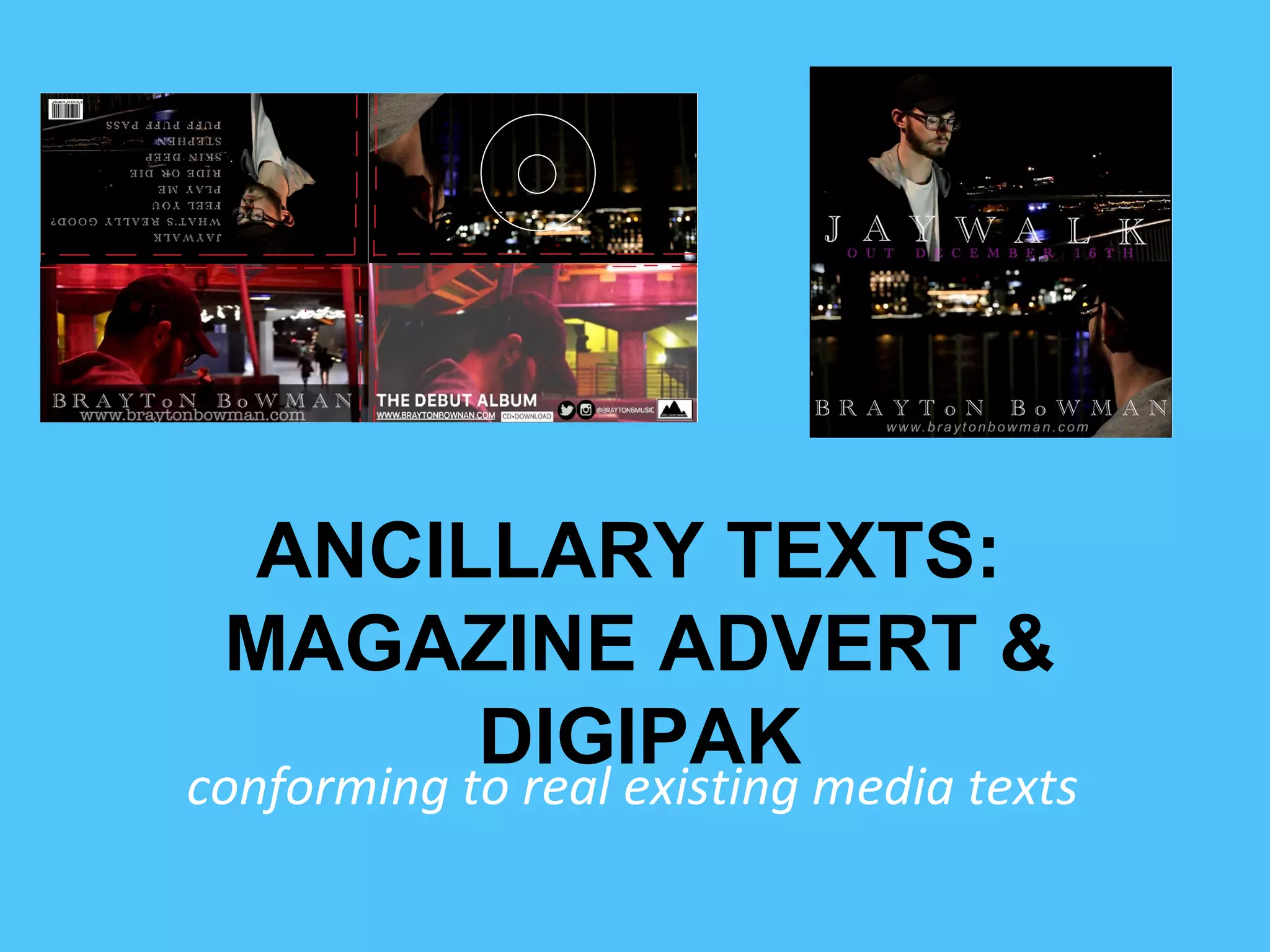
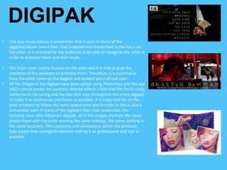
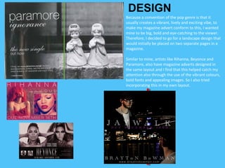
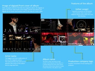
ANCILLARY TEXTS:
MAGAZINE ADVERT &
DIGIPAK
conforming to real existing media texts
DIGIPAKS REFERRED TO:
DIGIPAK
• Like pop music videos, a convention that is seen in many of the
digipaks/album covers that I had analyzed and researched, is the focus on
the artist. It is essential for the audience to be able to recognize the artist in
order to promote them and their music.
• The front cover mainly focuses on the artist and it is vital to grab the
attention of the audience to promote them. Therefore, it is essential to
have the artist name be the biggest and boldest piece of text seen.
• All the images in the digipak have been edited using Photoshop and the app
VSCO cam to create the youthful, filtered effects. I find that this finish really
conforms to the young and hip vibe that runs throughout the entire digipak
to make it as continuous and fluent as possible. It is important for all the
print products to follow the same appearance and formats as this is also a
convention seen in many of the digipaks that I had researched. For
instance, here with Rihanna’s digipak, all of the images are from the same
photo shoot with the artist wearing the same makeup, the same clothing in
the same locations. This continuity and consistency within the products
help create that synergistic element making it as professional and real as
possible.
MAGAZINE ADVERTS REFERRED TO:
Because a convention of the pop genre is that it
usually creates a vibrant, lively and exciting vibe, to
make my magazine advert conform to this, I wanted
mine to be big, bold and eye-catching to the viewer.
Therefore, I decided to go for a landscape design that
would initially be placed on two separate pages in a
magazine.
Similar to mine, artists like Rihanna, Beyonce and
Paramore, also have magazine adverts designed in
the same layout and I find that this helped catch my
attention also through the use of the vibrant colours,
bold fonts and appealing images. So I also tried
incorporating this in my own layout.
DESIGN
Features of the album
(other songs)
A general convention of real existing
print products. Seen in pop artist’s
magazine adverts such as Katy Perry and
Ellie Goulding.
Production company logo
Another convention of real existing print
products.
Artist name
The biggest and most visible piece of
text on the magazine advert.
This self promotes the artist as it is
placed in the centre of the advert
and at a big sized font.
Album name
The font is clear and easy to read
similar to the features of the album. It
is placed above the artist name and in
the centre of the entire advert to make
it clear that this is the album name.
Image of digipak/front cover of album
Adds synergistic element that links the magazine advert, the digipak as
well as the music video itself as the images used for the advert and
digipak are at scenes and locations seen in the clips of a music video.

Eval 1 presentation

  • 1.
    ANCILLARY TEXTS: MAGAZINE ADVERT& DIGIPAK conforming to real existing media texts
  • 2.
  • 3.
    DIGIPAK • Like popmusic videos, a convention that is seen in many of the digipaks/album covers that I had analyzed and researched, is the focus on the artist. It is essential for the audience to be able to recognize the artist in order to promote them and their music. • The front cover mainly focuses on the artist and it is vital to grab the attention of the audience to promote them. Therefore, it is essential to have the artist name be the biggest and boldest piece of text seen. • All the images in the digipak have been edited using Photoshop and the app VSCO cam to create the youthful, filtered effects. I find that this finish really conforms to the young and hip vibe that runs throughout the entire digipak to make it as continuous and fluent as possible. It is important for all the print products to follow the same appearance and formats as this is also a convention seen in many of the digipaks that I had researched. For instance, here with Rihanna’s digipak, all of the images are from the same photo shoot with the artist wearing the same makeup, the same clothing in the same locations. This continuity and consistency within the products help create that synergistic element making it as professional and real as possible.
  • 4.
  • 5.
    Because a conventionof the pop genre is that it usually creates a vibrant, lively and exciting vibe, to make my magazine advert conform to this, I wanted mine to be big, bold and eye-catching to the viewer. Therefore, I decided to go for a landscape design that would initially be placed on two separate pages in a magazine. Similar to mine, artists like Rihanna, Beyonce and Paramore, also have magazine adverts designed in the same layout and I find that this helped catch my attention also through the use of the vibrant colours, bold fonts and appealing images. So I also tried incorporating this in my own layout. DESIGN
  • 6.
    Features of thealbum (other songs) A general convention of real existing print products. Seen in pop artist’s magazine adverts such as Katy Perry and Ellie Goulding. Production company logo Another convention of real existing print products. Artist name The biggest and most visible piece of text on the magazine advert. This self promotes the artist as it is placed in the centre of the advert and at a big sized font. Album name The font is clear and easy to read similar to the features of the album. It is placed above the artist name and in the centre of the entire advert to make it clear that this is the album name. Image of digipak/front cover of album Adds synergistic element that links the magazine advert, the digipak as well as the music video itself as the images used for the advert and digipak are at scenes and locations seen in the clips of a music video.
  • 7.
    Features of thealbum (other songs) A general convention of real existing print products. Seen in pop artist’s magazine adverts such as Katy Perry and Ellie Goulding. Production company logo Another convention of real existing print products. Artist name The biggest and most visible piece of text on the magazine advert. This self promotes the artist as it is placed in the centre of the advert and at a big sized font. Album name The font is clear and easy to read similar to the features of the album. It is placed above the artist name and in the centre of the entire advert to make it clear that this is the album name. Image of digipak/front cover of album Adds synergistic element that links the magazine advert, the digipak as well as the music video itself as the images used for the advert and digipak are at scenes and locations seen in the clips of a music video.