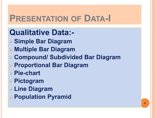
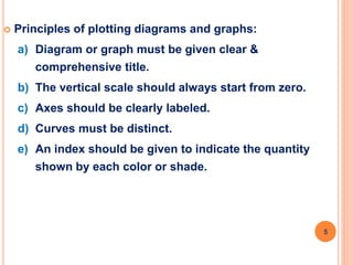
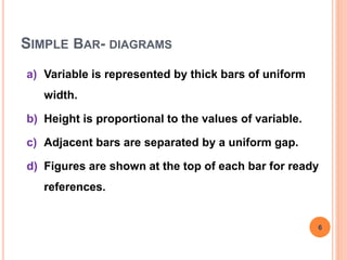
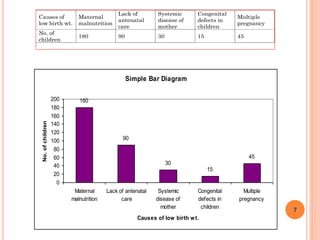
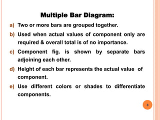
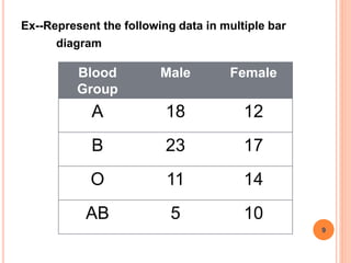
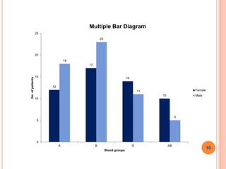
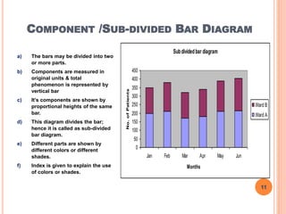
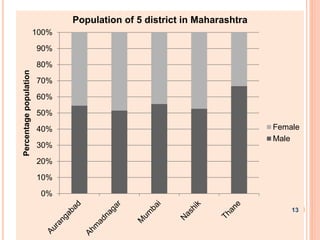
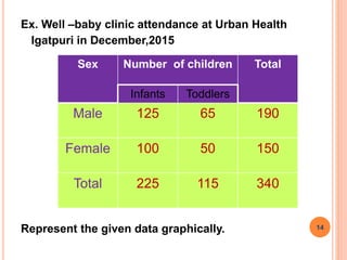
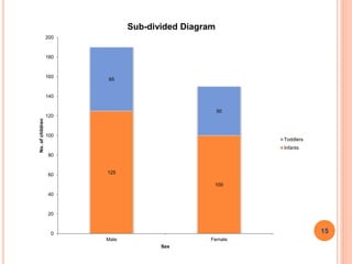
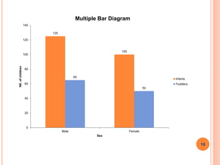
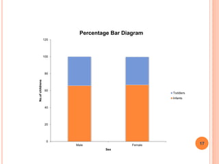
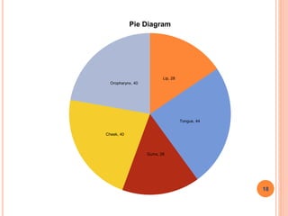
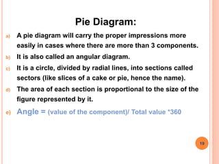
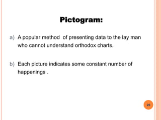
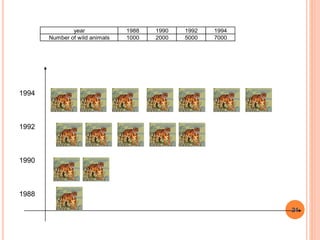
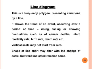
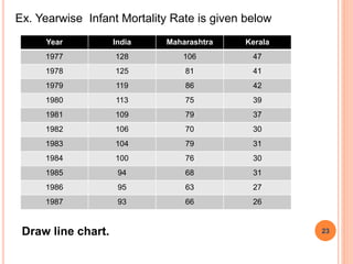
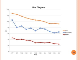
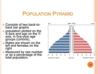
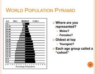
PRESENTATION OF DATA-I
Jagdish D. Powar
Statistician cum Tutor
Community Medicine
SMBT, IMSRC, Nashik
COMPETENCY-CM6.2
CM6.2
Describe and discuss the principles and
demonstrate the methods of collection,
classification, analysis, interpretation
and presentation of statistical data
2
LEARNING OBJECTIVES
The student should be able to
1. Make presentation of data using different
diagrams and graphs according to type of data-
linear graph, simple and proportional Bar
diagrams, Histogram, frequency polygon, pie
diagram.
2. Interpret the data from diagrams and graphs.
3
PRESENTATION OF DATA-I
Qualitative Data:-
 Simple Bar Diagram
 Multiple Bar Diagram
 Compound/ Subdivided Bar Diagram
 Proportional Bar Diagram
 Pie-chart
 Pictogram
 Line Diagram
 Population Pyramid
4
 Principles of plotting diagrams and graphs:
a) Diagram or graph must be given clear &
comprehensive title.
b) The vertical scale should always start from zero.
c) Axes should be clearly labeled.
d) Curves must be distinct.
e) An index should be given to indicate the quantity
shown by each color or shade.
5
SIMPLE BAR- DIAGRAMS
a) Variable is represented by thick bars of uniform
width.
b) Height is proportional to the values of variable.
c) Adjacent bars are separated by a uniform gap.
d) Figures are shown at the top of each bar for ready
references.
6
Causes of
low birth wt.
Maternal
malnutrition
Lack of
antenatal
care
Systemic
disease of
mother
Congenital
defects in
children
Multiple
pregnancy
No. of
children
180 90 30 15 45
Simple Bar Diagram
180
90
30
15
45
0
20
40
60
80
100
120
140
160
180
200
Maternal
malnutrition
Lack of antenatal
care
Systemic
disease of
mother
Congenital
defects in
children
Multiple
pregnancy
Causes of low birth wt.
No.ofchildren
7
Multiple Bar Diagram:
a) Two or more bars are grouped together.
b) Used when actual values of component only are
required & overall total is of no importance.
c) Component fig. is shown by separate bars
adjoining each other.
d) Height of each bar represents the actual value of
component.
e) Use different colors or shades to differentiate
components.
8
Ex--Represent the following data in multiple bar
diagram
Blood
Group
Male Female
A 18 12
B 23 17
O 11 14
AB 5 10
9
12
17
14
10
18
23
11
5
0
5
10
15
20
25
A B O AB
No.ofpatients
Blood groups
Multiple Bar Diagram
Female
Male
10
COMPONENT /SUB-DIVIDED BAR DIAGRAM
a) The bars may be divided into two
or more parts.
b) Components are measured in
original units & total
phenomenon is represented by
vertical bar
c) It’s components are shown by
proportional heights of the same
bar.
d) This diagram divides the bar;
hence it is called as sub-divided
bar diagram.
e) Different parts are shown by
different colors or different
shades.
f) Index is given to explain the use
of colors or shades.
Subdividedbar diagram
0
50
100
150
200
250
300
350
400
450
Jan Feb Mar Apr May Jun
Months
No.ofPatients
Ward B
Ward A
11
Proportional Bar Diagram :
a) Percentage Bar Diagram is same as sub-divided bar
diagram.
b) In Sub-divided Bar Diagram actual values are used, & in
Percentage Bar Diagram percentages are used.
c) All bars are having equal height & it is equal to 100.
d) Total phenomenon is represented by vertical bar, which
is divided into different segments according to
percentages.
e) Different parts are shown by different colors or different
shades.
f) Index is given to explain the use of colors or shades.
12
0%
10%
20%
30%
40%
50%
60%
70%
80%
90%
100%
Percentagepopulation
Population of 5 district in Maharashtra
Female
Male
13
Ex. Well –baby clinic attendance at Urban Health
Igatpuri in December,2015
Represent the given data graphically.
Sex Number of children Total
Infants Toddlers
Male 125 65 190
Female 100 50 150
Total 225 115 340
14
125
100
65
50
0
20
40
60
80
100
120
140
160
180
200
Male Female
No.ofchildren
Sex
Sub-divided Diagram
Toddlers
Infants
15
125
100
65
50
0
20
40
60
80
100
120
140
Male Female
N0.ofchildren
Sex
Multiple Bar Diagram
Infants
Toddlers
16
0
20
40
60
80
100
120
Male Female
No.ofchildrens
Sex
Percentage Bar Diagram
Toddlers
Infants
17
Lip, 28
Tongue, 44
Gums, 28
Cheek, 40
Oropharynx, 40
Pie Diagram
18
Pie Diagram:
a) A pie diagram will carry the proper impressions more
easily in cases where there are more than 3 components.
b) It is also called an angular diagram.
c) It is a circle, divided by radial lines, into sections called
sectors (like slices of a cake or pie, hence the name).
d) The area of each section is proportional to the size of the
figure represented by it.
e) Angle = (value of the component)/ Total value *360
19
Pictogram:
a) A popular method of presenting data to the lay man
who cannot understand orthodox charts.
b) Each picture indicates some constant number of
happenings .
20
year 1988 1990 1992 1994
Number of wild animals 1000 2000 5000 7000
1994
1992
1990
1988
21
Line diagram:
This is a frequency polygon, presenting variations
by a line.
It shows the trend of an event, occurring over a
period of time – rising, falling or showing
fluctuations such as of cancer deaths, infant
mortality rate, birth rate, death rate etc.
Vertical scale may not start from zero.
Shape of line chart may alter with the change of
scale, but trend indicated remains same.
22
Ex. Yearwise Infant Mortality Rate is given below
Draw line chart.
Year India Maharashtra Kerala
1977 128 106 47
1978 125 81 41
1979 119 86 42
1980 113 75 39
1981 109 79 37
1982 106 70 30
1983 104 79 31
1984 100 76 30
1985 94 68 31
1986 95 63 27
1987 93 66 26
23
0
20
40
60
80
100
120
140
1977 1978 1979 1980 1981 1982 1983 1984 1985 1986 1987
IMR
Years
Line Diagram
India
Maharashtra
Kerala
24
POPULATION PYRAMID
 Consists of two back-to-
back bar graphs
 population plotted on the
X-axis and age on the Y-
axis, in five-year age
groups (cohorts).
 Males are shown on the
left and females on the
right
 Measured by raw number
or as a percentage of the
total population.
25
25
WORLD POPULATION PYRAMID
 Where are you
represented?
 Males?
 Females?
 Oldest at top
 Youngest?
 Each age group called a
“cohort”
26
26
THANK YOU
27

Presentation of Data

  • 1.
    PRESENTATION OF DATA-I JagdishD. Powar Statistician cum Tutor Community Medicine SMBT, IMSRC, Nashik
  • 2.
    COMPETENCY-CM6.2 CM6.2 Describe and discussthe principles and demonstrate the methods of collection, classification, analysis, interpretation and presentation of statistical data 2
  • 3.
    LEARNING OBJECTIVES The studentshould be able to 1. Make presentation of data using different diagrams and graphs according to type of data- linear graph, simple and proportional Bar diagrams, Histogram, frequency polygon, pie diagram. 2. Interpret the data from diagrams and graphs. 3
  • 4.
    PRESENTATION OF DATA-I QualitativeData:-  Simple Bar Diagram  Multiple Bar Diagram  Compound/ Subdivided Bar Diagram  Proportional Bar Diagram  Pie-chart  Pictogram  Line Diagram  Population Pyramid 4
  • 5.
     Principles ofplotting diagrams and graphs: a) Diagram or graph must be given clear & comprehensive title. b) The vertical scale should always start from zero. c) Axes should be clearly labeled. d) Curves must be distinct. e) An index should be given to indicate the quantity shown by each color or shade. 5
  • 6.
    SIMPLE BAR- DIAGRAMS a)Variable is represented by thick bars of uniform width. b) Height is proportional to the values of variable. c) Adjacent bars are separated by a uniform gap. d) Figures are shown at the top of each bar for ready references. 6
  • 7.
    Causes of low birthwt. Maternal malnutrition Lack of antenatal care Systemic disease of mother Congenital defects in children Multiple pregnancy No. of children 180 90 30 15 45 Simple Bar Diagram 180 90 30 15 45 0 20 40 60 80 100 120 140 160 180 200 Maternal malnutrition Lack of antenatal care Systemic disease of mother Congenital defects in children Multiple pregnancy Causes of low birth wt. No.ofchildren 7
  • 8.
    Multiple Bar Diagram: a)Two or more bars are grouped together. b) Used when actual values of component only are required & overall total is of no importance. c) Component fig. is shown by separate bars adjoining each other. d) Height of each bar represents the actual value of component. e) Use different colors or shades to differentiate components. 8
  • 9.
    Ex--Represent the followingdata in multiple bar diagram Blood Group Male Female A 18 12 B 23 17 O 11 14 AB 5 10 9
  • 10.
    12 17 14 10 18 23 11 5 0 5 10 15 20 25 A B OAB No.ofpatients Blood groups Multiple Bar Diagram Female Male 10
  • 11.
    COMPONENT /SUB-DIVIDED BARDIAGRAM a) The bars may be divided into two or more parts. b) Components are measured in original units & total phenomenon is represented by vertical bar c) It’s components are shown by proportional heights of the same bar. d) This diagram divides the bar; hence it is called as sub-divided bar diagram. e) Different parts are shown by different colors or different shades. f) Index is given to explain the use of colors or shades. Subdividedbar diagram 0 50 100 150 200 250 300 350 400 450 Jan Feb Mar Apr May Jun Months No.ofPatients Ward B Ward A 11
  • 12.
    Proportional Bar Diagram: a) Percentage Bar Diagram is same as sub-divided bar diagram. b) In Sub-divided Bar Diagram actual values are used, & in Percentage Bar Diagram percentages are used. c) All bars are having equal height & it is equal to 100. d) Total phenomenon is represented by vertical bar, which is divided into different segments according to percentages. e) Different parts are shown by different colors or different shades. f) Index is given to explain the use of colors or shades. 12
  • 13.
  • 14.
    Ex. Well –babyclinic attendance at Urban Health Igatpuri in December,2015 Represent the given data graphically. Sex Number of children Total Infants Toddlers Male 125 65 190 Female 100 50 150 Total 225 115 340 14
  • 15.
  • 16.
  • 17.
  • 18.
    Lip, 28 Tongue, 44 Gums,28 Cheek, 40 Oropharynx, 40 Pie Diagram 18
  • 19.
    Pie Diagram: a) Apie diagram will carry the proper impressions more easily in cases where there are more than 3 components. b) It is also called an angular diagram. c) It is a circle, divided by radial lines, into sections called sectors (like slices of a cake or pie, hence the name). d) The area of each section is proportional to the size of the figure represented by it. e) Angle = (value of the component)/ Total value *360 19
  • 20.
    Pictogram: a) A popularmethod of presenting data to the lay man who cannot understand orthodox charts. b) Each picture indicates some constant number of happenings . 20
  • 21.
    year 1988 19901992 1994 Number of wild animals 1000 2000 5000 7000 1994 1992 1990 1988 21
  • 22.
    Line diagram: This isa frequency polygon, presenting variations by a line. It shows the trend of an event, occurring over a period of time – rising, falling or showing fluctuations such as of cancer deaths, infant mortality rate, birth rate, death rate etc. Vertical scale may not start from zero. Shape of line chart may alter with the change of scale, but trend indicated remains same. 22
  • 23.
    Ex. Yearwise InfantMortality Rate is given below Draw line chart. Year India Maharashtra Kerala 1977 128 106 47 1978 125 81 41 1979 119 86 42 1980 113 75 39 1981 109 79 37 1982 106 70 30 1983 104 79 31 1984 100 76 30 1985 94 68 31 1986 95 63 27 1987 93 66 26 23
  • 24.
    0 20 40 60 80 100 120 140 1977 1978 19791980 1981 1982 1983 1984 1985 1986 1987 IMR Years Line Diagram India Maharashtra Kerala 24
  • 25.
    POPULATION PYRAMID  Consistsof two back-to- back bar graphs  population plotted on the X-axis and age on the Y- axis, in five-year age groups (cohorts).  Males are shown on the left and females on the right  Measured by raw number or as a percentage of the total population. 25 25
  • 26.
    WORLD POPULATION PYRAMID Where are you represented?  Males?  Females?  Oldest at top  Youngest?  Each age group called a “cohort” 26 26
  • 27.