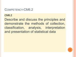
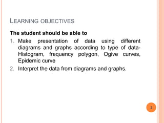
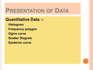
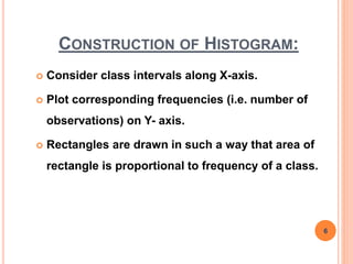
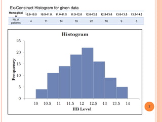
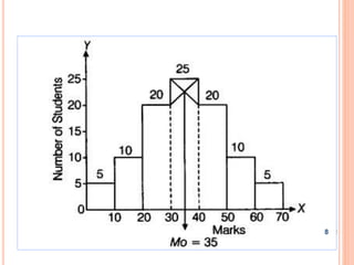
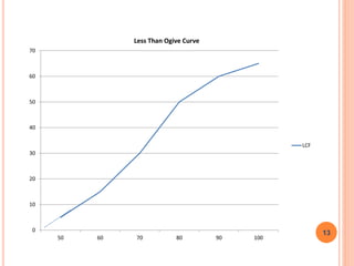
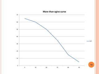
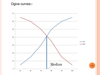
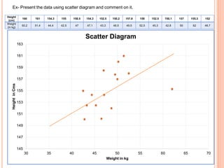
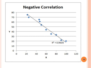
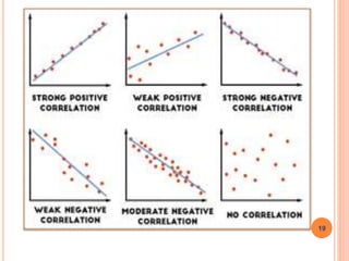
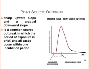
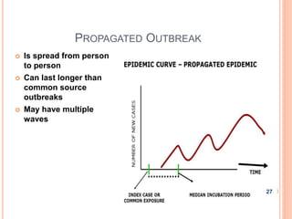
PRESENTATION OF STATISTICS-II
Jagdish D. Powar
Statistician cum Tutor
Community Medicine
SMBT, IMSRC, Nashik
COMPETENCY-CM6.2
CM6.2
Describe and discuss the principles and
demonstrate the methods of collection,
classification, analysis, interpretation
and presentation of statistical data
2
LEARNING OBJECTIVES
The student should be able to
1. Make presentation of data using different
diagrams and graphs according to type of data-
Histogram, frequency polygon, Ogive curves,
Epidemic curve
2. Interpret the data from diagrams and graphs.
3
PRESENTATION OF DATA
Quantitative Data :-
 Histogram
 Frequency polygon
 Ogive curve
 Scatter Diagram
 Epidemic curve
4
Histogram :
 Histograms are area diagrams.
 Area is directly proportional to height (frequency of
a class) & width (class interval).
 In histograms, there will be no space in between
rectangular blocks.
 Data must be tabulated into continuous classes.
(i.e. exclusive classes)
5
CONSTRUCTION OF HISTOGRAM:
 Consider class intervals along X-axis.
 Plot corresponding frequencies (i.e. number of
observations) on Y- axis.
 Rectangles are drawn in such a way that area of
rectangle is proportional to frequency of a class.
6
7
Hemoglobi
n
10.0-10.5 10.5-11.0 11.0-11.5 11.5-12.0 12.0-12.5 12.5-13.0 13.0-13.5 13.5-14.0
No.of
patients
4 11 14 19 22 16 9 5
Ex-Construct Histogram for given data
8
Frequency polygon:
Frequency polygon is an area diagram of
frequency distribution developed over a
histogram.
Construction of frequency polygon:
 Consider mid-points of classes along X-axis &
frequencies along Y-axis.
 Plot the points corresponding to X-co-ordinate as mid-
point & Y-co-ordinate as frequency.
 Join these points by straight line to get a polygon.
9
10
4) Cumulative frequency curves (Ogive curves):
Since there are two types of cumulative frequencies, we
get two types of ogive curves.-
a) Less than ogive b) greater than ogive.
Construction of ogive curves:
 Consider upper class limits (lower class limits) along
X-axis, & less than frequencies (greater than
frequencies) on Y-axis.
 Plot the points corresponding to X-co-ordinate as
upper class limit (lower class limit) & Y-co-ordinate as
less than frequency (greater than frequency).
 Join these points by smooth curve to get a less than
(greater than) ogive curve.
11
Cumulative Frequency distribution
Marks frequency
Cumulative frequency
l.c.f. g.c.f.
0-50 5 5 65
50 - 60 10 15 60
60 - 70 15 30 50
70 – 80 20 50 35
80 - 90 10 60 15
90 – 100 5 65 5
12
0
10
20
30
40
50
60
70
50 60 70 80 90 100
Less Than Ogive Curve
LCF
13
0
10
20
30
40
50
60
70
0 50 60 70 80 90
More than ogive curve
GCF
14
Ogive curves:-
0
10
20
30
40
50
60
70
50 60 70 80 90 100
LOC
GOC
15
Scatter diagram:
This is also called as correlation diagram.
By using this diagram we can say that whether there is any
association or correlation (either positive or negative) between two
variables, or they are independent.
Only points are plotted on graph paper and depending upon the trend
of those points, we get the type of correlation.
Uses of this tool:
• To understand the behaviour of a process.
• To determine if there is a relationship between two factors.
• To visually demonstrate the correlation between two related factors.
• To determine where there may be a cause and effect relationship.
16
145
147
149
151
153
155
157
159
161
163
30 35 40 45 50 55 60 65 70
HeightinCms
Weight in kg
Scatter Diagram
Height
(cm)
160 161 154.3 155 158.5 154.3 152.5 150.2 157.8 158 152.5 150.1 157 155.3 152
Weight
(in kg)
50.2 51.4 44.4 42.5 47 47.1 43.3 46.5 49.5 52.5 45.3 42.8 50 62 48.7
Ex- Present the data using scatter diagram and comment on it.
18
19
Spot Map :-
Map showing the geographic location
of people with with specific attribute
e.g. cases of an infectious disease
20
21
Epidemic curve:
Epidemic curve is useful to determine
outbreak characteristics like peak of disease
occurrence, possible incubation or latency
period and type of disease propagation.
An epidemic curve is a graphical depiction of
the number of cases of illness by the date of
illness onset
22
CONSTRUCTION OF EPIDEMIC CURVE:
 Take time interval on X-axis
 Consider number of cases on Y-axis.
 Plot the points corresponding to X-co-ordinate as
time interval & Y-co-ordinate as no. of cases.
 Join these points by smooth curve to get a
epidemic curve.
23
OUTBREAK PATTERN OF SPREAD
The overall shape of the epidemic curve can
reveal the type of outbreak
 Common source
 Point source
 Propagated
24
COMMON SOURCE OUTBREAK
 An outbreak due to
transmission from a
single environmental
or human source
 Period of exposure
may be brief or long
25
POINT SOURCE OUTBREAK
 sharp upward slope
and a gradual
downward slope
 Is a common source
outbreak in which the
period of exposure is
brief, and all cases
occur within one
incubation period
26
PROPAGATED OUTBREAK
 Is spread from person
to person
 Can last longer than
common source
outbreaks
 May have multiple
waves
27
THANK YOU
28

Presentation of statistics

  • 1.
    PRESENTATION OF STATISTICS-II JagdishD. Powar Statistician cum Tutor Community Medicine SMBT, IMSRC, Nashik
  • 2.
    COMPETENCY-CM6.2 CM6.2 Describe and discussthe principles and demonstrate the methods of collection, classification, analysis, interpretation and presentation of statistical data 2
  • 3.
    LEARNING OBJECTIVES The studentshould be able to 1. Make presentation of data using different diagrams and graphs according to type of data- Histogram, frequency polygon, Ogive curves, Epidemic curve 2. Interpret the data from diagrams and graphs. 3
  • 4.
    PRESENTATION OF DATA QuantitativeData :-  Histogram  Frequency polygon  Ogive curve  Scatter Diagram  Epidemic curve 4
  • 5.
    Histogram :  Histogramsare area diagrams.  Area is directly proportional to height (frequency of a class) & width (class interval).  In histograms, there will be no space in between rectangular blocks.  Data must be tabulated into continuous classes. (i.e. exclusive classes) 5
  • 6.
    CONSTRUCTION OF HISTOGRAM: Consider class intervals along X-axis.  Plot corresponding frequencies (i.e. number of observations) on Y- axis.  Rectangles are drawn in such a way that area of rectangle is proportional to frequency of a class. 6
  • 7.
    7 Hemoglobi n 10.0-10.5 10.5-11.0 11.0-11.511.5-12.0 12.0-12.5 12.5-13.0 13.0-13.5 13.5-14.0 No.of patients 4 11 14 19 22 16 9 5 Ex-Construct Histogram for given data
  • 8.
  • 9.
    Frequency polygon: Frequency polygonis an area diagram of frequency distribution developed over a histogram. Construction of frequency polygon:  Consider mid-points of classes along X-axis & frequencies along Y-axis.  Plot the points corresponding to X-co-ordinate as mid- point & Y-co-ordinate as frequency.  Join these points by straight line to get a polygon. 9
  • 10.
  • 11.
    4) Cumulative frequencycurves (Ogive curves): Since there are two types of cumulative frequencies, we get two types of ogive curves.- a) Less than ogive b) greater than ogive. Construction of ogive curves:  Consider upper class limits (lower class limits) along X-axis, & less than frequencies (greater than frequencies) on Y-axis.  Plot the points corresponding to X-co-ordinate as upper class limit (lower class limit) & Y-co-ordinate as less than frequency (greater than frequency).  Join these points by smooth curve to get a less than (greater than) ogive curve. 11
  • 12.
    Cumulative Frequency distribution Marksfrequency Cumulative frequency l.c.f. g.c.f. 0-50 5 5 65 50 - 60 10 15 60 60 - 70 15 30 50 70 – 80 20 50 35 80 - 90 10 60 15 90 – 100 5 65 5 12
  • 13.
    0 10 20 30 40 50 60 70 50 60 7080 90 100 Less Than Ogive Curve LCF 13
  • 14.
    0 10 20 30 40 50 60 70 0 50 6070 80 90 More than ogive curve GCF 14
  • 15.
  • 16.
    Scatter diagram: This isalso called as correlation diagram. By using this diagram we can say that whether there is any association or correlation (either positive or negative) between two variables, or they are independent. Only points are plotted on graph paper and depending upon the trend of those points, we get the type of correlation. Uses of this tool: • To understand the behaviour of a process. • To determine if there is a relationship between two factors. • To visually demonstrate the correlation between two related factors. • To determine where there may be a cause and effect relationship. 16
  • 17.
    145 147 149 151 153 155 157 159 161 163 30 35 4045 50 55 60 65 70 HeightinCms Weight in kg Scatter Diagram Height (cm) 160 161 154.3 155 158.5 154.3 152.5 150.2 157.8 158 152.5 150.1 157 155.3 152 Weight (in kg) 50.2 51.4 44.4 42.5 47 47.1 43.3 46.5 49.5 52.5 45.3 42.8 50 62 48.7 Ex- Present the data using scatter diagram and comment on it.
  • 18.
  • 19.
  • 20.
    Spot Map :- Mapshowing the geographic location of people with with specific attribute e.g. cases of an infectious disease 20
  • 21.
  • 22.
    Epidemic curve: Epidemic curveis useful to determine outbreak characteristics like peak of disease occurrence, possible incubation or latency period and type of disease propagation. An epidemic curve is a graphical depiction of the number of cases of illness by the date of illness onset 22
  • 23.
    CONSTRUCTION OF EPIDEMICCURVE:  Take time interval on X-axis  Consider number of cases on Y-axis.  Plot the points corresponding to X-co-ordinate as time interval & Y-co-ordinate as no. of cases.  Join these points by smooth curve to get a epidemic curve. 23
  • 24.
    OUTBREAK PATTERN OFSPREAD The overall shape of the epidemic curve can reveal the type of outbreak  Common source  Point source  Propagated 24
  • 25.
    COMMON SOURCE OUTBREAK An outbreak due to transmission from a single environmental or human source  Period of exposure may be brief or long 25
  • 26.
    POINT SOURCE OUTBREAK sharp upward slope and a gradual downward slope  Is a common source outbreak in which the period of exposure is brief, and all cases occur within one incubation period 26
  • 27.
    PROPAGATED OUTBREAK  Isspread from person to person  Can last longer than common source outbreaks  May have multiple waves 27
  • 28.