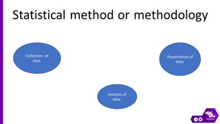
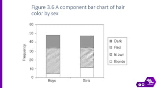
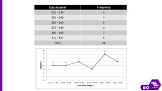
Presentation of the data in medical research
Statistical method or methodology
Collection of
data
Analysis of
data
Presentation of
data
Presentation of data
A. Tabular.
B. Graphical.
C. Mathematical.
Tubular presentation of data or tubation
- Characteristics of the tables :
A table can be simple or complex.
The tables should be numbered.
A brief title must be given to each
table.
The headings of the columns or
rows should be clear and concise.
The data must be presented according
to its importance.
Table should not be too large.
A vertical arrangement is better than a
horizontal one.
 Tabular presentation :
• Simple tables
• Frequency distribution tables
• Cumulative frequency distribution tables
• Cross tabulation
Simple table
Table(3): Frequency table showing the distribution of
hair color of each of 95 children in a study of
Malathion versus d-phenothrin for the treatment of nits
In constructing frequency distribution tables:
 Determine the largest and smallest numbers in the given set of
data i.e. rang.
 divide the range into a convenient number of class intervals
having the same size.
 Determine the number of observations falling into each class
interval.
Table (5): Age distribution of gastroenteritis
patients
Cumulative distribution of the data
◙ Shows the total number of
observations either less or more
than a given level of the variable.
◙ Includes:
* Ascending distribution tables.
* Descending distribution tables.
Table (5): Age distribution of gastroenteritis
patients
◙ Describe the relationship between two categorical variables
Cross table
◙ In a cross-tabulation, the categories of one variable determine the
rows of the table, and the categories of the other variable determine the
columns.
Age
Total
Over 30
Under 30
BP
65
38
27
Low
135
90
45
Normal
82
59
23
High
187
95
Total
Graphic presentation of the data
 Not more than 3, preferably only 2, elements should be
compared in a single graph.
 The graph should be a simple summary of tabulated data.
Criteria of a graph
1. Bar charts.
2. Histogram.
3. Frequency polygon.
4. Line diagrams.
5. Pie (Circular) chart.
6. Pictogram.
Types of graphs
Bar chart
 Bar charts are ways of presenting a set of numbers by the
length of a bar – the length of the bar is proportional to the
magnitude to be represented.
 Bars may be vertical or horizontal.
Bar chart
 The bars are usually separated by appropriate
spaces, & the bars should be of the same width.
 A suitable scale must be chosen to present the
length of the bars.
Bar chart
Simple Multiple Component
0
10
20
30
40
50
60
70
80
90
100
Percentage(%)
U. R.
Residence
0
10
20
30
40
50
60
70
80
90
100
Percentage(%)
U. R.
Residence
Males Females
0
10
20
30
40
50
60
70
80
90
100
Percentage(%)
U. R.
Residence
Males Females
Figure 3.3 Simple bar chart of hair color of
children receiving Malathion in nit lotion study
Figure 3.4 Compound bar chart of hair color
by sex for children
Figure 3.6 A component bar chart of hair
color by sex
0
2
4
6
8
10
12
14
16
18
20
10 20 30 40 50 60 70 80
Age (Years)
%
of
the
population Histogram
❖Diagram representing the frequency
distribution table.
❖As bar chart but with no gaps.
❖Can represent only one variable.
Table(4): Grouped frequency distribution for birth weight of 30 infants
Figure 3.8 Histogram of the grouped birth
weight data in Table 4
0
2
4
6
8
10
12
14
16
18
20
10 20 30 40 50 60 70 80
Age (Years)
%
of
the
population
Frequency polygon
Fig.(3): Infant mortality rate in Egypt during the period
from 1935-1985.
Line diagram
0
50
100
150
200
1935 1945 1955 1965 1975 1985
Year
I.M.R.(per
thousand)
Urban
60%
Rural
40%
Pie or circular chart
Fig.(1): Distribution of the studied sample according to their
residence.
Can present only one variable
 Loses its clarity if used to represent
more than 4 or five categories.
Pictogram
Fig(7): Pictorial illustration shows the population size in
two areas.
Tools to Summarize Categorical & Discrete Data
 Simple Table.
 Bar Chart.
 Pie Chart.
 Pictogram.
Tools to Summarize Continuous Data:
 Frequency DistributionTable.
 Histogram, Frequency Polygon
 Construct a frequency table with equal class intervals from the
following data on the monthly wages (in rupees) of 28 laborers
working in a factory, taking one of the class intervals
as 210−230 (230 not included):
220,268,258,242,210,268,272,242,311,
290,300,320,319,304,302,318,306,292, 254, 278, 210,
240,280,316, 306, 215, 256, 236.
Q1
Class interval Frequency
210 – 229 4
230 – 249 4
250 – 269 5
270 – 289 3
290 – 309 7
310 - 330 5
Total 28
School A started a recycling project. The bar chart below shows how many kilograms of each item was collected
for recycling last week.
Of which item did the school collect the greatest number of kilograms? plastic
Of which item did the school collect 11 kg? electronics
Of which item did the school collect the smallestnumber of kilograms? paper
In a study of the relationship between blood group and the
occurrence of peptic ulcer in 100 cases.Represent the
result using suitable graph.
Number
Bl. group
20
O
45
A
10
B
25
AB
100
Total
0
5
10
15
20
25
30
35
40
45
50
O A B AB
Simple bar chart
A company interested in the health of its employees started a
health program including monitoring blood pressure. Based on age,
employees were categorized according to ranges of blood pressure
by age intervals. Data are shown in the table below
.
Age
Total
Over 50
30-49
Under 30
BP
96
31
38
27
Low
230
92
90
48
Normal
154
72
59
23
High
480
195
187
98
Total
The percentage of employees who are over age 50 and have high
blood pressure is
A) 31.6% (59/187).
B) 15.0% (72/480).
C) 36.9% (72/195),
D) 46.8% (72/154).
E) 32.1% (154/480).
data presentation tabular and graphical methods

data presentation tabular and graphical methods

  • 1.
    Presentation of thedata in medical research
  • 3.
    Statistical method ormethodology Collection of data Analysis of data Presentation of data
  • 4.
    Presentation of data A.Tabular. B. Graphical. C. Mathematical.
  • 5.
    Tubular presentation ofdata or tubation - Characteristics of the tables : A table can be simple or complex. The tables should be numbered. A brief title must be given to each table. The headings of the columns or rows should be clear and concise.
  • 6.
    The data mustbe presented according to its importance. Table should not be too large. A vertical arrangement is better than a horizontal one.
  • 8.
     Tabular presentation: • Simple tables • Frequency distribution tables • Cumulative frequency distribution tables • Cross tabulation
  • 9.
  • 10.
    Table(3): Frequency tableshowing the distribution of hair color of each of 95 children in a study of Malathion versus d-phenothrin for the treatment of nits
  • 11.
    In constructing frequencydistribution tables:  Determine the largest and smallest numbers in the given set of data i.e. rang.  divide the range into a convenient number of class intervals having the same size.  Determine the number of observations falling into each class interval.
  • 12.
    Table (5): Agedistribution of gastroenteritis patients
  • 13.
    Cumulative distribution ofthe data ◙ Shows the total number of observations either less or more than a given level of the variable. ◙ Includes: * Ascending distribution tables. * Descending distribution tables.
  • 14.
    Table (5): Agedistribution of gastroenteritis patients
  • 17.
    ◙ Describe therelationship between two categorical variables Cross table ◙ In a cross-tabulation, the categories of one variable determine the rows of the table, and the categories of the other variable determine the columns. Age Total Over 30 Under 30 BP 65 38 27 Low 135 90 45 Normal 82 59 23 High 187 95 Total
  • 18.
  • 19.
     Not morethan 3, preferably only 2, elements should be compared in a single graph.  The graph should be a simple summary of tabulated data. Criteria of a graph
  • 20.
    1. Bar charts. 2.Histogram. 3. Frequency polygon. 4. Line diagrams. 5. Pie (Circular) chart. 6. Pictogram. Types of graphs
  • 21.
    Bar chart  Barcharts are ways of presenting a set of numbers by the length of a bar – the length of the bar is proportional to the magnitude to be represented.  Bars may be vertical or horizontal.
  • 22.
  • 23.
     The barsare usually separated by appropriate spaces, & the bars should be of the same width.  A suitable scale must be chosen to present the length of the bars.
  • 24.
    Bar chart Simple MultipleComponent 0 10 20 30 40 50 60 70 80 90 100 Percentage(%) U. R. Residence 0 10 20 30 40 50 60 70 80 90 100 Percentage(%) U. R. Residence Males Females 0 10 20 30 40 50 60 70 80 90 100 Percentage(%) U. R. Residence Males Females
  • 25.
    Figure 3.3 Simplebar chart of hair color of children receiving Malathion in nit lotion study
  • 26.
    Figure 3.4 Compoundbar chart of hair color by sex for children
  • 27.
    Figure 3.6 Acomponent bar chart of hair color by sex
  • 30.
    0 2 4 6 8 10 12 14 16 18 20 10 20 3040 50 60 70 80 Age (Years) % of the population Histogram
  • 31.
    ❖Diagram representing thefrequency distribution table. ❖As bar chart but with no gaps. ❖Can represent only one variable.
  • 32.
    Table(4): Grouped frequencydistribution for birth weight of 30 infants
  • 33.
    Figure 3.8 Histogramof the grouped birth weight data in Table 4
  • 34.
    0 2 4 6 8 10 12 14 16 18 20 10 20 3040 50 60 70 80 Age (Years) % of the population Frequency polygon
  • 37.
    Fig.(3): Infant mortalityrate in Egypt during the period from 1935-1985. Line diagram 0 50 100 150 200 1935 1945 1955 1965 1975 1985 Year I.M.R.(per thousand)
  • 38.
    Urban 60% Rural 40% Pie or circularchart Fig.(1): Distribution of the studied sample according to their residence.
  • 40.
    Can present onlyone variable
  • 41.
     Loses itsclarity if used to represent more than 4 or five categories.
  • 42.
    Pictogram Fig(7): Pictorial illustrationshows the population size in two areas.
  • 44.
    Tools to SummarizeCategorical & Discrete Data  Simple Table.  Bar Chart.  Pie Chart.  Pictogram. Tools to Summarize Continuous Data:  Frequency DistributionTable.  Histogram, Frequency Polygon
  • 45.
     Construct afrequency table with equal class intervals from the following data on the monthly wages (in rupees) of 28 laborers working in a factory, taking one of the class intervals as 210−230 (230 not included): 220,268,258,242,210,268,272,242,311, 290,300,320,319,304,302,318,306,292, 254, 278, 210, 240,280,316, 306, 215, 256, 236. Q1
  • 46.
    Class interval Frequency 210– 229 4 230 – 249 4 250 – 269 5 270 – 289 3 290 – 309 7 310 - 330 5 Total 28
  • 47.
    School A starteda recycling project. The bar chart below shows how many kilograms of each item was collected for recycling last week. Of which item did the school collect the greatest number of kilograms? plastic Of which item did the school collect 11 kg? electronics Of which item did the school collect the smallestnumber of kilograms? paper
  • 48.
    In a studyof the relationship between blood group and the occurrence of peptic ulcer in 100 cases.Represent the result using suitable graph. Number Bl. group 20 O 45 A 10 B 25 AB 100 Total
  • 49.
  • 50.
    A company interestedin the health of its employees started a health program including monitoring blood pressure. Based on age, employees were categorized according to ranges of blood pressure by age intervals. Data are shown in the table below . Age Total Over 50 30-49 Under 30 BP 96 31 38 27 Low 230 92 90 48 Normal 154 72 59 23 High 480 195 187 98 Total
  • 51.
    The percentage ofemployees who are over age 50 and have high blood pressure is A) 31.6% (59/187). B) 15.0% (72/480). C) 36.9% (72/195), D) 46.8% (72/154). E) 32.1% (154/480).