Download as PDF, PPTX


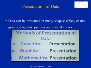
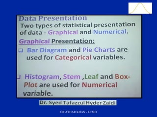

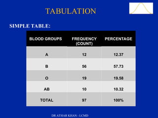


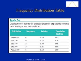


The document presents a comprehensive overview of data presentation methods, including tables, charts, graphs, and diagrams outlined by Dr. Athar Khan. Key learning objectives include describing various forms of data presentation and listing the advantages of tabular and graphic methods. Examples such as pie charts, bar charts, histograms, and scatter diagrams are included to illustrate how qualitative and quantitative data can be effectively visualized.