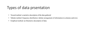
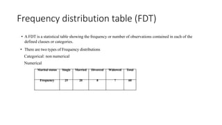
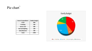
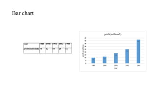
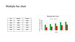
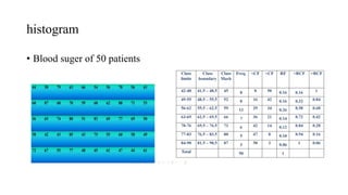
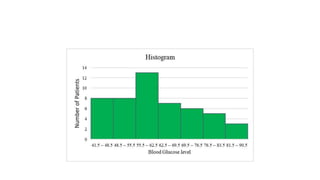
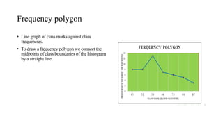
Methods of data prsentation
Presented by
S.M.Bairagadar
PhD Scholar Textile Engg(2021-22)
Shivaji university kolhapur
Presentation of data
• Method by which people organize ,summersize and communicate
information using variety of tools such as table,graphs,and diagrams
Types of data prsentation
• Texural method :a narrative description of the data gathered
• Tabular method: frequency distribution: tabular arrangement of information in columns and rows
• Graphical method: an illustrative description of data
Frequency distribution table (FDT)
• A FDT is a statistical table showing the frequency or number of observations contained in each of the
defined classes or categories.
• There are two types of Frequency distributions
Categorical: non numerical
Numerical
Marital status Single Married Divorced Widowed Total
Frequency 25 20 8 7 60
Numerical frequency distribution
• Data are classified according to numerical size.
• Used to summarize interval and ratio data.
• May be discrete or continuous, depending on whether the variable is discrete or continuous population
• Discrete frequency distribution
• Example :count the number of times each possible value is repeated
• In a survey of 30 families, the number of children per family was recorded and obtained the following data:
• 4 2 4 3 2 8 3 4 4 2 2 8 5 3 4 5 4 5 4 3 5 2 7 3 3 6 7 3 8 4 these
• Individual observations can be arranged in ascending order of magnitude to from an array
• 2 2 2 2 2 3 3 3 3 3 3 3 4 4 4 4 4 4 4 4 5 5 5 5 6 7 7 8 8 8
continuous frequency distribution
• Range (R)
• Class interval(k)
• Class boundaries( CB)
Graphical methods of data prsentation
Advantages
• To understand the information easily.
• To make the data attractive
• To make comparisons of items easy
• To draw attention of the observer
Diagrammatic presentation of data
• The three most commonly used diagrammatic presentation of data are
• Pie charts
• Bar charts
• Pictograms
Pie chart`
item of expenditure family budget
Food 600
Clothing 100
house rent 400
fuel and lighting 100
miscellaneous 300
Total 1500
Bar chart
year 1989 1990 1991 1992 1993
profit(milions$) 10 12 18 25 42
Multiple bar chart
year imports Exports
1991 7930 4260
1992 8850 5225
1993 9780 6150
1994 11720 7340
1995 12150 8145
Graphical presentation of data
• The histogram
• frequency polygon
• cumulative frequency graph
histogram
• Blood suger of 50 patients
Frequency polygon
• Line graph of class marks against class
frequencies.
• To draw a frequency polygon we connect the
midpoints of class boundaries of the histogram
by a straight line
Thank you
Methods of data prsentation.pptx

Methods of data prsentation.pptx

  • 1.
    Methods of dataprsentation Presented by S.M.Bairagadar PhD Scholar Textile Engg(2021-22) Shivaji university kolhapur
  • 2.
    Presentation of data •Method by which people organize ,summersize and communicate information using variety of tools such as table,graphs,and diagrams
  • 3.
    Types of dataprsentation • Texural method :a narrative description of the data gathered • Tabular method: frequency distribution: tabular arrangement of information in columns and rows • Graphical method: an illustrative description of data
  • 4.
    Frequency distribution table(FDT) • A FDT is a statistical table showing the frequency or number of observations contained in each of the defined classes or categories. • There are two types of Frequency distributions Categorical: non numerical Numerical Marital status Single Married Divorced Widowed Total Frequency 25 20 8 7 60
  • 5.
    Numerical frequency distribution •Data are classified according to numerical size. • Used to summarize interval and ratio data. • May be discrete or continuous, depending on whether the variable is discrete or continuous population • Discrete frequency distribution • Example :count the number of times each possible value is repeated • In a survey of 30 families, the number of children per family was recorded and obtained the following data: • 4 2 4 3 2 8 3 4 4 2 2 8 5 3 4 5 4 5 4 3 5 2 7 3 3 6 7 3 8 4 these • Individual observations can be arranged in ascending order of magnitude to from an array • 2 2 2 2 2 3 3 3 3 3 3 3 4 4 4 4 4 4 4 4 5 5 5 5 6 7 7 8 8 8
  • 6.
    continuous frequency distribution •Range (R) • Class interval(k) • Class boundaries( CB)
  • 7.
    Graphical methods ofdata prsentation Advantages • To understand the information easily. • To make the data attractive • To make comparisons of items easy • To draw attention of the observer
  • 8.
    Diagrammatic presentation ofdata • The three most commonly used diagrammatic presentation of data are • Pie charts • Bar charts • Pictograms
  • 9.
    Pie chart` item ofexpenditure family budget Food 600 Clothing 100 house rent 400 fuel and lighting 100 miscellaneous 300 Total 1500
  • 10.
    Bar chart year 19891990 1991 1992 1993 profit(milions$) 10 12 18 25 42
  • 11.
    Multiple bar chart yearimports Exports 1991 7930 4260 1992 8850 5225 1993 9780 6150 1994 11720 7340 1995 12150 8145
  • 12.
    Graphical presentation ofdata • The histogram • frequency polygon • cumulative frequency graph
  • 13.
  • 15.
    Frequency polygon • Linegraph of class marks against class frequencies. • To draw a frequency polygon we connect the midpoints of class boundaries of the histogram by a straight line
  • 16.