Downloaded 103 times


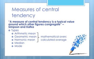
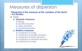
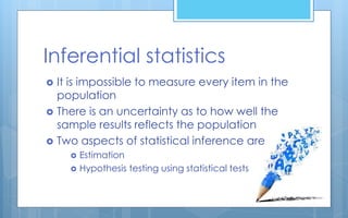

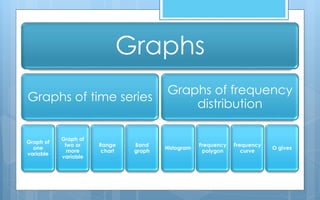
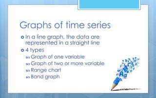
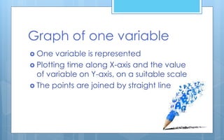
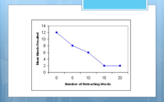
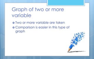
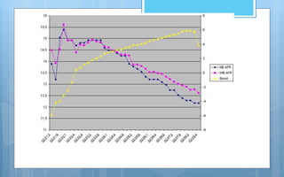
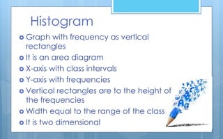
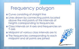
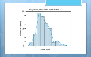
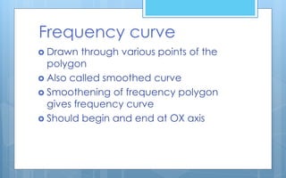
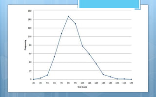
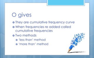
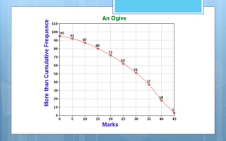

The document discusses different methods of analyzing and presenting quantitative data. It describes two main types of analysis: qualitative analysis, which involves interpreting qualitative research data, and quantitative analysis, which involves presenting and interpreting numerical data through descriptive and inferential statistics. Descriptive statistics include measures of central tendency like mean, median and mode, as well as measures of variability like range and standard deviation. Inferential statistics are used to test hypotheses and generalize samples to populations. The document also discusses various methods of graphically presenting quantitative data through graphs like histograms, frequency polygons, frequency curves and Ogive curves.