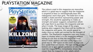
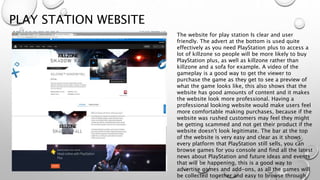
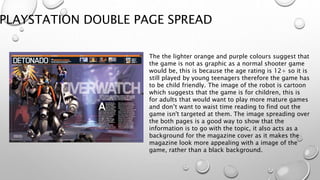
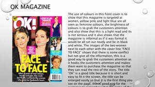
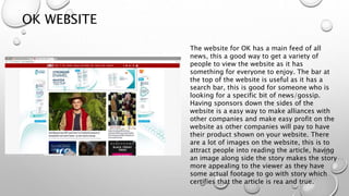
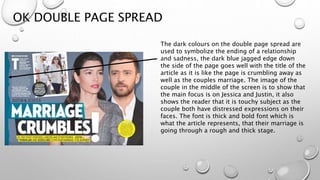
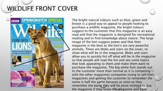
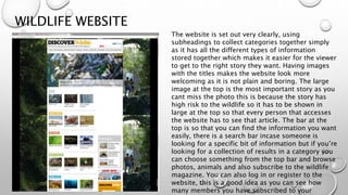
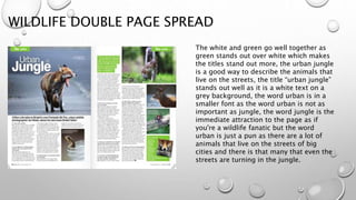
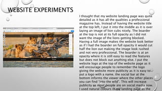
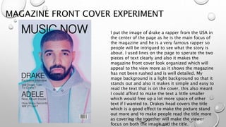
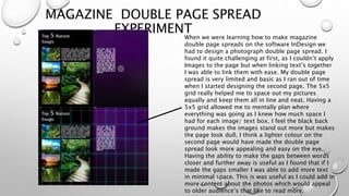
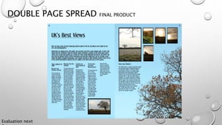
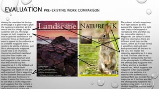
SlideShare a Scribd company logo
1 of 31
MAGAZINE
RESEARCH
BY JOE MANSHIP
PLAYSTATION MAGAZINE
The colours used in this magazine are masculine
which is a good way to suggest that the magazine
is targeted at boys as stereotypically boys like
videogames more than girls. The bold text in the
middle is bold and thick representing power and
strength, this would be appealing to males as
strength and power suggests competition which
will urge them to purchase the magazine and see
what it inside. The large image of the angry
looking alien suggests that there will be conflict in
the magazine and game, this would appeal to
males more as males get excited by the thought of
conflict. The PlayStation magazine uses very iconic
logos to display what is in the magazine without
having to use text so that the magazine cover
doesn't looks tedious and also using logos is a
good way to free space on the cover as logo use
less space than text boxes. The age ratings at the
bottom are to give people guidance on who can
read the magazine this immediately shows the
viewer that the magazine is for adults which
PLAY STATION WEBSITE
The website for play station Is clear and user
friendly. The advert at the bottom is used quite
effectively as you need PlayStation plus to access a
lot of killzone so people will be more likely to buy
PlayStation plus, as well as killzone rather than
killzone and a sofa for example. A video of the
gameplay is a good way to get the viewer to
purchase the game as they get to see a preview of
what the game looks like, this also shows that the
website has good amounts of content and it makes
the website look more professional. Having a
professional looking website would make users feel
more comfortable making purchases, because if the
website was rushed customers may feel they might
be getting scammed and not get their product if the
website doesn't look legitimate. The bar at the top
of the website is very easy and clear as it shows
every platform that PlayStation still sells, you can
browse games for you console and find all the latest
news about PlayStation and future ideas and events
that will be happening, this is a good way to
advertise games and add-ons, as all the games will
be collected together and easy to browse through
PLAYSTATION DOUBLE PAGE SPREAD
The the lighter orange and purple colours suggest that
the game is not as graphic as a normal shooter game
would be, this is because the age rating is 12+ so it is
still played by young teenagers therefore the game has
to be child friendly. The image of the robot is cartoon
which suggests that the game is for children, this is
for adults that would want to play more mature games
and don’t want to waist time reading to find out the
game isn't targeted at them. The image spreading over
the both pages is a good way to show that the
information is to go with the topic, it also acts as a
background for the magazine cover as it makes the
magazine look more appealing with a image of the
game, rather than a black background.
OK MAGAZINE
The use of colours in this front cover is to
show that this magazine is targeted at
women, yellow pink and light blue are all
seen as feminine colours, the brightness of
colours is to grab the customers attention
and also show that this is a light read and its
is not serious and it also shows that the
magazine is informal as if it was formal it
would be all set out neatly and be in black
and white. The images of the two women
next to each other with the cover line “FACE
TO FACE” shows that there is some conflict
but not give all the information, this is a
good way to grab the customers attention as
it hooks the customers attention and makes
them want to purchase the magazine so that
they can read the rest of the story. The title
“OK” is a good title because it is short and
easy to fit n the screen, the title can be
enlarged easily so that it is the first thing you
see on the page, this is good way for the
OK WEBSITE
The website for OK has a main feed of all
news, this a good way to get a variety of
people to view the website as it has
something for everyone to enjoy. The bar at
the top of the website is useful as it has a
search bar, this is good for someone who is
looking for a specific bit of news/gossip.
Having sponsors down the sides of the
website is a easy way to make alliances with
other companies and make easy profit on the
website as other companies will pay to have
their product shown on your website. There
are a lot of images on the website, this is to
attract people into reading the article, having
an image along side the story makes the story
more appealing to the viewer as they have
some actual footage to go with story which
certifies that the article is rea and true.
OK DOUBLE PAGE SPREAD
The dark colours on the double page spread are
used to symbolize the ending of a relationship
and sadness, the dark blue jagged edge down
the side of the page goes well with the title of the
article as it is like the page is crumbling away as
well as the couples marriage. The image of the
couple in the middle of the screen is to show that
the main focus is on Jessica and Justin, it also
shows the reader that it is touchy subject as the
couple both have distressed expressions on their
faces. The font is thick and bold font which is
what the article represents, that their marriage is
going through a rough and thick stage.
WILDLIFE FRONT COVER
The bright natural colours such as blue, green and
brown is a good way to appeal to people looking to
purchase a wildlife magazine, the bright colours
suggest to the customer that this magazine is an easy
read and that the magazine is designed for recreational
reading and to find knowledge about nature. The large
image of the lion suggest power and that their
magazine is the best as the lion’s are very powerful
animals. There are blobs and stars on the cover, to
show what will be in the magazine. Blobs and stars
allow you to quickly list off what will be in the magazine
so that people will read the list and see some topics
that look appealing to them and make them want to
purchase the magazine. The big white font stands out
to the customer more than normal as it is competing
with the other magazines companies trying to sell their
magazines and getting the customer to remember the
name is half the game because as soon as they
remember the name they will be more inclined to buy
the magazine if they know the magazine and have
WILDLIFE WEBSITE
The website is set out very clearly, using
subheadings to collect categories together simply
as it has all the different types of information
stored together which makes it easier for the viewer
to get to the right story they want. Having images
with the titles makes the website look more
welcoming as it is not plain and boring. The large
image at the top is the most important story as you
cant miss the photo this is because the story has
high risk to the wildlife so it has to be shown in
large at the top so that every person that accesses
the website has to see that article. The bar at the
top is so that you can find the information you want
easily, there is a search bar incase someone is
looking for a specific bit of information but if you’re
looking for a collection of results in a category you
can choose something from the top bar and browse
photos, animals and also subscribe to the wildlife
magazine. You can also log in or register to the
website, this is a good idea as you can see how
many members you have subscribed to your
WILDLIFE DOUBLE PAGE SPREAD
The white and green go well together as
green stands out over white which makes
the titles stand out more, the urban jungle
is a good way to describe the animals that
live on the streets, the title “urban jungle”
stands out well as it is a white text on a
grey background, the word urban is in a
smaller font as the word urban is not as
important as jungle, the word jungle is the
immediate attraction to the page as if
you're a wildlife fanatic but the word
urban is just a pun as there are a lot of
animals that live on the streets of big
cities and there is that many that even the
streets are turning in the jungle.
WEBSITE EXPERIMENTS
I thought that my website landing page was quite
detailed as it has all the qualities a professional
magazine has. Instead of having the website title
at the top left, I put it into the middle as it is over
laying an image of lion cubs nicely. The boarder
at the top is not at its full opacity as I did not
want the image of the lions getting blocked.
Having a full image makes the website look better
as if I had the boarder on full opacity it would cut
half the lion out making the image look rushed
and not very professional. The boarder is at an
opacity where it is still easy to read the features
but does not block out anything else. I put the
website logo at the top of the website page as it
will encourage people to remember the logo
giving the website more publicity as it is easy to
put a logo with a name. the social bar at the
bottom informs the viewer where the other places
you can find “into the wild”. This will increase
publicity as most people are on social media now.
I used natural colours in my landing page as the
MAGAZINE FRONT COVER EXPERIMENT
I put the image of drake a rapper from the USA in
the center of the page as he is the main focus of
the magazine and he is a very famous rapper so
people will be intrigued to see what the story is
about. I used lines on the page to sperate the two
pieces of text clearly and also it makes the
magazine front cover look organized which will
appeal to the view more as it shows the magazine
has not been rushed and is well detailed. My
mage background is a light background so that it
stands out and also it makes it simple and easy to
read the text that is on the cover, this also meant
I could afford to make the text a little smaller
which would free up a lot more space of other
text if I wanted to. Drakes head covers the title
which is a good effect to make the picture stand
out more and to make people read the title more
as covering the together will make the viewer
focus on both the image and the title.
MAGAZINE DOUBLE PAGE SPREAD
EXPERIMENTWhen we were learning how to make magazine
double page spreads on the software InDesign we
had to design a photograph double page spread. I
found it quite challenging at first, as I couldn’t apply
Images to the page but when linking text’s together
I was able to link them with ease. My double page
spread is very limited and basic as I ran out of time
when I started designing the second page. The 5x5
grid really helped me to space out my pictures
equally and keep them all in line and neat. Having a
5x5 grid allowed me to mentally plan where
everything was going as I knew how much space I
had for each image/ text box. I feel the black back
ground makes the images stand out more but makes
the page look dull, I think a lighter colour on the
second page would have made the double page
spread look more appealing and easy on the eye.
Having the ability to make the gaps between words
closer and further away is useful as I found that if I
made the gaps smaller I was able to add more text
in minimal space. This is was useful as I could add in
more content about the photos which would appeal
to older audience’s that like to read more.
PROPOSAL
Working title
I will call my magazine and website ”Nature UK” as my magazine will be about animals in the UK and where there habitats are.
Audience
my audience will be males aged 30+ as most older males enjoy going out into naturistic places and looking at the wildlife, this is because it is a good way
to get fresh air but does not take too much effort and exercise to get out. I think that my magazine will appeal to males more as as the majority of females
prefer to stay in read about the latest gossip. My magazine will be open to any social statues as it isn't directed at a certain product or trend, it is directed at
animals and people of all social statues like animals, the magazine is also a weekly edition so it will be affordable for any one from E – A. people that are
socially conscious type A will want to purchase my magazine as it is about the environment and the animals that live there this is a good way to appeal to
my audience as people who are socially conscious tend to respond to environmental subjects.
Rationale
I have learnt how to use InDesign this year so far, this will help me to create a double page spread to a professional standard. I have also learnt that using
ruler lines and grids when designing a magazine are useful because it helps you to plan out where everything fit into your magazine, it also helps to keep
text in line with each other so that the magazine looks neat and in line with each other as if I didn't have the grids the magazine would look rushed and
incomplete.
Project concept
I will create a wildlife magazine. My magazine will include, images that I will take myself, I will borrow a camera of good quality from college and go to a
near by nature reserve park and take photos of as many animals as possible, after taking photos of the animals I will see which photos are worthy of
applying them to my magazine. I will have to research local nature parks and where they are, google earth will show me all the nearest nature parks. I will
put my best image of the wildlife on the front cover as I want my magazine to look as appealing as possible to the viewer. I will also have my second best
picture on my website landing page so that people don't think that my website has been rushed and that the content is bad. I will use natural colours such
as blue, brown, green and yellow as it will go well with the magazine topic. Having natural colours in my magazine will help the magazine blend in, as I
don’t want bright colours taking the all the focus and taking the attraction from the images displayed in the magazine. I will have more images than text as
people who purchase nature magazine tend to look for images as it is better to show images of the wildlife rather than try describe them with large extracts
of text.
Evaluation
I will get 3 peers from my course, and have them answer some questions about how my magazine and website looks, using their feedback I will self
evaluate my work, I will include how they thought I could do better and also what I did well and then see if what I thought I could have done better with and
MIND MAP
FLAT PLANS (MOCK-UPS)
COVER
MASTHEA
D
Image
Social bar
Bar
code
text
I will have a masthead so that everyone who views the
magazine knows which magazine they’re reading, this is
good for publicity as if people know the name of your
magazine, they will be more likely to tell their friends and
more people will want to read the magazine. I have put the
text on the left side of the page so that the txt isn’t
covering the image which would make the text hard to
read.
FLAT PLAN (MOCK UPS)
DOUBLE PAGE SPREAD
I used columns in my double page spread
as it leaves more space for images. Images
are a very big selling point in wildlife
magazines as instead of having to describe
what the animal looks like or where it
hibernates you can just show an image of
the animal or place of habitation freeing up
a lot of more space.
FLAT PLAN (MOCK UP)
WEBSITE
Nature UK Home Animals Habitat About
us Contact us
IMAGES
IMAGE
WITH TEXT
ON
IMAGE
WITH TEXT
ON
IMAGE
WITH TEXT
ON
IMAGE
WITH TEXT
ON
A large image in the centre
of the website is a good way
to attract people to the page
as people will want to find
information about the
images. I have inserted a bar
across the top of the page so
that it is easy for the
customer to browse through
the website easily.
STYLE SHEET
Font:
• Coolvetica
• Champagne & limousines
• Big noodle titling
• Couture
• Dream orphans
• Apple
• Euphorigenic
• Imperator
My images will be of animals in their habitats.
I will use natural colours so
that the images and colour
theme blend together and
doesn’t make the images look
out of place.
WEBSITE FLOW CHART
Home
GalleryFactsHome Animals
Contact
us
Section section section section section sectionsection
ARTICLE
Magazine Article
The wildlife in the UK has a very varied set of creatures that lurk in the forests, ponds and back gardens of English home owners. Here we will show you some fun facts about
these animals!
Hedgehog
Small, round, brown and famously covered in spines, the Hedgehog is one of the most familiar of Britain's wild mammals. They are most commonly spotted in parks and gardens,
where bushes and hedges provide the perfect day-time getaway, and insect-rich lawns and flowerbeds make excellent feeding grounds at dusk. Hedgehogs eat all kinds of
invertebrates, as well as amphibians, bird’s eggs and anything else they can catch; they particularly like big, crunchy beetles, earthworms and slugs, making them a gardener's
best friend.
5 fun facts about Hedgehogs
Hedgehogs are lactose intolerant (this means they can’t process dairy products).
Hedgehogs found their name through their foraging habits.
There are 17 different species of hedgehog.
It is illegal to own a hedgehog in Pennsylvania.
Hedgehogs are not affected by adder venom.
Rabbits
The Rabbit is a very familiar animal which can easily be spotting grazing on heathland, farmland and grasslands. They can also be found on sand dunes and moorland, at
woodland edges and in towns and cities. Rabbits live in large groups in extensive underground burrow systems known as 'warrens'. There are eight different genera in the
family classified as rabbits, including the European rabbit, cottontail rabbits and the Amami rabbit There are many other species of rabbit, and these, along with pikas and hares,
make up the order Lagomorpha.
5 fun facts about rabbits
A female rabbit is called a doe.
A male rabbit is called a buck.
A young rabbit is called a kit (or kitten).
More than half of the worlds rabbits live in North America.
A rabbit’s teeth never stop growing. Fortunately, they’re naturally kept short by the normal wear and tear of chewing. Lots and lots of chewing, that is — about 120 times a
minute.
Ducks
Duck is the common name for a large number of species in the waterfowl family Anatidae, which also includes swans and geese. Ducks are divided among several subfamilies in
the family Anatidae; they do not represent a monophyletic group (the group of all descendants of a single common ancestral species) but a form taxon, since swans and geese are
not considered ducks. Ducks are mostly aquatic birds, mostly smaller than the swans and geese, and may be found in both fresh water and sea water. Ducks have excellent
eyesight. duck's eyes are located on either sides of its head, they have a field of vision of nearly 340 degrees. And thanks to the shape of their eyes, they can see objects both
near and far simultaneously. To top it off, ducks have three eyelids and can see in color.
5 fun facts about ducks
Very few ducks actually quack.
Ducklings learn to fly in two months of being born.
PRODUCTION SCHEDULE
TUESDAY: DESIGN AND COMPLETE FRONT COVER (POSSIBLE START ON DPS)
On the Tuesday I will design my front cover for my magazine. I will use the software Photoshop to design my front cover, if
the software Photoshop is not working I will create my double page spread while I wait for Photoshop to come back online. It
should only take 3 lessons to fully complete my front cover so I if I have any spare time I will make a start on my double page
spread using InDesign.
WEDNESDAY: MAKE A START ON THE DOUBLE PAGE SPREAD
On Wednesday if I have not already started my double page spread. If any of the software's I need are down I shall start
designing my website as I only need the internet for that. I think it will take all of the day and some Thursday to complete my
DPS as I have not used the software InDesign many time and I am not fully up to date with how you use the software so I will
be a little slower than usual on the software which is why I have left time for my double page spread on Thursday to a good
standard and make sure it is complete on schedule.
THURSDAY: FINISH DOUBLE PAGE SPREAD AND START ON WEBSITE
On Thursday if I haven't already completed my double page spread I will finish that off in the first lesson, then use the second
lesson to make a start on my website using the website wix.com. Wix.com is website creator that I will use to make my
website. If wix.com is down I will make my website on yola.com which is a competing website creator which I don’t like as
much as wix.com but if wix is down I will have to use yola.
FRIDAY: FINISH OFF WEBSITE AND EVALUATE ALL OF THE PRODUCTION
On Friday I will be finishing off my website in the morning of Friday and making sure that my website is fully complete and up
to a good standard, I have left the afternoon for evaluating but if I need time after the morning I will do my evaluation the
week after as I don’t have it evaluated in this week.
EVALUATION RESEARCH
I thought that my research wasn’t fully developed enough as I did not think about the weather
conditions when I was out taking photos as at first I was meant to take photos of animals but
then when went to take photos I noticed there were no animals and I had forgotten animals
hibernate in winter. This left me no choice but to tweak my magazine so that I could take photos
of something that would go with the theme of my magazine. I thought that my pre-existing
product research was very detailed as I thought every aspect on how to make my products were
designed and looking at impressive parts of the magazine/ website that I could apply to my own
final products. In thought that my idea generation mind map was very useful to me as when I
came to creating my final product I was able to go back and look at which font I should use for
my product and what colours would suit my products. Using a mind map to plan your final
product is a good idea as you can use the mind map as a check list as you can look at every part
of your research and check to see if you have applied that specific idea to your final products.
My flat plans weren't as useful as I thought as I didn't find much use for my flat plans once I had
made them. I did not use the flat plans as I didn't find them necessary to help me put my images
and text in. I didn't want to use the flat plan as I wasn’t sure how large my text was going to be
on the page so inserted my text then fit the images around the text meaning I couldn't use the
flat plan to make my final products. I thought that my style sheet I made was very useful as I was
using natural colours so I listed off all the natural looking colours and fonts that I thought would
be appealing in my products and also fit the theme of the products. I didn't find much use for
my flow chart as I didn't need to do many pages for my website, I think if I was designing more
pages I think it would be useful as I would need it to keep track of when I need to make a new
page but as I only had a limited amount of pages I didn't find the flow chart necessary. Next
time I will make sure I think about the weather conditions when I have to get my own footage/
photos as I didn't fully research what the weather would be like, causing problems when getting
EVALUATION PRODUCTION EXPERIMENT
In my production experiments I learnt how to edit the image over a certain part of
text, I was creating my music magazine and the image of the rapper drake was under
the title, once I had put the image over the text by duplicating the part the image that
was under the text then moving the layers so that the part of the image was over the
text, then using the magic razor tool to delete the background around the area
selected which is covering the rest of the text. The magazine looked a lot better and
made the image look like it was jumping out of the page, this made the magazine
stand out more and would attract more customers. This is why in my final piece I was
able to have the image of the rabbit with the ears of the rabbit over the text which is a
good way to make the magazine stand out over all other competing magazine
companies. I thought that my DPS was limited as I found it hard to generate ideas for
a photography magazine. As it was my first time using InDesign I wasn’t trying to
make a magazine that is a professional standard I was just experimenting with the
software and learning to use different aspects of InDesign so that I had an idea of
what I was doing when it came to make the final product. This was a useful technique
as when I fell behind on my work I was able to catch up as I could already had an idea
of how to use everything and I could use my time effectively and design a final
EVALUATION FINAL PRODUCT (FRONT COVER)
I thought that my magazine front cover was a great success as it looks
appealing to my audience and is to a professional standard. I used
different sized text so that the main captions would grab the attention
of the viewer then the smaller text would inform people of what is in
the magazine making them more likely to purchase the magazine if
they like the content. The yellow bar at the bottom is a competition bar
which links the magazine to the website as it states to go to the
website and then shows the web address on the magazine, this is a
good way to get people to visit the website as the website will not be
as publicized as the magazine is so advertising the website on the
magazine is a good way to get people to visit the website. I used the
image as the whole background for the magazine as the rabbit is very
eye-catching because the rabbit is the only part of the image that is
focused so it is the main attention on the page. I used natural colours
so that it fit the theme of the magazine. As my audience is an older
and more mature audience, I didn't find it necessary to have any fancy
fonts to appeal to the audience as older people look for good content
over presentation. Trajan pro 3 was the font I used as you can clearly
read the font and it is a mature font and does not make the magazine
look childish. I used lines to separate the cover lines apart so that it is
clear what content is in the magazine, it is also a good to create space
on the page as you don’t have to space your text out more rather than
slotting a line in the middle and being able to push text together with
DOUBLE PAGE SPREAD FINAL PRODUCT
Evaluation next
EVALUATION FINAL PRODUCTION (DOUBLE PAGE SPREAD)
I thought that my double page spread was very effective as the background for the DPS fit really
well with the topic of the page. The image of the tree in the corner with the light blue sky made
it easy for me to add in my text as reading black on a baby blue background made it very clear
and easy to read which made the magazine more appealing to my customer as I could easily
convey my content to them. Learning to use InDesign to make my double page spread was very
useful as you can make much more professional looking magazine articles. This also made it
easier for me to catch up on work as I could quickly design a magazine article and spend more
time on my website as I needed more time to learn the software due to my inexperience with
wix.com the website creator. Having a clear and light background meant I could maximize the
amount of text I put in my article as I could make the text small and close together with it still
being easily visible to the customer. The font I used was dream orphanage as it was an easy font
to read incase people that like to skim read were reading, this would appeal to people that like
to flick through magazines in their recreational time and are not really fussy about the content.
When finding places to apply into my article I used places all over the UK so that my viewers
would be able to visit these places without having to cross any waters. I thought that this was a
good idea as it includes all the surrounding islands such as republic of Ireland, wales, northern
Ireland and Scotland, this is a good way to get a wide variety of people viewing your magazine
as people all over the UK will be looking for the different places to go. I also chose to do places
all over the UK as my audience are 30+ year old males which usually have families with children
so they will want to visit these places with their family meaning more people will purchase the
magazine to see where to go with the family. The text to image ratio in my DPS is almost equal
WEBSITE FINAL PRODUCT
https://joemanship.wixsite.com/natureuk
Evaluation next
EVALUATION FINAL PRODUCTION (WEBSITE)
I think that my website could have been improved a lot more as it was very basic and
limited, this was because I had not used the website engine before. Not being
experienced in making a website meant that my website would not be as appealing to
my audience. I thought that wix.com was a good site that allowed me to edit every
aspect of my website. The only problem I faced was I didn't know how to use every tool
and I didn’t do much extensive research on websites. Next time I will know to research
the platforms I am the most inexperienced in and learn how to design the properly so
that all my work has the same standard which would make my products more effective
together. I think in future I will design my website first because as we were nearing the
deadline my website was the last product to design and I had to cut my editing short as
I wouldn't have had it finished in time if I had put everything in. I collected quite a few
photos together of all the views I had seen in the last week, this made it possible to
make a gallery on my website, this would appeal to my secondary audience as young
children like to look at images so they can browse through our gallery. It is also a good
idea to have a gallery as people who are not looking to read big amounts of text can
also look through the gallery. The background images for the website are blurred and
not fully recognizable, the images are used to grab the viewers attention with the
EVALUATION TIME MANAGEMENT
My initial plans were to make a wildlife magazine and take photos of the UK’s
animals, this became very hard as most of the UK’s animals start to hibernate in
winter. As I didn't have any images of animals I was forced to tweak my magazine
into a wildlife and landscape view magazine. Having to change my magazine
caused me to fall behind on schedule, this meant I had to rush my work to catch
up not giving me my full potential improvement time meaning my work was not
to its full standard. Next time I will make a better contingency plan when I'm
generating ideas so that I can avoid issues such as there are no animals in winter
and the weather conditions are not right for animals to come out so I couldn't
take any photos of them. Although I fell behind on my schedule, I thought that I
caught up well and made good timing when I was creating my products. If I had
the full amount of time to design my products I would have had a week to
improve my work meaning my work could be more detailed and I could have
designed better products which would have meant my products would have been
more appealing to my audience.
EVALUATION PRE-EXISTING WORK COMPARISON
Having the masthead at the top
of the page is a good way to grab
the customers attention as it is
one of the first things that the
customer will see. The large
images on both magazine are
also to grab the attention of the
customer these are both goof
ways to appeal to the audience as
in a wildlife magazine there
needs to be plenty of photos, just
like a photography magazine
would need a lot of photos.
Having big and bold masthead
and cover lines makes the
magazine look important and
and suggests to the customer
that they should buy this
magazine as it is the boldest and
best. Everything on both
magazines are neatly in line and
well organised, this is appealing
to the customer because if you
have a tidy neat front cover it
makes it easier for the customer
to see what is in the magazine
and suggests that the content is
of good quality as there is some
The colours in both magazines
have light colours as they
suggest the magazine is a light
read that can be enjoyed in
recreational time and that you
can relax while reading it.
Magazines use colour to show
that it is informal as there are
different sized fonts on the
covers, where as if it was formal
it would be a dull and plain
background with all the text in
the size, this makes the
magazine appealing as it is easy
to read. The font used in my
magazine compared to the font
in the photography is different as
the photography magazine font
is fancy and not a standard
normal font, which suggests the
magazine is for young adults
where as my audience is a
mature older audience so a
standard font was in order for my
magazine as if the font was like
the photography magazine my
audience may think that it is a
childish magazine and not worth

More Related Content

What's hot

Content of Gaming Magazine
Content of Gaming MagazineContent of Gaming Magazine
Content of Gaming MagazineGumbytom
 
Editing Process
Editing ProcessEditing Process
Editing Process08hsmith
 
Magazine resarch
Magazine resarch Magazine resarch
Magazine resarch jack-morton
 
Becky double page spread magazine analysis
Becky double page spread  magazine analysisBecky double page spread  magazine analysis
Becky double page spread magazine analysisCharis Creber
 
Front Cover analysis
Front Cover analysisFront Cover analysis
Front Cover analysisFlipDexHD1
 
AS Media Magazine Design rough Drafts
AS Media Magazine Design rough DraftsAS Media Magazine Design rough Drafts
AS Media Magazine Design rough DraftsFilipstojcic
 
Analysis of magazine covers
Analysis of magazine coversAnalysis of magazine covers
Analysis of magazine coversAmy Lea
 
Gaming Magazine Pre-Production Treatment
Gaming Magazine Pre-Production TreatmentGaming Magazine Pre-Production Treatment
Gaming Magazine Pre-Production TreatmentFilipstojcic
 

What's hot (17)

Content of Gaming Magazine
Content of Gaming MagazineContent of Gaming Magazine
Content of Gaming Magazine
 
3. research(1)
3. research(1)3. research(1)
3. research(1)
 
3. research(1)
3. research(1)3. research(1)
3. research(1)
 
Research
ResearchResearch
Research
 
Editing Process
Editing ProcessEditing Process
Editing Process
 
Magazine resarch
Magazine resarch Magazine resarch
Magazine resarch
 
Fmp research
Fmp researchFmp research
Fmp research
 
Fmp Research
Fmp Research Fmp Research
Fmp Research
 
Production
ProductionProduction
Production
 
Desig pro forma
Desig pro formaDesig pro forma
Desig pro forma
 
Page layout
Page layoutPage layout
Page layout
 
Becky double page spread magazine analysis
Becky double page spread  magazine analysisBecky double page spread  magazine analysis
Becky double page spread magazine analysis
 
Front Cover analysis
Front Cover analysisFront Cover analysis
Front Cover analysis
 
AS Media Magazine Design rough Drafts
AS Media Magazine Design rough DraftsAS Media Magazine Design rough Drafts
AS Media Magazine Design rough Drafts
 
Gaming magazine
Gaming magazineGaming magazine
Gaming magazine
 
Analysis of magazine covers
Analysis of magazine coversAnalysis of magazine covers
Analysis of magazine covers
 
Gaming Magazine Pre-Production Treatment
Gaming Magazine Pre-Production TreatmentGaming Magazine Pre-Production Treatment
Gaming Magazine Pre-Production Treatment
 

Similar to Magazine research

Research and planning all 3
Research and planning all 3Research and planning all 3
Research and planning all 3ReecebahiaGAD
 
Media coursework 9 analysis'
Media coursework 9 analysis'Media coursework 9 analysis'
Media coursework 9 analysis'Mcyuzuzo
 
Media coursework 9 analysis'
Media coursework 9 analysis'Media coursework 9 analysis'
Media coursework 9 analysis'Mcyuzuzo
 
Task3 smash hits analysis
Task3 smash hits analysisTask3 smash hits analysis
Task3 smash hits analysisdenhamj1
 
contents page analysis
contents page analysiscontents page analysis
contents page analysisTee983
 
Music magazine analysation
Music magazine analysationMusic magazine analysation
Music magazine analysationBethanyPhilippa
 
Music magazine analysation
Music magazine analysationMusic magazine analysation
Music magazine analysationBethanyPhilippa
 
Magazine resarch powerp 2
Magazine resarch powerp 2Magazine resarch powerp 2
Magazine resarch powerp 2Jessica Smith
 
Magazine resarch powerp 2 final
Magazine resarch powerp 2 finalMagazine resarch powerp 2 final
Magazine resarch powerp 2 finalJessica Smith
 

Similar to Magazine research (20)

Research
ResearchResearch
Research
 
Research and planning all 3
Research and planning all 3Research and planning all 3
Research and planning all 3
 
Media coursework 9 analysis'
Media coursework 9 analysis'Media coursework 9 analysis'
Media coursework 9 analysis'
 
Media coursework 9 analysis'
Media coursework 9 analysis'Media coursework 9 analysis'
Media coursework 9 analysis'
 
Analysis
Analysis Analysis
Analysis
 
Double Page Spread Analysis
Double Page Spread AnalysisDouble Page Spread Analysis
Double Page Spread Analysis
 
Task3 smash hits analysis
Task3 smash hits analysisTask3 smash hits analysis
Task3 smash hits analysis
 
contents page analysis
contents page analysiscontents page analysis
contents page analysis
 
Ancillary Research
Ancillary Research Ancillary Research
Ancillary Research
 
Ancillary planning
Ancillary planningAncillary planning
Ancillary planning
 
Research
ResearchResearch
Research
 
Analysis of magazines
Analysis of magazinesAnalysis of magazines
Analysis of magazines
 
Music magazine analysation
Music magazine analysationMusic magazine analysation
Music magazine analysation
 
Music Magazine Analysis
Music Magazine AnalysisMusic Magazine Analysis
Music Magazine Analysis
 
Music magazine analysation
Music magazine analysationMusic magazine analysation
Music magazine analysation
 
How did you attract
How did you attractHow did you attract
How did you attract
 
How did you attract
How did you attractHow did you attract
How did you attract
 
1. research
1. research1. research
1. research
 
Magazine resarch powerp 2
Magazine resarch powerp 2Magazine resarch powerp 2
Magazine resarch powerp 2
 
Magazine resarch powerp 2 final
Magazine resarch powerp 2 finalMagazine resarch powerp 2 final
Magazine resarch powerp 2 final
 

More from joe manship

1. research(1) (1)
1. research(1) (1)1. research(1) (1)
1. research(1) (1)joe manship
 
3. copy year 2 fully complete file
3. copy year 2 fully complete file3. copy year 2 fully complete file
3. copy year 2 fully complete filejoe manship
 
Term 1 theory tasks(1)
Term 1 theory tasks(1)Term 1 theory tasks(1)
Term 1 theory tasks(1)joe manship
 
Spaced homework
Spaced homework Spaced homework
Spaced homework joe manship
 
Tense visual analysis homework
Tense visual analysis   homework Tense visual analysis   homework
Tense visual analysis homework joe manship
 
Spaced homework
Spaced homework Spaced homework
Spaced homework joe manship
 
1. research yr 2
1. research yr 21. research yr 2
1. research yr 2joe manship
 
2. idea development yr2
2. idea development yr22. idea development yr2
2. idea development yr2joe manship
 
5. pre production (1)
5. pre production (1)5. pre production (1)
5. pre production (1)joe manship
 
2. research sf 2017 complete copy
2. research sf 2017 complete copy2. research sf 2017 complete copy
2. research sf 2017 complete copyjoe manship
 
4. pre production sf 2017
4. pre production sf 20174. pre production sf 2017
4. pre production sf 2017joe manship
 
6. evaluation sf 2017
6. evaluation sf 20176. evaluation sf 2017
6. evaluation sf 2017joe manship
 
4. production experiments(1) (1)
4. production experiments(1) (1)4. production experiments(1) (1)
4. production experiments(1) (1)joe manship
 
1. initial plans (1)
1. initial plans (1)1. initial plans (1)
1. initial plans (1)joe manship
 
2. initial plans
2. initial plans2. initial plans
2. initial plansjoe manship
 

More from joe manship (20)

Proposal
ProposalProposal
Proposal
 
1. research(1) (1)
1. research(1) (1)1. research(1) (1)
1. research(1) (1)
 
3. copy year 2 fully complete file
3. copy year 2 fully complete file3. copy year 2 fully complete file
3. copy year 2 fully complete file
 
Fanzine pages
Fanzine pagesFanzine pages
Fanzine pages
 
Term 1 theory tasks(1)
Term 1 theory tasks(1)Term 1 theory tasks(1)
Term 1 theory tasks(1)
 
3. copy
3. copy3. copy
3. copy
 
Spaced homework
Spaced homework Spaced homework
Spaced homework
 
Tense visual analysis homework
Tense visual analysis   homework Tense visual analysis   homework
Tense visual analysis homework
 
Spaced homework
Spaced homework Spaced homework
Spaced homework
 
1. research yr 2
1. research yr 21. research yr 2
1. research yr 2
 
2. idea development yr2
2. idea development yr22. idea development yr2
2. idea development yr2
 
5. pre production (1)
5. pre production (1)5. pre production (1)
5. pre production (1)
 
2. research sf 2017 complete copy
2. research sf 2017 complete copy2. research sf 2017 complete copy
2. research sf 2017 complete copy
 
4. pre production sf 2017
4. pre production sf 20174. pre production sf 2017
4. pre production sf 2017
 
6. evaluation sf 2017
6. evaluation sf 20176. evaluation sf 2017
6. evaluation sf 2017
 
3. research(1)
3. research(1)3. research(1)
3. research(1)
 
4. production experiments(1) (1)
4. production experiments(1) (1)4. production experiments(1) (1)
4. production experiments(1) (1)
 
1. initial plans (1)
1. initial plans (1)1. initial plans (1)
1. initial plans (1)
 
2. proposal
2. proposal2. proposal
2. proposal
 
2. initial plans
2. initial plans2. initial plans
2. initial plans
 

Recently uploaded

Software Engineering Methodologies (overview)
Software Engineering Methodologies (overview)Software Engineering Methodologies (overview)
Software Engineering Methodologies (overview)eniolaolutunde
 
Introduction to Nonprofit Accounting: The Basics
Introduction to Nonprofit Accounting: The BasicsIntroduction to Nonprofit Accounting: The Basics
Introduction to Nonprofit Accounting: The BasicsTechSoup
 
Ecosystem Interactions Class Discussion Presentation in Blue Green Lined Styl...
Ecosystem Interactions Class Discussion Presentation in Blue Green Lined Styl...Ecosystem Interactions Class Discussion Presentation in Blue Green Lined Styl...
Ecosystem Interactions Class Discussion Presentation in Blue Green Lined Styl...fonyou31
 
The basics of sentences session 2pptx copy.pptx
The basics of sentences session 2pptx copy.pptxThe basics of sentences session 2pptx copy.pptx
The basics of sentences session 2pptx copy.pptxheathfieldcps1
 
Paris 2024 Olympic Geographies - an activity
Paris 2024 Olympic Geographies - an activityParis 2024 Olympic Geographies - an activity
Paris 2024 Olympic Geographies - an activityGeoBlogs
 
social pharmacy d-pharm 1st year by Pragati K. Mahajan
social pharmacy d-pharm 1st year by Pragati K. Mahajansocial pharmacy d-pharm 1st year by Pragati K. Mahajan
social pharmacy d-pharm 1st year by Pragati K. Mahajanpragatimahajan3
 
Kisan Call Centre - To harness potential of ICT in Agriculture by answer farm...
Kisan Call Centre - To harness potential of ICT in Agriculture by answer farm...Kisan Call Centre - To harness potential of ICT in Agriculture by answer farm...
Kisan Call Centre - To harness potential of ICT in Agriculture by answer farm...Krashi Coaching
 
Z Score,T Score, Percential Rank and Box Plot Graph
Z Score,T Score, Percential Rank and Box Plot GraphZ Score,T Score, Percential Rank and Box Plot Graph
Z Score,T Score, Percential Rank and Box Plot GraphThiyagu K
 
A Critique of the Proposed National Education Policy Reform
A Critique of the Proposed National Education Policy ReformA Critique of the Proposed National Education Policy Reform
A Critique of the Proposed National Education Policy ReformChameera Dedduwage
 
Disha NEET Physics Guide for classes 11 and 12.pdf
Disha NEET Physics Guide for classes 11 and 12.pdfDisha NEET Physics Guide for classes 11 and 12.pdf
Disha NEET Physics Guide for classes 11 and 12.pdfchloefrazer622
 
Class 11th Physics NEET formula sheet pdf
Class 11th Physics NEET formula sheet pdfClass 11th Physics NEET formula sheet pdf
Class 11th Physics NEET formula sheet pdfAyushMahapatra5
 
Unit-IV- Pharma. Marketing Channels.pptx
Unit-IV- Pharma. Marketing Channels.pptxUnit-IV- Pharma. Marketing Channels.pptx
Unit-IV- Pharma. Marketing Channels.pptxVishalSingh1417
 
fourth grading exam for kindergarten in writing
fourth grading exam for kindergarten in writingfourth grading exam for kindergarten in writing
fourth grading exam for kindergarten in writingTeacherCyreneCayanan
 
Russian Escort Service in Delhi 11k Hotel Foreigner Russian Call Girls in Delhi
Russian Escort Service in Delhi 11k Hotel Foreigner Russian Call Girls in DelhiRussian Escort Service in Delhi 11k Hotel Foreigner Russian Call Girls in Delhi
Russian Escort Service in Delhi 11k Hotel Foreigner Russian Call Girls in Delhikauryashika82
 
Accessible design: Minimum effort, maximum impact
Accessible design: Minimum effort, maximum impactAccessible design: Minimum effort, maximum impact
Accessible design: Minimum effort, maximum impactdawncurless
 
APM Welcome, APM North West Network Conference, Synergies Across Sectors
APM Welcome, APM North West Network Conference, Synergies Across SectorsAPM Welcome, APM North West Network Conference, Synergies Across Sectors
APM Welcome, APM North West Network Conference, Synergies Across SectorsAssociation for Project Management
 
Student login on Anyboli platform.helpin
Student login on Anyboli platform.helpinStudent login on Anyboli platform.helpin
Student login on Anyboli platform.helpinRaunakKeshri1
 

Recently uploaded (20)

Software Engineering Methodologies (overview)
Software Engineering Methodologies (overview)Software Engineering Methodologies (overview)
Software Engineering Methodologies (overview)
 
Introduction to Nonprofit Accounting: The Basics
Introduction to Nonprofit Accounting: The BasicsIntroduction to Nonprofit Accounting: The Basics
Introduction to Nonprofit Accounting: The Basics
 
Advance Mobile Application Development class 07
Advance Mobile Application Development class 07Advance Mobile Application Development class 07
Advance Mobile Application Development class 07
 
Ecosystem Interactions Class Discussion Presentation in Blue Green Lined Styl...
Ecosystem Interactions Class Discussion Presentation in Blue Green Lined Styl...Ecosystem Interactions Class Discussion Presentation in Blue Green Lined Styl...
Ecosystem Interactions Class Discussion Presentation in Blue Green Lined Styl...
 
The basics of sentences session 2pptx copy.pptx
The basics of sentences session 2pptx copy.pptxThe basics of sentences session 2pptx copy.pptx
The basics of sentences session 2pptx copy.pptx
 
Paris 2024 Olympic Geographies - an activity
Paris 2024 Olympic Geographies - an activityParis 2024 Olympic Geographies - an activity
Paris 2024 Olympic Geographies - an activity
 
social pharmacy d-pharm 1st year by Pragati K. Mahajan
social pharmacy d-pharm 1st year by Pragati K. Mahajansocial pharmacy d-pharm 1st year by Pragati K. Mahajan
social pharmacy d-pharm 1st year by Pragati K. Mahajan
 
INDIA QUIZ 2024 RLAC DELHI UNIVERSITY.pptx
INDIA QUIZ 2024 RLAC DELHI UNIVERSITY.pptxINDIA QUIZ 2024 RLAC DELHI UNIVERSITY.pptx
INDIA QUIZ 2024 RLAC DELHI UNIVERSITY.pptx
 
Código Creativo y Arte de Software | Unidad 1
Código Creativo y Arte de Software | Unidad 1Código Creativo y Arte de Software | Unidad 1
Código Creativo y Arte de Software | Unidad 1
 
Kisan Call Centre - To harness potential of ICT in Agriculture by answer farm...
Kisan Call Centre - To harness potential of ICT in Agriculture by answer farm...Kisan Call Centre - To harness potential of ICT in Agriculture by answer farm...
Kisan Call Centre - To harness potential of ICT in Agriculture by answer farm...
 
Z Score,T Score, Percential Rank and Box Plot Graph
Z Score,T Score, Percential Rank and Box Plot GraphZ Score,T Score, Percential Rank and Box Plot Graph
Z Score,T Score, Percential Rank and Box Plot Graph
 
A Critique of the Proposed National Education Policy Reform
A Critique of the Proposed National Education Policy ReformA Critique of the Proposed National Education Policy Reform
A Critique of the Proposed National Education Policy Reform
 
Disha NEET Physics Guide for classes 11 and 12.pdf
Disha NEET Physics Guide for classes 11 and 12.pdfDisha NEET Physics Guide for classes 11 and 12.pdf
Disha NEET Physics Guide for classes 11 and 12.pdf
 
Class 11th Physics NEET formula sheet pdf
Class 11th Physics NEET formula sheet pdfClass 11th Physics NEET formula sheet pdf
Class 11th Physics NEET formula sheet pdf
 
Unit-IV- Pharma. Marketing Channels.pptx
Unit-IV- Pharma. Marketing Channels.pptxUnit-IV- Pharma. Marketing Channels.pptx
Unit-IV- Pharma. Marketing Channels.pptx
 
fourth grading exam for kindergarten in writing
fourth grading exam for kindergarten in writingfourth grading exam for kindergarten in writing
fourth grading exam for kindergarten in writing
 
Russian Escort Service in Delhi 11k Hotel Foreigner Russian Call Girls in Delhi
Russian Escort Service in Delhi 11k Hotel Foreigner Russian Call Girls in DelhiRussian Escort Service in Delhi 11k Hotel Foreigner Russian Call Girls in Delhi
Russian Escort Service in Delhi 11k Hotel Foreigner Russian Call Girls in Delhi
 
Accessible design: Minimum effort, maximum impact
Accessible design: Minimum effort, maximum impactAccessible design: Minimum effort, maximum impact
Accessible design: Minimum effort, maximum impact
 
APM Welcome, APM North West Network Conference, Synergies Across Sectors
APM Welcome, APM North West Network Conference, Synergies Across SectorsAPM Welcome, APM North West Network Conference, Synergies Across Sectors
APM Welcome, APM North West Network Conference, Synergies Across Sectors
 
Student login on Anyboli platform.helpin
Student login on Anyboli platform.helpinStudent login on Anyboli platform.helpin
Student login on Anyboli platform.helpin
 

Magazine research

  • 2. PLAYSTATION MAGAZINE The colours used in this magazine are masculine which is a good way to suggest that the magazine is targeted at boys as stereotypically boys like videogames more than girls. The bold text in the middle is bold and thick representing power and strength, this would be appealing to males as strength and power suggests competition which will urge them to purchase the magazine and see what it inside. The large image of the angry looking alien suggests that there will be conflict in the magazine and game, this would appeal to males more as males get excited by the thought of conflict. The PlayStation magazine uses very iconic logos to display what is in the magazine without having to use text so that the magazine cover doesn't looks tedious and also using logos is a good way to free space on the cover as logo use less space than text boxes. The age ratings at the bottom are to give people guidance on who can read the magazine this immediately shows the viewer that the magazine is for adults which
  • 3. PLAY STATION WEBSITE The website for play station Is clear and user friendly. The advert at the bottom is used quite effectively as you need PlayStation plus to access a lot of killzone so people will be more likely to buy PlayStation plus, as well as killzone rather than killzone and a sofa for example. A video of the gameplay is a good way to get the viewer to purchase the game as they get to see a preview of what the game looks like, this also shows that the website has good amounts of content and it makes the website look more professional. Having a professional looking website would make users feel more comfortable making purchases, because if the website was rushed customers may feel they might be getting scammed and not get their product if the website doesn't look legitimate. The bar at the top of the website is very easy and clear as it shows every platform that PlayStation still sells, you can browse games for you console and find all the latest news about PlayStation and future ideas and events that will be happening, this is a good way to advertise games and add-ons, as all the games will be collected together and easy to browse through
  • 4. PLAYSTATION DOUBLE PAGE SPREAD The the lighter orange and purple colours suggest that the game is not as graphic as a normal shooter game would be, this is because the age rating is 12+ so it is still played by young teenagers therefore the game has to be child friendly. The image of the robot is cartoon which suggests that the game is for children, this is for adults that would want to play more mature games and don’t want to waist time reading to find out the game isn't targeted at them. The image spreading over the both pages is a good way to show that the information is to go with the topic, it also acts as a background for the magazine cover as it makes the magazine look more appealing with a image of the game, rather than a black background.
  • 5. OK MAGAZINE The use of colours in this front cover is to show that this magazine is targeted at women, yellow pink and light blue are all seen as feminine colours, the brightness of colours is to grab the customers attention and also show that this is a light read and its is not serious and it also shows that the magazine is informal as if it was formal it would be all set out neatly and be in black and white. The images of the two women next to each other with the cover line “FACE TO FACE” shows that there is some conflict but not give all the information, this is a good way to grab the customers attention as it hooks the customers attention and makes them want to purchase the magazine so that they can read the rest of the story. The title “OK” is a good title because it is short and easy to fit n the screen, the title can be enlarged easily so that it is the first thing you see on the page, this is good way for the
  • 6. OK WEBSITE The website for OK has a main feed of all news, this a good way to get a variety of people to view the website as it has something for everyone to enjoy. The bar at the top of the website is useful as it has a search bar, this is good for someone who is looking for a specific bit of news/gossip. Having sponsors down the sides of the website is a easy way to make alliances with other companies and make easy profit on the website as other companies will pay to have their product shown on your website. There are a lot of images on the website, this is to attract people into reading the article, having an image along side the story makes the story more appealing to the viewer as they have some actual footage to go with story which certifies that the article is rea and true.
  • 7. OK DOUBLE PAGE SPREAD The dark colours on the double page spread are used to symbolize the ending of a relationship and sadness, the dark blue jagged edge down the side of the page goes well with the title of the article as it is like the page is crumbling away as well as the couples marriage. The image of the couple in the middle of the screen is to show that the main focus is on Jessica and Justin, it also shows the reader that it is touchy subject as the couple both have distressed expressions on their faces. The font is thick and bold font which is what the article represents, that their marriage is going through a rough and thick stage.
  • 8. WILDLIFE FRONT COVER The bright natural colours such as blue, green and brown is a good way to appeal to people looking to purchase a wildlife magazine, the bright colours suggest to the customer that this magazine is an easy read and that the magazine is designed for recreational reading and to find knowledge about nature. The large image of the lion suggest power and that their magazine is the best as the lion’s are very powerful animals. There are blobs and stars on the cover, to show what will be in the magazine. Blobs and stars allow you to quickly list off what will be in the magazine so that people will read the list and see some topics that look appealing to them and make them want to purchase the magazine. The big white font stands out to the customer more than normal as it is competing with the other magazines companies trying to sell their magazines and getting the customer to remember the name is half the game because as soon as they remember the name they will be more inclined to buy the magazine if they know the magazine and have
  • 9. WILDLIFE WEBSITE The website is set out very clearly, using subheadings to collect categories together simply as it has all the different types of information stored together which makes it easier for the viewer to get to the right story they want. Having images with the titles makes the website look more welcoming as it is not plain and boring. The large image at the top is the most important story as you cant miss the photo this is because the story has high risk to the wildlife so it has to be shown in large at the top so that every person that accesses the website has to see that article. The bar at the top is so that you can find the information you want easily, there is a search bar incase someone is looking for a specific bit of information but if you’re looking for a collection of results in a category you can choose something from the top bar and browse photos, animals and also subscribe to the wildlife magazine. You can also log in or register to the website, this is a good idea as you can see how many members you have subscribed to your
  • 10. WILDLIFE DOUBLE PAGE SPREAD The white and green go well together as green stands out over white which makes the titles stand out more, the urban jungle is a good way to describe the animals that live on the streets, the title “urban jungle” stands out well as it is a white text on a grey background, the word urban is in a smaller font as the word urban is not as important as jungle, the word jungle is the immediate attraction to the page as if you're a wildlife fanatic but the word urban is just a pun as there are a lot of animals that live on the streets of big cities and there is that many that even the streets are turning in the jungle.
  • 11. WEBSITE EXPERIMENTS I thought that my website landing page was quite detailed as it has all the qualities a professional magazine has. Instead of having the website title at the top left, I put it into the middle as it is over laying an image of lion cubs nicely. The boarder at the top is not at its full opacity as I did not want the image of the lions getting blocked. Having a full image makes the website look better as if I had the boarder on full opacity it would cut half the lion out making the image look rushed and not very professional. The boarder is at an opacity where it is still easy to read the features but does not block out anything else. I put the website logo at the top of the website page as it will encourage people to remember the logo giving the website more publicity as it is easy to put a logo with a name. the social bar at the bottom informs the viewer where the other places you can find “into the wild”. This will increase publicity as most people are on social media now. I used natural colours in my landing page as the
  • 12. MAGAZINE FRONT COVER EXPERIMENT I put the image of drake a rapper from the USA in the center of the page as he is the main focus of the magazine and he is a very famous rapper so people will be intrigued to see what the story is about. I used lines on the page to sperate the two pieces of text clearly and also it makes the magazine front cover look organized which will appeal to the view more as it shows the magazine has not been rushed and is well detailed. My mage background is a light background so that it stands out and also it makes it simple and easy to read the text that is on the cover, this also meant I could afford to make the text a little smaller which would free up a lot more space of other text if I wanted to. Drakes head covers the title which is a good effect to make the picture stand out more and to make people read the title more as covering the together will make the viewer focus on both the image and the title.
  • 13. MAGAZINE DOUBLE PAGE SPREAD EXPERIMENTWhen we were learning how to make magazine double page spreads on the software InDesign we had to design a photograph double page spread. I found it quite challenging at first, as I couldn’t apply Images to the page but when linking text’s together I was able to link them with ease. My double page spread is very limited and basic as I ran out of time when I started designing the second page. The 5x5 grid really helped me to space out my pictures equally and keep them all in line and neat. Having a 5x5 grid allowed me to mentally plan where everything was going as I knew how much space I had for each image/ text box. I feel the black back ground makes the images stand out more but makes the page look dull, I think a lighter colour on the second page would have made the double page spread look more appealing and easy on the eye. Having the ability to make the gaps between words closer and further away is useful as I found that if I made the gaps smaller I was able to add more text in minimal space. This is was useful as I could add in more content about the photos which would appeal to older audience’s that like to read more.
  • 14. PROPOSAL Working title I will call my magazine and website ”Nature UK” as my magazine will be about animals in the UK and where there habitats are. Audience my audience will be males aged 30+ as most older males enjoy going out into naturistic places and looking at the wildlife, this is because it is a good way to get fresh air but does not take too much effort and exercise to get out. I think that my magazine will appeal to males more as as the majority of females prefer to stay in read about the latest gossip. My magazine will be open to any social statues as it isn't directed at a certain product or trend, it is directed at animals and people of all social statues like animals, the magazine is also a weekly edition so it will be affordable for any one from E – A. people that are socially conscious type A will want to purchase my magazine as it is about the environment and the animals that live there this is a good way to appeal to my audience as people who are socially conscious tend to respond to environmental subjects. Rationale I have learnt how to use InDesign this year so far, this will help me to create a double page spread to a professional standard. I have also learnt that using ruler lines and grids when designing a magazine are useful because it helps you to plan out where everything fit into your magazine, it also helps to keep text in line with each other so that the magazine looks neat and in line with each other as if I didn't have the grids the magazine would look rushed and incomplete. Project concept I will create a wildlife magazine. My magazine will include, images that I will take myself, I will borrow a camera of good quality from college and go to a near by nature reserve park and take photos of as many animals as possible, after taking photos of the animals I will see which photos are worthy of applying them to my magazine. I will have to research local nature parks and where they are, google earth will show me all the nearest nature parks. I will put my best image of the wildlife on the front cover as I want my magazine to look as appealing as possible to the viewer. I will also have my second best picture on my website landing page so that people don't think that my website has been rushed and that the content is bad. I will use natural colours such as blue, brown, green and yellow as it will go well with the magazine topic. Having natural colours in my magazine will help the magazine blend in, as I don’t want bright colours taking the all the focus and taking the attraction from the images displayed in the magazine. I will have more images than text as people who purchase nature magazine tend to look for images as it is better to show images of the wildlife rather than try describe them with large extracts of text. Evaluation I will get 3 peers from my course, and have them answer some questions about how my magazine and website looks, using their feedback I will self evaluate my work, I will include how they thought I could do better and also what I did well and then see if what I thought I could have done better with and
  • 16. FLAT PLANS (MOCK-UPS) COVER MASTHEA D Image Social bar Bar code text I will have a masthead so that everyone who views the magazine knows which magazine they’re reading, this is good for publicity as if people know the name of your magazine, they will be more likely to tell their friends and more people will want to read the magazine. I have put the text on the left side of the page so that the txt isn’t covering the image which would make the text hard to read.
  • 17. FLAT PLAN (MOCK UPS) DOUBLE PAGE SPREAD I used columns in my double page spread as it leaves more space for images. Images are a very big selling point in wildlife magazines as instead of having to describe what the animal looks like or where it hibernates you can just show an image of the animal or place of habitation freeing up a lot of more space.
  • 18. FLAT PLAN (MOCK UP) WEBSITE Nature UK Home Animals Habitat About us Contact us IMAGES IMAGE WITH TEXT ON IMAGE WITH TEXT ON IMAGE WITH TEXT ON IMAGE WITH TEXT ON A large image in the centre of the website is a good way to attract people to the page as people will want to find information about the images. I have inserted a bar across the top of the page so that it is easy for the customer to browse through the website easily.
  • 19. STYLE SHEET Font: • Coolvetica • Champagne & limousines • Big noodle titling • Couture • Dream orphans • Apple • Euphorigenic • Imperator My images will be of animals in their habitats. I will use natural colours so that the images and colour theme blend together and doesn’t make the images look out of place.
  • 20. WEBSITE FLOW CHART Home GalleryFactsHome Animals Contact us Section section section section section sectionsection
  • 21. ARTICLE Magazine Article The wildlife in the UK has a very varied set of creatures that lurk in the forests, ponds and back gardens of English home owners. Here we will show you some fun facts about these animals! Hedgehog Small, round, brown and famously covered in spines, the Hedgehog is one of the most familiar of Britain's wild mammals. They are most commonly spotted in parks and gardens, where bushes and hedges provide the perfect day-time getaway, and insect-rich lawns and flowerbeds make excellent feeding grounds at dusk. Hedgehogs eat all kinds of invertebrates, as well as amphibians, bird’s eggs and anything else they can catch; they particularly like big, crunchy beetles, earthworms and slugs, making them a gardener's best friend. 5 fun facts about Hedgehogs Hedgehogs are lactose intolerant (this means they can’t process dairy products). Hedgehogs found their name through their foraging habits. There are 17 different species of hedgehog. It is illegal to own a hedgehog in Pennsylvania. Hedgehogs are not affected by adder venom. Rabbits The Rabbit is a very familiar animal which can easily be spotting grazing on heathland, farmland and grasslands. They can also be found on sand dunes and moorland, at woodland edges and in towns and cities. Rabbits live in large groups in extensive underground burrow systems known as 'warrens'. There are eight different genera in the family classified as rabbits, including the European rabbit, cottontail rabbits and the Amami rabbit There are many other species of rabbit, and these, along with pikas and hares, make up the order Lagomorpha. 5 fun facts about rabbits A female rabbit is called a doe. A male rabbit is called a buck. A young rabbit is called a kit (or kitten). More than half of the worlds rabbits live in North America. A rabbit’s teeth never stop growing. Fortunately, they’re naturally kept short by the normal wear and tear of chewing. Lots and lots of chewing, that is — about 120 times a minute. Ducks Duck is the common name for a large number of species in the waterfowl family Anatidae, which also includes swans and geese. Ducks are divided among several subfamilies in the family Anatidae; they do not represent a monophyletic group (the group of all descendants of a single common ancestral species) but a form taxon, since swans and geese are not considered ducks. Ducks are mostly aquatic birds, mostly smaller than the swans and geese, and may be found in both fresh water and sea water. Ducks have excellent eyesight. duck's eyes are located on either sides of its head, they have a field of vision of nearly 340 degrees. And thanks to the shape of their eyes, they can see objects both near and far simultaneously. To top it off, ducks have three eyelids and can see in color. 5 fun facts about ducks Very few ducks actually quack. Ducklings learn to fly in two months of being born.
  • 22. PRODUCTION SCHEDULE TUESDAY: DESIGN AND COMPLETE FRONT COVER (POSSIBLE START ON DPS) On the Tuesday I will design my front cover for my magazine. I will use the software Photoshop to design my front cover, if the software Photoshop is not working I will create my double page spread while I wait for Photoshop to come back online. It should only take 3 lessons to fully complete my front cover so I if I have any spare time I will make a start on my double page spread using InDesign. WEDNESDAY: MAKE A START ON THE DOUBLE PAGE SPREAD On Wednesday if I have not already started my double page spread. If any of the software's I need are down I shall start designing my website as I only need the internet for that. I think it will take all of the day and some Thursday to complete my DPS as I have not used the software InDesign many time and I am not fully up to date with how you use the software so I will be a little slower than usual on the software which is why I have left time for my double page spread on Thursday to a good standard and make sure it is complete on schedule. THURSDAY: FINISH DOUBLE PAGE SPREAD AND START ON WEBSITE On Thursday if I haven't already completed my double page spread I will finish that off in the first lesson, then use the second lesson to make a start on my website using the website wix.com. Wix.com is website creator that I will use to make my website. If wix.com is down I will make my website on yola.com which is a competing website creator which I don’t like as much as wix.com but if wix is down I will have to use yola. FRIDAY: FINISH OFF WEBSITE AND EVALUATE ALL OF THE PRODUCTION On Friday I will be finishing off my website in the morning of Friday and making sure that my website is fully complete and up to a good standard, I have left the afternoon for evaluating but if I need time after the morning I will do my evaluation the week after as I don’t have it evaluated in this week.
  • 23. EVALUATION RESEARCH I thought that my research wasn’t fully developed enough as I did not think about the weather conditions when I was out taking photos as at first I was meant to take photos of animals but then when went to take photos I noticed there were no animals and I had forgotten animals hibernate in winter. This left me no choice but to tweak my magazine so that I could take photos of something that would go with the theme of my magazine. I thought that my pre-existing product research was very detailed as I thought every aspect on how to make my products were designed and looking at impressive parts of the magazine/ website that I could apply to my own final products. In thought that my idea generation mind map was very useful to me as when I came to creating my final product I was able to go back and look at which font I should use for my product and what colours would suit my products. Using a mind map to plan your final product is a good idea as you can use the mind map as a check list as you can look at every part of your research and check to see if you have applied that specific idea to your final products. My flat plans weren't as useful as I thought as I didn't find much use for my flat plans once I had made them. I did not use the flat plans as I didn't find them necessary to help me put my images and text in. I didn't want to use the flat plan as I wasn’t sure how large my text was going to be on the page so inserted my text then fit the images around the text meaning I couldn't use the flat plan to make my final products. I thought that my style sheet I made was very useful as I was using natural colours so I listed off all the natural looking colours and fonts that I thought would be appealing in my products and also fit the theme of the products. I didn't find much use for my flow chart as I didn't need to do many pages for my website, I think if I was designing more pages I think it would be useful as I would need it to keep track of when I need to make a new page but as I only had a limited amount of pages I didn't find the flow chart necessary. Next time I will make sure I think about the weather conditions when I have to get my own footage/ photos as I didn't fully research what the weather would be like, causing problems when getting
  • 24. EVALUATION PRODUCTION EXPERIMENT In my production experiments I learnt how to edit the image over a certain part of text, I was creating my music magazine and the image of the rapper drake was under the title, once I had put the image over the text by duplicating the part the image that was under the text then moving the layers so that the part of the image was over the text, then using the magic razor tool to delete the background around the area selected which is covering the rest of the text. The magazine looked a lot better and made the image look like it was jumping out of the page, this made the magazine stand out more and would attract more customers. This is why in my final piece I was able to have the image of the rabbit with the ears of the rabbit over the text which is a good way to make the magazine stand out over all other competing magazine companies. I thought that my DPS was limited as I found it hard to generate ideas for a photography magazine. As it was my first time using InDesign I wasn’t trying to make a magazine that is a professional standard I was just experimenting with the software and learning to use different aspects of InDesign so that I had an idea of what I was doing when it came to make the final product. This was a useful technique as when I fell behind on my work I was able to catch up as I could already had an idea of how to use everything and I could use my time effectively and design a final
  • 25. EVALUATION FINAL PRODUCT (FRONT COVER) I thought that my magazine front cover was a great success as it looks appealing to my audience and is to a professional standard. I used different sized text so that the main captions would grab the attention of the viewer then the smaller text would inform people of what is in the magazine making them more likely to purchase the magazine if they like the content. The yellow bar at the bottom is a competition bar which links the magazine to the website as it states to go to the website and then shows the web address on the magazine, this is a good way to get people to visit the website as the website will not be as publicized as the magazine is so advertising the website on the magazine is a good way to get people to visit the website. I used the image as the whole background for the magazine as the rabbit is very eye-catching because the rabbit is the only part of the image that is focused so it is the main attention on the page. I used natural colours so that it fit the theme of the magazine. As my audience is an older and more mature audience, I didn't find it necessary to have any fancy fonts to appeal to the audience as older people look for good content over presentation. Trajan pro 3 was the font I used as you can clearly read the font and it is a mature font and does not make the magazine look childish. I used lines to separate the cover lines apart so that it is clear what content is in the magazine, it is also a good to create space on the page as you don’t have to space your text out more rather than slotting a line in the middle and being able to push text together with
  • 26. DOUBLE PAGE SPREAD FINAL PRODUCT Evaluation next
  • 27. EVALUATION FINAL PRODUCTION (DOUBLE PAGE SPREAD) I thought that my double page spread was very effective as the background for the DPS fit really well with the topic of the page. The image of the tree in the corner with the light blue sky made it easy for me to add in my text as reading black on a baby blue background made it very clear and easy to read which made the magazine more appealing to my customer as I could easily convey my content to them. Learning to use InDesign to make my double page spread was very useful as you can make much more professional looking magazine articles. This also made it easier for me to catch up on work as I could quickly design a magazine article and spend more time on my website as I needed more time to learn the software due to my inexperience with wix.com the website creator. Having a clear and light background meant I could maximize the amount of text I put in my article as I could make the text small and close together with it still being easily visible to the customer. The font I used was dream orphanage as it was an easy font to read incase people that like to skim read were reading, this would appeal to people that like to flick through magazines in their recreational time and are not really fussy about the content. When finding places to apply into my article I used places all over the UK so that my viewers would be able to visit these places without having to cross any waters. I thought that this was a good idea as it includes all the surrounding islands such as republic of Ireland, wales, northern Ireland and Scotland, this is a good way to get a wide variety of people viewing your magazine as people all over the UK will be looking for the different places to go. I also chose to do places all over the UK as my audience are 30+ year old males which usually have families with children so they will want to visit these places with their family meaning more people will purchase the magazine to see where to go with the family. The text to image ratio in my DPS is almost equal
  • 29. EVALUATION FINAL PRODUCTION (WEBSITE) I think that my website could have been improved a lot more as it was very basic and limited, this was because I had not used the website engine before. Not being experienced in making a website meant that my website would not be as appealing to my audience. I thought that wix.com was a good site that allowed me to edit every aspect of my website. The only problem I faced was I didn't know how to use every tool and I didn’t do much extensive research on websites. Next time I will know to research the platforms I am the most inexperienced in and learn how to design the properly so that all my work has the same standard which would make my products more effective together. I think in future I will design my website first because as we were nearing the deadline my website was the last product to design and I had to cut my editing short as I wouldn't have had it finished in time if I had put everything in. I collected quite a few photos together of all the views I had seen in the last week, this made it possible to make a gallery on my website, this would appeal to my secondary audience as young children like to look at images so they can browse through our gallery. It is also a good idea to have a gallery as people who are not looking to read big amounts of text can also look through the gallery. The background images for the website are blurred and not fully recognizable, the images are used to grab the viewers attention with the
  • 30. EVALUATION TIME MANAGEMENT My initial plans were to make a wildlife magazine and take photos of the UK’s animals, this became very hard as most of the UK’s animals start to hibernate in winter. As I didn't have any images of animals I was forced to tweak my magazine into a wildlife and landscape view magazine. Having to change my magazine caused me to fall behind on schedule, this meant I had to rush my work to catch up not giving me my full potential improvement time meaning my work was not to its full standard. Next time I will make a better contingency plan when I'm generating ideas so that I can avoid issues such as there are no animals in winter and the weather conditions are not right for animals to come out so I couldn't take any photos of them. Although I fell behind on my schedule, I thought that I caught up well and made good timing when I was creating my products. If I had the full amount of time to design my products I would have had a week to improve my work meaning my work could be more detailed and I could have designed better products which would have meant my products would have been more appealing to my audience.
  • 31. EVALUATION PRE-EXISTING WORK COMPARISON Having the masthead at the top of the page is a good way to grab the customers attention as it is one of the first things that the customer will see. The large images on both magazine are also to grab the attention of the customer these are both goof ways to appeal to the audience as in a wildlife magazine there needs to be plenty of photos, just like a photography magazine would need a lot of photos. Having big and bold masthead and cover lines makes the magazine look important and and suggests to the customer that they should buy this magazine as it is the boldest and best. Everything on both magazines are neatly in line and well organised, this is appealing to the customer because if you have a tidy neat front cover it makes it easier for the customer to see what is in the magazine and suggests that the content is of good quality as there is some The colours in both magazines have light colours as they suggest the magazine is a light read that can be enjoyed in recreational time and that you can relax while reading it. Magazines use colour to show that it is informal as there are different sized fonts on the covers, where as if it was formal it would be a dull and plain background with all the text in the size, this makes the magazine appealing as it is easy to read. The font used in my magazine compared to the font in the photography is different as the photography magazine font is fancy and not a standard normal font, which suggests the magazine is for young adults where as my audience is a mature older audience so a standard font was in order for my magazine as if the font was like the photography magazine my audience may think that it is a childish magazine and not worth

Editor's Notes

  1. Sinhala Sangam MN: FONT TO USE IN FINAL MAGAZINE
  2. Sinhala Sangam MN: FONT TO USE IN FINAL MAGAZINE