8377087607, Door Step Call Girls In Gaur City (NOIDA) 24/7 Available
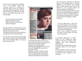
contents page analysis
1. As you can see the title of the magazine
“q” is the headline along with
“contents", which are in a big text to
make the readers know and recognise
the masthead of the magazine. Also the
contents is big and white with a formal
font so the readers know that its he
contents page.
The main column on the contents
page is the features section
which presents the main features
inside the magazine.
The page number is also the same size as the
features plus there are brief descriptions of
what each feature will contain.
The features title also has a banner behind it
to appeal attract the readers attention.
Plus the colour scheme of the contents page
has a colour scheme of grey and red which
links to the masthead which is Q because
that is also red as well. In the bottom left hand corner the is an
every month information column showing
what features they have inside the
magazine every months edition .
They have also highlighted “every month”
with red to highlight this section as its
important to read.
Also there is a brief of what the artists
inside the magazine had to say in their
interview which will then attracting the
reader as they will want to know more .
in the bottom right there is a review
section fro “Q” showing the page
numbers of all the man articles in the
magazine with brief descriptions
summing it up.
It also has a very simple layout by using
rectangular boxes to fit the features
inside.
Plus the heading “Q review” is bold and
in a large text size to stand out more
and become more noticeable to the
customers .
The main picture dominates the contents
page as its the largest feature. The facial
expression of the model is very simplistic
with a subtle makeup colour but its still
effective as she is gazing towards the
camera, however not directly at it.
Her face has been focused on by the camera
as her neck and body has been cropped out
leaving it as a close up. The photo takes up
the majority of the page, which is useful as
it shows whom the magazine is mainly
featuring.
In the top right there is a date and
issue of the magazine. The fact that is
it positioned here is vital as the date
needs to be clearly seen and it blends
in well with the background.
There is also a website underneath
the date so that people can easily
access the website.
2. immediately, we see that this contents
page is dominated by an image of a band
in this case ,Metallica, which is being
used to promote a competition to win
merchandise. The bright yellow puff
behind the “Win” makes it clear that
there is something to be won, which will
grips the readers attention straight away
especially because it’s a buzz word being
indorsed by artists as well .
A simple red, yellow black and white colour
scheme that is funky and vibrant while still
looking professional. The main image used is
black and white so as not to clash with the
house style.
The target audience for this magazine is
mainly teens aged between 16-19. This is
represented by the limited text and use of
more pictures. Compared to the Q magazine
contents pages with more text is normally
targeted for older readers as to much text
will not attract a young audience.
The advertisements encourage more people to
purchase more than one issue. Also by putting
the price makes it seem cheap which would
also attract their readers.
The use of the editors message gives the
magazine a personal and informal feel, with the
editor directing his message to the reader. The
language used is very casual, such as “fancy
winning” and bloody happy winner” when
looking at the competition article. Young people
may prefer this kind of feel instead of a formal
magazine with more complex words and they
usually would like to read a magazine for
entertainment, so they don’t want to
concentrate to hard on trying to understand the
magazine .
Magazine features and articles are placed
under sub headings to allow the reader to
navigate around the magazine easily as
possible. Each feature is accompanied by its
page number and a brief explanation about
what the article entails. This allows the reader
to decide what features they would mostly
likely be interested in reading . This s vital so
that readers will not be put off by the
magazine.
The issue number and cover date
is placed on the contents page so
readers know what issue the
magazine is .
3. The unusual layout of the word “contents”
suggests individuality from other magazines and
possibly connoting the individuality of the genre
of music that VIBE covers .
The column inch on the left has a simple layout
separated into two categories for ease for
reading. The category headings are written in a
font with formal serif.
Overall the layout is fairly balanced. Heavily
orientated towards the main image with all
other elements being places in accordance to
this picture. Possibly connoting the idea that
the artists are the main focus of vibe.
The deep red background colour could be
connoting deep passion; it also acts a nice
complimenting colour to the artist skin tone.
The white font colour choice is a good
contrast and creates a modern,contempoary
feel.
The model is pictured topless showing his
tattoos along with a variety of jewellery
and a base ball cap backwards which is a
convention of the rap genre as this
represents someone who is tough and
masculine as his muscles are evident . All
these elements promote the rap culture
for instance the gold teeth show wealth
and “grind”. The way his teeth are
clenched together shows anger along with
the pulling of the chain also shows he has
some sort of status.
Incorporating the magazine logo into the
background works in promoting the brand
identity. Helping to tie all the elements on
the page together. It fills a large gap in the
page without it being overwhelming
Date of magazine .