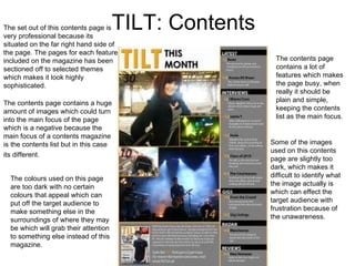
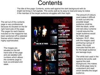
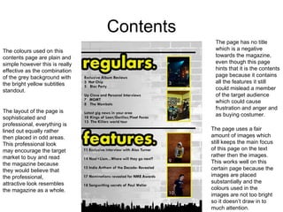
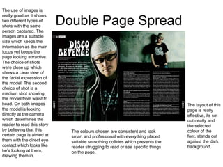
SlideShare a Scribd company logo
1 of 10
Magazine Analysis Beth Dobson
VIBE: Music Magazine The image overlaps the masthead which resembles  a big importance towards the model (Kanye West) used for the main image. The additional headlines are placed around the image creating a border which frames the image which once again resembles a big importance towards the model (Kanye West). The Model (Kanye West) looks straight at the camera which encourages the audience to think the magazine is aimed at them with the direct eye contact. The Colour of the masthead ( blue) co-ordinates with the colar of the model (Kanye West) which reflects on the importance of both things, with them both being the Masthead and the Main Headline.  The front cover doesn’t include any additional images around the page. This could be a negative feature about the magazine due to the target audience finding the model (Kanye West) who is the main image, appealing in any way towards them. This would then put off the target market buying the product. The colours used for the font of the page are pink and blue, this shows no division in gender, which concludes to the target audience being any gender, due to the stereo typical colours that relate to both male and female genders. As you can see the masthead is overlapped by the main image, this shows that the magazine has been around for a while and are known well throughout the public which can also show that they are at successful stage to hide their name because the target audience will already be aware of who the magazine is.
BLURT: Music Magazine The front cover doesn’t include any additional images around the page. This could be a negative feature about the magazine due to the target audience finding the model (Jenny Lewis) who is the main image, appealing in any way towards them. This would then put off the target market buying the product. The main image makes the target audience of the magazine, be people who find the model (Jenny Lewis) appealing in any way to them such as iconic and influential. Personally I would imagine that the magazine is aimed more towards a female target audience because this women who is on the front cover could be a role model towards these possible teenagers. Both the masthead and hat the model (Jenny Lewis) is wearing consist which shows how both features on the front cover are the most important on the front cover and as the magazine as a whole.  The colours used most on the front cover is pink; such as the pink balloons that the model (Jenny Lewis) is captured holding and also the parts of the text are highlighted pink. This hints more that the selected target audience are female because of this stereo typical chosen colour. The masthead is in full black capitals with hardly anything overlapping the text, which could show that the magazine is new and not ready for it to be covered because people are still not fully aware of this certain magazine.
TOP OF THE POPS: Music Magazine This certain front cover has so much included on it that makes it a very busy page. However this could be a positive point as it will persuade the young target audience to buy the product because they wants to read everything that is shown on the front cover. The featured headlines on the front cover include a variety of headlines. This directs at a variety of people who may prefer some headlines to other ones. Which encourage a bigger amount of buyers. The page is covered with stereo typical female colours: pink and purple. Which shows the aimed target audience are females because they relate more towards this colour more then boys do, however this is a very stereo typical circumstance. The target audience aimed for this magazine are children. This is concluded because the magazine contains a huge amount of bright colours which children find more appealing rather then adults and also the language used is very plain and simple which obviously for children due to them not at the stage of understand difficult, long vocabulary and finally the text is in bold to make the text easier to read for this certain age range. The masthead is overlapped by the main image which shows that the magazine has been around for a while which shows how the target audience and the rest of the public are very familiar with this product and also resembles success.
TILT: Contents The set out of this contents page is very professional because its situated on the far right hand side of the page. The pages for each feature included on the magazine has been sectioned off to selected themes which makes it look highly sophisticated.  The contents page contains a huge amount of images which could turn into the main focus of the page which is a negative because the main focus of a contents magazine is the contents list but in this case its different. The contents page contains a lot of features which makes the page busy, when really it should be plain and simple, keeping the contents list as the main focus.  Some of the images used on this contents page are slightly too dark, which makes it difficult to identify what the image actually is which can effect the target audience with frustration because of the unawareness. The colours used on this page are too dark with no certain colours that appeal which can put off the target audience to make something else in the surroundings of where they may be which will grab their attention to something else instead of this magazine.
Contents The set out of this contents page is very professional because its situated on the far right hand side of the page. The pages for each feature included on the magazine has been sectioned off to selected themes which makes it look highly sophisticated.  The amount of colours used makes it difficult to work out who the possible target audience could be. With the black, white and red colour scheme I would assume the target audience would be males aged between 16-21. Also with the images used  portraying a group of males, this could insinuate that the aim for the target audience are teenage boys.  The images are situated on the left hand side of the page and are labelled with numbers which allows the contents page to look co-ordinated and sleek.  The title of this page: Contents, works well against the dark background with its bright red lining in full capitals. This works well as its easy to read and easy to notice if the member of the target audience struggles with their sight. The white text used in the contents list works well against the dark background, this makes the whole page easy to understand and read which benefits the target audience.
Contents The colours used on this contents page are plain and simple however this is really effective as the combination of the grey background with the bright yellow subtitles standout. The page uses a fair amount of images which still keeps the main focus of this page on the text rather then the images. This works well on this certain page because the images are placed substantially and the colours used in the images are not too bright so it doesn’t draw in to much attention.  The layout of the page is sophisticated and professional, everything is lined out equally rather then placed in odd areas. This professional look may encourage the target market to buy and read the magazine because they would believe that the professional, attractive look resembles the magazine as a whole. The page has no title which is a negative towards the magazine, even though this page hints that it is the contents page because it contains all the features it still could mislead a member of the target audience which could cause frustration and anger and as buying costumer.
Double Page Spread The colour scheme on this double sheet page is very well chosen, the dark reddish background makes the image and everything surrounding it look really effective, and the white and black colour contrast looks spectacular. The use of images is really good as it shows different types of shots with the same person captured. The images are a suitable size which keeps the information as the main focus yet keeps the page looking attractive. The layout of the text is very poor as its placed in to fit around the image which makes the text unpleasant to read.  The magazine double page spread uses a quote which is written in a large font which highlights  the main part of the story, this could encourage the reader to read the whole story to find out why that quote is positioned and said.
Double Page Spread The use of images is really good as it shows two different types of shots with the same person captured. The images are a suitable size which keeps the information as the main focus yet keeps the page looking attractive. The choice of shots were close up which shows a clear view of the facial expression of the model. The second choice of shot is a medium shot showing the model from waist to head. On both images the model is looking directly at the camera which determines the reader to read this story by believing that this certain page is aimed at them with the direct eye contact which looks like he’s looking at them, drawing them in. The layout of this page is really effective, its set out neatly and the selected colour of the font, stands out against the dark background. The colours chosen are consistent and look smart and professional with everything placed suitable so nothing collides which prevents the reader struggling to read or see specific things on the page.
Double Page Spread The colours used on this double spread page are very feministic with the images bordered in pink and the subtitles highlighted in pink. However the other colours used look horrendous in contrast with the main (most used) colour. I believe that these unsuitable colours were used “last minute” as a way to avoid the target audience just being recognised for females with the stereo typical main use of colour. The use of images are a good variety as it equals with the same amount of text, this helps to prevent any main feature stealing the main focus. The images are recognised more towards a female audience with all the models captured who are all female.  The quotes boxed up around the main text is used in a bright colour which helps it to stand out, however the text colour be difficult to read for some   individual who may struggle with eye sight. The use of images is really good as it shows different types of shots with the group of people captured. The images are a suitable size which keeps the information as the main focus yet keeps the page looking attractive. All the models look direct at the camera which draws in a reader as they will believe the story is personally directed at them because of the eye contact.

More Related Content

What's hot

Contents Page and Double Page Spread
Contents Page and Double Page SpreadContents Page and Double Page Spread
Contents Page and Double Page SpreadMystifyingproductions
 
Textual analysis contents pages
Textual analysis  contents pagesTextual analysis  contents pages
Textual analysis contents pages051MARY
 
Analysis of cover page
Analysis of cover pageAnalysis of cover page
Analysis of cover pageKlarasa098
 
Textual analysis covers
Textual analysis  coversTextual analysis  covers
Textual analysis covers051MARY
 
Front cover analysis
Front cover analysisFront cover analysis
Front cover analysislarnamccann
 
Magazine cover analysis
Magazine cover analysisMagazine cover analysis
Magazine cover analysislewis tull
 
Contents Page Analysis
Contents Page AnalysisContents Page Analysis
Contents Page Analysisrebeccadahl98
 
Mixed Magazine cover analysis
Mixed Magazine cover analysis Mixed Magazine cover analysis
Mixed Magazine cover analysis carlaharrisss
 
Print Rotation Portfolio
Print Rotation PortfolioPrint Rotation Portfolio
Print Rotation PortfolioAbbey Glancy
 
Music contents pages
Music contents pagesMusic contents pages
Music contents pagescassieli
 

What's hot (15)

Magazine analysis 3
Magazine analysis 3Magazine analysis 3
Magazine analysis 3
 
Contents Page and Double Page Spread
Contents Page and Double Page SpreadContents Page and Double Page Spread
Contents Page and Double Page Spread
 
Textual analysis contents pages
Textual analysis  contents pagesTextual analysis  contents pages
Textual analysis contents pages
 
A2exsw
A2exswA2exsw
A2exsw
 
Analysis of cover page
Analysis of cover pageAnalysis of cover page
Analysis of cover page
 
Textual analysis covers
Textual analysis  coversTextual analysis  covers
Textual analysis covers
 
Front cover analysis
Front cover analysisFront cover analysis
Front cover analysis
 
Magazine cover analysis
Magazine cover analysisMagazine cover analysis
Magazine cover analysis
 
Magazine cover analysis
Magazine cover analysisMagazine cover analysis
Magazine cover analysis
 
Magazine cover analysis
Magazine cover analysisMagazine cover analysis
Magazine cover analysis
 
Contents Page Analysis
Contents Page AnalysisContents Page Analysis
Contents Page Analysis
 
front cover
front coverfront cover
front cover
 
Mixed Magazine cover analysis
Mixed Magazine cover analysis Mixed Magazine cover analysis
Mixed Magazine cover analysis
 
Print Rotation Portfolio
Print Rotation PortfolioPrint Rotation Portfolio
Print Rotation Portfolio
 
Music contents pages
Music contents pagesMusic contents pages
Music contents pages
 

Similar to Music magazine analysis

Research and planning all 3
Research and planning all 3Research and planning all 3
Research and planning all 3ReecebahiaGAD
 
Task3 smash hits analysis
Task3 smash hits analysisTask3 smash hits analysis
Task3 smash hits analysisdenhamj1
 
Evaluation 5 Media.
Evaluation 5 Media.Evaluation 5 Media.
Evaluation 5 Media.chloelogan1
 
Magazine resarch powerp 2 final
Magazine resarch powerp 2 finalMagazine resarch powerp 2 final
Magazine resarch powerp 2 finalJessica Smith
 
Magazine resarch powerp 2
Magazine resarch powerp 2Magazine resarch powerp 2
Magazine resarch powerp 2Jessica Smith
 
Evaluation 5 final
Evaluation 5 finalEvaluation 5 final
Evaluation 5 finalchloelogan1
 
Own magazine double page spread
Own magazine double page spreadOwn magazine double page spread
Own magazine double page spreadasmediae15
 
Codes and conventions of contents page
Codes and conventions of contents pageCodes and conventions of contents page
Codes and conventions of contents pagenathan gkikas
 
Shout contents analysis
Shout contents analysisShout contents analysis
Shout contents analysiskatiess07
 
Textual Analysis
Textual Analysis Textual Analysis
Textual Analysis 048600
 
Shout contents analysis
Shout contents analysisShout contents analysis
Shout contents analysiskatiess07
 
Analysing 3 magazine covers
Analysing 3 magazine coversAnalysing 3 magazine covers
Analysing 3 magazine coversblack-bird
 
Front covers, contents pages, double page spreads #5
Front covers, contents pages, double page spreads #5Front covers, contents pages, double page spreads #5
Front covers, contents pages, double page spreads #5QureshiSohail
 
etejtContents page ana
etejtContents page anaetejtContents page ana
etejtContents page analjsergh
 

Similar to Music magazine analysis (20)

Research and planning all 3
Research and planning all 3Research and planning all 3
Research and planning all 3
 
Task3 smash hits analysis
Task3 smash hits analysisTask3 smash hits analysis
Task3 smash hits analysis
 
Evaluation 5 Media.
Evaluation 5 Media.Evaluation 5 Media.
Evaluation 5 Media.
 
Magazine resarch powerp 2 final
Magazine resarch powerp 2 finalMagazine resarch powerp 2 final
Magazine resarch powerp 2 final
 
Magazine resarch powerp 2
Magazine resarch powerp 2Magazine resarch powerp 2
Magazine resarch powerp 2
 
Evaluation 5 final
Evaluation 5 finalEvaluation 5 final
Evaluation 5 final
 
Research
ResearchResearch
Research
 
Magazine resarch
Magazine resarch Magazine resarch
Magazine resarch
 
Own magazine double page spread
Own magazine double page spreadOwn magazine double page spread
Own magazine double page spread
 
Codes and conventions of contents page
Codes and conventions of contents pageCodes and conventions of contents page
Codes and conventions of contents page
 
Shout contents analysis
Shout contents analysisShout contents analysis
Shout contents analysis
 
Textual Analysis
Textual Analysis Textual Analysis
Textual Analysis
 
Shout contents analysis
Shout contents analysisShout contents analysis
Shout contents analysis
 
Analysing 3 magazine covers
Analysing 3 magazine coversAnalysing 3 magazine covers
Analysing 3 magazine covers
 
In style front cover
In style front coverIn style front cover
In style front cover
 
Mixmag analysis
Mixmag analysisMixmag analysis
Mixmag analysis
 
Front covers, contents pages, double page spreads #5
Front covers, contents pages, double page spreads #5Front covers, contents pages, double page spreads #5
Front covers, contents pages, double page spreads #5
 
Textual analysis
Textual analysisTextual analysis
Textual analysis
 
etejtContents page ana
etejtContents page anaetejtContents page ana
etejtContents page ana
 
Textual Analyasis
Textual AnalyasisTextual Analyasis
Textual Analyasis
 

More from BethanyPhilippa

Album cover and single cover and advert
Album cover and single cover and advertAlbum cover and single cover and advert
Album cover and single cover and advertBethanyPhilippa
 
Locations in music video
Locations in music videoLocations in music video
Locations in music videoBethanyPhilippa
 
Album cover and single cover and advert
Album cover and single cover and advertAlbum cover and single cover and advert
Album cover and single cover and advertBethanyPhilippa
 
Album cover and single cover and advert
Album cover and single cover and advertAlbum cover and single cover and advert
Album cover and single cover and advertBethanyPhilippa
 
Music poster and cd analysis
Music poster and cd analysisMusic poster and cd analysis
Music poster and cd analysisBethanyPhilippa
 
Music video analysis only video
Music video analysis only videoMusic video analysis only video
Music video analysis only videoBethanyPhilippa
 
Lauramclellanevaluationmediamagzine
LauramclellanevaluationmediamagzineLauramclellanevaluationmediamagzine
LauramclellanevaluationmediamagzineBethanyPhilippa
 
As media studies coursework evaluation
As media studies  coursework evaluationAs media studies  coursework evaluation
As media studies coursework evaluationBethanyPhilippa
 

More from BethanyPhilippa (20)

Portfolio
PortfolioPortfolio
Portfolio
 
Evaluation final
Evaluation finalEvaluation final
Evaluation final
 
Andrew goodwins theory
Andrew goodwins theoryAndrew goodwins theory
Andrew goodwins theory
 
Evaluation final
Evaluation finalEvaluation final
Evaluation final
 
Evaluation final
Evaluation finalEvaluation final
Evaluation final
 
Risk assessment
Risk assessmentRisk assessment
Risk assessment
 
Album cover and single cover and advert
Album cover and single cover and advertAlbum cover and single cover and advert
Album cover and single cover and advert
 
Lighting in music video
Lighting in music videoLighting in music video
Lighting in music video
 
Costume in music video
Costume in music videoCostume in music video
Costume in music video
 
Props in music video
Props in music videoProps in music video
Props in music video
 
Locations in music video
Locations in music videoLocations in music video
Locations in music video
 
Story board
Story boardStory board
Story board
 
Album cover and single cover and advert
Album cover and single cover and advertAlbum cover and single cover and advert
Album cover and single cover and advert
 
Album cover and single cover and advert
Album cover and single cover and advertAlbum cover and single cover and advert
Album cover and single cover and advert
 
Music poster and cd analysis
Music poster and cd analysisMusic poster and cd analysis
Music poster and cd analysis
 
Music video analysis only video
Music video analysis only videoMusic video analysis only video
Music video analysis only video
 
Music video analysis
Music video analysisMusic video analysis
Music video analysis
 
Lauramclellanevaluationmediamagzine
LauramclellanevaluationmediamagzineLauramclellanevaluationmediamagzine
Lauramclellanevaluationmediamagzine
 
As media studies coursework evaluation
As media studies  coursework evaluationAs media studies  coursework evaluation
As media studies coursework evaluation
 
More music mag images
More music mag imagesMore music mag images
More music mag images
 

Recently uploaded

Call Girl Service in Karachi +923081633338 Karachi Call Girls
Call Girl Service in Karachi +923081633338 Karachi Call GirlsCall Girl Service in Karachi +923081633338 Karachi Call Girls
Call Girl Service in Karachi +923081633338 Karachi Call GirlsAyesha Khan
 
Downtown Call Girls O5O91O128O Pakistani Call Girls in Downtown
Downtown Call Girls O5O91O128O Pakistani Call Girls in DowntownDowntown Call Girls O5O91O128O Pakistani Call Girls in Downtown
Downtown Call Girls O5O91O128O Pakistani Call Girls in Downtowndajasot375
 
Call Girls in Islamabad | 03274100048 | Call Girl Service
Call Girls in Islamabad | 03274100048 | Call Girl ServiceCall Girls in Islamabad | 03274100048 | Call Girl Service
Call Girls in Islamabad | 03274100048 | Call Girl ServiceAyesha Khan
 
Govindpuri Call Girls : ☎ 8527673949, Low rate Call Girls
Govindpuri Call Girls : ☎ 8527673949, Low rate Call GirlsGovindpuri Call Girls : ☎ 8527673949, Low rate Call Girls
Govindpuri Call Girls : ☎ 8527673949, Low rate Call Girlsashishs7044
 
FULL ENJOY - 9953040155 Call Girls in Noida | Delhi
FULL ENJOY - 9953040155 Call Girls in Noida | DelhiFULL ENJOY - 9953040155 Call Girls in Noida | Delhi
FULL ENJOY - 9953040155 Call Girls in Noida | DelhiMalviyaNagarCallGirl
 
9654467111 Call Girls In Noida Sector 62 Short 1500 Night 6000
9654467111 Call Girls In Noida Sector 62 Short 1500 Night 60009654467111 Call Girls In Noida Sector 62 Short 1500 Night 6000
9654467111 Call Girls In Noida Sector 62 Short 1500 Night 6000Sapana Sha
 
Turn Lock Take Key Storyboard Daniel Johnson
Turn Lock Take Key Storyboard Daniel JohnsonTurn Lock Take Key Storyboard Daniel Johnson
Turn Lock Take Key Storyboard Daniel Johnsonthephillipta
 
Bare And Wild Creation, Curio Shop, Tucumcari NM
Bare And Wild Creation, Curio Shop, Tucumcari NMBare And Wild Creation, Curio Shop, Tucumcari NM
Bare And Wild Creation, Curio Shop, Tucumcari NMroute66connected
 
FULL ENJOY - 9953040155 Call Girls in Uttam Nagar | Delhi
FULL ENJOY - 9953040155 Call Girls in Uttam Nagar | DelhiFULL ENJOY - 9953040155 Call Girls in Uttam Nagar | Delhi
FULL ENJOY - 9953040155 Call Girls in Uttam Nagar | DelhiMalviyaNagarCallGirl
 
Pragati Maidan Call Girls : ☎ 8527673949, Low rate Call Girls
Pragati Maidan Call Girls : ☎ 8527673949, Low rate Call GirlsPragati Maidan Call Girls : ☎ 8527673949, Low rate Call Girls
Pragati Maidan Call Girls : ☎ 8527673949, Low rate Call Girlsashishs7044
 
FULL ENJOY - 9953040155 Call Girls in Shahdara | Delhi
FULL ENJOY - 9953040155 Call Girls in Shahdara | DelhiFULL ENJOY - 9953040155 Call Girls in Shahdara | Delhi
FULL ENJOY - 9953040155 Call Girls in Shahdara | DelhiMalviyaNagarCallGirl
 
FULL ENJOY - 9953040155 Call Girls in Gandhi Vihar | Delhi
FULL ENJOY - 9953040155 Call Girls in Gandhi Vihar | DelhiFULL ENJOY - 9953040155 Call Girls in Gandhi Vihar | Delhi
FULL ENJOY - 9953040155 Call Girls in Gandhi Vihar | DelhiMalviyaNagarCallGirl
 
FULL ENJOY - 9953040155 Call Girls in Gtb Nagar | Delhi
FULL ENJOY - 9953040155 Call Girls in Gtb Nagar | DelhiFULL ENJOY - 9953040155 Call Girls in Gtb Nagar | Delhi
FULL ENJOY - 9953040155 Call Girls in Gtb Nagar | DelhiMalviyaNagarCallGirl
 
How Can You Get Dubai Call Girls +971564860409 Call Girls Dubai?
How Can You Get Dubai Call Girls +971564860409 Call Girls Dubai?How Can You Get Dubai Call Girls +971564860409 Call Girls Dubai?
How Can You Get Dubai Call Girls +971564860409 Call Girls Dubai?kexey39068
 
Karachi Escorts | +923070433345 | Escort Service in Karachi
Karachi Escorts | +923070433345 | Escort Service in KarachiKarachi Escorts | +923070433345 | Escort Service in Karachi
Karachi Escorts | +923070433345 | Escort Service in KarachiAyesha Khan
 
FULL ENJOY - 9953040155 Call Girls in Karol Bagh | Delhi
FULL ENJOY - 9953040155 Call Girls in Karol Bagh | DelhiFULL ENJOY - 9953040155 Call Girls in Karol Bagh | Delhi
FULL ENJOY - 9953040155 Call Girls in Karol Bagh | DelhiMalviyaNagarCallGirl
 
Call Girl in Bur Dubai O5286O4116 Indian Call Girls in Bur Dubai By VIP Bur D...
Call Girl in Bur Dubai O5286O4116 Indian Call Girls in Bur Dubai By VIP Bur D...Call Girl in Bur Dubai O5286O4116 Indian Call Girls in Bur Dubai By VIP Bur D...
Call Girl in Bur Dubai O5286O4116 Indian Call Girls in Bur Dubai By VIP Bur D...dajasot375
 
FULL ENJOY - 9953040155 Call Girls in Laxmi Nagar | Delhi
FULL ENJOY - 9953040155 Call Girls in Laxmi Nagar | DelhiFULL ENJOY - 9953040155 Call Girls in Laxmi Nagar | Delhi
FULL ENJOY - 9953040155 Call Girls in Laxmi Nagar | DelhiMalviyaNagarCallGirl
 
Khanpur Call Girls : ☎ 8527673949, Low rate Call Girls
Khanpur Call Girls : ☎ 8527673949, Low rate Call GirlsKhanpur Call Girls : ☎ 8527673949, Low rate Call Girls
Khanpur Call Girls : ☎ 8527673949, Low rate Call Girlsashishs7044
 

Recently uploaded (20)

Call Girl Service in Karachi +923081633338 Karachi Call Girls
Call Girl Service in Karachi +923081633338 Karachi Call GirlsCall Girl Service in Karachi +923081633338 Karachi Call Girls
Call Girl Service in Karachi +923081633338 Karachi Call Girls
 
Downtown Call Girls O5O91O128O Pakistani Call Girls in Downtown
Downtown Call Girls O5O91O128O Pakistani Call Girls in DowntownDowntown Call Girls O5O91O128O Pakistani Call Girls in Downtown
Downtown Call Girls O5O91O128O Pakistani Call Girls in Downtown
 
Call Girls in Islamabad | 03274100048 | Call Girl Service
Call Girls in Islamabad | 03274100048 | Call Girl ServiceCall Girls in Islamabad | 03274100048 | Call Girl Service
Call Girls in Islamabad | 03274100048 | Call Girl Service
 
Dxb Call Girls # +971529501107 # Call Girls In Dxb Dubai || (UAE)
Dxb Call Girls # +971529501107 # Call Girls In Dxb Dubai || (UAE)Dxb Call Girls # +971529501107 # Call Girls In Dxb Dubai || (UAE)
Dxb Call Girls # +971529501107 # Call Girls In Dxb Dubai || (UAE)
 
Govindpuri Call Girls : ☎ 8527673949, Low rate Call Girls
Govindpuri Call Girls : ☎ 8527673949, Low rate Call GirlsGovindpuri Call Girls : ☎ 8527673949, Low rate Call Girls
Govindpuri Call Girls : ☎ 8527673949, Low rate Call Girls
 
FULL ENJOY - 9953040155 Call Girls in Noida | Delhi
FULL ENJOY - 9953040155 Call Girls in Noida | DelhiFULL ENJOY - 9953040155 Call Girls in Noida | Delhi
FULL ENJOY - 9953040155 Call Girls in Noida | Delhi
 
9654467111 Call Girls In Noida Sector 62 Short 1500 Night 6000
9654467111 Call Girls In Noida Sector 62 Short 1500 Night 60009654467111 Call Girls In Noida Sector 62 Short 1500 Night 6000
9654467111 Call Girls In Noida Sector 62 Short 1500 Night 6000
 
Turn Lock Take Key Storyboard Daniel Johnson
Turn Lock Take Key Storyboard Daniel JohnsonTurn Lock Take Key Storyboard Daniel Johnson
Turn Lock Take Key Storyboard Daniel Johnson
 
Bare And Wild Creation, Curio Shop, Tucumcari NM
Bare And Wild Creation, Curio Shop, Tucumcari NMBare And Wild Creation, Curio Shop, Tucumcari NM
Bare And Wild Creation, Curio Shop, Tucumcari NM
 
FULL ENJOY - 9953040155 Call Girls in Uttam Nagar | Delhi
FULL ENJOY - 9953040155 Call Girls in Uttam Nagar | DelhiFULL ENJOY - 9953040155 Call Girls in Uttam Nagar | Delhi
FULL ENJOY - 9953040155 Call Girls in Uttam Nagar | Delhi
 
Pragati Maidan Call Girls : ☎ 8527673949, Low rate Call Girls
Pragati Maidan Call Girls : ☎ 8527673949, Low rate Call GirlsPragati Maidan Call Girls : ☎ 8527673949, Low rate Call Girls
Pragati Maidan Call Girls : ☎ 8527673949, Low rate Call Girls
 
FULL ENJOY - 9953040155 Call Girls in Shahdara | Delhi
FULL ENJOY - 9953040155 Call Girls in Shahdara | DelhiFULL ENJOY - 9953040155 Call Girls in Shahdara | Delhi
FULL ENJOY - 9953040155 Call Girls in Shahdara | Delhi
 
FULL ENJOY - 9953040155 Call Girls in Gandhi Vihar | Delhi
FULL ENJOY - 9953040155 Call Girls in Gandhi Vihar | DelhiFULL ENJOY - 9953040155 Call Girls in Gandhi Vihar | Delhi
FULL ENJOY - 9953040155 Call Girls in Gandhi Vihar | Delhi
 
FULL ENJOY - 9953040155 Call Girls in Gtb Nagar | Delhi
FULL ENJOY - 9953040155 Call Girls in Gtb Nagar | DelhiFULL ENJOY - 9953040155 Call Girls in Gtb Nagar | Delhi
FULL ENJOY - 9953040155 Call Girls in Gtb Nagar | Delhi
 
How Can You Get Dubai Call Girls +971564860409 Call Girls Dubai?
How Can You Get Dubai Call Girls +971564860409 Call Girls Dubai?How Can You Get Dubai Call Girls +971564860409 Call Girls Dubai?
How Can You Get Dubai Call Girls +971564860409 Call Girls Dubai?
 
Karachi Escorts | +923070433345 | Escort Service in Karachi
Karachi Escorts | +923070433345 | Escort Service in KarachiKarachi Escorts | +923070433345 | Escort Service in Karachi
Karachi Escorts | +923070433345 | Escort Service in Karachi
 
FULL ENJOY - 9953040155 Call Girls in Karol Bagh | Delhi
FULL ENJOY - 9953040155 Call Girls in Karol Bagh | DelhiFULL ENJOY - 9953040155 Call Girls in Karol Bagh | Delhi
FULL ENJOY - 9953040155 Call Girls in Karol Bagh | Delhi
 
Call Girl in Bur Dubai O5286O4116 Indian Call Girls in Bur Dubai By VIP Bur D...
Call Girl in Bur Dubai O5286O4116 Indian Call Girls in Bur Dubai By VIP Bur D...Call Girl in Bur Dubai O5286O4116 Indian Call Girls in Bur Dubai By VIP Bur D...
Call Girl in Bur Dubai O5286O4116 Indian Call Girls in Bur Dubai By VIP Bur D...
 
FULL ENJOY - 9953040155 Call Girls in Laxmi Nagar | Delhi
FULL ENJOY - 9953040155 Call Girls in Laxmi Nagar | DelhiFULL ENJOY - 9953040155 Call Girls in Laxmi Nagar | Delhi
FULL ENJOY - 9953040155 Call Girls in Laxmi Nagar | Delhi
 
Khanpur Call Girls : ☎ 8527673949, Low rate Call Girls
Khanpur Call Girls : ☎ 8527673949, Low rate Call GirlsKhanpur Call Girls : ☎ 8527673949, Low rate Call Girls
Khanpur Call Girls : ☎ 8527673949, Low rate Call Girls
 

Music magazine analysis

  • 2. VIBE: Music Magazine The image overlaps the masthead which resembles a big importance towards the model (Kanye West) used for the main image. The additional headlines are placed around the image creating a border which frames the image which once again resembles a big importance towards the model (Kanye West). The Model (Kanye West) looks straight at the camera which encourages the audience to think the magazine is aimed at them with the direct eye contact. The Colour of the masthead ( blue) co-ordinates with the colar of the model (Kanye West) which reflects on the importance of both things, with them both being the Masthead and the Main Headline. The front cover doesn’t include any additional images around the page. This could be a negative feature about the magazine due to the target audience finding the model (Kanye West) who is the main image, appealing in any way towards them. This would then put off the target market buying the product. The colours used for the font of the page are pink and blue, this shows no division in gender, which concludes to the target audience being any gender, due to the stereo typical colours that relate to both male and female genders. As you can see the masthead is overlapped by the main image, this shows that the magazine has been around for a while and are known well throughout the public which can also show that they are at successful stage to hide their name because the target audience will already be aware of who the magazine is.
  • 3. BLURT: Music Magazine The front cover doesn’t include any additional images around the page. This could be a negative feature about the magazine due to the target audience finding the model (Jenny Lewis) who is the main image, appealing in any way towards them. This would then put off the target market buying the product. The main image makes the target audience of the magazine, be people who find the model (Jenny Lewis) appealing in any way to them such as iconic and influential. Personally I would imagine that the magazine is aimed more towards a female target audience because this women who is on the front cover could be a role model towards these possible teenagers. Both the masthead and hat the model (Jenny Lewis) is wearing consist which shows how both features on the front cover are the most important on the front cover and as the magazine as a whole. The colours used most on the front cover is pink; such as the pink balloons that the model (Jenny Lewis) is captured holding and also the parts of the text are highlighted pink. This hints more that the selected target audience are female because of this stereo typical chosen colour. The masthead is in full black capitals with hardly anything overlapping the text, which could show that the magazine is new and not ready for it to be covered because people are still not fully aware of this certain magazine.
  • 4. TOP OF THE POPS: Music Magazine This certain front cover has so much included on it that makes it a very busy page. However this could be a positive point as it will persuade the young target audience to buy the product because they wants to read everything that is shown on the front cover. The featured headlines on the front cover include a variety of headlines. This directs at a variety of people who may prefer some headlines to other ones. Which encourage a bigger amount of buyers. The page is covered with stereo typical female colours: pink and purple. Which shows the aimed target audience are females because they relate more towards this colour more then boys do, however this is a very stereo typical circumstance. The target audience aimed for this magazine are children. This is concluded because the magazine contains a huge amount of bright colours which children find more appealing rather then adults and also the language used is very plain and simple which obviously for children due to them not at the stage of understand difficult, long vocabulary and finally the text is in bold to make the text easier to read for this certain age range. The masthead is overlapped by the main image which shows that the magazine has been around for a while which shows how the target audience and the rest of the public are very familiar with this product and also resembles success.
  • 5. TILT: Contents The set out of this contents page is very professional because its situated on the far right hand side of the page. The pages for each feature included on the magazine has been sectioned off to selected themes which makes it look highly sophisticated. The contents page contains a huge amount of images which could turn into the main focus of the page which is a negative because the main focus of a contents magazine is the contents list but in this case its different. The contents page contains a lot of features which makes the page busy, when really it should be plain and simple, keeping the contents list as the main focus. Some of the images used on this contents page are slightly too dark, which makes it difficult to identify what the image actually is which can effect the target audience with frustration because of the unawareness. The colours used on this page are too dark with no certain colours that appeal which can put off the target audience to make something else in the surroundings of where they may be which will grab their attention to something else instead of this magazine.
  • 6. Contents The set out of this contents page is very professional because its situated on the far right hand side of the page. The pages for each feature included on the magazine has been sectioned off to selected themes which makes it look highly sophisticated. The amount of colours used makes it difficult to work out who the possible target audience could be. With the black, white and red colour scheme I would assume the target audience would be males aged between 16-21. Also with the images used portraying a group of males, this could insinuate that the aim for the target audience are teenage boys. The images are situated on the left hand side of the page and are labelled with numbers which allows the contents page to look co-ordinated and sleek. The title of this page: Contents, works well against the dark background with its bright red lining in full capitals. This works well as its easy to read and easy to notice if the member of the target audience struggles with their sight. The white text used in the contents list works well against the dark background, this makes the whole page easy to understand and read which benefits the target audience.
  • 7. Contents The colours used on this contents page are plain and simple however this is really effective as the combination of the grey background with the bright yellow subtitles standout. The page uses a fair amount of images which still keeps the main focus of this page on the text rather then the images. This works well on this certain page because the images are placed substantially and the colours used in the images are not too bright so it doesn’t draw in to much attention. The layout of the page is sophisticated and professional, everything is lined out equally rather then placed in odd areas. This professional look may encourage the target market to buy and read the magazine because they would believe that the professional, attractive look resembles the magazine as a whole. The page has no title which is a negative towards the magazine, even though this page hints that it is the contents page because it contains all the features it still could mislead a member of the target audience which could cause frustration and anger and as buying costumer.
  • 8. Double Page Spread The colour scheme on this double sheet page is very well chosen, the dark reddish background makes the image and everything surrounding it look really effective, and the white and black colour contrast looks spectacular. The use of images is really good as it shows different types of shots with the same person captured. The images are a suitable size which keeps the information as the main focus yet keeps the page looking attractive. The layout of the text is very poor as its placed in to fit around the image which makes the text unpleasant to read. The magazine double page spread uses a quote which is written in a large font which highlights the main part of the story, this could encourage the reader to read the whole story to find out why that quote is positioned and said.
  • 9. Double Page Spread The use of images is really good as it shows two different types of shots with the same person captured. The images are a suitable size which keeps the information as the main focus yet keeps the page looking attractive. The choice of shots were close up which shows a clear view of the facial expression of the model. The second choice of shot is a medium shot showing the model from waist to head. On both images the model is looking directly at the camera which determines the reader to read this story by believing that this certain page is aimed at them with the direct eye contact which looks like he’s looking at them, drawing them in. The layout of this page is really effective, its set out neatly and the selected colour of the font, stands out against the dark background. The colours chosen are consistent and look smart and professional with everything placed suitable so nothing collides which prevents the reader struggling to read or see specific things on the page.
  • 10. Double Page Spread The colours used on this double spread page are very feministic with the images bordered in pink and the subtitles highlighted in pink. However the other colours used look horrendous in contrast with the main (most used) colour. I believe that these unsuitable colours were used “last minute” as a way to avoid the target audience just being recognised for females with the stereo typical main use of colour. The use of images are a good variety as it equals with the same amount of text, this helps to prevent any main feature stealing the main focus. The images are recognised more towards a female audience with all the models captured who are all female. The quotes boxed up around the main text is used in a bright colour which helps it to stand out, however the text colour be difficult to read for some individual who may struggle with eye sight. The use of images is really good as it shows different types of shots with the group of people captured. The images are a suitable size which keeps the information as the main focus yet keeps the page looking attractive. All the models look direct at the camera which draws in a reader as they will believe the story is personally directed at them because of the eye contact.